> ## Documentation Index
> Fetch the complete documentation index at: https://buttercms.com/docs/llms.txt
> Use this file to discover all available pages before exploring further.
# Component Library
> A comprehensive tour of the Component Library and how to manage your reusable Components in ButterCMS.
Components can either be **local** (only available to a specific Page or Page Type) or **global** (available to all Page Types).
Your global Components are available in your **Component Library**.
Reusable across all Page Types in your project
* Accessed via the Component Library
* Displayed with the Library icon
* Accessible from any Page Type configuration
* Changes affect all instances across your project
* Ideal for standardized content blocks
Scoped to a single Page Type for unique needs
* Exist on only one Page Type
* Good for creating one-off or unique Components
* Can be converted to a Global component by adding to your library
## Benefits of the Component Library
Compose compelling, unique content experiences with Pages built using Components
A Component that's been saved to your Library can be used across multiple Page Types, and its structure will stay consistent.
Edits to a Component in your Library will automatically propagate to all the Page Types where it has been used.
## Identifying Library Components
You can denote which Components on a Page schema are in your library by the presence of the Library icon:
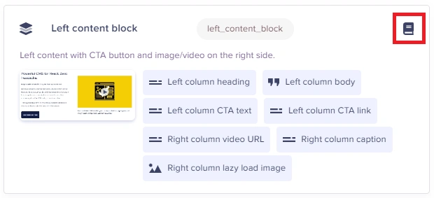
Local Components (which exist only on one Page Type) will not have this icon.
## Accessing the Component Library
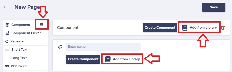
Select Components from your Component Library by simply clicking the **Add from Library** button or the Library shortcut icon:
## Viewing all Components
Access your full Component Library from your Content Type dashboard. You can filter by Components at the top to find your entire Component Library.
## Saving local Components to the Library
To save a Local Component to your Component Library simply click on the **Save to Library** button:
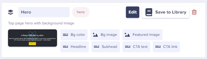
This turns it into a regular Component that can be used globally.
See [Creating, working with, and deleting Components](creating-components) for more information on updating Components, including via the Component Library.
## Building a Component Library
### Organizing your Components
1. **Start with common patterns** - Hero, Features, CTA, Testimonials
2. **Keep components focused** - Each component should do one thing well
3. **Use consistent naming** - snake\_case for API keys, descriptive names
4. **Document your components** - Help editors understand when to use each
### Suggested Component Library
| Category | Components |
| ------------------- | ------------------------------------------------- |
| **Headers** | hero, hero\_video, hero\_slideshow |
| **Content** | text\_block, text\_image, two\_column |
| **Features** | features\_grid, features\_list, comparison\_table |
| **Social Proof** | testimonial, testimonial\_carousel, logo\_wall |
| **Calls to Action** | cta\_simple, cta\_form, cta\_banner |
| **Media** | image\_gallery, video\_embed, image\_carousel |
| **Data** | pricing\_table, stats\_counter, timeline |
## Component Library best practices
Use clear, descriptive names like "Hero Section", "Testimonial Card", or "Feature Grid". Prefix related Components (e.g., "Blog - Author", "Blog - CTA").
Add help text to Component fields so content editors understand what each field is for and what content it expects.
Before creating Components, map out all the content blocks your site needs. Identify patterns and opportunities for reuse.
Each Component should serve a single purpose. A "Hero" Component should contain hero-related fields only—don't mix in unrelated content.
Only add relevant Components to each Page Type's Component Picker. A careers page doesn't need a pricing table Component.
## FAQ
It means those Components were identified as not being used anywhere. You can rename them or delete them to clean up your Component Library.
Changes automatically propagate to all Page Types where the Component is used. This allows you to update your content structure site-wide with a single change.
No, but you can remove a Component from the library (which disconnects it from Page Types) and then add it back as a local Component to specific Page Types.
There's no hard limit on the number of Components. However, keep your library organized and remove unused Components to maintain clarity.
## Next steps