> ## Documentation Index
> Fetch the complete documentation index at: https://buttercms.com/docs/llms.txt
> Use this file to discover all available pages before exploring further.
# Components: overview
> Learn how to work in the ButterCMS dashboard with Components: reusable content blocks for building flexible, dynamic page layouts.
## What is a component?
**Components** are a special field type you can add to Page schemas. A Component allows you to logically group related content fields to make it easy for content editors to build new unique pages.
They're the building blocks that let you mix and match different types of content sections.
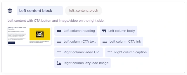
You can create a new Component for one-time use and you can also save it to the Component Library for future use. In addition, you can simply add any previously saved Components from your Component Library.
## Key features
Create a Component to group related fields together in a **single building block**.
Save any Component to your **Component library** and reuse its schema on any other Page.
Utilize trigger fields (checkboxes and dropdowns) to **conditionally show/hide other fields** (like an "on-sale" checkbox that shows or hides discount options).
Add the **Component Picker** to your Page schema to allow content editors to build flexible layouts from a preselected allowlist of components.
All of the Component's data is grouped in the Page's **API response** under the Component's slug.
## Field at a glance
### Input and output
Varies; Component is defined in Page schema with your choice of field types
`object`
### API response
Learn more about how Components are returned by the API, and how to model Component content in your app.
### Field configuration and validation options
Component fields don't have any configuration options of their own (except for [conditional fields](./conditional-fields-components)). Instead, each field you add to a component has its own [validation and configuration options](../fields-basics/configuring-and-validating-fields).
{/* SOURCE: file_path="knowledge-base/content-modeling-basics/content-fields.md" section="Component" */}
## Working with different Component types
### Text Components
Text components typically contain a WYSIWYG editor for rich content:
* Format text with bold, italic, headings
* Add links and lists
* Insert images inline
* Use all WYSIWYG features
### Media Components
Media components focus on visual content:
* Upload or select images from Media Library
* Set alt text for accessibility
* Specify dimensions if required
* Add captions where available
### CTA Components
Call-to-action Components drive user engagement:
* Set compelling headlines
* Write persuasive body text
* Configure button text and link
* Choose brand colors (if available)
## Common Component configurations
**Hero section**
```text theme={null}
Component: hero
├── Short Text: headline
├── Long Text: subheadline
├── Media: background_image
├── Short Text: cta_text
├── Short Text: cta_link
└── Dropdown: layout (left, center, right)
```
**Features grid**
```text theme={null}
Component: features_grid
├── Short Text: section_title
├── Long Text: section_description
└── Repeater: features
├── Media: icon
├── Short Text: title
└── Long Text: description
```
**Testimonial**
```text theme={null}
Component: testimonial
├── Long Text: quote
├── Short Text: author_name
├── Short Text: author_title
├── Short Text: company
└── Media: author_photo
```
**Call-to-action (CTA)**
```text theme={null}
Component: cta
├── Short Text: headline
├── Long Text: body_text
├── Short Text: button_text
├── Short Text: button_link
└── Dropdown: style (primary, secondary)
```
**Content block**
```text theme={null}
Component: content_block
├── Short Text: title
├── WYSIWYG: content
├── Media: image
└── Dropdown: image_position (left, right)
```
**Pricing table**
```text theme={null}
Component: pricing_table
└── Repeater: tiers
├── Short Text: name
├── Number: price
├── Short Text: period
├── Repeater: features
│ └── Short Text: feature
├── Short Text: cta_text
└── Checkbox: is_featured
```
## Best practices
**Content organization**
* Plan your page structure before adding components
* Use a logical flow: Hero → Features → Content → CTA
* Group related information in the same component
**Visual balance**
* Alternate between text-heavy and visual components
* Don't stack too many components of the same type
* Use CTA components strategically (not too many)
**Consistency**
* Use similar formatting across components
* Keep headlines at consistent lengths
* Use the same image dimensions for similar components
**Performance**
* Don't add too many components to a single page
* Optimize images before uploading to media components
* Keep text concise and scannable
## Troubleshooting
Components are defined by your developer at the Page Type level. Contact them to add new component options.
Check with your developer for field descriptions, or look for help text below each field.
Preview automatically saves your draft before displaying. If issues persist, ensure your preview URL is configured correctly.
## Best practices
**Component design**
1. **Keep components self-contained:** All necessary fields within the component
2. **Use sensible defaults:** Pre-populate common values
3. **Limit field count:** 5-10 fields per component is ideal
4. **Consider mobile:** Design components that work on all devices
**Component library**
1. **Standardize naming:** Consistent conventions across components
2. **Create documentation:** Screenshots and descriptions for editors
3. **Test before publishing:** Ensure components render correctly
4. **Version carefully:** Changes affect all pages using the component
**Performance**
1. **Lazy load heavy components:** Video, carousels, large images
2. **Use responsive images:** Different sizes for different screens
3. **Minimize component count:** More components = more complexity