> ## Documentation Index
> Fetch the complete documentation index at: https://buttercms.com/docs/llms.txt
> Use this file to discover all available pages before exploring further.
# Create, use, and delete Components
> Step-by-step guide on creating, editing, and deleting Components in ButterCMS.
## Creating Components
There are two primary methods for creating Components in ButterCMS:
| Method | Best for | Result |
| -------------------------------- | -------------------------------------------- | ----------------------------------- |
| **From Content Types dashboard** | Building reusable, global Components | Added directly to Component Library |
| **From Page Type configuration** | Creating Components as you build a Page Type | Can be local or saved to library |
### Method 1: Creating from the Content Types dashboard
Directly create new Components from your **Content Type** dashboard by clicking on the **New Content Type** button and then selecting **Component**:

Go to **Content Types** in the sidebar navigation.
Click the **New Content Type** button.
Choose **Component** from the dropdown options.
Configure the fields your Component needs.
Name your Component and save it to the library.
### Method 2: Creating from Page Type configuration
Create a local Component when configuring a Page Type by clicking on the **Create Component** button:
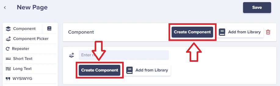
Fill in the fields as described above. Once your component is saved to the Page Type, you can then save it to the Component Library for repeated use.
#### Saving to the Component Library
After creating a local Component, you can save it to the Component Library for reuse across other Page Types:
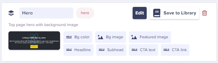
This turns it into a global Component that can be used across your entire project.
### Component examples
An SEO Component can be quite simple and highly reusable across all your Page Types:
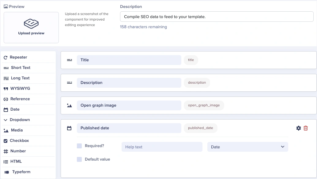
Our fields will be:
* A **Short Text** field for our meta title
* A **Short Text** field for our meta description
* You can set a max of 150-160 characters for SEO best practices by clicking on the Gear (⚙️) icon
* A **Media** field for our open graph image when sharing the Blog Post via social media and messaging platforms
* A **Date** field to set our original published date for SEO and JSON-LD
SEO Components are highly reusable. Create one SEO Component and add it to every Page Type in your project for consistent search optimization.
Let's create a hero Component for landing pages. After selecting **Create Component**, you'll see a Component configuration dropdown where you can choose the custom fields you want:
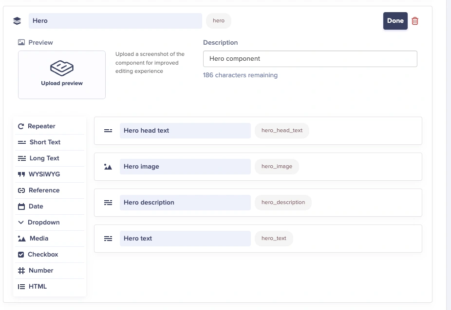
For the hero Component, add the following fields:
* **Short Text** for the hero headline
* **Media** for the hero image
* **Long Text** for hero description
* **Long Text** for hero subtext
A simple text Component with a single WYSIWYG field:
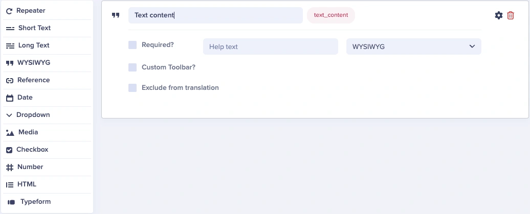
We named the field `Text Content`, but you can name it something different.
By clicking the second checkbox, you can also customize the toolbar to allow/disallow the usage of certain formats and options.
Once added and styled on the frontend, your Component could look like this:
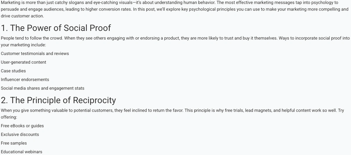
An image Component with only a few fields:
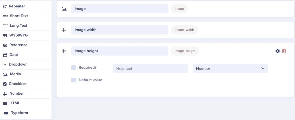
We only need three fields for our image Component:
* A **Media** field
* A **Number** field to define our image's width
* A **Number** field to define our image's height
**Tip**: Having image width and height dimensions impacts site performance and SEO as it can affect the layout shift of content across device screen sizes. Images should always be properly sized and have `height` and `width` attributes set.
You no longer need a Short Text field for your image's `alt` text—you can set it directly along with the image in the Media field.
Once styled on the frontend:

A CTA Component that's more involved, using Collections for brand colors:
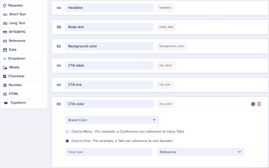
Our Component's fields are:
* A **Short Text** field for the CTA headline
* A **Long Text** field for the CTA body text
* A **Reference** field to reference our Brand Color collection
* We're using the `One-to-One` radio selection because this only needs to be single select
* A **Short Text** field for our CTA button's label/text
* A **Short Text** field for our CTA button's link
* A **Reference** field to reference our Brand Color collection for the button color
Once added and styled on the frontend, your Component could look like this:

It's a best practice to use Collections for brand color management as a way to provide guidelines to your team. With a color picker, it's easy to pick off-brand colors. Collections enforce consistency.
For Components that need repeating content, use a Repeater field. Here's how to create a services Component:
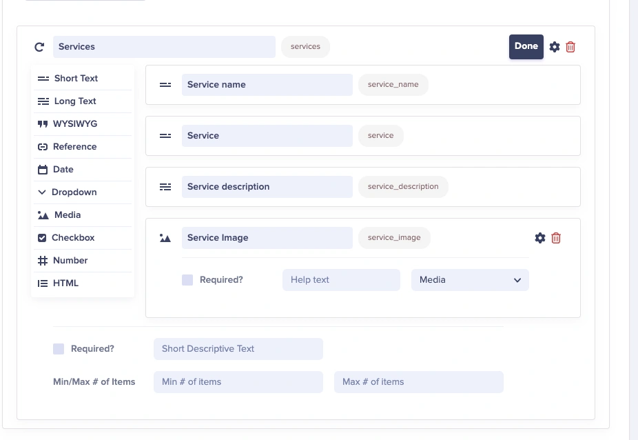
Using a Repeater field allows you to repeat the services content as many times as needed:
* **Short Text** for the service name
* **Short Text** for service tagline
* **Long Text** for service description
* **Media** for service image
For site-wide navigation, create a navigation Component:
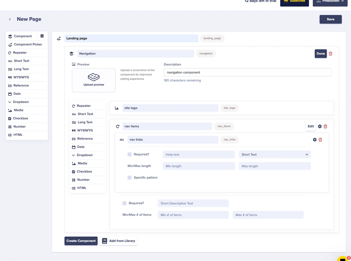
The navigation Component includes:
* **Media** for the site logo
* **Repeater** field named "nav items" containing:
* **Short Text** for nav link labels and URLs
## Editing Components
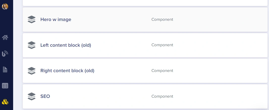
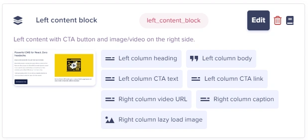
You can edit Components from a few places:
**1. From the Content Type dashboard:**
**2. While editing a Page Type, click Edit:**
**3. While viewing the Component Library, click the pencil icon:**
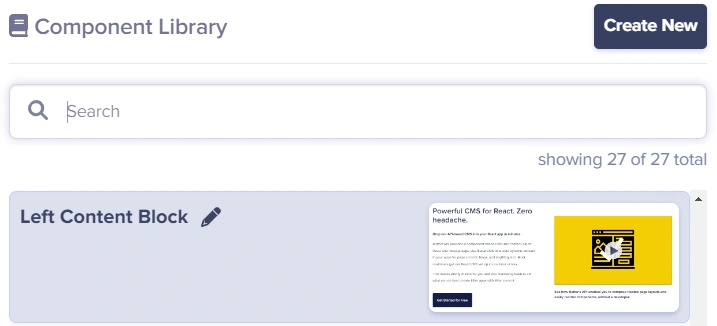
All edits to your Component will automatically propagate to all Page Types that use it.
Changes to global Components are immediately reflected across all Page Types that use them. This makes it easy to update your content structure site-wide with a single change.
## Cloning Components
You can clone a Local Component by clicking on the **Clone** button. This creates a copy of the Component that you can modify independently.
## Deleting Components
Deleting Components is only possible from the Component edit UI:
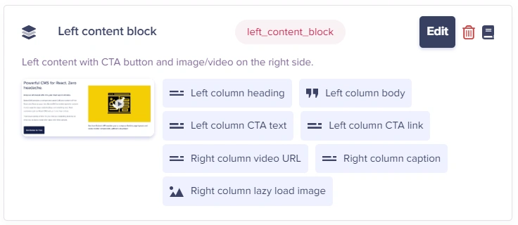
Deleting a Component from the Component Library will **NOT** delete the Component field from the Page Types. It will remove the Component from the Component Library and disconnect all instances of the Components that are found across your Page Types. You can then go and explicitly remove the Component from your desired Page Types.
**Caution**: Deleting a Local Component will delete all associated saved content as well. Be certain before deleting any Component.
## Related topics