> ## Documentation Index
> Fetch the complete documentation index at: https://buttercms.com/docs/llms.txt
> Use this file to discover all available pages before exploring further.
# The Component Picker
> Use the ButterCMS Component Picker to build flexible page layouts by selecting, adding, and reordering Components from an allowlist of predefined blocks.
The **Component Picker** field allows you to build dynamic landing pages.
Here's how it works in a nutshell:
1. Add a Component Picker field to a Page or Page Type.
2. Create an allowlist of Components to be used in the field - you can choose from existing Components, or create new ones.
3. When someone creates an instance of that Page or Page Type, they can select Components from that list.
When someone adds Components from a Picker, they can add multiple instances of each Component, and they can add Components in any order.
In the below example, someone has set up a "Page Body" Component Picker field in a Page Schema. They've added two Components to the allowlist: a "Left content block", and a "Right content block".
{/* IMAGE_SOURCE: file_path="knowledge-base/content-modeling-basics/content-fields.md" */}
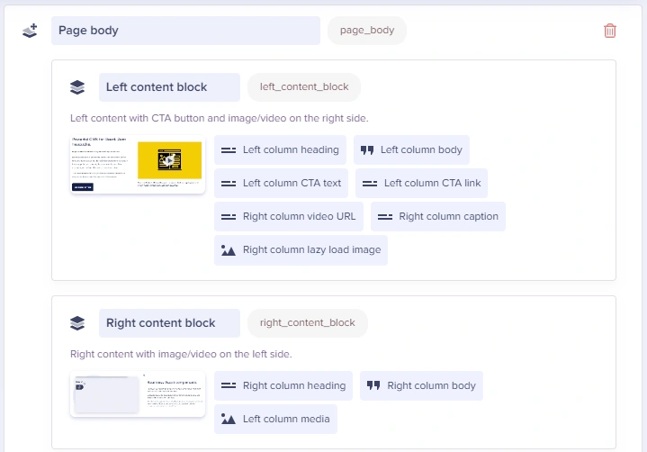
If a content creator were creating an instance of this Page Type, they might select Components to create a Page body like this:
* Right content block
* Left content block
* Left content block
* Right content block
## Field at a glance
### Input and output
Component Picker field defined in the Page schema with your choice of field types
`array`
### API response
Learn more about how Components are returned by the API, and how to model Component content in your app.
### Field configuration and validation options
Component fields don't have any configuration options of their own (except for the usage of [conditional fields](./conditional-fields-components)). Instead, each field you add to a component has its own [validation and configuration options](../fields-basics/configuring-and-validating-fields).
## Adding a Component Picker
Click on the **Component Picker** option in the Page Type configuration sidebar:
{/* IMAGE_SOURCE: file_path="knowledge-base/how-to/how-to-migrate-your-buttercms-blog-to-a-custom-page-type.md" */}

This will add the Component Picker to your page schema:
{/* IMAGE_SOURCE: file_path="knowledge-base/how-to/how-to-migrate-your-buttercms-blog-to-a-custom-page-type.md" */}

Give the field a descriptive name. Common names include "Body", "Sections", or "Content Blocks".
Click on the **Add from Library** button and select the components that content editors should be able to use:
{/* IMAGE_SOURCE: file_path="knowledge-base/how-to/how-to-migrate-your-buttercms-blog-to-a-custom-page-type.md" */}
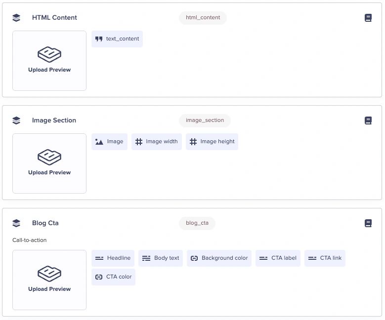
Or, you can define Components directly from inside the Component Picker.
## Using the Component Picker
### Adding Components
In your Page, look for the Component Picker section. Pickers can be identified by the **Component Picker** button.
Click on the button to add components:
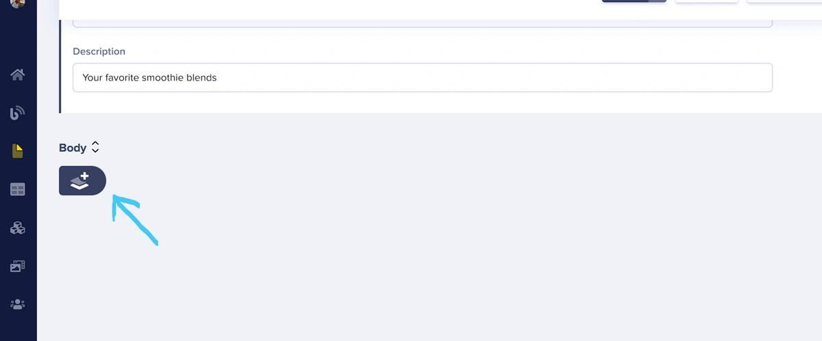
This opens a **Component Library** modal of Components that have been filtered to those in the Picker's allowlist.
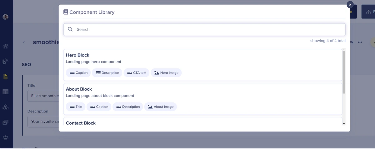
Select from the available components, and a new component section will appear.
Fill in the fields on the individual Components, and then Save or Publish the Page.
### Cloning Components
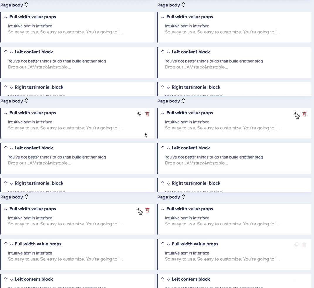
You can clone Components within a picker with the ***clone icon***.
### Expanding and collapsing Components
Click on the name of any Component in the Picker to expand or collapse it. You can also click on the **Expand All** button to expand all Components simultaneously.
{/* IMAGE_SOURCE: file_path="blog-posts/butter-updates/november-dashboard-enhancements.md" */}
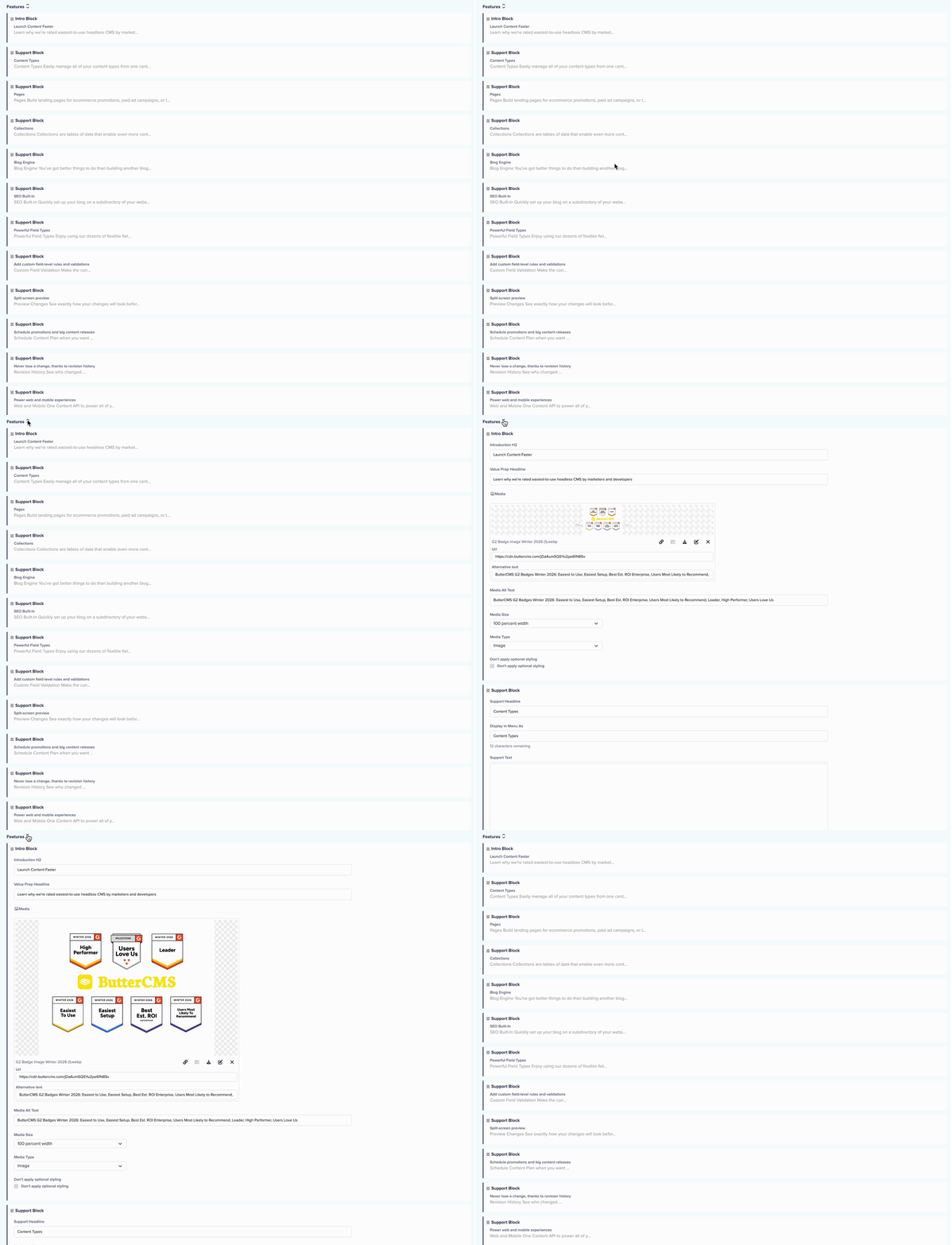
**Tip**: Collapse components you're not actively editing to keep your page easier to navigate, especially for pages with many components.
### Reordering Components
{/* IMAGE_SOURCE: file_path="knowledge-base/content-modeling-basics/create-dynamic-landing-pages-using-components.md" */}
{/* SOURCE: file_path="knowledge-base/how-to/how-to-build-components-and-manage-your-component-library.md" section="Re-ordering Components within a Component Picker" */}
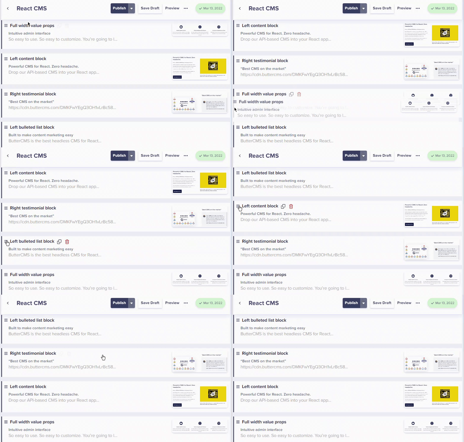
To re-order Components, you simply have to drag & drop a Component up or down your content layout.
#### Using arrow controls
If you prefer not to drag, you can also use the arrow buttons:
1. **Locate the up/down arrows** next to the component name
2. **Click the up arrow** to move the component higher on the page
3. **Click the down arrow** to move the component lower
4. The page preview will reflect the new order
Arrow controls are especially useful when you need to move a component just one or two positions, or when using a trackpad where drag-and-drop can be challenging.
**Pro Tip**: Collapse all components before reordering. This gives you a cleaner view of your page structure and makes drag-and-drop easier, especially for pages with many components.
## Best practices
Only include components that make sense for each Page Type. A careers page doesn't need a product pricing component.
Document which components to use in which situations. Create a style guide for content editors.
Before adding components, plan the page layout. Consider the user journey and information hierarchy.
Always preview the page to see how components render together before publishing.
Name Component Picker fields consistently across Page Types (e.g., always "Body" or always "Sections").
## Related topics