
If you’ve already created some conditional fields in your dashboard and want to understand how to render them, check out Rendering Conditional Fields.
Conditional fields basics
Conditional fields in a Component are shown only when a trigger field, such as a checkbox or dropdown, has been activated.
Checkbox trigger
Checking the trigger fields reveals the conditional fields; unchecking the trigger hides them.Dropdown trigger
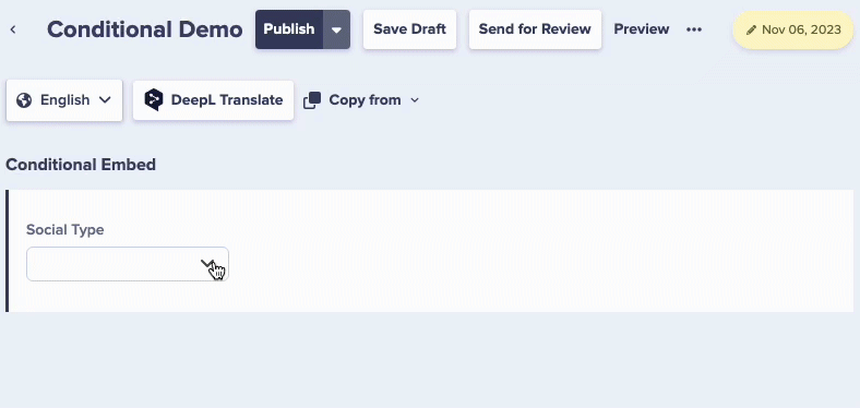
Changing the dropdown selection reveals different sets of conditional fields.Why should I use conditional fields?
Imagine you have a number of e-commerce products that your organization periodically runs flash sales for at various discount percentages. You’ve modeled this data in a Sale Component where you input the discount percentage, the sale start date, and so on. However, you’ve noticed this introduces a lot of visual clutter, and sometimes confusion with both your content creators—should they enter in “0” for a discount percentage if there is no sale?—and your app developers, who are trying to figure out why some items are marked as not being on-sale, but have discount percentages assigned to them. In this case, you could mark the sale fields as conditional, with an “on sale” checkbox trigger field. When the trigger field is checked, the discount fields appear in the dashboard and API response.Benefits of conditional fields
Reduced clutter
Only show fields relevant to the current selection
Fewer Components
One flexible component instead of multiple similar ones
Better UX
Content editors see only what they need to fill out
Cleaner data
Prevent content bloat and empty fields
Setting up conditional fields
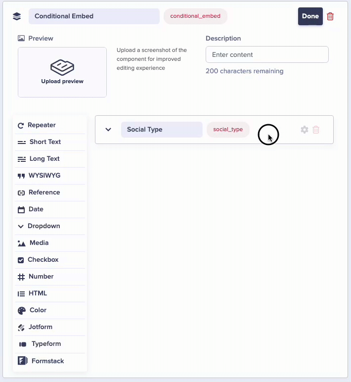 Implementing Conditional Fields is straightforward:
- Edit your component in ButterCMS.
- Include a checkbox or dropdown to act as your condition trigger.
- Define which fields show up based on the selected conditions.

Example: “On sale” product Component with checkbox trigger
A product component with an “On Sale” checkbox that reveals discount-related fields: Base Fields (Always Visible):- Product Name (Short Text)
- Regular Price (Number)
- Description (Long Text)
- Product Image (Media)
- Sale Price (Number)
- Sale Start Date (Date)
- Sale End Date (Date)
- Sale Badge Text (Short Text)
Example: Event type Component with dropdown trigger
An event component with a “Type” dropdown that shows different fields based on selection: Base fields (always visible):- Event Title (Short Text)
- Date & Time (Date)
- Description (WYSIWYG)
- Featured Image (Media)
- Webinar Link (Short Text)
- Platform (Dropdown: Zoom, Teams, Meet)
- Registration URL (Short Text)
- Max Attendees (Number)
- Venue Name (Short Text)
- Venue Address (Long Text)
- Room Number (Short Text)
- Parking Information (Long Text)
- Accessibility Notes (Long Text)
- All Webinar fields appear
- All In-Person Conference fields appear
Industry use cases
| Industry | Trigger | Conditional Fields |
|---|---|---|
| E-commerce | ”On Sale” checkbox or Product Category dropdown | Discount price, inventory levels, promotional fields |
| Real Estate | Property Type dropdown | Pool information, garage details, garden features |
| Events | Event Type dropdown | Venue details (in-person) or streaming links (online) |
| Education | Course Type dropdown | Lab resources (Science) or reading materials (Literature) |
| Marketing | Campaign Type dropdown | Email segmentation fields or social media platform fields |
| Recipe Sites | Cuisine Type or Dietary dropdown | Specific ingredient fields based on cuisine or restrictions |
| Travel | Transportation Mode dropdown | Flight details, train info, or car rental fields |
Best practices
Use clear trigger labels
Use clear trigger labels
Name your checkbox or dropdown options clearly so content editors understand what will happen when they make a selection. “Show Advanced Options” is better than “Advanced”.
Provide default values
Provide default values
Consider setting default values for conditional fields to guide content editors and ensure consistency.
Don't over-complicate
Don't over-complicate
While conditional fields are powerful, too many triggers in one component can confuse editors. If a component becomes too complex, consider splitting it into separate components.
Document conditional logic
Document conditional logic
Use help text on trigger fields to explain what happens when each option is selected.
Test all scenarios
Test all scenarios
Before rolling out, test each conditional path to ensure all field combinations work correctly.
- Plan your conditions - Map out what content variations you need before building
- Keep it simple - Don’t over-complicate with too many conditional branches
- Default content - Always have a fallback for when conditions aren’t met
- Track variations - Log which content versions users see
- Measure impact - Compare conversion rates between variations
- A/B test properly - Use proper statistical methods for testing
- Don’t hide critical info - Important content should be accessible to all
- Announce changes - Use ARIA live regions for dynamic content
- Test all variations - Ensure each content variation is accessible
API response behavior
When conditional fields are hidden (not selected), they typically don’t appear in the API response. This keeps your API responses clean and focused on active content. Example: “On Sale” checkbox uncheckedFAQ
Can I have multiple conditional triggers in one component?
Can I have multiple conditional triggers in one component?
Yes! A component can have multiple checkboxes and/or dropdowns, each controlling different sets of conditional fields.
Can conditional fields be required?
Can conditional fields be required?
Yes, conditional fields can be marked as required. When they appear (based on your selection), you must fill them in before saving if they’re required.
Do conditional fields work with References?
Do conditional fields work with References?
Yes, you can use Reference fields as conditional fields. For example, a “Featured Author” field might only appear when a “Show Author” checkbox is checked.
Can I nest conditional fields?
Can I nest conditional fields?
Conditional fields operate at a single level within a component. For more complex nesting, consider breaking the logic into multiple components.