
This tutorial walks through building a complete React portfolio website with Tailwind CSS and ButterCMS as the content layer. You'll build six reusable components (Navbar, Home, About, Skills, Works, and Contact) and connect them to ButterCMS so your portfolio content stays dynamic and easy to update without touching code.
A strong portfolio does more than list your projects. It shows how you think, how you build, and how you present your work to the people who need to see it. By the end of this tutorial, you'll have a fully functional, responsive portfolio that you can deploy and start using right away.
Prerequisites: Basic knowledge of React and Tailwind CSS, Node.js and Git installed on your system, and a code editor like VS Code.
But before we get into the code, it's worth understanding why we're using a headless CMS in the first place, and what it gives you that hardcoding your content doesn't.
Why use ButterCMS for a React portfolio?
Most developer portfolios start with hardcoded content — project titles, bios, and skills written directly into React components or JSON files. That works fine initially, but it means every content update requires a code change and a redeploy. As your career evolves, that friction adds up.
ButterCMS is a headless CMS purpose-built for API-first frameworks like React. Your portfolio components fetch content dynamically through the ButterCMS API, so you can update your bio, add new projects, or rearrange your skills section without rebuilding the app. Your content lives in one place, and your codebase stays focused on presentation and logic.
Here's how that compares to the alternatives:
| Feature | ButterCMS (headless CMS) | Hardcoding content (JSON/JS) | Other CMS options |
|---|---|---|---|
| Content updates | Update in the dashboard; no code change or redeploy needed | Requires a code change and redeploy for every update | Varies by platform |
| SEO flexibility | API-driven content with full control over meta fields, slugs, and structured data | Static content; SEO changes require code edits | Moderate to high, depending on the platform |
| React integration | Purpose-built for API-first architecture; SDKs, starter projects, and clean data modeling | Manual data management within your component tree | Often requires a custom integration layer |
| Content team access | Non-technical teammates can update content independently | Only developers can make changes | Varies; some require technical knowledge |
| Learning curve | Low: intuitive dashboard, strong docs, and Laravel/React-specific guides | Low for basic content, but maintenance scales poorly | Moderate to high for most enterprise options |
| Long-term maintenance | Managed hosting, automatic updates, no plugin or security patch overhead | You own all maintenance | Ranges from fully managed to self-hosted |
If your portfolio is purely static and you don't plan to update it often, hardcoding works. But if you want a portfolio that grows with your career, and one that demonstrates your ability to build with modern, API-first architecture, a headless CMS is the stronger choice.
The React portfolio website you'll build
In this tutorial, you'll build a modern React portfolio website that has:
-
A home and about section to make a good first impression
-
A skills section to highlight your technical expertise
-
A projects section to show your best work and GitHub contributions
-
A contact section to connect with potential employers
-
Smooth navigation between sections for a better user experience
Note: Each section is built as a reusable React component. This makes your portfolio easy to maintain and update. You can find the complete code in this GitHub repo and follow along step by step.
Below is a GIF showing what you’ll build in the tutorial:

Tools you’ll need to build your React portfolio website
To follow along with this React portfolio tutorial, you'll need:
-
Basic knowledge of React and Tailwind CSS
-
A code editor for writing and editing your code (like VS code)
These are the tools and platforms you’ll use to build and deploy the portfolio website:
-
ButterCMS: Rather than hardcoding your portfolio content, use this headless CMS to make your portfolio content dynamic and easy to update.
-
Tailwind CSS: Tailwind's utility-first approach helps you build responsive layouts quickly, maintain consistent styling, create smooth hover effects and transitions, and customize the design to match your personal brand.
-
React-scroll: The react-scroll library helps you create smooth scrolling between sections, giving your portfolio a professional feel when visitors navigate through your work.
-
React Icons: React Icons gives you access to social media icons for your profiles, tech stack icons for your skills section, and UI icons for navigation and interaction.
-
Axios: Axios is a library used to send asynchronous HTTP queries to REST endpoints. This library comes in handy when performing CRUD operations. You can talk to the backend using this library. To keep your portfolio dynamic, use Axios to fetch your latest content from ButterCMS, keep your portfolio data up to date, and handle API requests.
Setting up your React development environment
This starter GitHub repository contains the images and data required for this tutorial. It also contains dependencies and configurations for Tailwind CSS and other dependencies such as Axios, React Icons, and React Scroll.
Clone the Github repo by running the following in your terminal:
git clone -b starter https://github.com/Tammibriggs/portfolio-butterCMS.gitThen, navigate into the project directory with this command:
cd portfolio-butterCMSOpen the project in your code editor. If you're using Visual Studio Code, run the command code in your terminal. You'll see the following project folder structure:
.
└── PORTFOLIO-BUTTERCMS/
    ├── public
    ├── src
    ├── .gitignore
    ├── package-lock.json
    ├── package.json
    ├── postcss.config.js
    ├── README.md
    └── tailwind.config.js
Next, open your terminal in your project’s directory and run the following command to install the project’s dependencies:
npm install
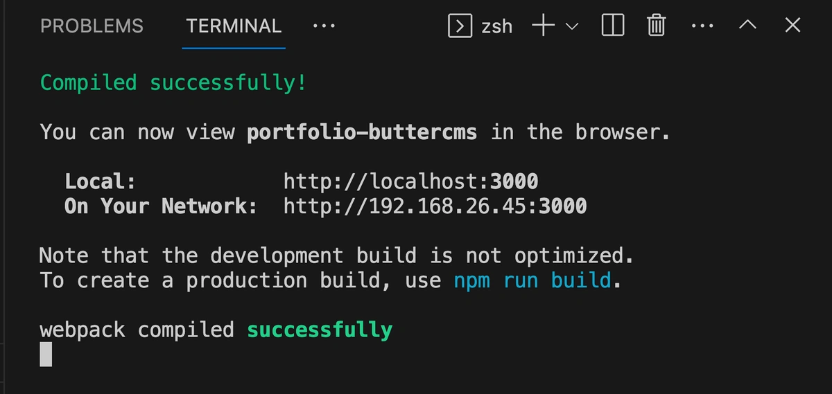
After installing all the project dependencies, start the development server with this command:
npm start
After you run that command, your project will be up and running on localhost, and you'll receive a URL. You can visit the URL in your browser to see the project:
Create the component structure for your React portfolio
To build a maintainable React portfolio website, start with a clean component-based architecture. Create a components folder in your src directory with these files:
.
└── src/
    ├── assets/
    │   ├── code2.png
    │   └── me.png
    ├── components/
    │   ├── About.jsx
    │   ├── Contact.jsx
    │   ├── Home.jsx
    │   ├── Navbar.jsx
    │   ├── Skills.jsx
    │   └── Works.jsx
    ├── App.js
    ├── index.css
    └── index.js
Now, it’s time to add code to your components. Here’s how to set up the About component (the others will follow the same pattern):
import React from 'react'

function About() {
  return (
    <div>About</div>
  )
}
export default About
In the About component, you're doing the following:
-
Importing the React library required for writing React components.
-
Defining a function called
About(), which will serve as your React component that you'll use as a reusable UI. -
Defining what the About component will render on the screen in a
returnstatement. For now, it simply returns adivelement with an “About” text. -
Exporting the About component to other parts of your React application.
Apply the same approach to create the other components. In your Navbar.jsx file, add the following code. This defines a Navbar() function with a div, which displays a “Navbar” text within a div and exports your Navbar component:
import React from 'react'

function Navbar() {
  return (
    <div>Navbar</div>
  )
}
export default Navbar
Create similar basic components for Navbar, Home, Skills, Works, and Contact. Each one should import React, define a functional component, and export it.
Like this:
import React from 'react'

function Home() {
  return (
    <div>Home</div>
  )
}
export default Home
Make sure to change the name of the function and the export for the component you’re creating. Also, feel free to change the text within the <div>.
Now that you have your modular foundation, assemble these components in App.js. The order of components matters for both visual hierarchy and SEO:
import About from './components/About';
import Contact from './components/Contact';
import Home from './components/Home';
import Navbar from './components/Navbar';
import Skills from './components/Skills';
import Works from './components/Works';

function App() {
  return (
    <div >
      <Navbar />
      <Home />
      <About />
      <Skills />
      <Works />
      <Contact />
    </div>
  );
}

export default App;
Use a combination of Tailwind CSS utilities and custom styles for styling. The base styles in index.css establish the foundation of your portfolio.
Tailwind CCS is a good choice because it offers:
-
Rapid prototyping with utility classes
-
Consistent design system
-
Built-in responsive design
-
No context switching between files
Alternative styling approaches you could consider are:
-
CSS modules for better CSS scoping
-
Styled components for CSS-in-JS
-
SASS for more structured CSS
-
CSS frameworks like Material UI or Chakra UI
The complete styling is in the index.css file of the GitHub repo. For portfolios, Tailwind CSS allows quick iterations and maintains consistency across components, but you can choose whatever matches your workflow.
Next, one of the most important components of your portfolio: the navigation bar.
How to build a responsive navigation bar in React
Every great React portfolio needs smooth navigation that just works.
Since you’re building a single-page application, you’ll create a responsive nav bar that lets visitors jump between sections easily and includes quick links to your professional profiles.
The code uses React's useState hook for menu toggling and react-scroll for smooth navigation, while Tailwind CSS handles the responsive design and animations. You can find the complete code here:
//Navbar.jsx

// Import necessary dependencies
import React, { useState } from 'react';
// Import icons we'll use for our navbar
import {
  FaBars,
  FaTimes,
  FaGithub,
  FaLinkedin,
} from 'react-icons/fa';
import { HiOutlineMail } from 'react-icons/hi';
import { BsFillPersonLinesFill } from 'react-icons/bs';
// Import Link for smooth scrolling between sections
import { Link } from 'react-scroll';

const Navbar = () => {
  // State to handle mobile menu toggle (open/closed)
  const [nav, setNav] = useState(false);
  const handleClick = () => setNav(!nav);

  return (
    // Main navbar container - fixed at top, full width
    <div className='fixed w-full h-20 flex justify-between items-center px-4 bg-slate-900 text-gray-300'>
      {/* Your logo or brand name */}
      <div>
        <h1 className='font-thin text-2xl italic font-serif'>TB</h1>
      </div>

      {/* Desktop Menu - hidden on mobile, flex on medium screens and up */}
      <ul className='hidden md:flex gap-x-8'>
        <li>
          <Link to='home' smooth={true} duration={500}>
            Home
          </Link>
        </li>
        {/* ... other menu items ... */}
      </ul>

      {/* Hamburger Icon - visible only on mobile */}
      <div onClick={handleClick} className='md:hidden z-10 cursor-pointer'>
        {!nav ? <FaBars size={20} /> : <FaTimes size={20} />}
      </div>

      {/* Mobile Menu - full screen overlay */}
      <ul className={!nav ? 'hidden' : 'absolute top-0 left-0 w-full h-screen bg-slate-900 flex flex-col justify-center items-center'}>
        <li className='py-6 text-4xl'>
          <Link onClick={handleClick} to='home' smooth={true} duration={500}>
            Home
          </Link>
        </li>
        {/* ... other mobile menu items ... */}
      </ul>

      {/* Social icons - hidden on smaller screens, shown on large screens */}
      <div className='hidden lg:flex fixed flex-col top-[35%] left-0'>
        <ul>
          {/* LinkedIn - sliding animation on hover */}
          <li className='w-40 h-14 flex justify-between items-center ml-[-100px] hover:ml-[-10px] duration-300 bg-blue-600'>
            <a href="https://linkedin.com" className='flex justify-between items-center w-full text-gray-300 px-4'>
              LinkedIn <FaLinkedin size={30} />
            </a>
          </li>
          {/* ... other social links ... */}
        </ul>
      </div>
    </div>
  );
};

export default Navbar;
The code creates three key elements:
-
A desktop menu with a smooth-scrolling section links
-
A mobile-friendly hamburger menu that expands into a full-screen navigation
-
A social sidebar with icons for your professional profiles
Build the home component for your React portfolio
The Home component builds the hero section, the first thing visitors see when they land on your site.
Go to the Home.jsx file under src/components and update the code there with the following:
//Home.jsx
// Import required components and assets
import React from 'react';
import { HiArrowNarrowRight } from 'react-icons/hi'; // Arrow icon for button
import me from '../assets/me.png'; // Your profile photo
import { Link } from "react-scroll"; // For smooth scrolling

const Home = () => {
 return (
   // Main container - full screen with dark background
   <div name="home" className="h-screen w-full bg-[#0a192f]">
     {/* Content wrapper - centers content and handles responsive layout */}
     <div className="max-w-screen-lg mx-auto flex flex-col items-center justify-center h-full px-4 md:flex-row">
       {/* Left side - Text content */}
       <div className="flex flex-col justify-center h-full">
         {/* Main headline */}
         <h2 className="text-4xl sm:text-7xl font-bold text-white">
           I'm a Full Stack Web Developer
         </h2>
         {/* Brief introduction */}
         <p className="text-gray-500 py-4 max-w-md">
           I have 4 years of experience in graphics design and web development.
           Currently, I love to work on web application using technologies like
           React, Tailwind, Next.js and Mongodb.
         </p>
         {/* About Me button with hover effect */}
         <div>
           <Link
             to="about"
             smooth
             duration={500}
             className="group text-white w-fit px-6 py-3 my-2 flex items-center rounded-md bg-gradient-to-r from-cyan-500 to-blue-500 cursor-pointer"
           >
             About Me
             <span className="group-hover:rotate-90 duration-300">
               <HiArrowNarrowRight size={25} className="ml-3" />
             </span>
           </Link>
         </div>
       </div>
       {/* Right side - Profile image */}
       <div>
         <img
           src={me}
           alt="my profile"
           className="rounded-2xl mx-auto w-2/3 md:w-full"
         />
       </div>
     </div>
   </div>
 );
};

export default Home;
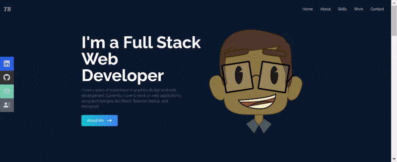
Run your application with the following command to see how the landing page looks in your browser:
npm startGo to your localhost URL in your browser, and you should see the following:
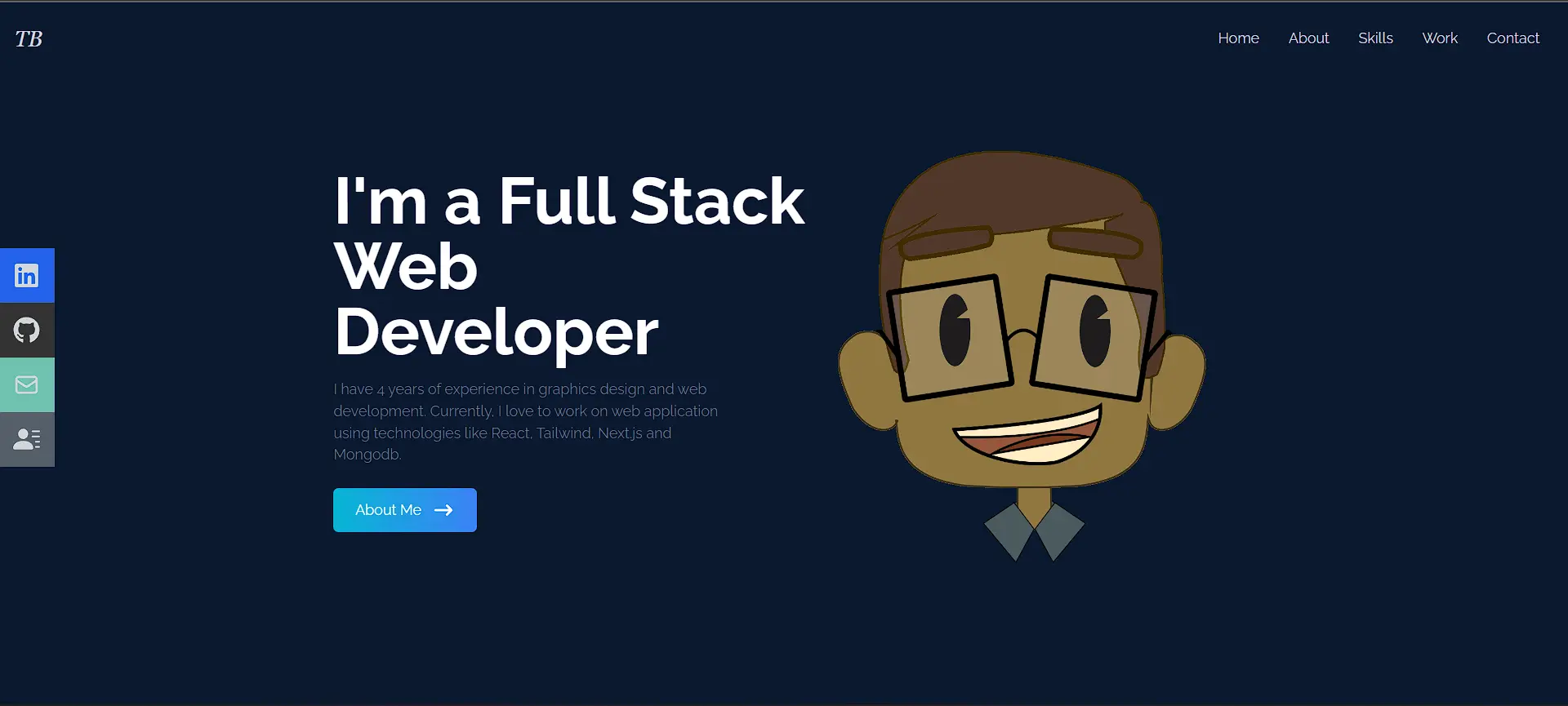
To make the home page your own, be sure to:
-
Replace the placeholder text with your own experience
-
Update the image import to use your photo
-
Change the gradient colors to match your brand
Build the about section of your React portfolio
The About section is where you make a genuine connection with visitors by sharing more about yourself.
Go to the About.jsx file under src/components and replace all code with this:
//About.jsx
import React from "react";


const About = () => {
  return (
    // Main container with full width/height and background
    <div
      name="about"
      id="about"
      className="w-full h-screen bg-[#0a192f] text-gray-300"
    >
      {/*Content container with cyan background*/}
      <div className="flex flex-col justify-center items-center w-full h-full">
        {/*Title section using grid */}
        <div className="py-16 rounded-md bg-cyan-800 flex flex-col justify-center items-center w-4/6">
          <div className="max-w-[1000px] w-full grid grid-cols-2 gap-8 mb-4">
            <div className="sm:text-right pb-8 pl-4">
              <p className="text-4xl font-bold inline border-b-4 border-cyan-500">
                About
              </p>
            </div>
            <div></div>
            {/*Content section with responsive grid*/}
          </div>
          <div className="max-w-[1000px] w-full grid sm:grid-cols-2 gap-8 px-4">
            <div className="sm:text-right text-4xl font-bold">
              <p>
                Hi. I'm Taminoturoko Briggs, nice to meet you. Please take a
                look around.
              </p>
            </div>
            <div>
              <p>
                A software developer with experience in building Responsive and
                Scalable Web apps...
              </p>
            </div>
          </div>
        </div>
      </div>
    </div>
  );
};


export default About;
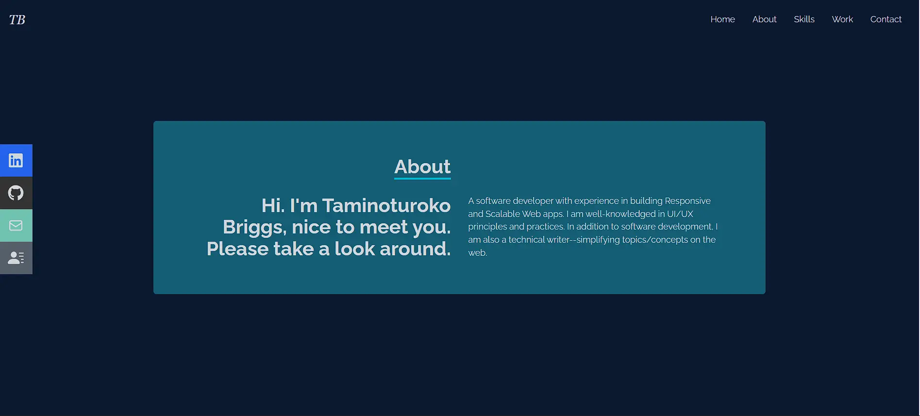
Refresh the site on your browser and click the About Me button on the landing page. You should see the new page. The new section should display your title, greeting, and bio in a two-column layout with cyan accents. You can tweak it as necessary.
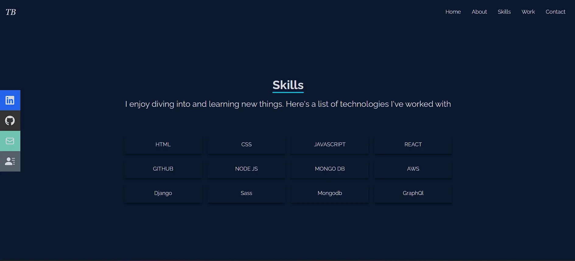
Add a skills section to your React portfolio
Your Skills section is where you showcase your preferred tech stack and attract employers looking for specific skills.
Go to the Skills.jsx file under src/components and replace everything with this:
//Skills.jsx
import React from 'react';

const Skills = () => {
  return (
    // Main container with dark background
    <div name='skills' className='w-full h-screen bg-[#0a192f] text-gray-300'>
      {/* Content wrapper with max width and centering */}
      <div className='max-w-[1000px] mx-auto p-4 flex flex-col justify-center w-full h-full'>
          {/* Header section with title and intro */}
          <div className='w-full flex justify-center items-center flex-col mb-7'>
              <p className='text-4xl font-bold inline border-b-4 border-cyan-500 text-center'>Skills</p>
              <p className='py-4 text-2xl'>I enjoy diving into and learning new things. Here's a list of technologies I've worked with</p>
          </div>
          {/* Skills grid - responsive layout with hover effects */}
          <div className='w-full grid grid-cols-2 sm:grid-cols-4 gap-4 text-center py-8'>
              {/* Individual skill cards with shadow and scale animation */}
              <div className='shadow-md shadow-[#040c16] hover:scale-110 duration-500'>
                  <p className='my-4'>HTML</p>
              </div>
              {/* Additional skill cards follow same pattern... */}
          </div>
      </div>
    </div>
  );
};

export default Skills;
The code creates a responsive grid of technology cards with:
-
A bold, underlined title
-
An engaging intro
-
Animated skill cards that scale on hover
-
Responsive layout (two columns on mobile, four on desktop)
Showcase projects with a works section in React
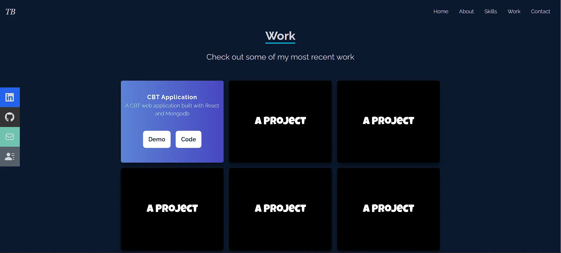
Next, build the Works section to add all your projects.
Go to the Works.jsx file under src/components and implement this by updating your code with:
//Works.jsx
import React from 'react';
import code from '../assets/code2.png';

const Works = () => {
  return (
    // Main container with responsive height
    <div name='work' className='w-full md:h-screen text-gray-300 bg-[#0a192f]'>
      <div className='max-w-[1000px] mx-auto p-4 flex flex-col justify-center w-full h-full'>
        {/* Section header */}
        <div className='pb-8 w-full flex justify-center items-center flex-col'>
          <p className='text-4xl font-bold inline border-b-4 text-gray-300 border-cyan-500'>Work</p>
          <p className='py-6 text-2xl'>Check out some of my most recent work</p>
        </div>

        {/* Project grid */}
        <div className='grid sm:grid-cols-2 md:grid-cols-3 gap-4'>
          {/* Project card with hover overlay */}
          <div
            style={{ backgroundImage: `url(${code})` }}
            className='shadow-lg shadow-[#040c16] group container rounded-md flex justify-center items-center mx-auto content-div'
          >
            {/* Hover content */}
            <div className='opacity-0 group-hover:opacity-100 flex justify-center items-center flex-col'>
              <span className='text-lg font-bold text-white tracking-wider'>Project Title</span>
              <p className='text-center'>Project description</p>
              {/* Action buttons */}
              <div className='pt-8 text-center'>
                <a href='/'><button className='text-center rounded-lg px-4 py-3 m-2 bg-white text-gray-700 font-bold text-lg'>Demo</button></a>
                <a href='/'><button className='text-center rounded-lg px-4 py-3 m-2 bg-white text-gray-700 font-bold text-lg'>Code</button></a>
              </div>
            </div>
          </div>
          {/* Additional project cards follow same pattern */}
        </div>
      </div>
    </div>
  );
};

export default Works;
The code creates a responsive project showcase with:
-
A dynamic grid layout (2 – 3 columns based on screen size)
-
Project cards with hover effects revealing details
-
Demo and code links for each project
-
Clean animations for better UX
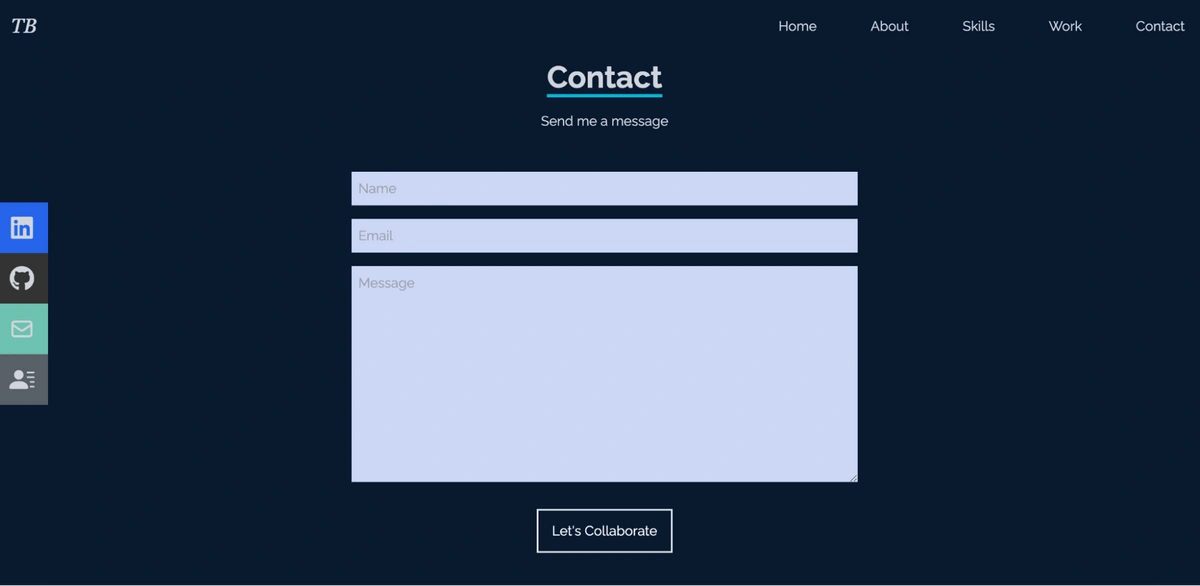
Add a contact form to your React portfolio website
You can add a contact form by updating the Contact component.
Go to the Contact.jsx file under src/components and replace all code with:
//Contact.jsx
import React from 'react'

const Contact = () => {
  return (
    // Main container with full height and centering
    <div name='contact' className='w-full h-screen bg-[#0a192f] flex justify-center items-center p-4'>
        {/* Form wrapper with max width */}
        <div className='flex flex-col max-w-[600px] w-full'>
            {/* Header section */}
            <div className='pb-8 flex flex-col justify-center w-full h-full items-center'>
                <p className='text-4xl font-bold inline border-b-4 border-cyan-500 text-gray-300'>Contact</p>
                <p className='text-gray-300 py-4'>Send me a message</p>
            </div>
            {/* Form inputs with consistent styling */}
            <input className='bg-[#ccd6f6] p-2' type="text" placeholder='Name' name='name' />
            <input className='my-4 p-2 bg-[#ccd6f6]' type="email" placeholder='Email' name='email' />
            <textarea className='bg-[#ccd6f6] p-2' name="message" rows="10" placeholder='Message'></textarea>
            <button className='text-white border-2 hover:bg-cyan-500 hover:border-cyan-500 px-4 py-3 my-8 mx-auto flex items-center'>Let's Collaborate</button>
        </div>
    </div>
  )
}
export default Contact
This code creates a clean contact form with:
-
A centered layout with custom styling
-
Input fields for name, email, and message
-
A call-to-action button with hover effects
Note: This is a placeholder form. To make it fully functional, you have several options:
Email service integration:
-
Set up EmailJS or a similar service
-
Configure the form to send emails directly
-
No backend is required
Backend integration:
-
Create API endpoint (Node/Express)
-
Configure form submission handling
-
Set up email forwarding
Form service:
-
Use Formspree, Netlify Forms, or GetForm
-
Add service endpoint to form action
-
Configure email notifications
To preview your contact form, scroll to the bottom of your portfolio or click Contact in the navigation. You'll see a centered form ready for your chosen submission method.
How to manage your React portfolio content with ButterCMS
Now that your React components are built, it's time to make your content dynamic. Rather than updating hardcoded text every time you finish a new project or learn a new skill, you'll connect your portfolio to ButterCMS so content updates happen in the dashboard, not in your codebase.
Before starting the integration, you'll need to structure your content in ButterCMS. If you haven’t already, sign up for a free Butter account, and then log in to the dashboard.
Model your React portfolio in ButterCMS
In the next sections, you'll learn how to model your React portfolio’s content in ButterCMS.
Create a portfolio page in ButterCMS
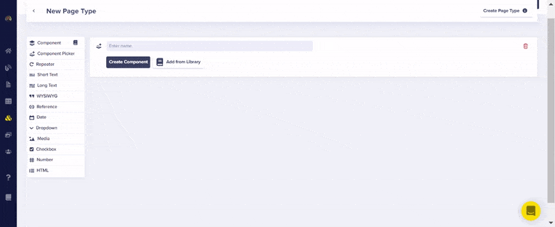
Your website's sections will be built from individual, reusable components. From the left sidebar of your ButterCMS dashboard, click the Page Types plus icon:
The following page will open. On this new page, you will set up the content structure for each individual section of your website.
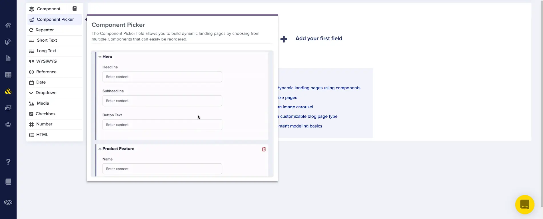
The component picker will allow you to select the different components you want and omit the ones you don't need. Click the Add your first field button and select Component Picker from the left menu. This creates a flexible container for all portfolio sections.
Model the home component content
Next, enter a name for the page and create the first section. Name the Component Picker “My Personal Portfolio” and click the Create Component button. Then, create the first component, name it “Landing Section,” and do the following:
-
Add a description: “This will be the section for our landing page.”
-
Add two text fields, one for the caption and one for the main text of your landing page by doing the following:
-
Select the Long Text field and enter “landing caption”
-
Select the Long Text field and enter “landing main text”
Check the GIF below to see how it is structured:
Why do it like this?
Since your homepage displays a bold headline and detailed introduction paragraph, use Long Text fields for both "landing caption" and "landing main text." Long Text gives you the formatting flexibility you need. You can update your portfolio content by mapping these fields to Butter without touching the code.
Model the about section content
Click the Create Component button at the bottom of the page. Name the component “About section.” Then, add two fields to the component for the caption and main text by doing the following:
-
Select the Short Text field and enter “About caption.”
-
Select the Long Text field and enter “About main details.”
Your component should look like this:
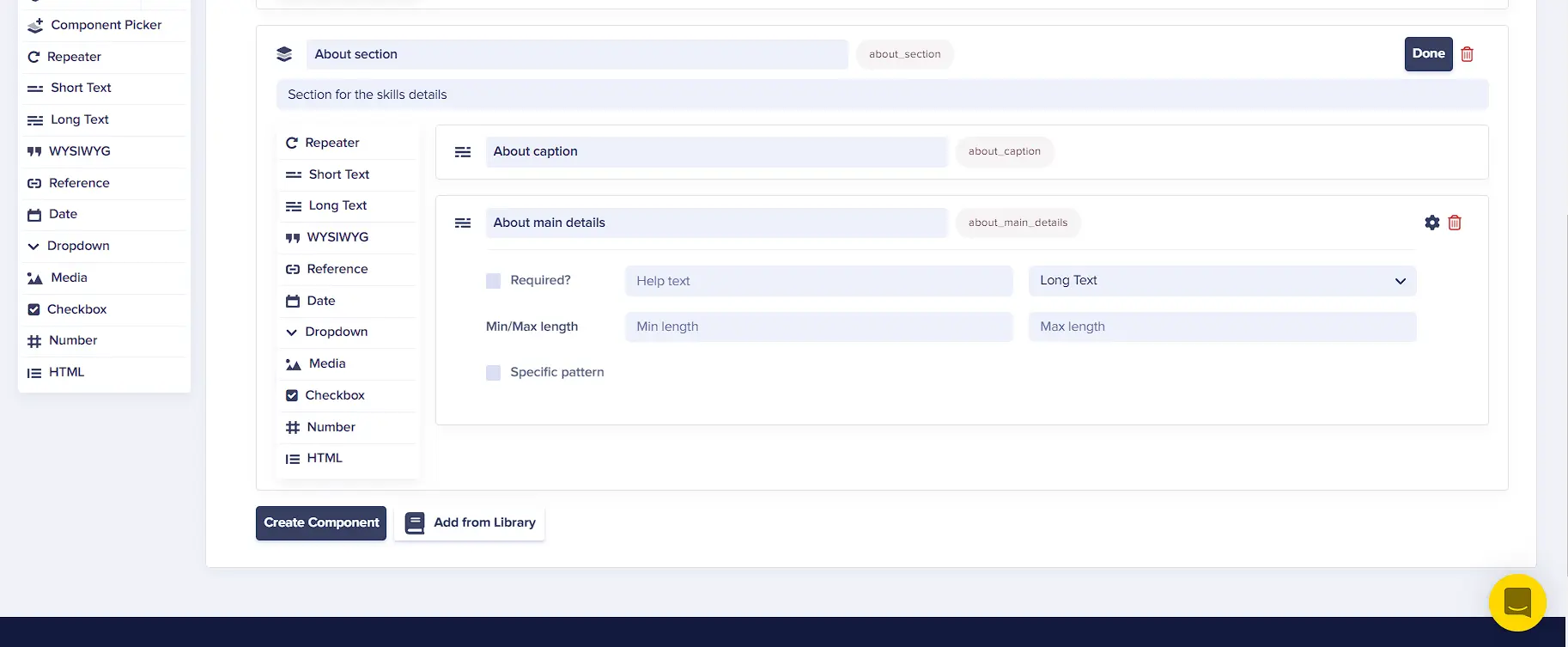
Why do it like this?
Think of these fields as the CMS version of your React code. Since the About caption in the React code is short, and you don't anticipate it exceeding one line, you can select the Short Text field. The main details will most likely exceed one line, so you should select the Long Text field.
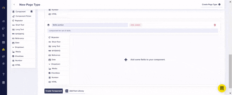
Model skills and works section content
The Skills section will have a text field and a list of different technologies. To do this, you'll need an array-like structure, which can be achieved using a Repeater. A Repeater is a group of content fields that can be replicated on a web page.
Create the Skills component by selecting Create Component and add a description. Then, do the following:
-
Select the Long Text field and enter “skills header.”
-
Select the Repeater field and name it “skills.”:
-
Choose the Short Text field to enter each of the names of your skills.
Refer to the following GIF to see the added fields:
Why use a Repeater?
Think of it as your skills array in CMS form. Instead of hardcoding ["React," "Node," "JavaScript"] in your component, you can add, remove, or update skills through ButterCMS, perfect for when you learn new technologies.
Next, for your Works section, click the Create Component button at the bottom of the page to add another component.
Create the Works section similar to how you created the Skills section by adding the following fields:
-
Select the Long Text field and enter “work header”
-
Select the Repeater field and name it “works”
-
Select the Short Text field and enter “work title”
-
Select the Long Text field and enter “work description”
-
Select the Media field and enter “work image”
-
Select the Short Text field and enter “github url”' for the GitHub link to your project
-
Select the Short Text field and enter “demo” for the demo link to your project
Check the following GIF to see how the fields were added:
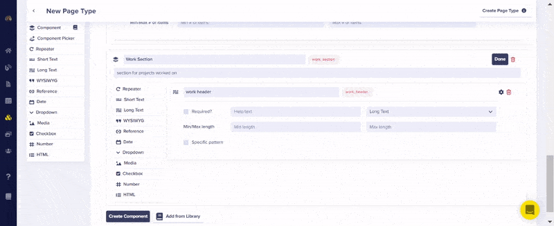
From the GIF above, you can see that each project defined using the Repeater will have a title, a description, an image, and two URLs for the project’s code and demo.
To save the page, click the Create Page Type button at the top and enter “portfolio” in the page-type-name field.
Add content to your portfolio page
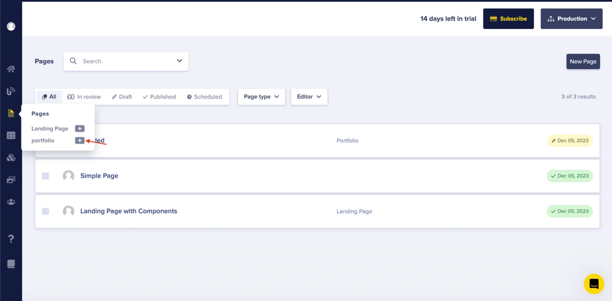
With the page setup complete, you can now add actual content to the page. Later, you'll fetch and display this content from the CMS in your application.
To start, select the created page, “portfolio,” from the page options on the left sidebar as follows:
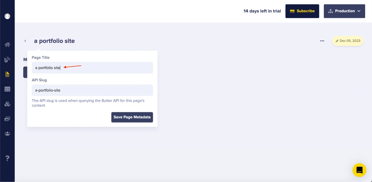
Afterward, you'll be prompted to enter a page title, which will serve as the title of the created page. Enter “a portfolio site” into the field as follows:
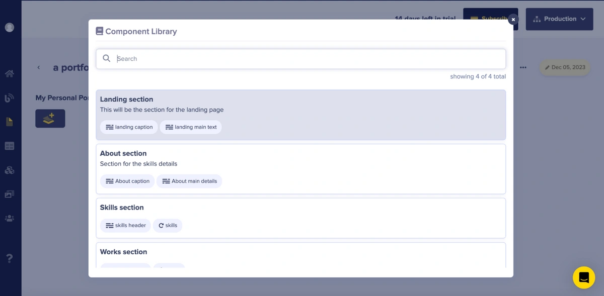
To add new content, click on the plus icon to access the component picker, as shown below:
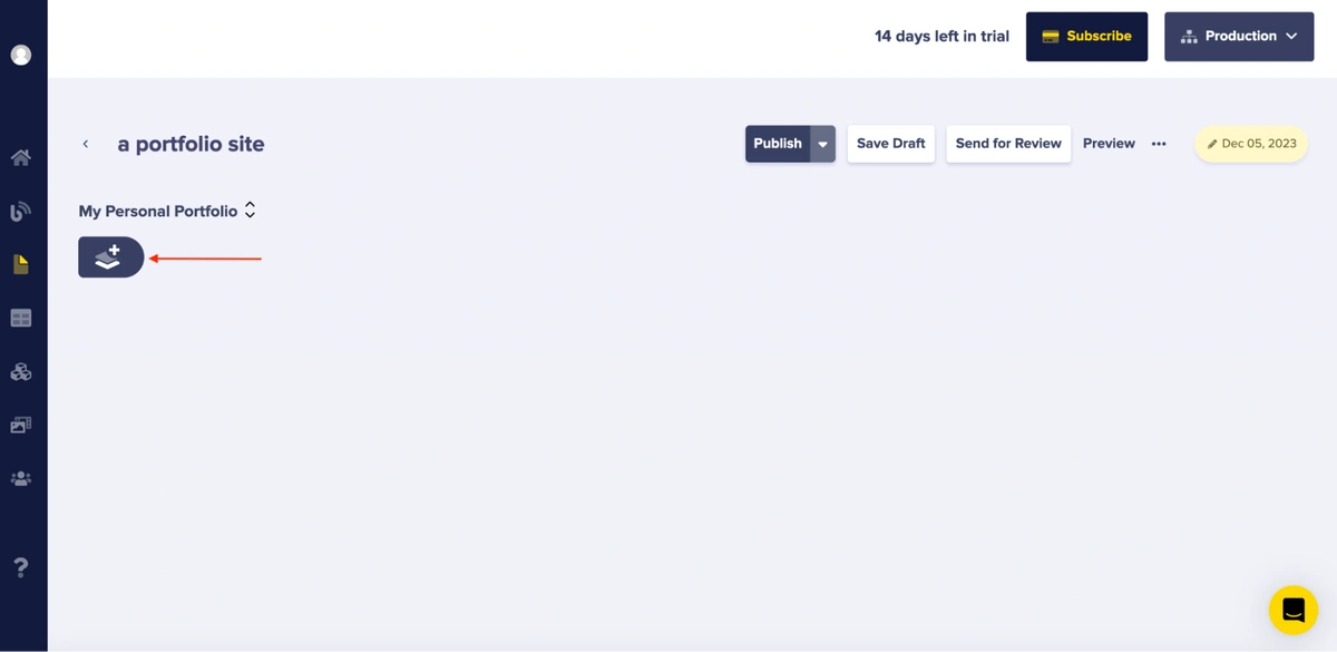
Then, select the content structure you want to use from the list of components you defined for your page:
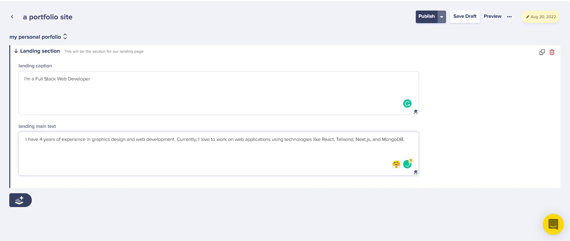
After selecting, add the required content to the fields by populating each section. Begin with the Landing section and add the following content to the fields:
-
Landing caption: “I'm a Full Stack Web Developer.”
-
Landing main text: “I have four years of experience in graphic design and web development. Currently, I love working on web applications using technologies like React, Tailwind, Next.js, and MongoDB.”
Your Landing section should look like this:
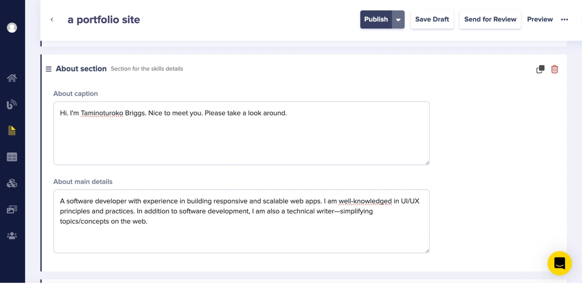
For your About section, add the following content to the fields:
-
About caption: “Hi, I'm Taminoturoko Briggs. Nice to meet you. Please take a look around.”
-
About main details: “I am a software developer with experience in building responsive and scalable web applications. I possess a strong understanding of UI/UX principles and practices. In addition to software development, I am also a technical writer, simplifying topics and concepts on the web.”
Your About section should look like this:
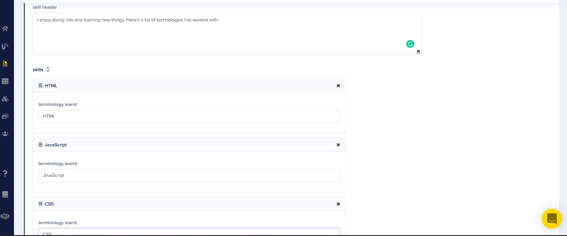
For your Skills section, add the following content:
-
Skill header: “I enjoy diving into and learning new things. Here's a list of technologies I've worked with:”
-
Skills: “HTML, JavaScript, and CSS”
Your Skills section should look like this:
For your Works section, add the following content:
-
Works header: “Check out some of my most recent work.”
-
Works:
-
Work title: “Web design”
-
Work description: “This is a web design for a portfolio site.”
-
Insert an image of choice in the work image section.
-
Your Works section should look like this:

To save and publish your changes, click the Save Draft and then the Publish button.
Connect your React portfolio website to ButterCMS
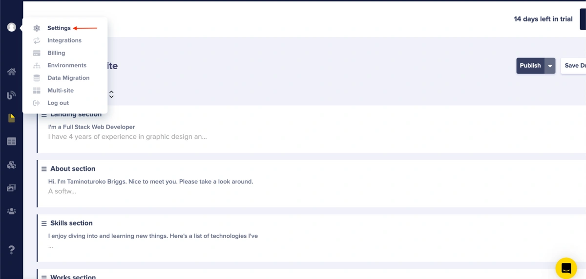
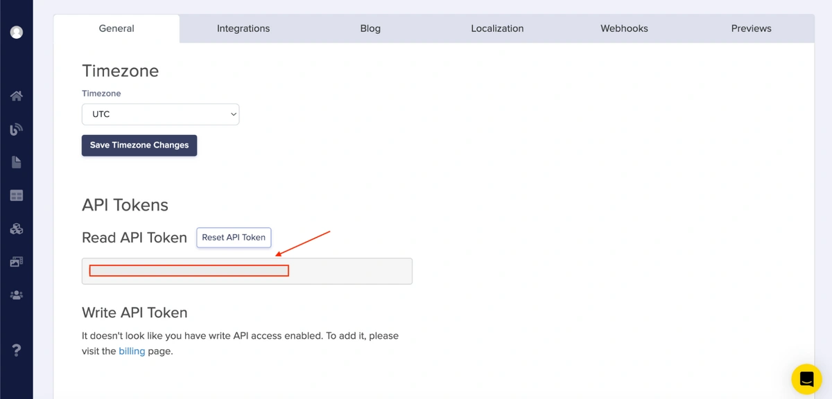
To connect your application to ButterCMS, you’ll need the Read API Token. To locate it, go to Settings as follows:
Copy your Read API Token:
Next, set up a fetch request to read data from the content you added in ButterCMS. To do this, update the code in your App.js file with the following code and replace “your read token” with the Read API Token you just copied.
// App.js with API connection and props passing
//...
import {React, useEffect, useState} from "react";
import axios from "axios";

function App() {
  const readtoken = "your read token"
  const [data, setData] = useState([]);

  useEffect(() => {
    const getData = async () => {
      axios.get(`https://api.buttercms.com/v2/pages/portfolio/a-portfolio-site?auth_token=${readtoken}`).then(res => {
        setData(res.data.data.fields.my_personal_porfolio);
      }).catch(err => {
        console.log(err);
      })
    }
    getData();
  }, []);
  return (
    <div>
      <Navbar />
      <Home content={data[0]}/>
      <About content={data[1]}/>
      <Skills content={data[2]}/>
      <Works content={data[3]}/>
      <Contact />
    </div>
  );
}
//...
In the code block above, you set up a fetch request that reads data from the CMS. When the request is executed, the value of the state data is set to the returned value. Additionally, you passed the corresponding data elements as props to each component.
To set up your Home component to use the CMS content you added, update the code in your Home.jsx file as follows:
-
Pass in
{content}as a prop to your Home component. -
Replace the
h2text with{content?.fields.landing_caption}. -
Replace the
ptext with{content?.fields.landing_main_text}.
Update your Home.jsx file with the following code:
// Maps landing_caption and landing_main_text
const Home = ({content}) => {
//....
 <h2 className="text-4xl sm:text-7xl font-bold text-white">
    {content?.fields.landing_caption}
  </h2>
  <p className="text-gray-500 py-4 max-w-md">
    {content?.fields.landing_main_text}
  </p>
To set up your About component to use the CMS content, you’ll need to do the following:
-
Pass in
{content}as a prop to your About component. -
Replace your Greeting text with
{content?.fields.about_caption}. -
Replace your Bio text with
{content?.fields.about_main_details}.
Update your About.jsx file with the following code:
// Maps about_caption and about_main_details
const About = ({content}) => {
//...
<div className="max-w-[1000px] w-full grid sm:grid-cols-2 gap-8 px-4">
<div className="sm:text-right text-4xl font-bold">
  <p>
   {content?.fields.about_caption}
  </p>
</div>
<div>
  <p>
    {" "}
    {content?.fields.about_main_details}
  </p>
</div>
</div>
To set up your Skills component to use the CMS content, you’ll need to do the following:
-
Pass
{content}as a prop to your Skills component. -
Replace your skills introduction text with
{content?.fields.skill_header}. -
Use
{content?.fields.skills.map((skill, index) => {})}to map through the skills. -
Replace the skills with
{skill.terminology_learnt}.
Update your Skills.jsx file with the following code:
// Maps skill_header and skills array
const Skills = ({content}) => {
//....
<p className="text-4xl font-bold inline border-b-4 border-cyan-500 text-center ">
      Skills
    </p>
    <p className="py-4 text-2xl">{content?.fields.skill_header}</p>
  </div>
  <div className="w-full grid grid-cols-2 sm:grid-cols-4 gap-4 text-center py-8">
    {content?.fields.skills.map((skill, index) => {
      return (
        <div className="shadow-md shadow-[#040c16] hover:scale-110 duration-500" key={index}>
          <p className="my-4">{skill.terminology_learnt}</p>
        </div>
      );
    })}
  </div>
Finally, to set up your Works component to use the CMS content, do the following:
-
Replace the introduction text with
{content?.fields.work_header}. -
Add
{content?.fields.works.map((work, index) => {})}to map through the projects. -
Replace the background image with
work.work_image. -
Replace your work title with
{work.work_title}. -
Replace your work description with
{work.work_description}. -
For your Demo button, add
{work.github_url}to your `href` property. -
For your Code button, add
{work.demo_url}.
Update your Works.jsx file with the following code:
// Maps work_header and works array
const Works = ({content}) => {
//....
<p className="text-4xl font-bold inline border-b-4 text-gray-300 border-cyan-500">
    Works
  </p>
  <p className="py-6 text-2xl">{content?.fields.work_header}</p>
</div>
{/* Container */}
<div className="grid sm:grid-cols-2 md:grid-cols-3 gap-4">
  {/* Grid Item */}
  {content?.fields.works.map((work, index) => {
    return (
      <div
        style={{ backgroundImage: `url(${work.work_image})` }}
        className="shadow-lg shadow-[#040c16] group container rounded-md flex justify-center items-center mx-auto content-div"
        key={index}
      >
        {/* Hover Effects */}
        <div className="opacity-0 group-hover:opacity-100 flex justify-center items-center flex-col">
          <span className=" text-lg font-bold text-white tracking-wider">
            {work.work_title}
          </span>
          <p className="text-center">
            {work.work_description}
          </p>
          <div className="pt-8 text-center">
            <a href={work.github_url}>
              <button className="text-center rounded-lg px-4 py-3 m-2 bg-white text-gray-700 font-bold text-lg">
                Demo
              </button>
            </a>
            <a href={work.demo_url}>
              <button className="text-center rounded-lg px-4 py-3 m-2 bg-white text-gray-700 font-bold text-lg">
                Code
              </button>
            </a>
          </div>
        </div>
      </div>
    );
  })}
</div>
Now, if you view your application in the browser, you’ll see a result similar to the GIF below:
The GIF shows that the content displayed on your portfolio page matches the content of your CMS.
React portfolio websites for inspiration
Your basic React portfolio site is ready. If you want to customize it further and make it truly awesome, here are a few React developer portfolios to give you some ideas and inspiration.
Brittany Chiang
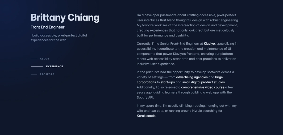
Clean architecture, smooth transitions, and excellent project showcasing. Notice how the minimalist design lets the content shine.
Josh W Comeau
Unique interactive elements are playful and show technical skill. Pay attention to how animations enhance usability.
Kent C. Dodds
The perfect balance of personal brand and technical expertise. Note how content hierarchy guides visitors naturally.
To make your portfolio stand out to recruiters and clients, add some creative and interactive animations to it. These libraries can help you do that: Framer Motion, tsParticles, and Three.js.
React portfolio website templates to use
If you are short on time, or simply don’t want to build from scratch, start with a template to build your portfolio website. This way, you can focus on customization and content while having a professional architecture. Here are three options:
DevFolio
A one-page layout portfolio template built with React, it’s fully responsive with a modern UI design, animations, and hover effects. Clone the repository to get started.
Full-stack developer portfolio
A software developer portfolio template built with React, Next.js, and other technologies. It has a good component structure for custom sections to showcase your skills and experiences. Clone the repository.
Software developer portfolio
A multi-page layout portfolio template built with React, Node.js, and other technologies. It is fully responsive and styled with React-Bootstrap and CSS, offering easy-to-customize colors. Clone the repository.
Final thoughts on building a React portfolio website
Building a portfolio website with React gives you more than a place to display your work. It gives you a way to show how you think, how you build, and how you turn ideas into polished experiences. In this tutorial, you learned how to structure a React portfolio with six reusable components, style it with Tailwind CSS, and connect it to ButterCMS so your content is dynamic and easy to manage.
Using a headless CMS also makes your portfolio easier to maintain over time. Instead of updating hardcoded content every time a project, skill, or bio changes, you can manage everything in one place and keep your site current with less effort.
If you're ready to try it yourself, you can start with ButterCMS's 14-day free trial. And if you need more time, ButterCMS also offers a free forever plan, so you can keep building and testing without rushing into a paid upgrade. If you'd rather see how it works first, you can also request a demo.
FAQs
What should I put in a React portfolio website?
Your React portfolio should include a projects section with live demos and GitHub links, a skills section listing your tech stack, an About section that introduces you and your experience, and a contact form so potential employers or clients can reach you directly. A resume download link is also a strong addition. Use a headless CMS like ButterCMS to manage this content so you can keep your portfolio current without redeploying every time something changes.
How do I deploy a React portfolio site?
The most common deployment platforms for React are Vercel, Netlify, and GitHub Pages. The process is straightforward: run npm run build to compile your app into a production-ready build or dist folder, then connect your GitHub repository to your chosen platform. Vercel and Netlify both offer automatic deployments. Every time you push to your main branch, the site rebuilds and redeploys. For a portfolio connected to ButterCMS, content updates happen through the CMS dashboard and don't require a redeploy at all.
Can I use a CMS like ButterCMS with React?
Yes. Headless CMSs like ButterCMS are designed for exactly this use case. ButterCMS provides a content API that your React components consume directly, so you model your content in the ButterCMS dashboard (project titles, descriptions, images, skills) and fetch it dynamically in your app using Axios or any HTTP client. This means your marketing content, portfolio projects, and bio text live in one manageable place, and your React codebase stays clean and focused on presentation logic.
