

One of the most important best practices in software development is reusability: you write a common piece of code once and use it wherever it’s needed. Think functions, utility classes, and shared modules. These reusable building blocks help keep your codebase clean, consistent, and easier to maintain.
In React, this same idea shows up in the form of reusable components. Instead of repeating the same UI code over and over, you can create a single component and use it throughout your app.
In this article, you’ll learn:
-
How to build reusable components in React
-
Why they matter
-
How to structure them in a way that saves you time and effort down the road
Table of contents
çWhat is a reusable React component?
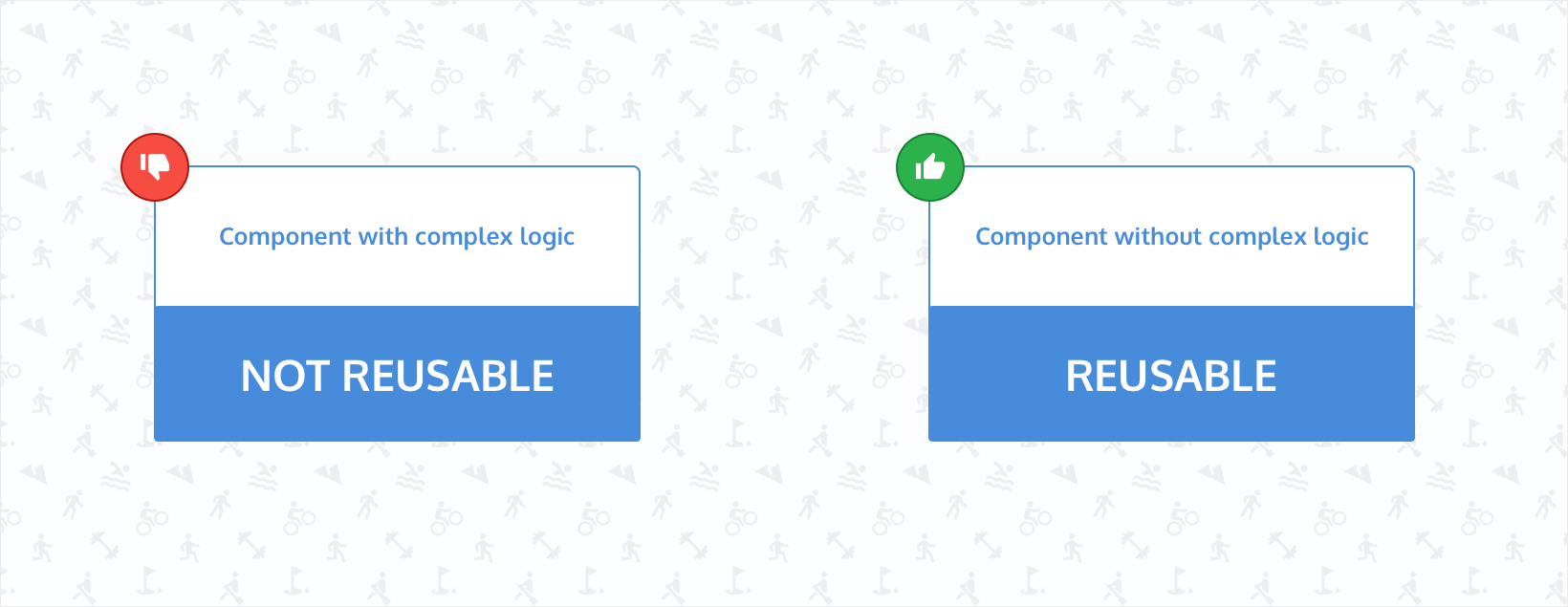
Reusable components are one of the most critical React best practices. They are pure and predictable pieces of your UI. These components are free from complex business logic and are generic in nature. This means when you give them the same data, they'll always display the same consistent user interface.
Indicators of when you can make your React component reusable
For a React component to be truly reusable, it should avoid side effects like data fetching, reading from localStorage, or making API calls. These actions can lead to unpredictable behavior, since the results may vary depending on when or where you use the component. This unpredictability makes it harder to reuse the component reliably.
Reusable components should behave the same way no matter where you use them. Elements like buttons, navbars, and footers are good examples; they should look and act the same across your entire site.
Here are a few signs that indicate you should make a component reusable.
Repeating the same styles
Imagine you have built a BlueButton React component with the following code:
import React from "react";

const BlueButton = () => {
  return (
    <button
      className="padding-2 shadow-none hover:shadow background-light-blue hover:background-dark-blue"
    >
      Click here
    </button>
  );
}

export default BlueButton
Now, you need to create another button, but in red. So, you create another component and call it RedButton with the following code:
import React from "react";

const BlueButton = () => {
  return (
    <button
      className="padding-2 shadow-none hover:shadow background-light-red hover:background-dark-red"
    >
      Click here
    </button>
  );
}

export default BlueButton
Notice the style duplications between the two buttons. Apart from the color, they are the exact same. That means you can create a component called Button and pass the necessary props to make it reusable. The code can look like the following:
import React from "react";

const Button = ({
  color
}) => {
  return (
    <button
      className={`padding-2 shadow-none hover:shadow background-light-${color} hover:background-dark-${color}`}
    >
      Click here
    </button>
  );
}

export default Button
When using the above component, you can pass the color prop, which should take care of the button's background color. You can also add a fallback color in case the prop isn’t passed to the component:
....
const Button = ({
  color = "blue"
}) => {
....
Now, if the color isn’t passed to the Button component, the rendered button will be blue due to the fallback of the prop.
Hardcoding texts instead of passing them as props
In the above Button component, there is one issue that makes the component less reusable. The label of the button is hardcoded inside the component. As a result, the component can’t be reused with a different label. To make it more reusable, you can pass the label as a prop. The component will look like the following now:
import React from "react";

const Button = ({
  color,
  label = "Click here"
}) => {
  return (
    <button
      className={`padding-2 shadow-none hover:shadow background-light-${color} hover:background-dark-${color}`}
    >
      {label}
    </button>
  );
}

export default Button
Now, the `Button` component can be reused in different places with a unique label like the following:
<Button
  color="blue"
  label="Click here"
/>
However, if you want to pass text along with an icon, the above component won’t support that as it is. To handle this, you can use React’s children prop. You can update the Button component like this:
import React from "react";

const Button = ({
  color,
  children
}) => {
  return (
    <button
      className={`padding-2 shadow-none hover:shadow background-light-${color} hover:background-dark-${color}`}
    >
      {children}
    </button>
  );
}

export default Button
You can now use the component in the following way:
<Button
  color="blue"
>
  Click here
</Button>
You can also pass an icon now in the children:
<Button
  color="blue"
>
  <SendIcon /> Click here
</Button>
Calling the same API from different buttons
Consider the scenario where you have a button inside a form that calls an API on click. Your code might look like the following:
import React from "react";
import saveNewUserData from "../api"

const UserForm = ({
  color,
  children
}) => {
  return (
    <form>
      <input type="text" placeholder="username" />
      <input type="password" placeholder="password" />

      <button
        className="blue"
        onClick={() => {
          saveNewUserData();
        }}
      >
        Submit
      </button>
    </form>
  );
}

export default Button
In the above form, there's a button that triggers the saveNewUserData() function on click. The app uses this function in several places, each time inside a different button.
If you ever need to update something like the className for all those buttons, you’d have to do it in multiple places, which isn’t ideal. A better approach is to create a single reusable button that always calls saveNewUserData().
Here’s how you can create a SaveNewUserButton component:
import React from "react";
import saveNewUserData from "../api"

const SaveNewUserButton  = ({
  color,
  children
}) => {
  return (
    <button
      color={color}
      onClick={() => {
        saveNewUserData();
      }}
    >
      {children}
    </button>
  );
}

export default SaveNewUserButton
Now, there will be only one button that encapsulates the calling of the saveNewUserData() function, and you can manage it easily. To add new functionality when a user clicks the button, you just have to update a single component.
The same layout or structure is used in multiple places
If your app uses a specific layout pattern (like a card with a header, image, and body) in different parts, you should make it a reusable component. That way, you only have to make changes to the structure (like adding a border or spacing) once.
const Card = ({ title, children }) => (
  <div className="border rounded p-4 shadow">
    <h3>{title}</h3>
    <div>{children}</div>
  </div>
);
Conditional rendering logic is repeated
If you're repeating if checks or ternary operators across components to show or hide parts of the UI, wrap that logic in a component. For example, you could wrap the code for showing a loading spanner or an empty state into a reusable wrapper.
const WithLoader = ({ isLoading, children }) => {
  if (isLoading) return <Spinner />;
  return children;
};
Forms or form fields with similar validation
The same validation or input logic is often used across different forms. To make this process reusable, create components like TextInput, PasswordInput, or ValidatedField. This saves you from writing the same onChange and validation logic over and over.
const TextInput = ({ label, value, onChange, error }) => (
  <div>
    <label>{label}</label>
    <input type="text" value={value} onChange={onChange} />
    {error && <span className="text-red-500">{error}</span>}
  </div>
);
Icons or SVGs with shared styles
Icons that have the same sizing, colors, or hover effects should be wrapped in a reusable Icon component that accepts the name, size, and color as props.
const Icon = ({ name, size = 24, color = "gray" }) => {
  const icons = {
    send: <SendIcon />,
    close: <CloseIcon />,
    // etc.
  };
  return (
    <div className={`text-${color} w-${size} h-${size}`}>
      {icons[name]}
    </div>
  );
};
Reusable React components versus templates
You’ve probably seen plenty of ready-made React templates that offer a quick way to kick off a project. These templates are usually built using many smaller React components and often make good use of reusability to maintain a consistent look and feel. You can find such templates on the MUI Store or marketplaces like Envato.
Using a template can save time and give you a solid starting point. But if you want to build a custom brand experience with specific design requirements and interaction patterns, a generic template may not be the best fit. In that case, it makes more sense to build your own reusable components from scratch, based on your design system.
That said, you can still start with a template and customize it. Just keep in mind that if you already have a well-defined design system, adjusting an existing template to match it can sometimes be more effort than it's worth.
Benefits of reusability
We've already touched on some of the advantages of reusable design, but here they are in more detail:
Consistency
When building a website, you want to create a consistent user experience throughout the entire website. Reusing components is one of the easiest ways to achieve this consistency and thereby, a good user experience. The interactions and behavior of the reusable components increase the familiarity of the website.
Gentle learning curve
Improving a feature in an existing code base sometimes comes with a learning curve. That’s because you have to figure out how the building blocks or components interact with each other and how the data flows between them.
If the APIs or props of these components are consistent via reusable components, the learning curve is a lot less steep. After you figure out how a component works, you can easily add new functionalities to all the places that use the component.
When the code base is smaller, there won’t be many issues if you don’t reuse components. But as the size of the codebase grows and multiple developers start working on it, the development experience will worsen if you don’t follow the principles of reusability.
Faster time to market
Reusing components can significantly reduce the amount of code needed to ship new features. Once you’ve built a solid set of components, you won’t need to start from scratch every time. This leads to faster development and quicker time-to-market.
Since components can be used across multiple parts of your site, the initial development cost is mostly tied to the first use case. For example, once you build an autocomplete search, you can simply reuse it on the homepage, product listings, and individual product pages.
Easier testing
Tests are critical for giving you confidence about the feature that gets shipped to your users. Proper test coverage can help you reduce the number of bugs and thereby help maintain existing features and ship new ones.
When you reuse the same components across your website, you'll likely write fewer tests overall. That's because you're not creating many new components; instead, you're relying on components you've already built and, ideally, thoroughly tested.
Making a React component reusable
To make a component reusable, think about how to remove any logic that contains side effects like API calls. Extracting this logic from a component makes it much easier to make it reusable.
Consider the scenario where you have a button that does an API call. The code for the button component could be the following:
import React from "react";
import doAPICall from "../api"

const SaveButton  = () => {
  return (
    <button
      onClick={() => {
        doAPICall();
      }}
    >
      Save
    </button>
  );
}

export default SaveButton
It is quite clear that you can’t reuse the above button in multiple places since this button component contains a side effect (doAPICall()) inside it. To make this component reusable, extract the side effect and pass that as a prop to the button component, like the following:
const App = () =>  {
  function doAPICall() {
    // Does an API call to save the current state of the app.
  }

  return (
    <div>
      <SaveButton onClick={doAPICall}/>
    </div>
  )
}
The button component will look like the following:
const SaveButton  = ({
  onClick
}) => {
  return (
    <button
      onClick={onClick}
    >
      Save
    </button>
  );
}
You can now use the above button in all the places where you want to save data on the click of a button. You can use it like this in multiple places:
const App = () =>  {
  function saveUser() {
    // Does an API call to save the user.
  }

  function saveProject() {
    // Does an API call to save the project.
  }

  return (
    <div>
      <SaveButton onClick={saveUser}/>
      <SaveButton onClick={saveProject}/>
    </div>
  )
}
You can also make the button component more reusable by using a prop to control the label, like the following:
const App = () =>  {
  function saveUser() {
    // Does an API call to save the user.
  }

  function saveProject() {
    // Does an API call to save the project.
  }

  return (
    <div>
      <SaveButton onClick={saveUser} label="Save user"  />
      <SaveButton onClick={saveProject} label="Save project" />
    </div>
  )
}
The button component will look like the following:
const SaveButton  = ({
  onClick,
  label
}) => {
  return (
    <button
      onClick={onClick}
    >
      {label}
    </button>
  );
}
Common reusable component use cases
Any component that needs to be used in more than a single place can potentially be a candidate for a reusable component. However, the most popular ones are navbars, tables, buttons, footers, sidebars, forms, and inputs.
For example, in the case of navbars, you can build it once and reuse it across your website.
The code for the Navbar component might look like the following:
const Navbar = () => {
  return (
    <div className="navbar">
      <div className="navbar-container">
        <div className="navbar-logo">
          <img src={logo} alt="logo" />
        </div>
        <div className="navbar-links">
          <a href="/">Home</a>
          <a href="/about">About</a>
          <a href="/contact">Contact</a>
        </div>
      </div>
    </div>
  )
}
Now, you want to reuse the Navbar component across all pages of your website, including pages that are behind an authentication wall. These pages should only be accessible to logged-in users.
For users who are logged in, the navbar should show a link to their profile. For those who aren’t, it should show a link to the login page. You can update the Navbar component to handle both cases and make it work across all pages:
const Navbar = ({ isLoggedIn }) => {
  return (
    <div className="navbar">
      <div className="navbar-container">
        <div className="navbar-logo">
          <img src={logo} alt="logo" />
        </div>
        <div className="navbar-links">
          <a href="/">Home</a>
          <a href="/about">About</a>
          <a href="/contact">Contact</a>
          {isLoggedIn ? (
            <a href="/profile">Profile</a>
            ) : (
            <a href="/login">Login</a>
          )}
        </div>
      </div>
    </div>
  )
}
You need to pass the isLoggedIn prop to the Navbar component and the Navbar component will take care of rendering the correct link.
With tables, you might have a component for which the code looks like the following:
const Table = () => {
  return (
    <table>
      <tr>
        <th>First name</th>
        <th>Last name</th>
        <th>Status</th>
      </tr>
      <tr>
        <td>Jane</td>
        <td>Doe</td>
        <td>Offline</td>
      </tr>
      <tr>
        <td>John</td>
        <td>Doe</td>
        <td>Online</td>
      </tr>
    </table>
  )
}
Now, this table isn’t reusable. To make it reusable, extract the data and pass it as a prop to the Table component. Your code to make these changes might look like the following:
const data = [{
 id: 1,
 firstName: 'Jane',
 lastName: 'Doe',
 status: 'Offline'
},{
 id: 2,
 firstName: 'John',
 lastName: 'Doe',
 status: 'Online'
}]

const App = () => {
 return (
   <Table
     data={data}
   />
 )
}

const Table = ({ data }) => {
 return (
   <table>
     <tr>
       <th>First name</th>
       <th>Last name</th>
       <th>Status</th>
     </tr>
     {data.map((user) => {
       return (
         <tr key={user.id}>
           <td>{user.firstName}</td>
           <td>{user.lastName}</td>
           <td>{user.status}</td>
         </tr>
       )
     })}
   </table>
 )
}
Now, you can reuse the Table component on multiple pages. You just need to pass the correct data via the data prop of the Table component.
You can also create reusable typography components that will make your website consistent across all the pages.
Integrating React components with ButterCMS
ButterCMS is a headless CMS that provides APIs and a React client library to simplify the integration.
Whether you're building a blog, a single page application (SPA), or a React knowledge base app, ButterCMS makes it easy to fetch and display dynamic content without having to hardcode it into your React app.
Let's create a form and integrate that form with ButterCMS. First, check if you need to write API access. Go to the settings page to check that out. Then, you need to create a function App which will contain a form:
const App = () => {
 const [name, updateName] = useState("");

 function handleSubmit(e) {
   e.preventDefault();

   api(name);
 }

 return (
   <div className="app">
     <form onSubmit={handleSubmit}>
       <input
         type="text"
         name="name"
         className="input"
         value={name}
         onChange={e => updateName(e.target.value)}
       />
       <SaveButton
         handleClick={handleSubmit}
         label="Submit"
       />
     </form>
   </div>
 );
}
The App function includes a handleSubmit() function. This handleSubmit() function is responsible for calling an api() function, which in turn makes an API call to save data to ButterCMS. The api() function is structured as follows:
export default function api(name) {
const BUTTER_CMS_API_TOKEN = "YOUR_BUTTER_CMS_WRITE_API_TOKEN";
const URL = "https://api.buttercms.com/v2/content/";
fetch(URL, {
method: "POST",
headers: {
"Content-Type": "application/json",
Authorization: `Token ${BUTTER_CMS_API_TOKEN}`
},
body: JSON.stringify({
key: "user_details",
status: "published",
fields: [
{
en: {
name
}
}
]
})
}).then(response => response.json());
}You can get the value of the BUTTER_CMS_API_TOKEN from the settings page. In this code, you are using the write API of ButterCMS to save your form data as a collection.
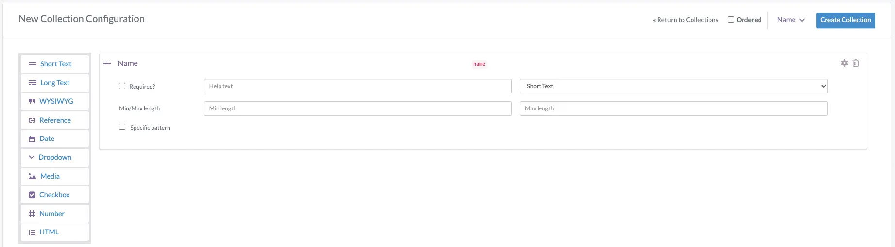
However, before running this code, you should define a corresponding collection entity in ButterCMS. To do that, log in to your ButterCMS dashboard and go to the collections section. You can add a new collection by clicking the New Collection button.
Then, select the Short Text field from the sidebar and enter the title of the field as Name (as shown in the screenshot below):
Next, click on the Create Collection button and enter User details as the name of the collection:
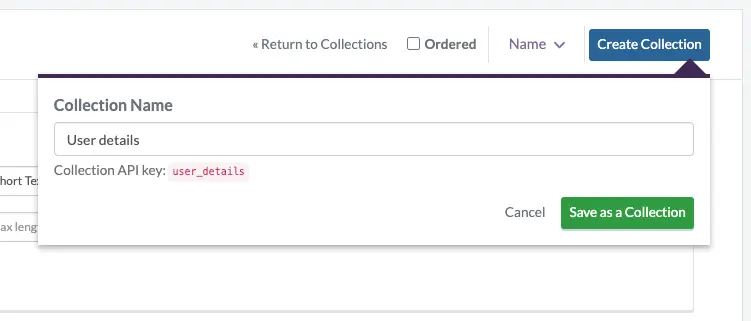
Finally, click on the Save as a Collection button to save the collection.
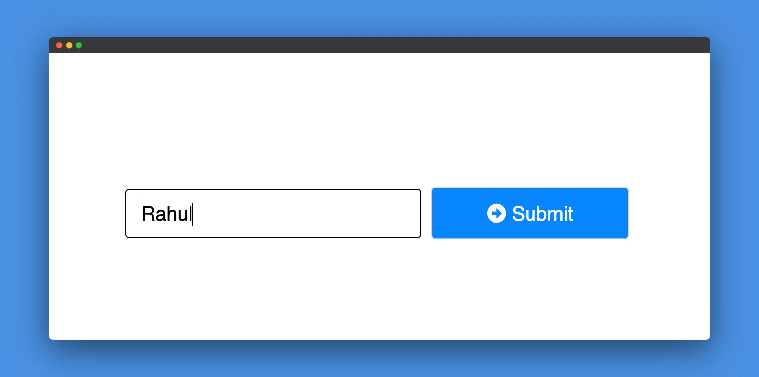
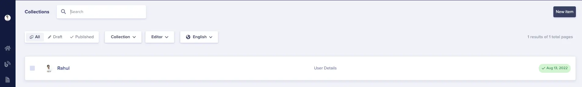
After running the app code, type something into the input box on the form, and click Submit. Your data should be saved to ButterCMS collections.
Now, if you go to collections, you can see that the details have been saved:
You can check out this CodeSandbox to view the implementation of this whole process. You’ll need to enter your ButterCMS Write API Token (which can be found in your settings) in the butter-cms-api-call.js/BN file.
Closing thoughts
The main idea behind reusing components is that they give you the confidence to ship consistent and tested features faster. If you have a large or growing code base, make sure to embrace the principles of reusability to maintain consistency and improve the overall quality of your app.
If you’re looking to streamline your development even further, check out the ButterCMS React starter project which offers pre-built components designed to streamline your development process. You can also learn to build a serverless React application in our article on how to use serverless in practice.

