
When presenting information to your user, it’s important to succinctly get your point across. One way to do this is by using interactive chart elements on your web page. There are many use cases for charts on your website, such as:
- Analytics platforms where you need to present dashboards to your users. This includes:
- Pie charts for analytics dashboards showing the split of devices used by your audience
- Line/candlestick charts showing the performance of a stock over time in a trading platform
- An article where you are trying to present your findings based on some data. Having an interactive chart here would help your users more easily make sense of your topic. This includes:
- Marketing articles or landing pages with sales pitches
- Executive summaries
- Presenting results of data analysis
- Presenting geographic data using chloropeth maps, such as percentage of energy used being renewable; by state
There are many libraries that allow you to display charts on your web page, all with their pros and cons. In this post, we’ll explore and compare some of these highly interactive charting libraries.
Note that there is another class of dashboards that require charts: internal dashboards for your team to monitor relevant data for your organization. If this is your use case, it would be simpler to use tools that can directly connect to your data sources and provides visualizations. Redash, Metabase, and Apache Superset are all examples of such tools.
|
Name |
Open Source |
License |
Pricing |
Features |
|
Yes |
CC3.0 for non-commercial usage |
$445 per developer, additional $170 per year for premium support. $50 for pre-finance startups for first year Free for non-commercial usage |
Bar, line, scatter, pie charts Candlesticks, treemaps, maps, and a lot more Limited fallback mode for large(>100000 points) datasets |
|
|
No |
$497 per developer, including one year of premium support |
Bar, line, scatter, pie charts Gantt Charts, Heat Maps, and a lot more Zoom scatter-plot support for large(>1000000 points) datasets |
||
|
Yes |
MIT License |
Free |
Bar, line, scatter, pie charts Financial charts available via pre-initial-release plugin |
|
|
Yes |
WTFPL + MIT License |
Free |
Bar, line, scatter, pie charts |
All of these libraries are open-source, and have supporting libraries that define bindings for Angular, React and VueJS.
Highcharts
Highcharts is a commercial JavaScript library for embedding charts on web pages using SVG elements. Highcharts was established in 2009. It is a mature and stable library.

To use Highcharts, we create a container:
<div id="container"></div>And then define the data source via the JS API:
Highcharts.chart('container', {
   chart: {
       type: 'column'
   },
   title: {
       text: 'Forest land area across countries'
   },
   subtitle: {
       text: 'Source: Wikipedia'
   },
   xAxis: {
       categories: ["Russia", "Canada", "Brazil", "United States", "China"],
       title: {
           "text": "Country"
       }
   },
   yAxis: {
       title: {
           "text": "Forest Land Area(sq km)"
       }
   },
   series: [{
       name: 'Forest Land Area(sq km)',
       data: [8149300, 4916438, 4776980, 3100950, 2083210],
   }]
});
The above code generates this chart:
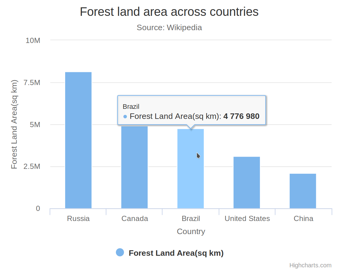
Highcharts allows you to configure the theme separately from the data. This allows you to have a common theme for your brand apply across all the charts on your website. Highcharts is extensively documented, and has most use cases covered. If the pricing is not a deterrent, Highcharts is an excellent choice. Highcharts also offers a discounted price of $50 for one year, two developers for pre-finance startups; as well as no cost for non-profit uses. If your use case fits into this model, this is the best option. Highcharts takes care of subtle details, like using M (million) instead of writing 6 trailing zeros.
Chart.js
Chart.js is a popular MIT licensed open-source JavaScript library for building charts using the HTML5 canvas element.
To create a chart in chart.js, we first create a canvas element:
<canvas id="myChart" width="400" height="400"></canvas>And then, create a Chart object:
var ctx = document.getElementById("myChart").getContext('2d');
var myChart = new Chart(ctx, {
    type: 'bar',
    data: {
        labels: ["Russia", "Canada", "Brazil", "United States", "China"],
        datasets: [{
            label: 'Forest Land Area(sq km)',
            data: [8149300, 4916438, 4776980, 3100950, 2083210],
            backgroundColor: 'rgba(129, 177, 8, 255)',
            borderWidth: 1
        }]
    },
    options: {
        scales: {
            xAxes: [
                {
                    gridLines: { display: false },
                    scaleLabel: {
                        display: true,
                        labelString: "Country"
                    }
                }
            ],
            yAxes: [
                {
                    scaleLabel: {
                        display: true,
                        labelString: "Forest Land Area(sq km)"
                    }
                }
            ]
        },
        title: {
            display: true,
            text: ["Forest land area across countries", "Source: Wikipedia"]
        }
    }
});
The above code generates this chart:
The Chart.js API is fairly simple and well documented. For most use cases, Chart.js should suffice! However, the theming system is very limited compared to the other options, forcing you to specify colors for individual charts. Additionally, Chart.js uses canvas instead of SVG. While this may not be very apparent, SVG elements for text and other elements tend to look more crisp. Chart.js is actively maintained, and has a few plugins to extend its functionality.
If the complexity of the requirements begins to grow, it would make sense to switch to a different library.
Chartist
Chartist is another open-source library. It is dual licensed with the WTFPL and MIT license, and offers no commercial support. Chartist uses SVG and CSS for the rendering of the charts, making it DPI-independent. This prevents blurring and other scaling artifacts because the rasterization is done much later in the pipeline. Also, this lets you take advantage of CSS animations.
To use chartist, first we create a container:
<div id="ct-chart"></div>Then, create the chart:
var data = {
    labels: ["Russia", "Canada", "Brazil", "United States", "China"],
    series: [
        [8149300, 4916438, 4776980, 3100950, 2083210]
    ]
};

var options = {
    fullWidth: true,
    axisY: {
        type: Chartist.AutoScaleAxis,
        scaleMinSpace: 50
    },
    chartPadding: {
        right: 40,
        left: 80,
        top: 0,
        bottom: 80
    },

    plugins: [
        Chartist.plugins.ctAxisTitle({
            axisX: {
                axisTitle: 'Country',
                axisClass: 'ct-axis-title',
                offset: {
                    x: 0,
                    y: 50
                },
                textAnchor: 'middle'
            },
            axisY: {
                axisTitle: 'Forest Land Area(sq km)',
                axisClass: 'ct-axis-title',
                offset: {
                    x: 0,
                    y: 40
                },
                textAnchor: 'middle',
                flipTitle: true
            }
    })]
};
new Chartist.Bar('#ct-chart', data, options);
Styling is done using CSS:
#ct-chart {
    max-width: 400px;
    height: 400px;
}

.ct-series-a .ct-bar {
    stroke: #11ab13;
    stroke-width: 40px;
}
.ct-label {
    color: #202020;
}
The above code generates this chart:
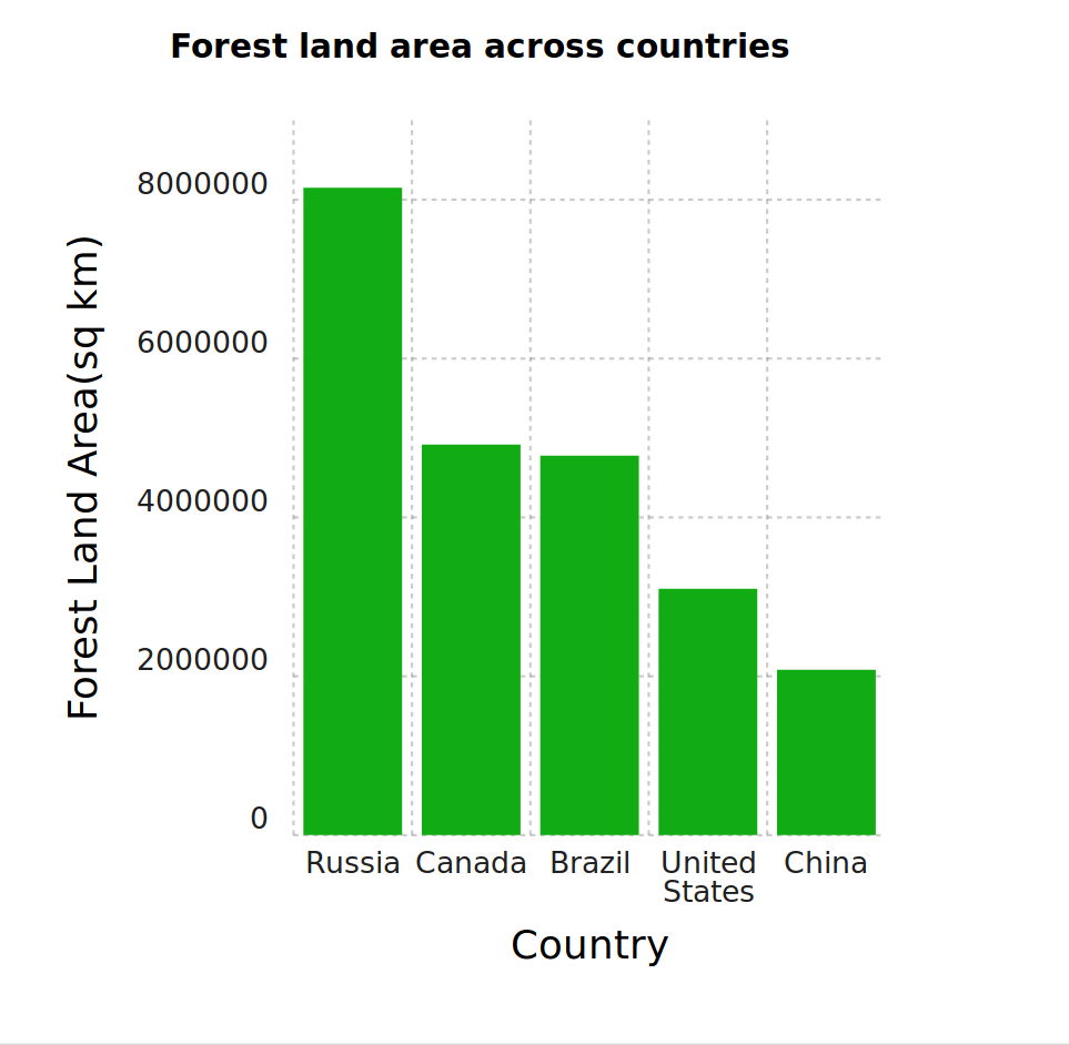
Chartist provides a great degree of control over styling and responsiveness. Every single aspect of the chart can be styled using CSS. This would apply to all the charts on your website. The drawback of custom CSS styling is that it requires a lot more work to tune and get right.
The documentation in Chartist could use a little work. Although there is API documentation, it is a bit difficult to find functions relevant to the developer when implementing a chart. Chartist also leaves out a couple of features, making them optional plugins instead. Some of these are very useful, like this accessibility plugin. The axis titles feature being a plugin is a bit odd though: it should rather be a core feature. Similarly, tooltips require a plugin. Chartist is a very powerful charting library, but it requires more work on the developer’s end to get things to look right.
FusionCharts
FusionCharts is a commercial JavaScript library for rendering charts and comes with extensive documentation. The FusionCharts team has another product called “FusionExport”, which allows you to export entire dashboards. FusionCharts uses SVG for rendering, ensuring responsiveness.
FusionCharts supports a wide variety of different chart types. Nearly everything from simple line, bar and scatter charts, node diagrams, heat maps, charts optimized for real-time streaming, and candlestick charts are supported.
To use FusionCharts, you first create a container:
<div id="chart-container"></div>And then use the JavaScript API:
const dataSource = {
    "chart": {
        "caption": "Forest land area by country",
        "subcaption": "Source: Wikipedia",
        "xaxisname": "Country",
        "yaxisname": "Forest Land Area(sq km)",
        "numbersuffix": "sq km",
        "theme": "candy"
    },
    "data": [
        {
            "label": "Russia",
            "value": "8149300"
        },
        {
            "label": "Canada",
            "value": "4916438"
        },
        {
            "label": "Brazil",
            "value": "4776980"
        },
        {
            "label": "United States",
            "value": "3100950"
        },
        {
            "label": "China",
            "value": "2083210"
        }
    ]
};

FusionCharts.ready(function () {
    var myChart = new FusionCharts({
        type: "column2d",
        renderAt: "chart-container",
        width: "100%",
        height: "100%",
        dataFormat: "json",
        dataSource
    }).render();
});
The above code generates this chart:
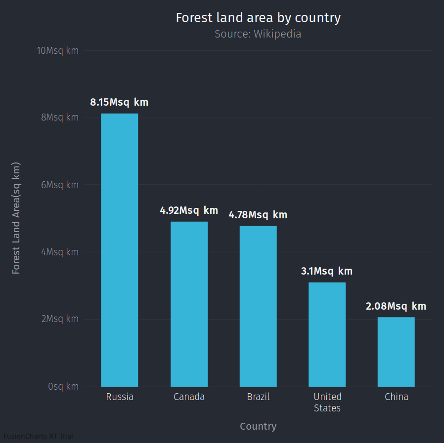
FusionCharts provides a set of themes, and a simple way to design new ones. The documentation of FusionChart covers a wide variety of use cases, included integration with various server-side frameworks, like django. Similar to Highcharts, FusionCharts has been engineered to take the scale of the data into consideration, using unit prefixes instead of cluttering the graph with lots of zeros.
Conclusion
After looking at the alternatives presented in this article, you should be able to select one for your particular product. If you want to stick to a free and open source library, use Chart.js. It is extremely simple to use for common use cases. If you need a little more control over rendering, then you could look into Chartist.
Both commercial offerings, Highcharts and FusionCharts, are mature libraries that can fit most use cases very well. Both of them have varied degrees of support for large datasets (>100k data points), and support a large variety of charts. If there is a specific type of chart you need to render, the choice might narrow down to one of them. Regarding pricing, the products have different tiers based on the number of users and whether or not it is for an internal dashboard. But Highcharts’ $50 license for pre-finance startups stands out from the other options. Note that this applies only for the first year, after which the price is upwards of $445 per developer per year. While this is a great marketing offer, it is important to evaluate this within the context of your business. Once integrated into your system, it is difficult to switch to a different library.
Whichever you pick, make sure that the data you present to your user is relevant and useful. Happy charting!