

Table of contents
In Part 1, we explored why front-end performance is an essential ingredient for any website serious about achieving its goals. We then learned about the common metrics which are used to measure major performance as well as some for the best tools to collect this data for you.
Now that we know how to measure and understand a website’s current performance, in Part 2, we’re going to talk about some of the recommended front-end performance optimization techniques you can use to improve it. All of these can be built into your web development workflow starting today.
Let’s jump right in!

Front-End Performance Optimization Techniques
Let’s take a brief look at some good optimization techniques you can use to speed up your website and improve user experience.
Lazy Loading
Usually, when you load a web page, the browser requests all of its images regardless of whether they’re in the viewport or further down the page and out of sight. Lazy loading allows us to only load the images which are visible and asynchronously load the rest on-demand as the user scrolls. This reduces the number of requests on load and can speed up the process considerably.
In 2019, lazy loading is best implemented with the Intersection Observer API. Google has a very well-written tutorial on how to implement lazy loading, which you should definitely check out if it’s something you’re looking to implement.
In addition, browsers will soon support lazy loading natively, which is great news!
Responsive Images
Appropriately sizing large images for the device they’re viewed on is another way to reduce the page size of a website. This also makes better use of the viewport space.
Using the srcset and sizes attributes, as well as the <picture> element, you’re able to show an appropriate image depending on the viewport width, like so:
<picture>
   <source media="(max-width: 799px)" srcset="dog-480w.jpg">
   <source media="(min-width: 800px)" srcset="dog-800w.jpg">
   <img src="dog-800w.jpg" alt="A picture of a dog">
</picture>
You can implement this on your own website using this handy responsive images tutorial from Mozilla.
Defer Third-Party JavaScript
When loading a page, during HTML parse, if the browser comes across an external script, like this …
<script src="third-party-script.js"></script>… the browser fetches the script asynchronously and then pauses rendering so it can be executed. This is bad because it slows the critical rendering path, which will result in a worse first contentful paint metric.
The solution is to use the defer attribute, like below:
<script src="third-party-script.js" defer></script>This instructs the browser to download the script as soon as it’s found, but it defers execution until after the HTML parsing is complete. This sidesteps the problem of delaying the critical rendering path and is the recommended way to load 3rd party scripts that manipulate the DOM.
You can see defer in action in the following timelines, where we’re loading jQuery from a CDN.
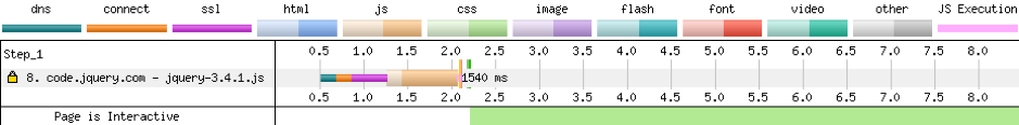

Without the defer attribute, the script is downloaded and executed immediately, resulting in a start render time of 2.2 seconds. You can see this moment being represented by the vertical green line on the timeline image.
With the defer attribute, the script is downloaded, but then execution is delayed until after the HTML document has been fully parsed. This speeds up the start render time to 1.7 seconds, which is 22% faster than before.
Note: When using the defer attribute, because jQuery is now being executed only when the page has finished parsing, any scripts which require jQuery must too be deferred, otherwise the load order will cause bugs. Not ideal!
Preconnect to Third-Party Origins
When the browser requests a resource from a server, this consists of various steps. These are:
DNS Lookup
In this step, the browser looks through a kind of internet phone book to find the server IP address that matches the website’s domain name.
Initial Connection
This is how long it takes the browser—upon determining the IP address of the website’s server—to establish a connection.
SSL Negotiation
If the HTTPS protocol is present, this stage involves the browser and server determining a secure way to communicate.
Time to First Byte (TTFB)
Once a connection is made, this is how long it takes the server to prepare and begin to send data back to the browser as a response.
Content Download
This is how long it takes the browser to download the content of the response.
With a normal request, these steps are all done at the same time and must be completed before a request can be completed.
Using the preconnect resource hint, we can tell the browser to complete the DNS Lookup, Initial Connection, and SSL Negotiation steps of this process as soon as possible, rather than later on when the script tag is discovered.
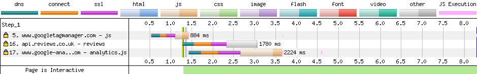
In this timeline, focus on request #17, which loads analytics.js. Here we have no preconnect resource hint to tell the browser to set up the connection early, so it all happens in one go.
Using this tag, we can tell the browser to preconnect to the domain:
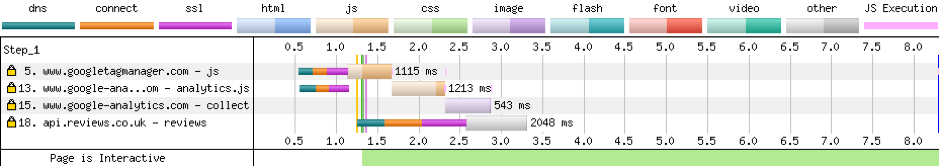
<link rel="preconnect" href="https://www.google-analytics.com">And when we rerun a test, we can see that the connection is being set up a lot sooner at #13, resulting in the whole loading process being completed a little faster. This is visualized by the green, orange, and purple bars now having a bit of a gap in relation to the content download block.
Brotli and gzip Compression
By default, when assets are sent from the server to the browser, they are sent as is. Using compression tools such as gzip and Google’s Brotli, we can decrease the file sizes of these requests exponentially:
|
File |
Uncompressed |
Gzip |
Brotli |
|
style.css |
346kb |
37kb (-89%) |
24kb (-93%) |
|
script.js |
106kb |
27kb (-75%) |
23kb (-78%) |
|
screenshot.png |
1.5mb |
1.4mb (-7%) |
1.4mb (-7%) |
You will notice that compared to the CSS and JS files, the compression ratio on the PNG is pretty lackluster. This is because gzip and Brotli are much better suited for text-based files where the rate of repetition is much higher, allowing the compression to be more successful.If you’re on managed hosting, gzip and Brotli may already be enabled. You can check this in the networks tab via Chrome’s DevTools, as seen below.
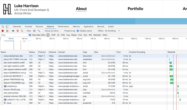
In the ‘Content-Encoding’ tab, br means the resource is compressed via Brotli, while gzip means the resource is compressed via … gzip!
If you manage your own server, then Google is your best friend here! 🤷♂️
Remove Unused CSS
In modern front-end development, frameworks such as Bootstrap provide a suite of highly reusable classes, which makes for quicker and easier UI creation.
For example, a typical grid system using Bootstrap would look like the following:
<div class="container">
   <div class="row">
      <div class="col-12 col-md-4">Column 1</div>
      <div class="col-12 col-md-4">Column 2</div>
      <div class="col-12 col-md-4">Column 3</div>
   </div>
</div>
The classes in this example make each column display full-width, and then from the md breakpoint onwards, it creates a classic 3-column layout.
These classes will be programmatically generated in SASS source files based on the grid and breakpoint variables provided to Bootstrap. This means that in addition to the classes from the example above, variants such as col-2, col-lg-7, and col-md-9 will also be compiled, whether they’re used in the HTML or not.
While convenient, this creates a lot of unused CSS in the stylesheet.
Just how much? Thankfully, Chrome can answer that for us.
In Chrome’s DevTools, toggle the console drawer (ESC) and then select the coverage tool. Click the reload icon in this tool to generate a coverage report, like the one below:
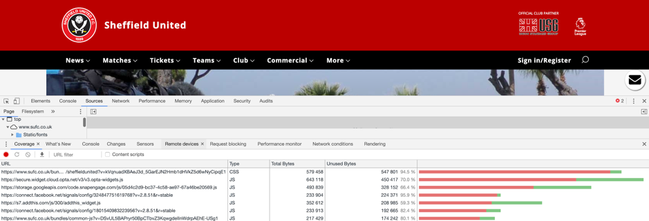
This tells us that on the Sheffield United homepage, a whopping 94.5% of CSS is unused! If we were to strip all of the unused styles from the 580kb uncompressed file, we would only be left with a meager 31kb of CSS.
From a performance perspective, this is a big opportunity to make some savings. Not only is a smaller stylesheet quicker to load, it’s also quicker to parse when the browser is forming the CSSOM (CSS Object Model).
There are various tools out there that do a good job of automating the process of removing unused CSS, many of which can slot right into a typical build system via NPM scripts or a task runner such as Gulp.
These are:
- UNCSS (https://github.com/uncss/uncss)
- PurifyCSS (https://github.com/purifycss/purifycss)
- PurgeCSS (https://www.purgecss.com/)
Let the great CSS purge begin!
WebP Images
JPG is the traditional way of displaying bitmap images on the web. As of the time of writing, it’s a 26-year-old format, which in the digital world is eons. Since then, lots of innovation in the field of image compression has been made, and in the last few years, some browsers have introduced support for a Google-created format called WebP.
By converting all of a website’s JPGs to WebP, you’ll reduce the overall size of your website’s images, allowing for faster load times overall.
|
Picture |
JPG |
WebP |
 |
puppy-dog.jpg (244kb) |
puppy-dog.webp (79kb) (-67.62%) |
 |
surprised-cat.jpg (110kb) |
Suprised-cat.webp (17kb) (-84.55%) |
Converting Images to WebP
You can convert images into the WebP format through a web-based WebP converter, or you can do it locally via Google’s own cwebp package which can be installed via npm.
In a terminal, as detailed in the docs, you would typically use the cwebp package like so:
cwebp [options] input_file -o output_file.webpHowever, to speed up this process, add the following snippet to your bash_profile:
function webp() {
	cwebp -q 80 "$1" -o "${1/jpg/webp}"
}
export -f webp
This allows you to just declare any options once and then reuse in the terminal over and over like this:
webp cat.pngFinally, you can also automate this process using Gulp and the gulp-webp package.
Using WebP
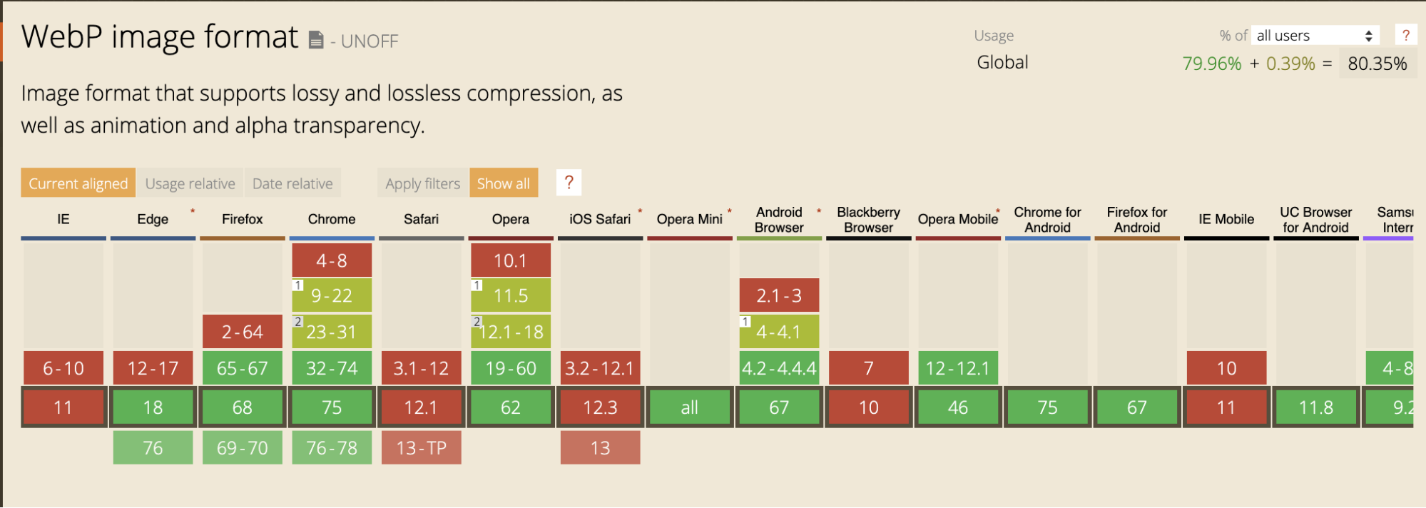
Like mentioned before, only some browsers support WebP. At the time of writing, caniuse.com shows only a partial support for WebP across modern browsers:
.htaccess file, you can work around this limitation:
RewriteEngine On
RewriteCond %{HTTP_ACCEPT} image/webp
RewriteCond %{DOCUMENT_ROOT}/$1.webp -f
RewriteRule (.*)\-.*(jpe?g|png) $1.webp [T=image/webp,E=accept:1]
When a request is made for a JPG or PNG file, this snippet instructs the server to do the following:
- Check if the browser requesting the JPG/PNG also supports WebP.
- If not, just send the JPG/PNG. The end.
- If yes, check if a WebP version exists with the same filename (so
puppy-dog.webpinstead ofpuppy-dog.jpg) - Rewrite the name of the WebP version to match the requested JPG/PNG version (filename extension included) and then send it to the browser.
This means the browser receives a response from the server with a file named puppy-dog.jpg, which is, in fact, a WebP. We’re getting all the benefits of WebP without having to modify any img elements or background styles in our existing code. Marvelous!
Better Caching Strategies
One good way to reduce page load times is to implement an efficient caching strategy so that assets such as CSS and Javascript, and images aren’t downloaded again by the browser cache unless absolutely necessary.
As recommended in this post by Jake Archibald, one of the best ways to handle the caching of our page’s assets is to simply tell the browser that our assets will never change and it’s safe to cache them forever.
This can be done by adding this snippet to your website’s .htaccess file:
<IfModule mod_headers.c>
   Header set Connection keep-alive
   Header unset ETag
    <filesMatch "\.(jpg|jpeg|gif|png|svg|css|js|ico|woff2|woff)$">
        Header set Cache-Control "max-age=31536000, immutable"
    </filesMatch>
</IfModule>
# By removing the ETag header, you disable caches and browsers from being able to validate files, so they are forced to rely on your Cache-Control and Expires header.
FileETag None
Now that we’ve told the browser that our website’s assets are set in stone and aren’t ever going to change, the next question naturally is, What happens when these assets do change?
The answer is, rather than changing the content of the files we’ve declared are immutable at a particular URL, we just change the URL! This is done using filename revision and involves appending a hashed version of the file’s contents to the filename itself, so style.css becomes style-4511748f41.css.
This means when an asset is updated, the hash (and therefore the filename) updates as well. This means that as far as the browser is concerned, this is a completely new asset and should be cached accordingly. The end result of this process is that files are cached up until the point when their content changes, which is a lot more efficient than default behaviors.
To automate this process as well as update HTML URLs so they point to the revised filename, I recommend gulp-rev, gulp-rev-rewrite, and gulp-rev-delete-original.
Final Thoughts
Hopefully, you now know a little more about why optimizing front-end web performance is important and how to accomplish it. Now you can make this a part of your standard workflow and see the considerable benefits for yourself. And like Yoda once said to Luke:

If you haven't yet, make sure you check out part 1 of this front-end performance article series

