
In the fast-paced world of mobile apps, where competition is fierce, businesses are constantly vying for the attention of potential users. Picture a product-focused landing page as the star of the show—a dedicated space meticulously designed to showcase a specific app, grabbing interest, educating users, and ultimately driving downloads.
Let's step into an exciting scenario: Imagine you've just created a revolutionary mobile app! While your main website narrates your company's vision, history, and range of products, you sense the need for a dedicated platform exclusively for this game-changing app—a space where potential users can embark on an interactive journey, exploring its exceptional features, experiencing it in real-time, and ultimately getting hooked on its incredible value. And that's exactly where a product-focused landing page comes into play, stealing the spotlight in mobile app development!
Table of contents
Why should you create a product-focused landing page?
-
Targeted content: Unlike general mobile apps, a landing page focuses solely on one product, preventing distractions from unrelated content.
-
Higher conversions: Clear call-to-actions and streamlined content often result in higher conversion rates than traditional landing pages.
-
Flexible marketing: Easily align your landing page with the messaging and goals of new marketing campaigns.
-
Performance insights: Landing pages allow precise user behavior tracking, providing valuable insights.
Powering your landing page with Kotlin and ButterCMS
Introduction to Kotlin
Kotlin is a statically typed programming language developed by JetBrains. Kotlin is designed to be fully interoperable with Java, offering more concise syntax and improved safety features. It is commonly used for Android app development and has gained popularity for its modern design and ease of use. Kotlin offers a range of features that make app development more efficient, such as null safety, extension functions, and functional programming capabilities.
Kotlin's Capabilities:
-
Modern programming language: Kotlin's clean syntax and modern features address challenges developers face today.
-
Developed by JetBrains: Created by JetBrains, Kotlin aims to make coding a more enjoyable experience.
-
Widely used for Android applications: Kotlin is a top choice for Android development, endorsed by Google.
-
Conciseness and expressiveness: Kotlin emphasizes brevity, making code more readable and manageable.
-
Compatibility with Java: Kotlin seamlessly integrates with existing Java projects, allowing for a gradual transition.
-
Null safety: Null pointer exceptions have been a persistent thorn in the side of many developers. Kotlin addresses this head-on with a robust null safety feature. By design, Kotlin's type system is geared to eliminate the risk of null pointer exceptions, ensuring that the code is more reliable and resilient.
Introduction to ButterCMS
ButterCMS is a headless content management system (CMS) designed to simplify the process of managing and delivering content to various platforms, including websites and mobile apps. It provides tools to create, manage, and update content without requiring extensive coding knowledge for marketers after the initial setup. This is particularly useful for dynamic content like the content you'd find on a mobile app's landing page.
ButterCMS: Simplifying Content Management
ButterCMS simplifies content management for developers and marketers with its user-friendly interface. It excels in delivering dynamic content to websites and mobile apps seamlessly.
-
Seamless content delivery to various platforms, including websites and mobile apps: ButterCMS excels in dynamic content delivery, employing an API-first approach, robust content modeling, real-time updates, and efficient caching mechanisms. This ensures rapid integration and display of dynamic content, which is crucial for user interaction and personalization.
-
Robust tooling: The platform provides tools for creating, managing, and updating content. These include an intuitive content editor, flexible content modeling, rich media support, version control, content localization, SEO-friendly features, real-time preview, scheduled publishing, API access, and robust security measures.
-
Accessibility to users with limited coding knowledge: While some initial development work is required for setup, marketers can handle ongoing content management without constant developer involvement. This empowers individuals who may not possess extensive coding expertise, a significant advantage over traditional content management systems.
-
Dynamic Content: ButterCMS truly shines in dynamic content management, which is particularly crucial for product apps. It excels in handling content that changes based on user behavior or real-time updates. With its intuitive user interface and robust content modeling capabilities, users can effortlessly create, edit, and organize dynamic content without extensive technical expertise. This streamlines the content management workflow, enabling more efficient updates and publishing.
Tutorial: Creating a landing page with Kotlin:
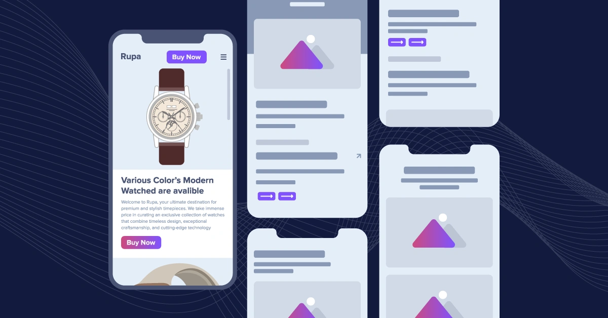
In this tutorial, we will harness the power of Kotlin and ButterCMS to develop a product-focused landing page. We will discuss the steps, from setting up the environment for development to building the user interface and integrating ButterCMS for content management. Here's a brief overview of what we're setting out to achieve.
You can find all the code for this project in this GitHub repo.
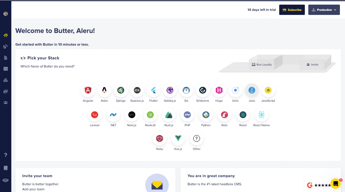
To utilize ButterCMS, you must first create a user account on the platform if you don't already have one. To do this, open your web browser and go to the ButterCMS login page.
Once you have successfully signed in to your account, you will be taken to a dashboard that resembles the image shown below:
Creating our landing page in ButterCMS
The landing page serves as the virtual storefront of a website or application, and it plays a crucial role in conveying information and engaging visitors effectively. The landing page is typically divided into distinct sections, each serving a specific purpose and communicating unique content within a relevant context to optimize this user experience. Below are the core sections we will create in this tutorial.
-
Product Benefits section: This section is strategically positioned at the beginning of the landing page to captivate the visitor's attention immediately. Its primary focus is to showcase the tangible benefits and advantages of the product or services offered by the website or application. This section aims to provide an initial glimpse of the platform's value proposition through compelling descriptions, images, and multimedia elements. The goal is to entice visitors and motivate them to explore further.
-
Key Features Overview section: Following the Product Benefits section, the landing page smoothly transitions into the Key Features Overview section. Here, the spotlight shifts from presenting the product to highlighting the essential functionalities and attributes that set it apart. This section is critical in informing visitors about what makes the product unique and how it addresses specific needs or challenges. It may include technical specifications, benefits, and real-world use cases.
-
Core Functionality Showcase section: The Core Functionality Showcase section provides an in-depth exploration of the website or application's capabilities. It goes beyond product-specific features and delves into the fundamental functionalities contributing to the platform's overall value to users. This section may cover technical aspects, user interface elements, integration options, and more. Its objective is to convey the platform's versatility and comprehensive offerings.
In each of these sections, the content is carefully curated to align with the context and objectives of that particular section. For instance, the Product Section focuses on visual appeal and product discovery, while the Product Features and Core Features sections are more information-oriented and aimed at educating and persuading visitors about the platform's strengths.
Creating the Landing Page page type
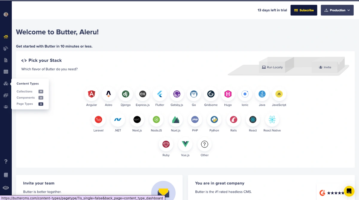
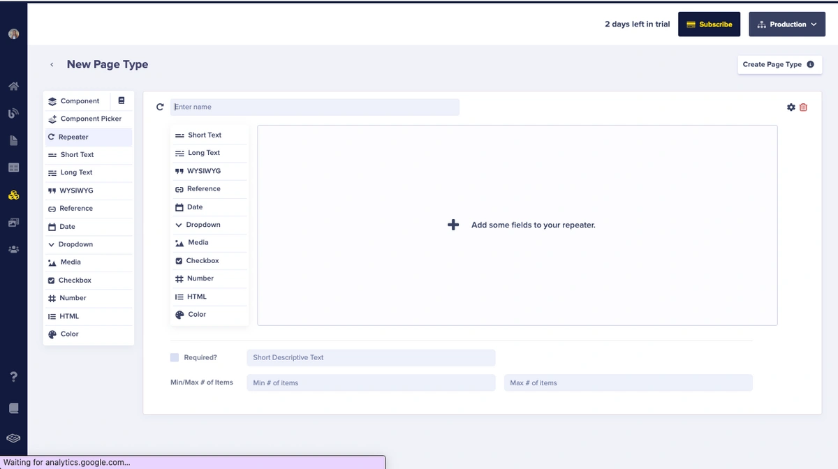
First, navigate to the Content Types tab in the side menu and find the Page Types option. Then, click on the plus “+” icon next to Page Types to proceed.
To create these sections, we'll use the Repeater field. Repeaters are a handy tool for replicating specific content sections. They enable the duplication and presentation of multiple instances of similar content blocks or sections within the information area. For instance, when there's a need to exhibit various products or services in a uniform format, repeaters come in handy.
To commence, hover over and select the Repeater field.
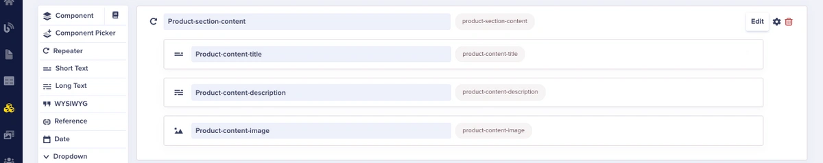
Creating the Product section
First, we will create our Product section using the repeater field we’ve just selected. We will name this repeater "Product-section-content” and add the following fields:
-
Product-content-title: [Short Text Field]
-
Product-content-description: [Long Text Field
-
Product-content-image: [Media]
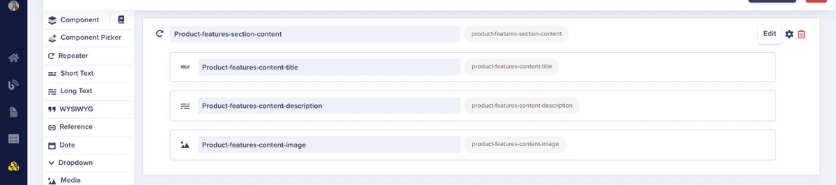
Creating the Product Features section
Next, we will build the Key Features Overview section, add another repeater field, and name it "Product-features-section-content”. Add the following fields to it:
-
Product-features-content-title: [Short Text Field]
-
Product-features-content-description: [Long Text Field]
-
Product-features-content-image: [Media]
Creating the Core Features Section
Lastly, we will build the Core Functionality section. Add another repeater field and name it "Core-features-section-content". Add the following fields:
-
Core-features-content-title: [Short Text Field]
-
Core-features-content-description: [Long Text Field]
-
Core-features-content-image: [Media]
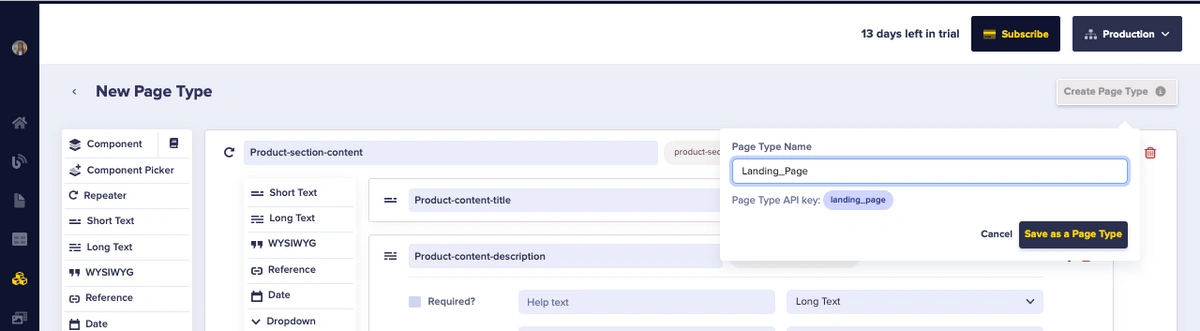
Next, we save this page as a “Landing_Page” page type.
This structured setup ensures consistency in the naming and inclusion of essential fields for each repeater, making it clear and organized for content creators to input data for each section.
Adding content to the Landing Page
To add content to our Landing Page, access the Pages section in the menu and select the Landing_Page option by clicking on the “+” icon. This will create a new page using the Landing Page page type schema. After landing on the page, you will be directed to input metadata information.
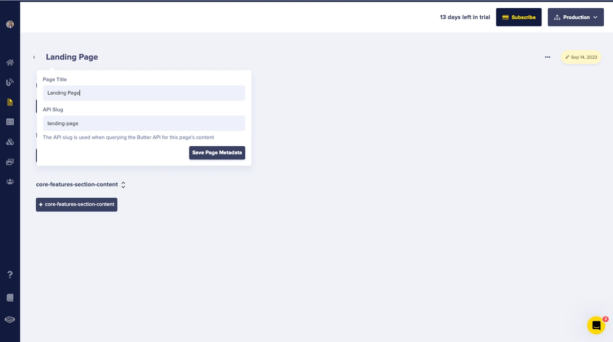
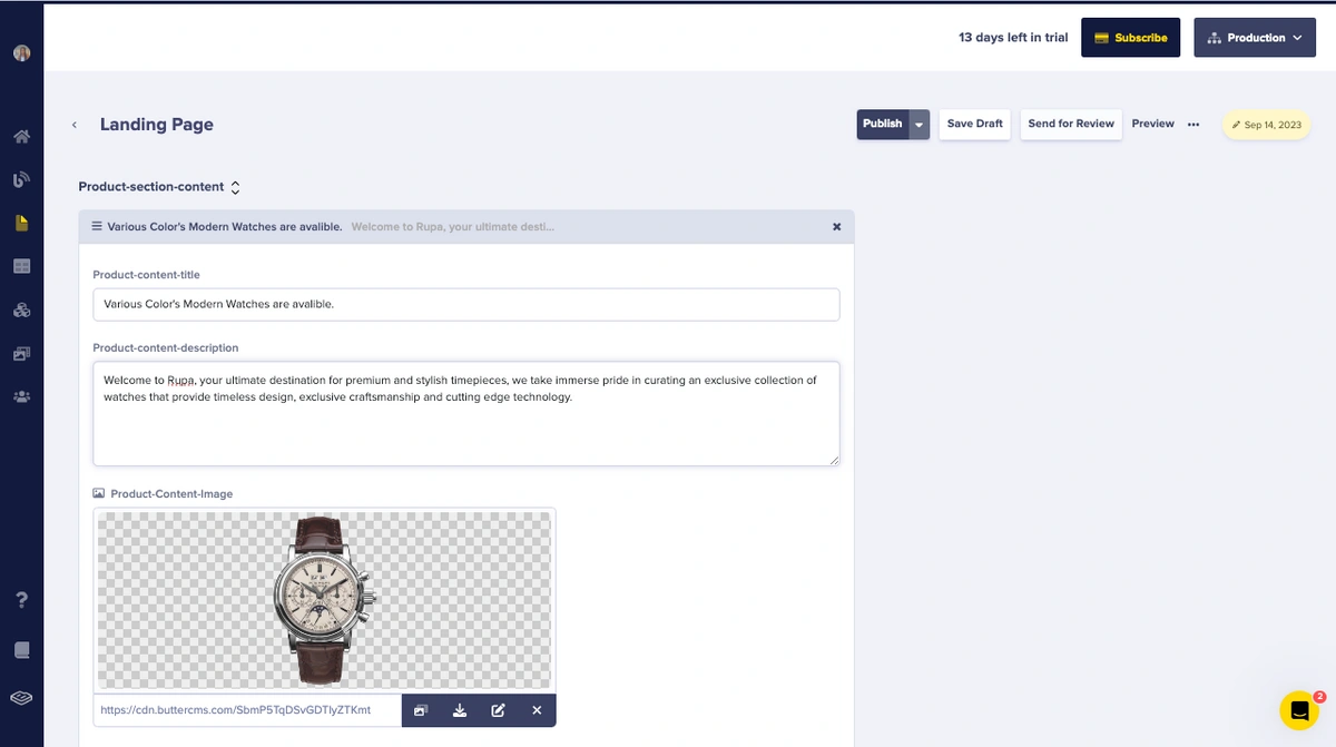
First, let’s add an item to our Product-section-content repeater. Select the + product-section-repeater button
Next, fill in the contents in the fields provided.
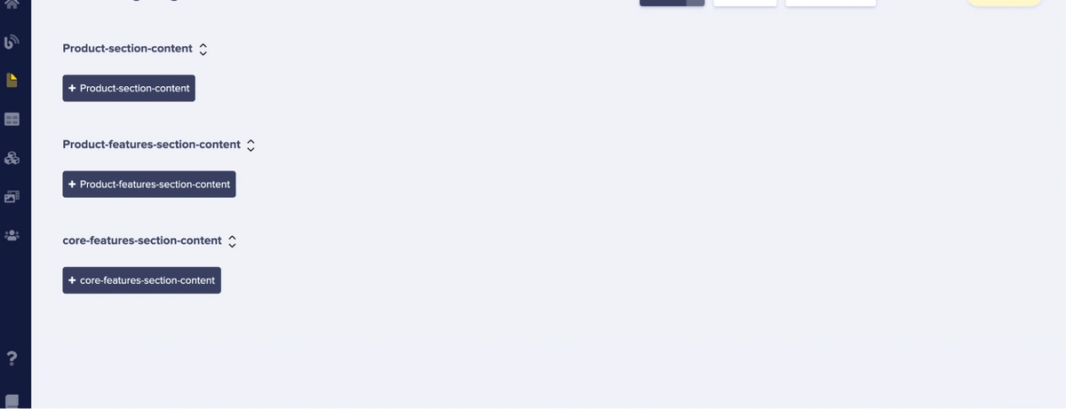
To add another item to this section, click on +Product-section-content and fill in the details of the content you want to add.
Next, let's add a product feature by entering the content within the "Product-features-section-content" repeater.
First, click on the + Product-features-section-content and fill in the contents in the fields provided.
To add another item to this section, click on + Product-features-section-content and fill in the details of the content you want to add.
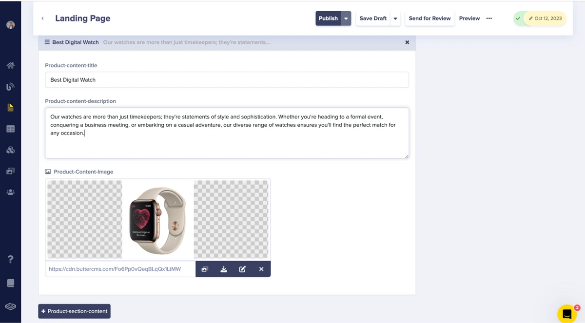
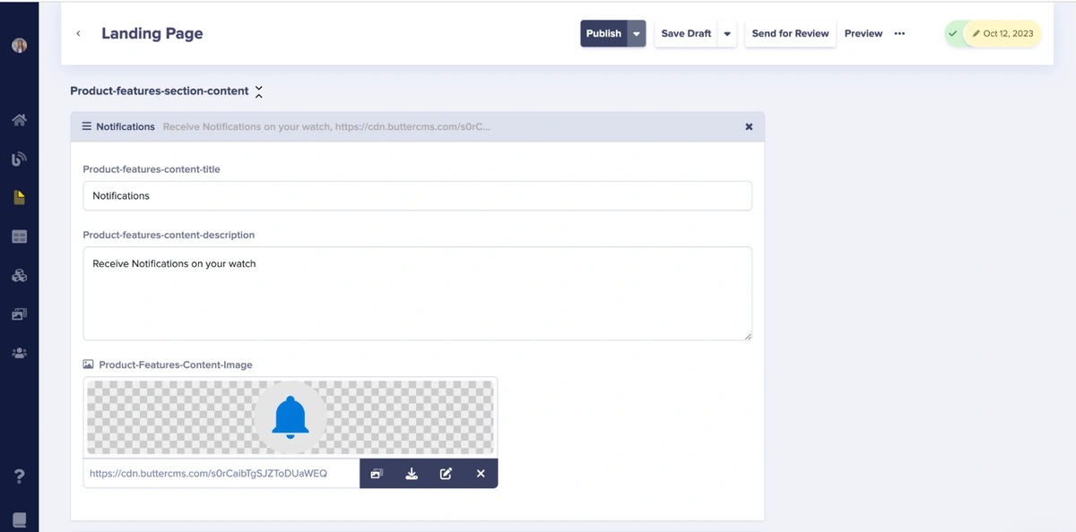
For this tutorial, we will add five items. Now, we will add the second item for this section.
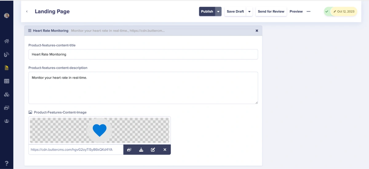
Now let’s add the third item, following the steps mentioned above.
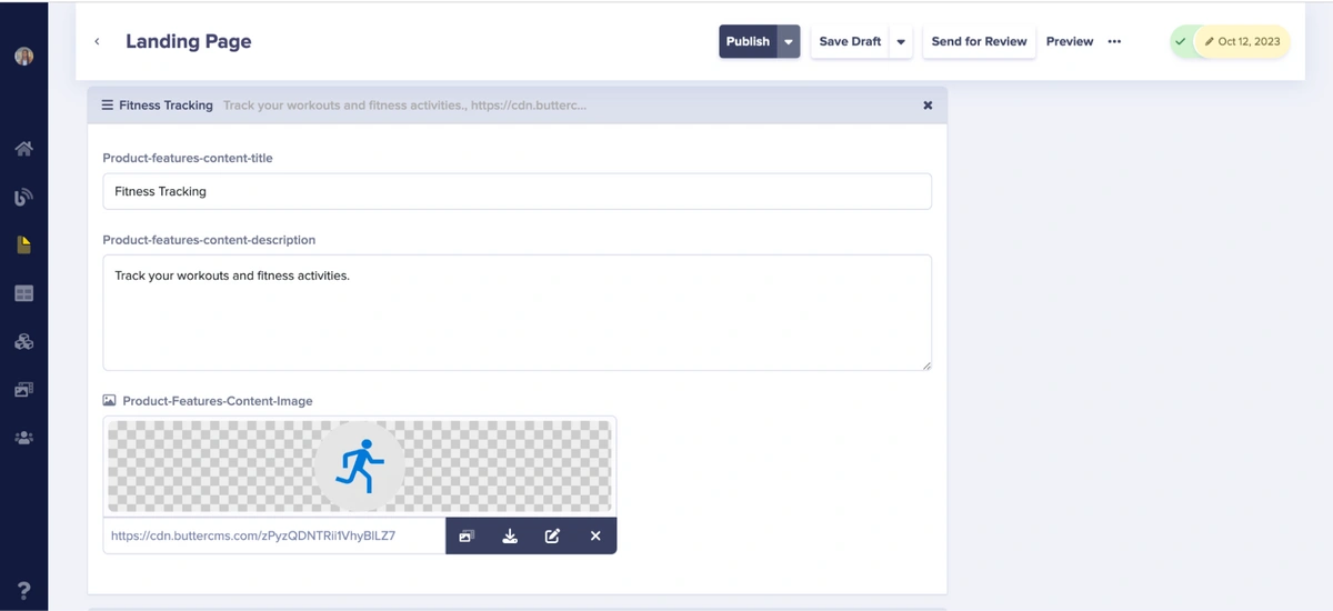
Next, we’ll add the fourth item in this section
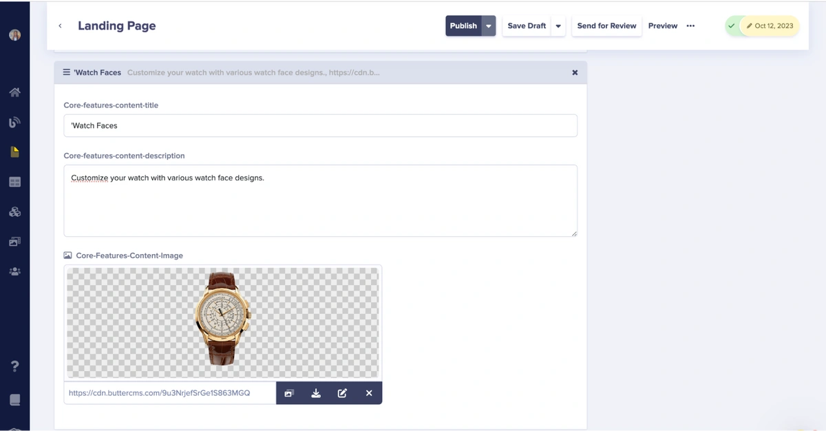
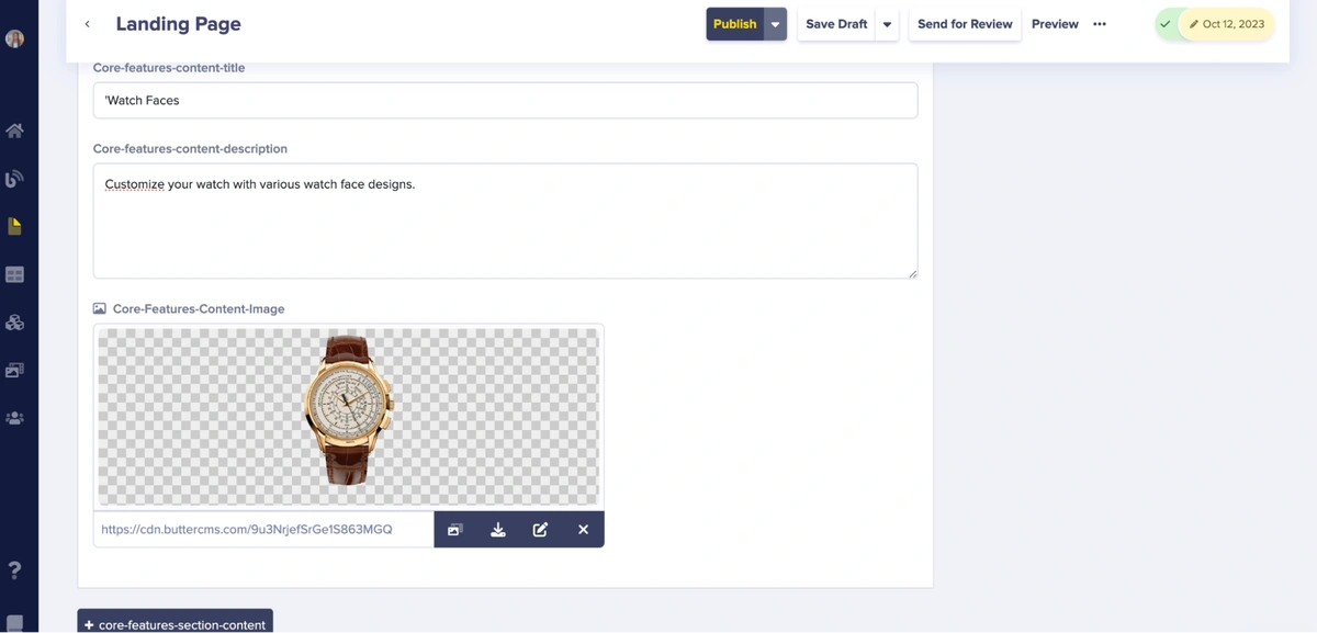
Next, let's add the core feature of the product by entering the contents within the "core-features-section-content" repeater. We will be adding five items here as well.
First, click on the + core-features-section-content and fill in the contents in the fields provided.
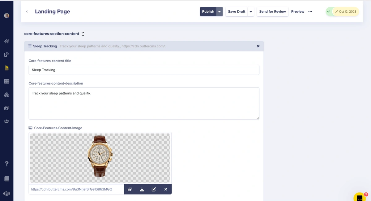
To add another item in this section, click on the + core-features-section-content and fill in the contents in the fields provided, just like we have done above.
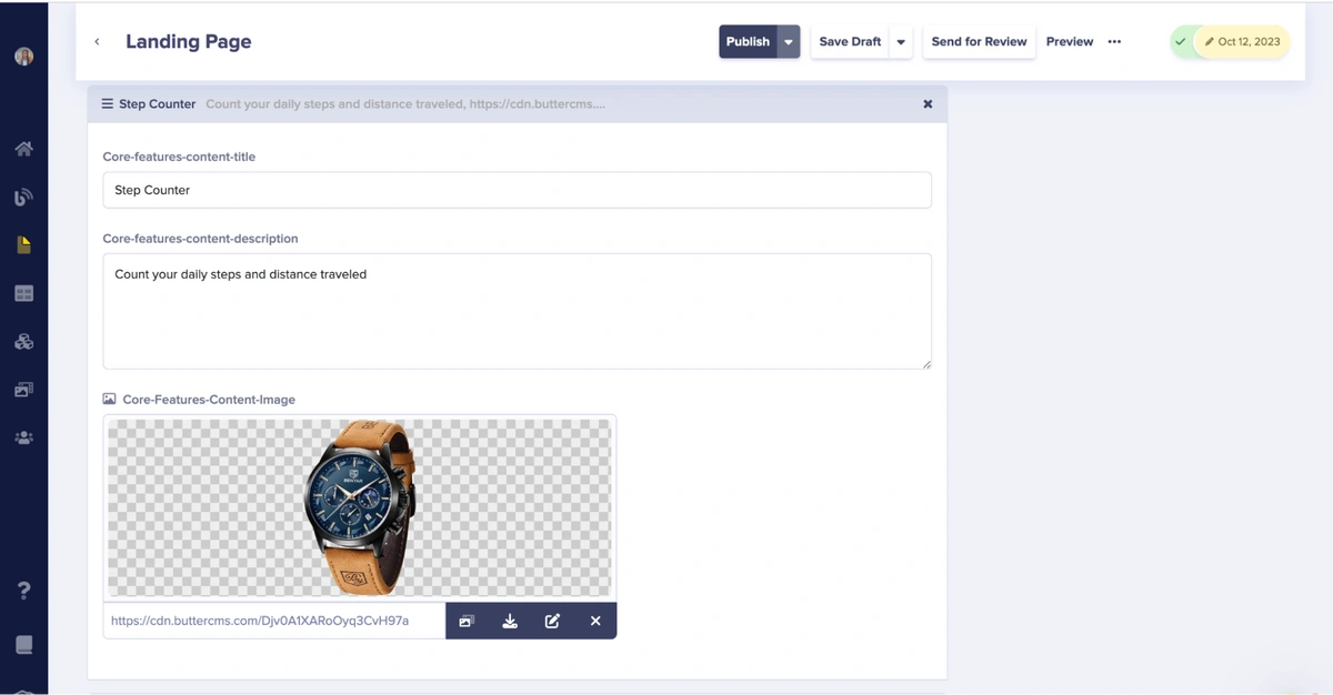
Now, we’ll add the next item in this section by following the steps mentioned above.
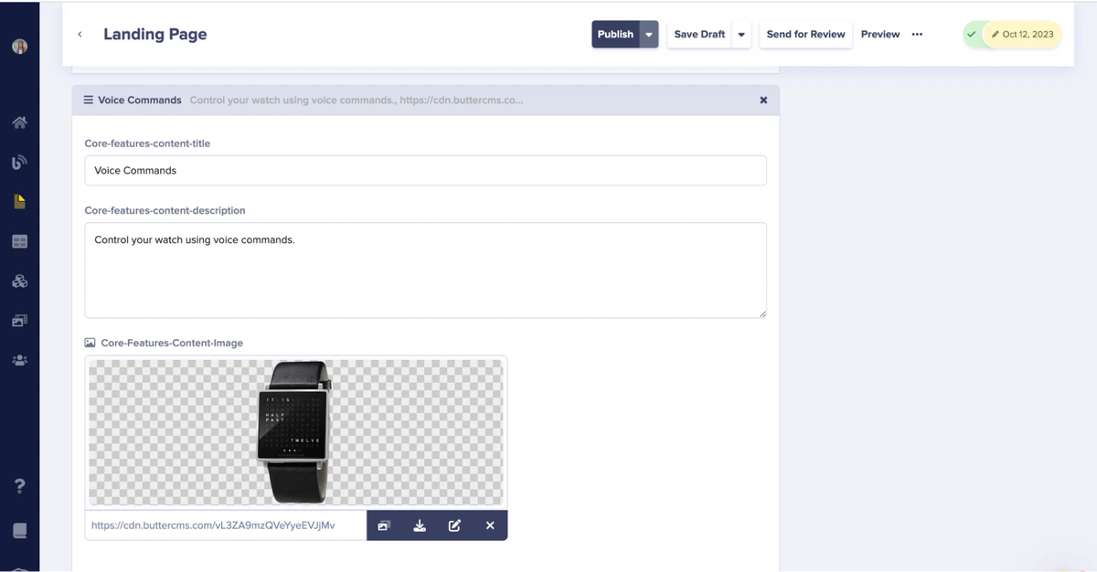
Next, we’ll add the fourth item.
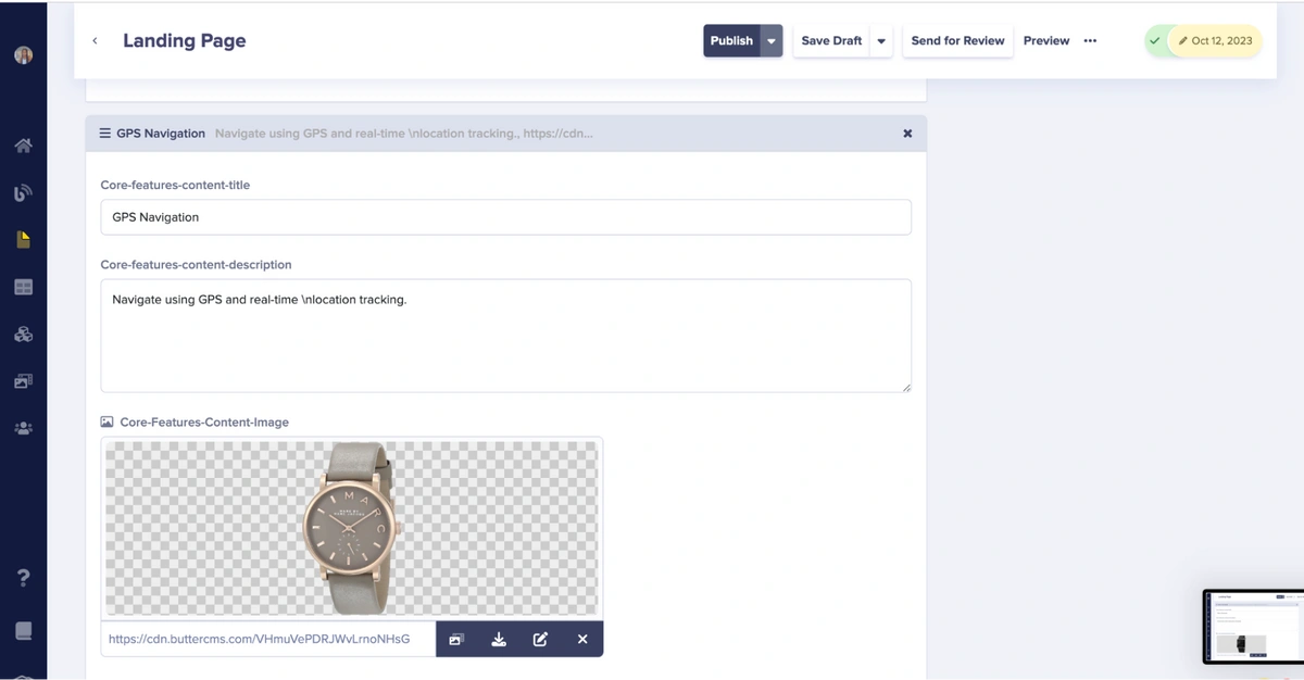
Last, we’ll add the fifth item.
Finally, click the Publish button to validate and publish the content you have added so far.
(NOTE: To add more content, simply click the + sign of the section you're interested in and proceed to fill in the details." )
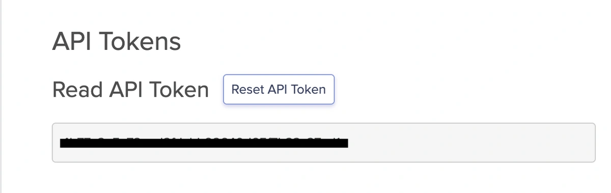
Obtain an API Key from ButterCMS
To obtain your API keys on your Dashboard, navigate to the Avatar icon and click on Settings.

Here, you will locate both the Read and Write API tokens. Copy the Read API token, as we will utilize it to retrieve content from ButterCMS.
Kotlin development environment setup
Before you start building mobile apps using Kotlin, you need to set up your development environment. This typically involves installing the necessary software tools, such as Android Studio, which provides an integrated development environment for Android app development with Kotlin.
Project Directory creation
For the purpose of developing the dynamic landing page, you'll create a dedicated project directory. This directory will house all the files and resources related to your mobile app's landing page development. Here’s an example of our project directory:
│   │   │   │   │   │   │   ├── ContentModel.kt
│   │   │   │   ├── res/
│   │   │   │   │   ├── layout/
│   │   │   │   │   │   ├── activity_main.xml
│   │   │   │   │   │   ├── fragment_landing_page.xml
│   │   │   │   ├── assets/
│   │   │   │   ├── res/
│   │   │   │   │   ├── drawable/
│   │   │   │   │   ├── values/
├── build.gradle
├── settings.gradle
Building the base landing page with Kotlin
First, we'll set up the foundational components of your app's landing page. This involves creating the basic structure of the page, including defining layout elements like containers, text views, images, buttons, and any other user interface elements that are part of the landing page design.
Building the product card
This refers to the process of designing and implementing a visual component on the landing page that showcases a product. This card would include details such as product name, description and image.
import androidx.compose.foundation.layout.
import androidx.compose.foundation.text.BasicTextField
import androidx.compose.runtime.Composable
import androidx.compose.ui.Modifier
import androidx.compose.ui.graphics.Color
import androidx.compose.ui.text.font.FontWeight
import androidx.compose.ui.tooling.preview.Preview
import androidx.compose.ui.unit.dp
import androidx.compose.ui.unit.sp
import com.example.ui.theme.BlackColor
import com.example.ui.theme.GrayColor
import com.example.ui.theme.WhiteColor
import com.google.accompanist.compose.font.Font
import com.google.accompanist.compose.font.toFontFamily

@Composable
fun buildIntoName(title: String, desc: String) {
    Box(
        modifier = Modifier
            .fillMaxWidth()
            .height(280.dp)
            .background(WhiteColor),
    ) {
        Column(
            modifier = Modifier
                .padding(top = 15.dp, start = 10.dp, end = 10.dp)
                .fillMaxSize(),
            verticalArrangement = Arrangement.Center,
            horizontalAlignment = Alignment.Start
        ) {
            BasicTextField(
                value = title,
                textStyle = TextStyle(
                    fontWeight = FontWeight.W800,
                    fontSize = 25.sp,
                    color = BlackColor.toComposeColor()
                ),
                onValueChange = {},
                modifier = Modifier.paddingFromBaseline(top = 15.dp)
            )
            BasicTextField(
                value = desc,
                textStyle = TextStyle(
                    fontWeight = FontWeight.W800,
                    fontSize = 14.sp,
                    color = GrayColor.toComposeColor()
                ),
                onValueChange = {},
                modifier = Modifier.paddingFromBaseline(top = 10.dp)
            )
            Spacer(modifier = Modifier.height(10.dp))
            buyNowBtn(txt = "Buy Now")
        }
    }
}

@Preview
@Composable
fun PreviewBuildIntoName() {
    buildIntoName(title = "Title Text", desc = "Description Text")
}
Building the Product Features card
This refers to the process of designing and implementing a visual component on the landing page that highlights the key features of a product. This card typically includes concise descriptions or bullet points outlining the unique selling points or functionalities of the product. The guide will likely provide step-by-step instructions to create and style this card using Kotlin, a programming language, in conjunction with ButterCMS for content management.
Building the data class
Data Class here, refers to the process of creating a class in Kotlin that is specifically designed to hold and manage data related to the Product Features being displayed on the landing page.
This class will define the structure and properties of the data, such as product name, description, and image URLs. By creating a data class, you can efficiently manage and manipulate this information within your Kotlin code. The guide may provide specific instructions to create and utilize this data class in conjunction with ButterCMS for content management.
import androidx.compose.material.icons.Icons
import androidx.compose.ui.graphics.vector.ImageVector

data class FeatureModel(
    val featureName: String,
    val icon: ImageVector,
    val featureDesc: String
)
Building the UI
This is the process of designing and constructing the User Interface (UI) elements that will be displayed on the landing page.
This step involves using Kotlin along with various JetPack components and layouts to create the visual representation of the landing page. It includes tasks like arranging buttons, text fields, images, and other interactive elements in a way that is aesthetically pleasing and user-friendly.
import androidx.compose.foundation.background
import androidx.compose.foundation.layout.
import androidx.compose.foundation.lazy.LazyColumn
import androidx.compose.foundation.lazy.items
import androidx.compose.foundation.lazy.rememberLazyListState
import androidx.compose.material.MaterialTheme
import androidx.compose.material3.MaterialTheme
import androidx.compose.material3.Surface
import androidx.compose.runtime.Composable
import androidx.compose.ui.Alignment
import androidx.compose.ui.Modifier
import androidx.compose.ui.graphics.Color
import androidx.compose.ui.text.font.FontWeight
import androidx.compose.ui.tooling.preview.Preview
import androidx.compose.ui.unit.dp
import androidx.compose.ui.unit.sp
import com.example.ui.theme.BlackColor
import com.example.ui.theme.BlueColor
import com.example.ui.theme.GreyColor
import com.example.ui.theme.WhiteColor
import com.google.accompanist.compose.font.toFontFamily
import com.google.accompanist.compose.icons.Icons
import com.google.accompanist.compose.icons.filled.Circle
import com.google.accompanist.compose.material3.MaterialTheme
import com.google.accompanist.compose.material3.Surface

data class FeatureModel(
    val featureName: String,
    val icon: ImageVector,
    val featureDesc: String
)

@Composable
fun ProductFeatures(features: List<FeatureModel>) {
    val listState = rememberLazyListState()

    Surface(
        modifier = Modifier
            .fillMaxSize()
            .background(GreyColor.toComposeColor())
    ) {
        LazyColumn(state = listState) {
            item {
                Text(
                    text = "Product Features",
                    style = MaterialTheme.typography.h5.copy(
                        fontWeight = FontWeight.Bold,
                        color = BlackColor.toComposeColor()
                    ),
                    modifier = Modifier
                        .padding(top = 35.dp, start = 10.dp, end = 10.dp)
                        .fillMaxWidth(),
                    textAlign = TextAlign.Center
                )
                Text(
                    text = "Explore our premium feel features from our brand's luxurious men's wrist watches.",
                    style = MaterialTheme.typography.subtitle1.copy(
                        fontWeight = FontWeight.Bold,
                        color = BlackColor.toComposeColor().copy(alpha = 0.5f)
                    ),
                    modifier = Modifier
                        .padding(top = 10.dp, start = 10.dp, end = 10.dp, bottom = 35.dp)
                        .fillMaxWidth(),
                    textAlign = TextAlign.Center
                )
            }
            items(features) { feature ->
                Column(
                    modifier = Modifier
                        .padding(horizontal = 12.dp, vertical = 12.dp)
                        .fillMaxWidth()
                ) {
                    Box(
                        contentAlignment = Alignment.Center,
                        modifier = Modifier
                            .size(250.dp)
                            .background(WhiteColor.toComposeColor())
                    ) {
                        Icon(
                            imageVector = feature.icon,
                            contentDescription = null,
                            tint = GreyColor.toComposeColor(),
                            modifier = Modifier.size(70.dp)
                        )
                        Column(
                            modifier = Modifier
                                .align(Alignment.Center)
                                .padding(top = 20.dp)
                        ) {
                            Text(
                                text = feature.featureName,
                                style = MaterialTheme.typography.h6.copy(
                                    fontWeight = FontWeight.Bold,
                                    color = BlueColor.toComposeColor()
                                ),
                                textAlign = TextAlign.Center
                            )
                            Text(
                                text = feature.featureDesc,
                                style = MaterialTheme.typography.caption.copy(
                                    fontWeight = FontWeight.Bold,
                                    color = BlackColor.toComposeColor()
                                ),
                                textAlign = TextAlign.Center,
                                modifier = Modifier.padding(top = 20.dp)
                            )
                        }
                    }
                }
            }
        }
    }
}

@Preview
@Composable
fun PreviewProductFeatures() {
    val features = listOf(
        FeatureModel("Feature 1", Icons.Default.Circle, "Description 1"),
        FeatureModel("Feature 2", Icons.Default.Circle, "Description 2"),
        FeatureModel("Feature 3", Icons.Default.Circle, "Description 3")
    )
    ProductFeatures(features)
}
Building the Core Features card
This involves the process of designing and implementing a visual component on the landing page that emphasizes the essential features of a product or service.
This card should showcase the key functionalities or attributes that set the product apart. It may include concise descriptions, icons, or graphics representing these core features.
Building the data class
This data class would likely be used to structure and organize information related to the Core Features card displayed on the landing page.
This data class may also be used to interact with the content management system, facilitating the retrieval and utilization of content for display on the landing page.
import androidx.compose.ui.graphics.vector.ImageVector

data class CoreFeatureModel(
    val featureName: String,
    val icon: ImageVector,
    val featureDesc: String,
    val imgPath: String
)
Building the UI
This simply means designing and constructing the visual elements and layout that users will interact with on the landing page.Jetpack UI components and layouts are used to create a visually appealing and user-friendly interface. Tasks may include arranging buttons, text fields, images, and other interactive elements in a way that provides a seamless and intuitive user experience.
import androidx.compose.foundation.background
import androidx.compose.foundation.layout.
import androidx.compose.foundation.lazy.LazyColumn
import androidx.compose.foundation.lazy.items
import androidx.compose.material3.MaterialTheme
import androidx.compose.runtime.Composable
import androidx.compose.ui.Alignment
import androidx.compose.ui.Modifier
import androidx.compose.ui.graphics.Color
import androidx.compose.ui.res.painterResource
import androidx.compose.ui.text.font.FontWeight
import androidx.compose.ui.tooling.preview.Preview
import androidx.compose.ui.unit.dp
import androidx.compose.ui.unit.sp
import com.example.ui.theme.BlackColor
import com.example.ui.theme.BlueColor
import com.example.ui.theme.WhiteColor
import com.google.accompanist.compose.material3.MaterialTheme
import com.google.accompanist.compose.material3.Surface

data class CoreFeatureModel(
    val featureName: String,
    val icon: ImageVector,
    val featureDesc: String,
    val imgPath: Int // R.drawable resource ID
)

@Composable
fun CoreFeatures(coreFeatures: List<CoreFeatureModel>) {
    Surface(
        modifier = Modifier
            .fillMaxSize()
            .background(WhiteColor.toComposeColor())
    ) {
        LazyColumn {
            item {
                Text(
                    text = "Core Features",
                    style = MaterialTheme.typography.h5.copy(
                        fontWeight = FontWeight.Bold,
                        color = Color.LightBlue.copy(alpha = 0.9f)
                    ),
                    modifier = Modifier
                        .padding(top = 35.dp, start = 10.dp, end = 10.dp)
                        .fillMaxWidth(),
                    textAlign = TextAlign.Center
                )
                Text(
                    text = "Core premium feel features from our brand's luxurious men's wrist watches.",
                    style = MaterialTheme.typography.subtitle1.copy(
                        fontWeight = FontWeight.Bold,
                        color = BlackColor.toComposeColor()
                    ),
                    modifier = Modifier
                        .padding(top = 10.dp, start = 10.dp, end = 10.dp, bottom = 35.dp)
                        .fillMaxWidth(),
                    textAlign = TextAlign.Center
                )
            }
            items(coreFeatures) { feature ->
                Column(
                    modifier = Modifier
                        .padding(horizontal = 12.dp, vertical = 12.dp)
                        .fillMaxWidth()
                ) {
                    Box(
                        contentAlignment = Alignment.Center,
                        modifier = Modifier
                            .fillMaxSize()
                            .background(BlueColor.toComposeColor())
                    ) {
                        Row(
                            modifier = Modifier.fillMaxSize(),
                            horizontalArrangement = Arrangement.spacedBy(8.dp),
                            verticalAlignment = Alignment.CenterVertically
                        ) {
                            Image(
                                painter = painterResource(id = feature.imgPath),
                                contentDescription = null,
                                modifier = Modifier.size(220.dp)
                            )
                            Column(
                                modifier = Modifier.fillMaxHeight(),
                                horizontalAlignment = Alignment.End
                            ) {
                                Icon(
                                    imageVector = feature.icon,
                                    contentDescription = null,
                                    tint = WhiteColor.toComposeColor(),
                                    modifier = Modifier.size(70.dp)
                                )
                                Text(
                                    text = feature.featureName,
                                    style = MaterialTheme.typography.h6.copy(
                                        fontWeight = FontWeight.Bold,
                                        color = WhiteColor.toComposeColor()
                                    ),
                                    textAlign = TextAlign.End,
                                    modifier = Modifier.padding(top = 20.dp)
                                )
                                Text(
                                    text = feature.featureDesc,
                                    style = MaterialTheme.typography.caption.copy(
                                        fontWeight = FontWeight.Bold,
                                        color = BlackColor.toComposeColor()
                                    ),
                                    textAlign = TextAlign.End,
                                    modifier = Modifier.padding(top = 20.dp)
                                )
                            }
                        }
                    }
                }
            }
        }
    }
}

@Preview
@Composable
fun PreviewCoreFeatures() {
    val coreFeatures = listOf(
        CoreFeatureModel("Feature 1", Icons.Default.Circle, "Description 1", R.drawable.image1),
        CoreFeatureModel("Feature 2", Icons.Default.Circle, "Description 2", R.drawable.image2),
        CoreFeatureModel("Feature 3", Icons.Default.Circle, "Description 3", R.drawable.image3)
    )
    CoreFeatures(coreFeatures)
}
Integrating Kotlin with Gradle:
Gradle is a build tool commonly used in Android app development. It helps manage dependencies, compile code, and package the app for distribution. To integrate Kotlin into your app project, you'll need to configure Gradle to include the necessary Kotlin libraries and plugins.
To achieve this in our project, in your application's 'build.gradle' level, add Retrofit and the required dependencies:
dependencies 'com.squareup.retrofit2:retrofit:2.9.0'
dependencies 'com.squareup.retrofit2:converter-gson:2.9.0'
Initializing ButterCMS SDK
To retrieve content from ButterCMS, we’ll integrate its SDK into your app. This involves importing the ButterCMS SDK into our project and initializing it with the API credentials we obtained earlier. This initialization allows your app to interact with ButterCMS's services.
First, define an interface to represent the ButterCMS API endpoint.
interface ButterCmsApiService {
    @GET("YOUR_ENDPOINT")
    suspend fun getBlogPosts(
        @Query("auth_token") authToken: String
    ): Response<List<BlogPost>>
}
Second, create a Retrofit instance and configure it with the ButterCMS base URL.
val authToken = "your_auth_token"
val retrofit = Retrofit.Builder()
    .baseUrl("https://api.buttercms.com/v2/")
    .addConverterFactory(GsonConverterFactory.create())
    .build()

val butterCmsApiService = retrofit.create(ButterCmsApiService::class.java)

// Make the API call using the defined methods in the 'ButterCmsApiService' // interface
Finally, implement the appropriate error and data handling logic based on your application code.
Note: You need to include an API key to access the ButterCMS API for authentication.
If you're using a different JSON converter library or format, adjust the converter factory accordingly.
Displaying the static content:
With the ButterCMS SDK integrated and initialized, we'll be able to fetch static content from the CMS and display it on our app's landing page. This would involve making API requests to ButterCMS and populating your UI components with the fetched content.
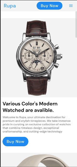
Congratulations on advancing through this tutorial! If you've correctly followed the instructions, your landing page should resemble the GIF shown below:
You have now built a Landing Page application with Kotlin and ButterCMS. If you want to add additional content, you can go back to your ButterCMS dashboard and create more pages with different content.
Final thoughts
Kotlin and ButterCMS are powerful tools for building modern, dynamic applications. This tutorial has shown how they can work together to create a seamless content management experience. By leveraging the strengths of Kotlin and ButterCMS, you can create applications that are easy to build, maintain, and scale.
This tutorial has only scratched the surface of what Kotlin and ButterCMS can do. We encourage you to continue learning about both topics and exploring how they can be used to create powerful, dynamic applications.
Here are some resources that you may find helpful:
