
“What we measure, we improve” - a maxim of growth-focused management. This rule applies to every aspect of life and work, where effort is expected to create growth and progress.
An e-commerce business looking to improve visitor engagement and conversion rates would need tools to identify visitors' hotspots and dropoff points on their website. Monitoring visitor activity allows for the collection of essential data, enabling a deeper understanding of areas requiring enhancement to achieve objectives. After the data has been collected, it should be represented in a graphical format for easy understanding and presentation.
Data visualization makes it easy for people to interact and better understand data. Whether simple or complex, the right visualization can communicate the same information to everyone, regardless of their level of expertise.
According to a yearly survey of over 70,000 developers by Stack Overflow Trends, ReactJS is the most popular front-end programming language among developers. ReactJS supports several web analytics tools. In 2026, many of these tools offer event-driven tracking and AI-powered insights, which makes ReactJS a strong choice for building interactive and data-heavy dashboards.
Below, we'll review the best React web analytics tools for tracking, collecting, and visualizing user data on React websites.
(Complementary reading: When to use React for web development)
Table of contents
Recharts: Data visualization for React JS
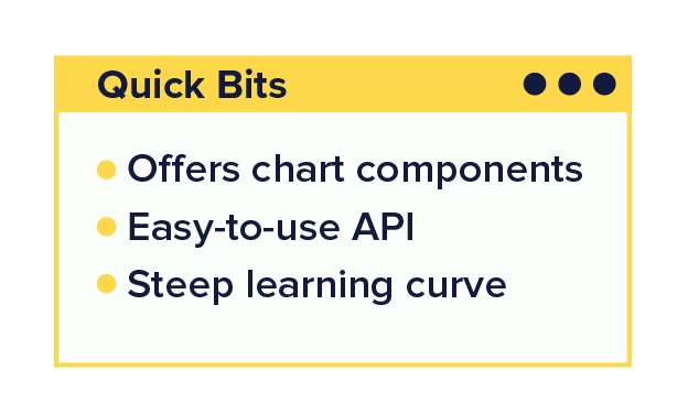
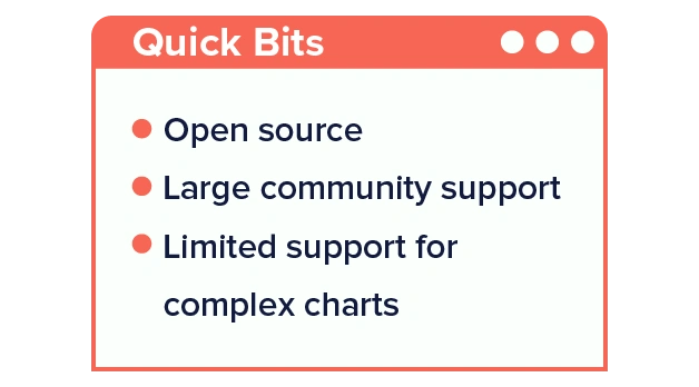
If you need custom data analytics for your React app, try Recharts. It is an open-source toolkit for component-based charts designed to work with React apps. Recharts is powered by D3.js and React, making it perfect for handling large data sets and creating interactive charts.
Pros
-
Easy to use API.
-
Combines React's simplicity and D3.js power. D3 is a Javascript library used to create custom, interactive charts. It is capable of handling large datasets and supports transitions between animated chart states.
-
The charts can be created with customization and can be reused.
Cons
-
Requires technical knowledge: Recharts is a ReactJS chart library for analytics, making it a technical tool for developers who work with the React library.
-
Limited animation support: Recharts only supports basic animation.
Pricing: Free for life
Best for: React web and React app analytics. Users can easily integrate Recharts on their website or mobile to visualize data.
Pro tip: Leveraging Recharts's modular architecture is beneficial when working with it. This allows you to import only the necessary components, minimizing bundle size and improving performance.
How to get started: Visit https://recharts.org/en-US/examples to read the documentation and live code examples of Recharts. This should get you started well.
Airbnb's Visx: Custom charts in React apps
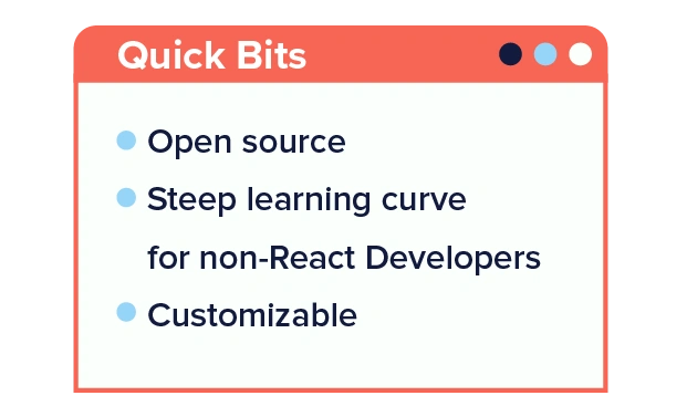
Next on our list of the best analytics tools for React is Airbnb's Visx. It is a powerful library for custom data analytics that supports various visualization formats, including bar, line, area, and pie charts.
Visx is built for React, so it seamlessly integrates with React applications. Its architecture aligns with React's component-based approach, allowing developers to leverage React's state management and lifecycle methods for building dynamic and interactive visualizations.
Pros
-
Extensive customization options
-
Supports responsive design
-
Seamless integration with React applications
Cons
-
Steep learning curve for non-React developers. Visx builds on React DOM, React component handling, and D3's power, making it a powerful tool for web data visualization. However, these features can only be used by React developers.
-
Limited documentation for advanced customization scenarios
Pricing: Airbnb's Visx is a free, open-source React analytics library, which makes it attractive to developers and organizations of all sizes.
Best for: Visx suits developers and teams looking to build custom data visualizations within React applications. It can handle large data sets and create interactive visualizations.
Pro tip: If you want to display multiple charts for comparison, create different data providers for each. The data provider collects all of the data from child series and computing scales, so if charts share this, they will all have the same scale (unless the scale config is overwritten with an explicit domain specifying). Here is the code documentation for this Visx Pro tip.
How to get started: Install Visx in your React project using npm or yarn:
npm install --save @visx/mock-data @visx/group @visx/shape @visx/scaleImport the desired visualization components from Visx into your React components.
import React from “react”
import { Bar, Line, Pie } from '@visx/shape';
Use the imported components to create custom data visualizations by passing your data and configuring the visualization properties.
Google Analytics: Tracking React website performance
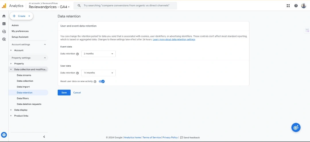
Currently, in its fourth version, Google Analytics 4 (GA4) is a powerful analytics tool with features to track tens of event parameters. GA4 uses machine learning to track users across web platforms and mobile devices, providing deep insight into user behavior. It is built with privacy in mind and receives regular updates to meet privacy law changes.
Being powered by Google, GA4 interfaces with other relevant Google products, like Firebase, by default and supports integration with external tools such as A/B Tasty and Optimizely. GA4 tracks cross-platform activities across web and mobile. It supports React applications and can track user activity across a React website and mobile app. So, if you need analytics for a React app without any add-on cost, try Google Analytics 4.
Pros
-
Free to use for small businesses
-
Supports event-based tracking
-
Supports tracking of single-page apps (one-pagers)
Cons
-
Steep learning curve: New users would have to spend quality time learning the features of Google Analytics 4 because it is markedly different from the Universal Analytics interface and standard report style.
-
Limited data views in the freemium version: Users must pay for the premium service to render data in several views.
Pricing: GA4 has a lifetime free version and a paid enterprise version. GA4 360 follows a usage-based pricing model. Although Google does not publicize its pricing criteria, the paid service reportedly starts from $50,000 per year with additional usage-based fees.
Best for: GA4 integrates with all websites and applications built with React, making it suitable for apps of any scale, including blogs, e-commerce sites, SMEs, and enterprises.
Pro tip: Google Analytics 4 allows you to track your React webs and app user metrics as a single property. This feature makes it easy for marketing teams to track usage from a single dashboard.
How to get started: First, you need Gmail to access all Google products. Visit gmail.com to get a Google email if you don't have one. Once your email is opened, enter https://analytics.google.com/ in your browser to access the tool.
(Read more: A complete guide on how to set up React Firebase analytics)
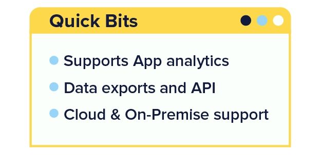
Matomo (formerly Piwik): Open-source analytics for React apps
As an open-source cloud and on-premise tool, Matomo gives users complete control over their data, allowing them to host it on their servers and comply with privacy regulations such as GDPR.
One of Matomo's key strengths is its flexibility and customization options. Users can configure the tool to track specific metrics, such as marketing attribution, website visits, or goal conversions. Matomo also offers detailed performance metrics for each page view. Matomo's media analytics lets you know how your videos are being watched and their impact on conversions.
The platform integrates with Reactjs websites. To use it on your website, you need to install a Javascript code snippet. Once installed, you can track user metrics in real-time, build a data dashboard, and generate detailed reports.
Pros
-
Complete data ownership and privacy control
-
Real-time tracking for immediate insights
-
Open-source flexibility for customization
Cons
-
It has a crowded dashboard and doesn't offer a helpful explainer video compared to other no-code analytics tools on this list. This issue is a UI/UX flaw. Depending on your experience with analytic tools, it may take some time to navigate the platform and use it effectively.
-
Requires maintenance and regular updates for optimal performance
Pricing: Matomo offers a self-hosted open-source version and a cloud-hosted version. The self-hosted version is free; however, add-on services like funnel building are charged separately. Matomo's cloud-hosted version offers various pricing plans, starting from $26 per month.
Best for: Businesses with multi-platform presences (Mobile app & web).
Pro tip: Matomo's cloud-based version is an integrated marketing manager with A/B testing, funnel building, conversion tracking, Ads, and SEO tracking capabilities. You can use these features to understand your visitors and optimize your website for conversion.
How to get started:
-
Choose between the on-premise or cloud-hosted version based on your preferences and requirements.
-
If you choose the on-premise version, visit https://matomo.org/download/ to install Matomo. Cloud users will have to integrate Matomo's JavaScript tracking code into their website or application before using it.
Looking to apply powerful tools like Matomo to your own projects? Learn how to build a blog from scratch using React in our comprehensive tutorial and start tracking your content's performance with ease.
66Analytics: Self-hosted analytics for React
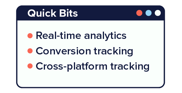
66analytics offers features such as real-time analytics, conversion tracking, heat maps, session recordings, and data ownership. This data visualization tool gives you a complete picture of your product—everything that marketing, UX, or product management teams ask for.
66analytics allows users to store collected data on their servers. This is an impressive data integrity feature, but it means you're fully responsible for your data integrity. ReactJS websites and React Native apps can run 66analytics through a Javascript integration.
Pros
-
Simple and intuitive interface for easy navigation
-
Real-time tracking for instant insights
-
Lightweight tracking script for minimal impact on website performance
Cons
-
Limited advanced features compared to more robust analytics platforms
-
Lack of customization options for reports and dashboards
Pricing: 66analytics offers a free version for users to test the platform's features before committing to a subscription. The base plan costs $4.99 per month and $50 per year.
Best for: Any business looking for one complete solution that focuses on privacy.
Pro tip: It doesn't require any deployments, and you still own your data, which you can completely wipe out when you want.
How to get started: Sign up for a 66analytics account, select a subscription plan, and enter your dashboard. Click the "add website button" to provide your website details, choose a tracking mode, and generate a tracking code. The tracking code must be inserted into your website's HTML structure to collect visitor data and display it on your 66analytics dashboard.
(Also read: A comprehensive guide on Angular vs. React)

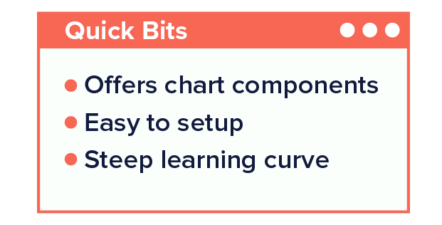
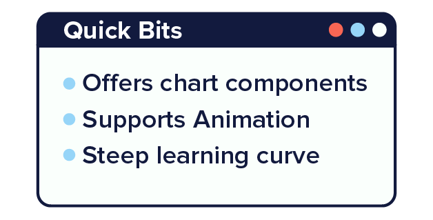
Nivo: Interactive data visualization in React JS
Nivo is an efficient React analytics library with server-side chart rendering capabilities. It can generate responsive bar, line, and pie charts using pure HTML, SVG, and Canvas.
Nivo is a React data visualization library that works perfectly with React applications. It can seamlessly generate dynamic and interactive React data analytics.
Pros
-
Wide range of customizable chart components
-
Built-in support for animations and interactivity
-
Responsive design for optimal viewing on various devices
Cons
-
Huge learning curve for beginners, especially those new to React. You need knowledge of React and how to use the Nivo library for data visualization.
-
Limited responsiveness due to a code flaw. Nivo has an infinite growing diagram issue, which makes it difficult to manage the size of charts on display.
Pricing: Nivo is an open-source D3 and React analytics library available for free under the MIT License. No licensing fees or subscription costs are associated with using Nivo in your projects.
Best for: It's ideal for projects that require a high degree of customization and interactivity in their charts and graphs.
Pro tip: Nivo has known responsiveness issues. If you ever experience the problem of an infinite growing diagram, try this auto-sizer solution.
import { AutoSizer } from 'react-virtualized'
<AutoSizer>
    {({ height, width }) => (
        <Pie
            height={height}
            width={width}
            ...
         />
    )}
</AutoSizer>
How to get started
Install Nivo in your React project using npm or yarn
Using npm
npm install @nivo/core @nivo/baUsing yarn
Yarn add @nivo/core @nivo/barImport the desired Nivo components into your React application
import { ResponsiveBar } from '@nivo/bar';

const MyBarChart = ({ data }) => (
    <div style={{ width: '400px', height: '300px' }}>
        <ResponsiveBar
            data={data}
            keys={['value']}
            indexBy="country"
            margin={{ top: 50, right: 130, bottom: 50, left: 60 }}
            padding={0.3}
            axisBottom={{
                tickSize: 5,
                tickPadding: 5,
                tickRotation: 0,
            }}
            axisLeft={{
                tickSize: 5,
                tickPadding: 5,
                tickRotation: 0,
            }}
        />
    </div>
);

export default MyBarChart;
React Chart JS 2: Lightweight data visualization
React Chart.js 2 is a React wrapper for Chart.js, a popular JavaScript library for creating dynamic and interactive charts and graphs. It seamlessly integrates Chart.js functionality into React applications, providing developers with an easy-to-use solution for data visualization.
React Chart.js 2 enables developers to create various charts and graphs, including line charts, bar charts, pie charts, radar charts, and more. It offers extensive customization options for styling, animations, tooltips, and interactivity, allowing developers to tailor the visualizations to their specific requirements.
Pros
-
Supports animation and data customization
-
Active community and extensive documentation
-
Well-established library with regular updates and improvements
Cons
-
Limited support for complex chart interactions out of the box.
-
Performance may slump with a large data set.
Pricing: React Chart.js 2 is an open-source library available for free under the MIT License. There are no licensing fees or subscription costs associated with using it in your projects.
Best for: React Chart.js 2 is ideal for projects requiring a wide range of chart types and customization options without complex setup or configuration.
Pro tip: The React Chart.js library cannot differentiate between datasets if their keys are not specified. So, you need to set keys when visualizing more than one data set. By default, the React Chart.js library utilizes the label property as the key to identify datasets. Otherwise, the library will copy one dataset to another, merging bars and lines.
How to get started: Install React Chart.js 2 and Chart.js via npm, yarn or pnpm:
Using yarn
yarn add chart.js react-chartjs-2Using pnpm
pnpm add chart.js react-chartjs-2Using npm
npm install --save chart.js react-chartjs-2Import the desired chart components into your React application:
import { Chart as ChartJS, ArcElement, Tooltip, Legend } from "chart.js";
import { Doughnut } from "react-chartjs-2";


ChartJS.register(ArcElement, Tooltip, Legend);


<Doughnut data={...} />
(Also read: React best practices)
Cube: Headless analytics API for React apps
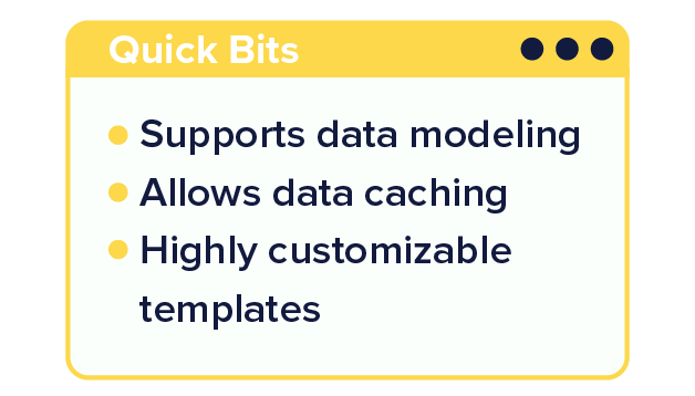
Cube is a headless business intelligence tool for building analytical web apps quickly and efficiently. Data modeling, access control, APIs, and caching are the four main features of Cube. It offers analytical API servers with query orchestration and multi-level caching capabilities.
Cube supports ReactJS analytics. It also has built-in support for multi-tenancy and row-level security. It has a client-side data-fetching library that integrates well with all major charting libraries for visualization. Additionally, it supports all modern data stores, including serverless query engines.
Pros
-
Unified API for querying and visualizing data
-
Scalable architecture for handling large datasets
-
Flexible data modeling and schema customization
Cons
-
Requires familiarity with SQL and data modeling concepts
-
Limited support for specific databases and data sources
Pricing: The pricing for Cube Cloud starts at $99 per month.
Best for: Enterprises looking for customizable and scalable web analytics tools
Pro tip: Use Cube's caching mechanisms and pre-aggregation features to optimize query performance and reduce latency.
How to get started: You need a Cube Cloud and Snowflake account to start visualizing data on Cube. After setting up the accounts, follow the steps to visualize data:
-
Load the data you want to analyze into your Snowflake account.
-
Connect your Snowflake to Cube Cloud.
-
Build a Cube data model.
-
Use a BI tool to explore the data model.
-
Build a React application with Cube REST API.
Fathom: Privacy-focused analytics for React websites
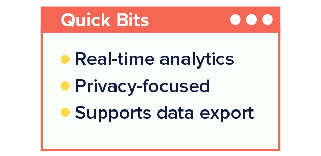
Marketed as the simple, lightweight, privacy-first alternative to Google Analytics, Fathom provides essential insights into website traffic and visitor behavior without compromising user privacy.
Fathom offers a simple, transparent approach to analytics, emphasizing data privacy and minimalism. This tool prioritizes data privacy by anonymizing visitor IP addresses and removing the use of cookies or tracking scripts.
While Fathom doesn't have specific integrations tailored for React, its lightweight tracking code is easily implemented in React applications. The process is simple and non-intrusive.
Pros
-
Privacy-focused approach with anonymized data collection
-
Lightweight tracking code for minimal impact on website performance
-
Simple and intuitive dashboard interface
Cons
-
Limited customization options compared to more robust analytics platforms
-
Lack of advanced features for in-depth analysis
Pricing: Fathom's pricing plans are based on the number of websites and pageviews tracked. The platform's base plan is $15 per month. New users get a free trial period to try out the platform's features before committing to a subscription. However, you have to provide your card details when signing up.
Best for: It's ideal for projects that require simple analytics tracking and strict user privacy.
Pro tip: Fathom keeps your React website cookie-free, so you don't have to worry much about privacy compliance in different regions.
How to get started: Visit Fathom to create an account, select a subscription plan, and set up your dashboard by following the onboarding instructions. Then, add the Fathom script to your website to collect data on user sessions.
Fathom allows users to block their IPs from tracking, which improves the reliability of the data recorded. You should block the IPs of all your team members who use the website often.
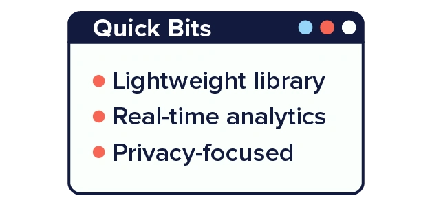
Plausible: Lightweight analytics for React and React native apps
Plausible is a privacy-focused website analytics tool that provides simple, actionable insights into website traffic and user behavior. It prioritizes data privacy by offering transparent analytics without cookies, tracking scripts, or personal data collection.
Plausible gives you full ownership of your data. It doesn't use cookies and fully complies with GDPR, CCPA, and PECR.
Plausible provides a lightweight tracking script that is easily integrated into React applications.
Pros
-
Privacy-focused approach with no personal data collection
-
Lightweight tracking script for minimal impact on website performance
-
Real-time analytics for immediate insights
Cons
-
Doesn't support e-commerce reporting
-
No heatmap and A/B testing feature
Pricing: Plausible offers transparent and affordable pricing plans based on the number of websites and pageviews tracked. The growth plan starts at $9 per month.
Best for: Plausible works well for simple data visualization tasks.
Pro tip: Integrate your Plausible account with the Google search console to track visitors' search queries to find your website. This data can unlock deep insight into your website's SEO performance.
How to get started: Visit Plausible to create an account and set up your dashboard, following the onboarding instructions. During sign-up, you will be asked for your website URL. After you provide this information, the platform will generate a tracking code snippet for your website.
Final thoughts: Choosing the best analytics tools for React
Selecting the right React data analytics tools for your website's performance is critical to optimizing performance successfully. Your technical ability and budget are vital factors to consider when choosing a tool. For example, you need technical knowledge to utilize all the powerful data visualization capabilities of React-analytics tools at zero cost.
Meanwhile, using Google Analytics 4, Fathom, and Plausible does not require core technical knowledge. However, you will not get the same customization, power, and control some other React analytics tools offer users.
Also, some React CMS tools like ButterCMS make the job easier by including out-of-the-box integration with Google Analytics and other popular analytics tools.
Many of these tools can help you get a good picture of user behavior, depending on your use case and bandwidth. What is your experience with any of these tools? Please share with us in the comments below.