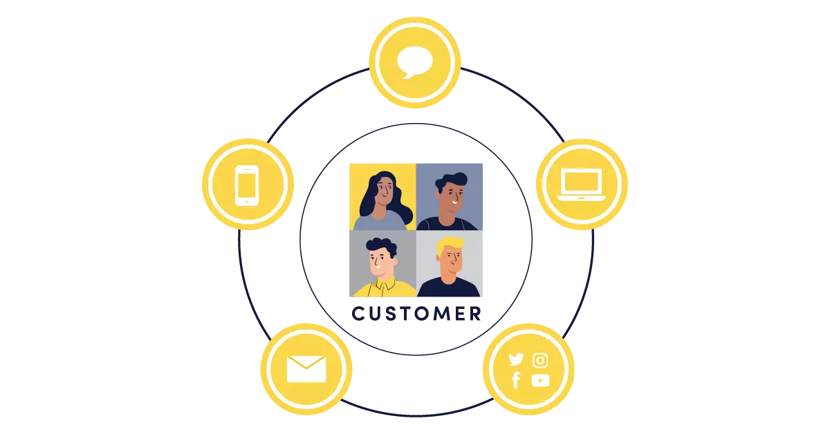
Most modern businesses and products today utilize some sort of customer support portal to handle feedback, queries, and requests for support. These portals in most cases act as an interface between customers, the business, and other customers (in cases where users can view content created by other users) where they can have access to information, frequently asked questions (FAQs), and support.
We’ll be diving in today to see exactly what a customer support portal is and how we can create a custom portal website using Nuxt.js - a frontend framework built on Vue.js with ButterCMS.
What is a customer support portal?
Well, I’m glad you asked! Let’s start by finding out what a “web portal” is.
Web portal: Basically, a web portal is a website or platform where information, content, and/or services are brought together and provided for a particular group of users. Portals that require authentication in the form of a login commonly contain personalized content and services based on that specific user's identity.
The information displayed is usually gathered from different sources, including information and resources from the creators(the business) or content shared by other users.

Customer support portal: So, what then is a customer support portal? It’s a website that gives customers access to the services and information they need from the business. A customer portal may not require a user login—it may provide general information and services available to anyone, such as knowledge base articles, FAQs, and content shared or posted by other users. Customers may, however, be required to log in to receive and share account-specific information,to get direct support, or to interact on the portal.
In summary, a customer support portal allows customers to interact with the business and a community of other customers.
Why is it important?
Customer convenience and satisfaction are crucial for business growth.
In modern products and businesses, customer support portals play a very important role in increasing user experience and customer satisfaction. Customer support portals also give customers a faster and more convenient way to access the information, services, and assistance they need. With these portals, customers do not always need to make calls or send emails to customer support over every issue, such as a delayed package or a new product feature that’s a little confusing. They can now get answers and support on the portal for a wide variety of cases.
Customers nowadays have become increasingly self-reliant and would rather opt for a self-service option rather than making a call or sending an email to customer support. In fact, according to statistics available from Microsoft’s research, 86% of customers in the US expect an organization to offer online self-service support options. It’s now a must-have rather than a bonus feature for businesses.
Customer care representatives and agents also benefit from customer support portals. It takes a huge weight off their shoulders as they do not have to respond to repeated requests that could just be clarified on the FAQs page. It also serves as a resource for them (customer care representatives) to lean on when answering user/customer questions, too.
Benefits of having a customer portal
We’ve seen how important a customer support portal is, let’s now take a look at what we stand to gain from one. This is for businesses and customers alike.
Helps customers find answers fast
As stated earlier, customers no longer have to always reach out to a support desk for help after issues arise or if they have questions about your products or services. They can easily find answers and solutions in resources and FAQs or perhaps shared by another customer who had a similar issue in the community forums.
Reduces the number of incoming tickets
Since information on certain topics and solutions and answers to previously shared problems are made available on the customer portal, new tickets for assistance on similar issues are rarely created. Customers can find the answers to their questions after a quick search. As stated earlier, this takes the pressure off agents and they can focus on more important or entirely new issues.

Reduces customer churn and boosts customer engagement
According to HubSpot, customer churn is the percentage of customers that stop using your company's products or services during a certain time frame. You can calculate the churn rate by dividing the number of customers you lost during that time period—say a quarter—by the number of customers you had at the beginning of that time period.
Since most customers can access information to solve their problems and answer their questions by themselves, the number of customers that stop using your product due to slow response times from customer care agents or out of frustration with unresolved issues gets reduced. A survey on achieving customer amazement shows that about 96% of customers overall are willing to switch and “will leave you for bad customer service.”
On the bright side, an article from LiveAgent Academy highlights that, among other great benefits, customer support portals boost customer engagement as they allow customers to share information and suggestions, them a sense of involvement.
Improves customer experience (CX)
This is a key benefit of customer support portals. CX is greatly improved with the addition of a customer support portal as more and more customers find it convenient to go through the self-service approach of finding answers and resolving issues that they might be having with your products or services.
Reduces support costs
The introduction of a customer support portal often greatly reduces the cost of customer support. Fewer support agents are required to answer customer questions and offer assistance since most customers will be able to solve their problems themselves.
Why you should use a headless CMS
Alright, now you know what a customer support portal is and want to integrate one into your new or existing website. A great way to get started is to use a headless CMS to provide all the content and features needed for your customer support portal.
But, hey, why a headless CMS? Heck, what is a headless CMS? Again, I’m glad you asked.
A headless CMS is simply a Content Management System (CMS) that acts as your content backend or content API that allows you to create and manage content for your websites and applications.
Fortunately, the name isn’t derived from some horror movie ;). The term “headless” simply means that the “head” (the frontend, where the content is rendered) is separated from the “body” (the backend, where the content is created, stored, and managed). Phew.
With a headless CMS, your application can be built on any frontend stack, technology, or framework—say, React, Vue, Svelte, Next, Nuxt, SvelteKit, and so on. Whereas in a traditional CMS, e.g. WordPress or Drupal, you don’t have that freedom. They are monolithic in the sense that the backend, which is the CMS, is coupled together with the frontend, and they can’t be separated.
We know what a headless CMS is and that it’s not just a word from a horror story. Let’s now find out why we should use a headless CMS to build our customer support portal. There are a number of reasons:
Seamless support and access across multiple devices
A headless CMS acts as a single source of truth for all your content and allows you to render that content in multiple applications. You can access the same content from your CMS and render it on the front end of your website or on your mobile or desktop app through simple API calls.
This means that, with a headless CMS, your support portal can be readily available on the devices that your customers use without duplicating content to support multiple devices.
Easier to create, update, and maintain content
The key benefit of a headless CMS that is enjoyed by both developers and marketers is its flexibility. This flexibility is not limited to the way content is distributed but also covers the way it is created, updated, and maintained.
In most cases, traditional CMS architectures adopt a one-size-fits-all approach in content management and content distribution or rendering. This means more resources are spent in trying to make it fit your particular use case or audience. Additional functionality can only be achieved through plugins or extensive PHP knowledge in order to get what works for you.
A headless CMS doesn’t care where you decide to place the head (the frontend). This means that more effort goes into creating and delivering better and structured content management.
The flexibility gained from using a headless CMS allows for building a better experience with the best frontend tooling for customers.
Support for modern, faster, and lighter infrastructures
Technology is moving at a very fast pace and growth is mostly determined by how we can keep up and adopt new and better technology. A headless CMS excels at this.
You can take advantage of modern technologies and lighter infrastructures, such as the Jamstack web architecture model, when building with a headless CMS.
According to the Jamstack site, Jamstack is the new standard architecture for the web. Using Git workflows and modern build tools, pre-rendered content is served to a CDN and made dynamic through APIs and serverless functions. Technologies in the stack include JavaScript frameworks, Static Site Generators, Headless CMSs, and CDNs. This results in a fast and very light approach to building websites and applications in recent times.
Apart from being able to render your portal on your front end of choice, you also have the ability to seamlessly connect to third-party applications through their APIs and pull in data/content from those applications to portal pages. For example, you can get recent information on Covid-19 cases by country or some other parameter and display them for your users using the Disease.sh API, an open-source API for disease-related statistics. This API only provides data on things like the number of Covid cases in a country, the number of recorded deaths, etc. The data gotten from this API is different from the Covid announcements and updates we created collections for earlier in this tutorial. Their docs are pretty straightforward. With that, you can follow this awesome article on importing third-party data into Butter to integrate this API into your ButterCMS account.

Tutorial: Creating a customer support portal with ButterCMS
So far we’ve been on quite a journey to understand what a customer support portal is, what its benefits are, and why it's a great idea to build one using a headless CMS. (And it’s not just because headless CMSs are what the cool kids are using these days.)
Now we’re going to build one! The buttery smooth way 😊.
Before we get started, though, it’s important to know that we will not be covering authentication and authorization in this tutorial. There are multiple services that allow us to add these features and they will be mentioned at the end of the tutorial.
Alright! Let’s get started.
You can find the code for this tutorial in the following GitHub repo: Create Customer Portal Repo.
Tutorial prerequisites
To follow along, you need to have a few things in place
- A ButterCMS account: ButterCMS is an API-based headless CMS that allows you to easily set up a live CMS backend for your projects in minutes.
- A text editor - VSCode for example
- HTML & JavaScript knowledge
- Basic knowledge of Vue.js: Vue is a JavaScript front-end framework that allows us to build fast and performant web apps.
- Nuxt.js installed (we’ll see how to set up the Nuxt.js project as we proceed): Nuxt is a server-side rendering (SSR) framework built on Vue which allows us to easily create SEO-friendly and fast Jamstack websites.
- A recent Node.js version (v14 or v16): At the time of writing, I’m using v16.13.2. You can read this article to learn how to update your Node version.
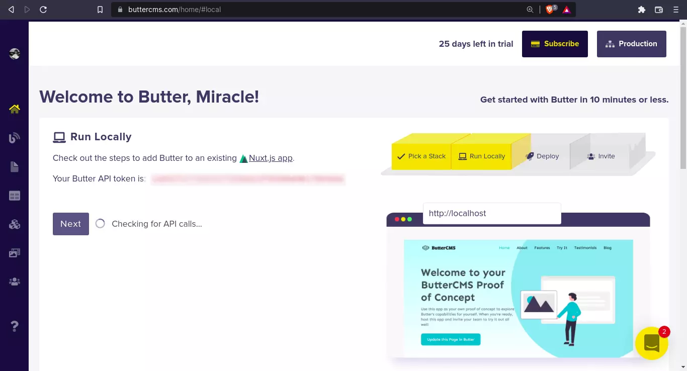
To get started with ButterCMS, create a ButterCMS account and you’ll be taken to your shiny new dashboard ✨
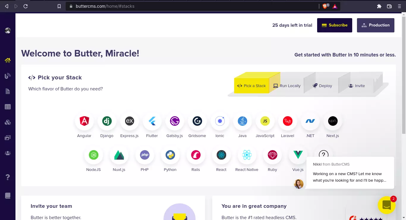
Here, among the plethora of frameworks and libraries supported by ButterCMS, we can see Nuxt.js.
Let’s take a look at what we're trying to build.
What we'll be building
We’re going to build out a customer support portal. To keep things simple, this will be a hospital patient portal.
Patient portals are simply customer portals that also offer patients access to personal health information and services. Modern portals have additional functionality that allow for information exchange and usually have some form of authentication and authorization as well.
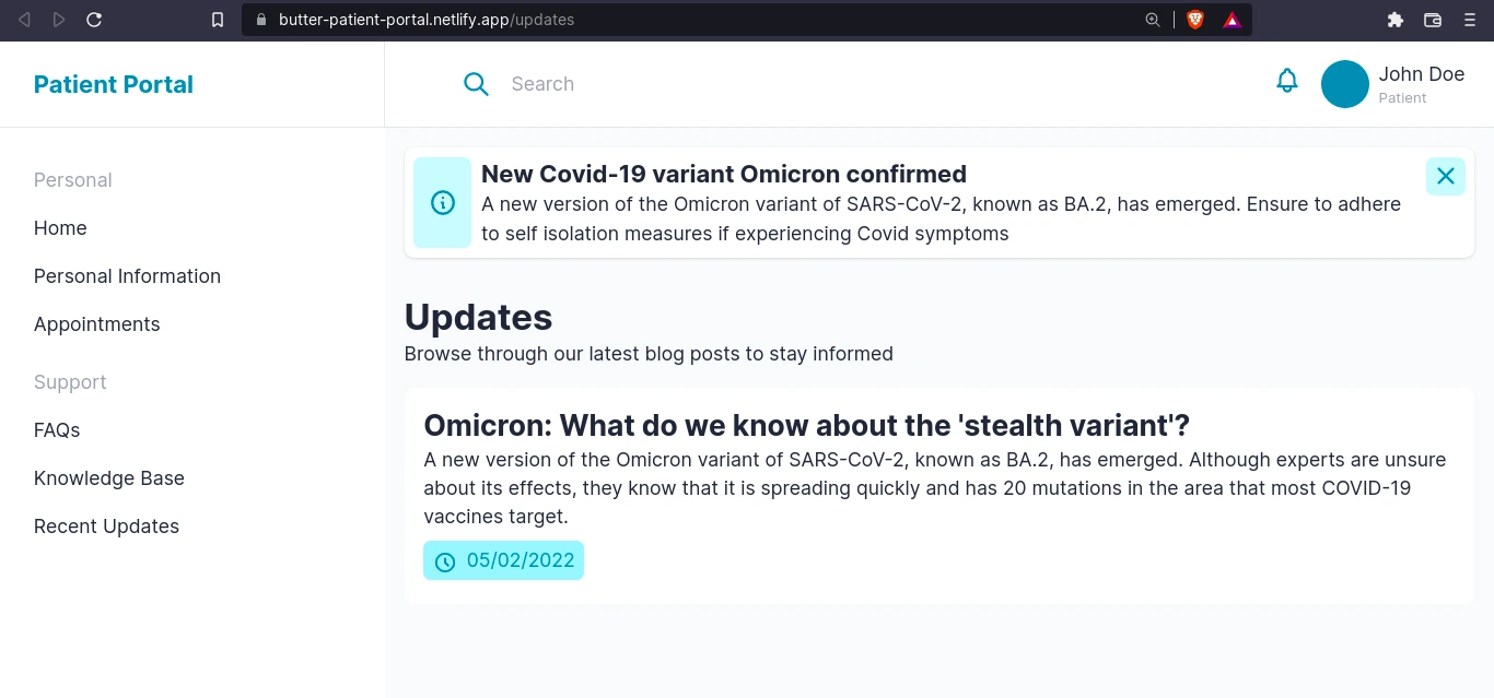
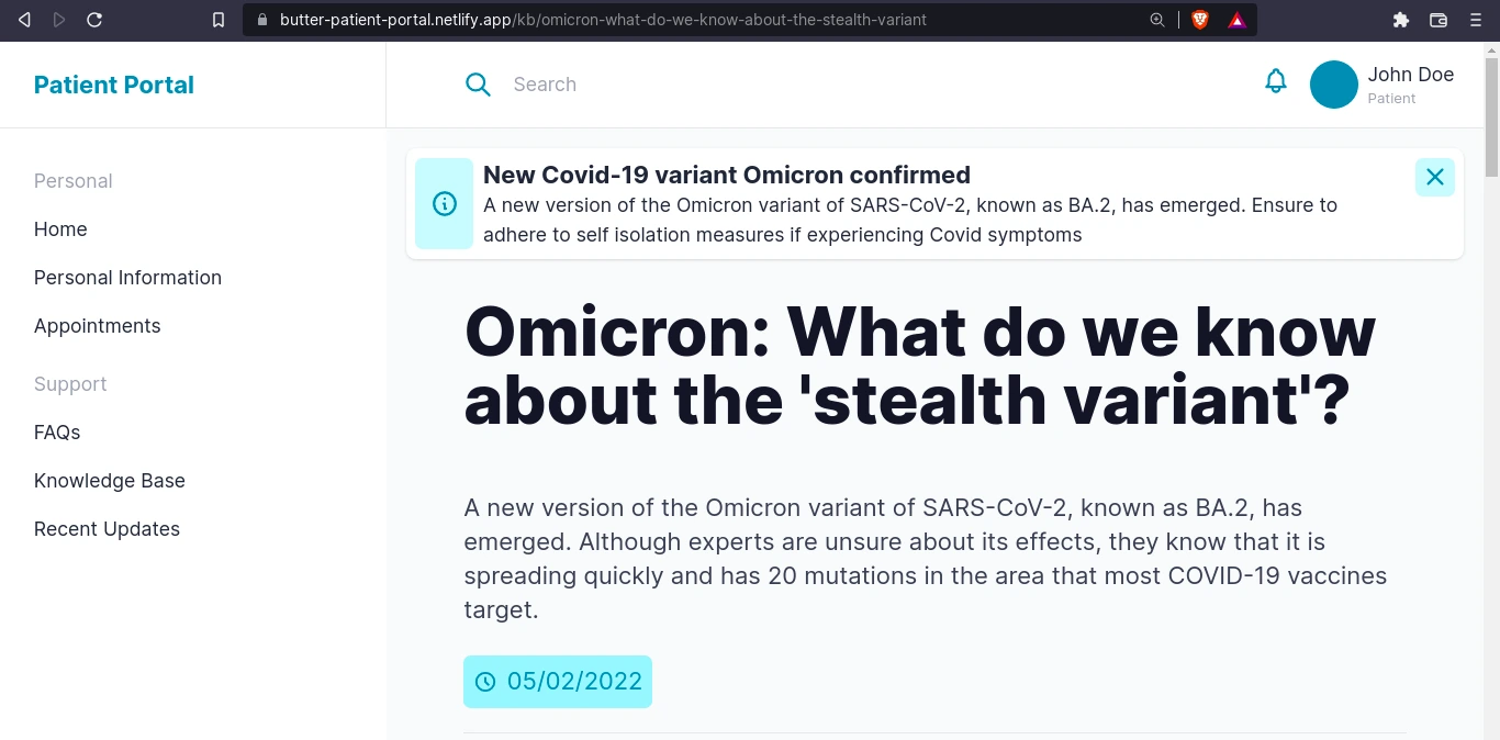
Users can do things like view appointments, get hospital updates, and view health information. To ensure a better customer experience, there will be pages for FAQs and articles from the Knowledge Base. Patients will also have access to updates in the form of blog posts and announcements.
We’ll be building a portal that showcases the following content from the CMS:
- Personalized information and content such as personal medical info, appointments, and messages
- Recent hospital announcements
- A broadcast alert such as a Covid update which will be selected from a collection of announcements
This content will be built as collections and pages in Butter and pulled to our Nuxt.js site using Butter’s API. So, let’s get on with it.
Getting started with Nuxt.js and Butter
As I mentioned earlier, Nuxt.js, or simply Nuxt, is a server-side rendering framework built on Vue. Server-side rendering is just one of the many features Nuxt offers that allow us to build performant and lightweight Jamstack sites without hassle.
In this tutorial, we’ll be using the latest version of Nuxt: Nuxt 3. At the time of writing, Nuxt 3 is still in beta but is stable enough for most sites.
To get started with Nuxt, we’ll first install it. You can check out their docs to learn more on how to get started with Nuxt 3 and how to install it.
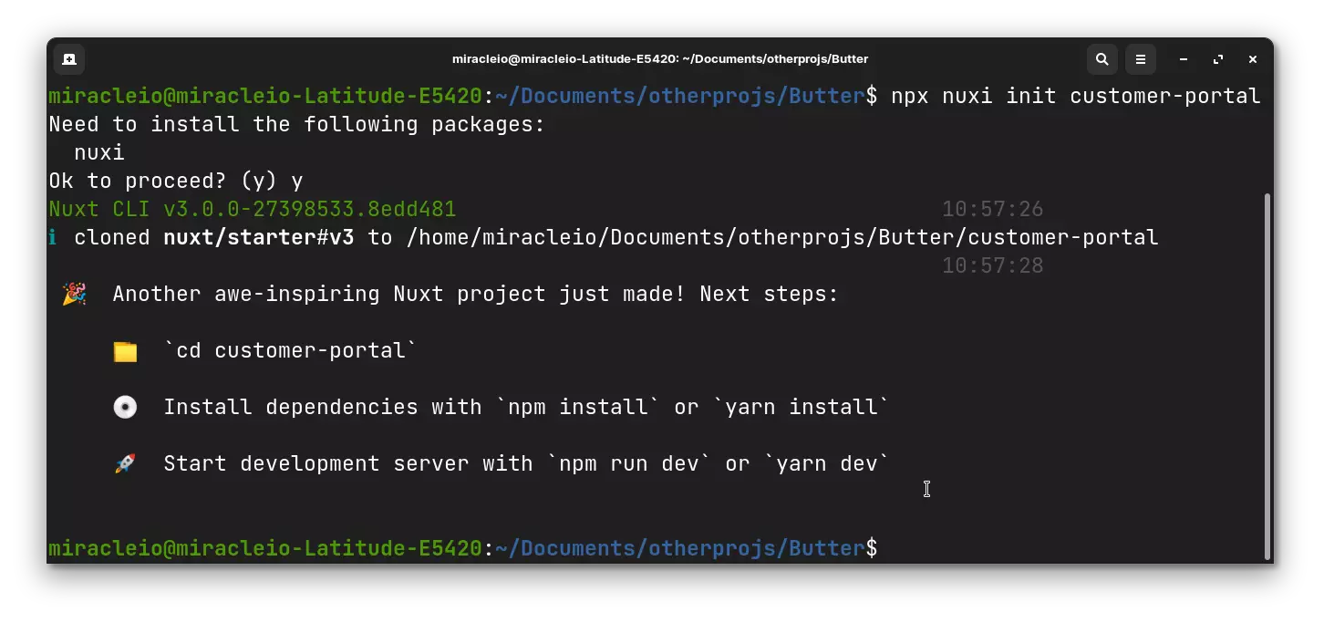
For now, pop open a terminal in your working directory and enter the installation command:
<span style="font-weight: 400;"> npx nuxi init customer-portal</span>
You should see the following output:
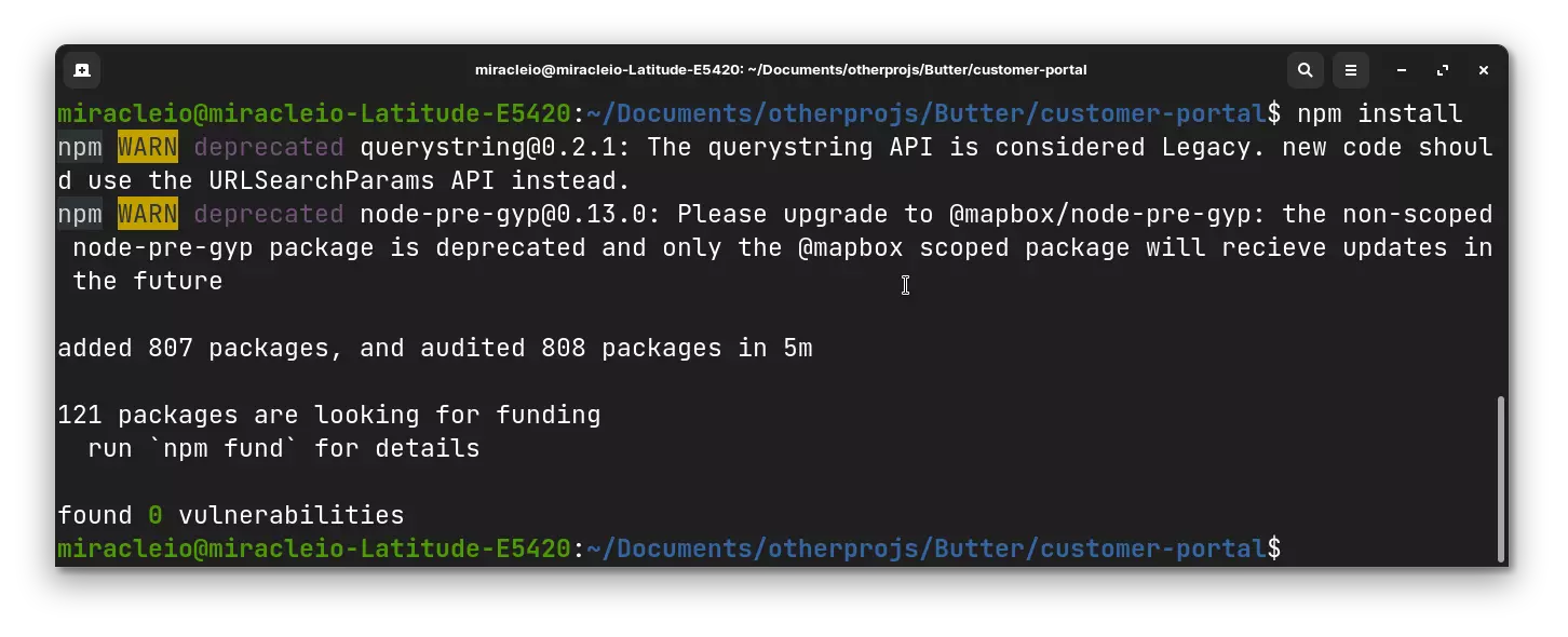
Next, navigate into your newly created Nuxt project folder and install your dependencies:
cd customer-portal
npm install
After a successful install:
Great! Now we have Nuxt installed.
In addition to Nuxt, we’ll be using WindiCSS, a “utility-first CSS framework” and a popular TailwindCSS alternative. You can even tell they’re related by their names 😅. WindiCSS integrates smoothly with Nuxt 3, which is why we’ll be using it in this project. All you have to do is follow the steps from the docs.
First, install the WindiCSS Nuxt integration package:
<span style="font-weight: 400;">npm i nuxt-windicss -D</span>
Once the installation is complete, within your nuxt.config.js add the following:
 import { defineNuxtConfig } from "nuxt3";

 export default defineNuxtConfig({
   buildModules: ["nuxt-windicss"],
 });
Voila! You have WindiCSS installed. Next, we’ll connect our Nuxt app to Butter.
Connecting our Nuxt app to Butter
Remember our shiny new Butter dashboard? If we go back there and pick a stack, Nuxt.js in our case, we’ll be taken to a page where we can access our API token.
To use this, we’ll follow the steps to add Butter to an existing app.
- Copy your API token: You can copy it from the current page or you can grab it from the settings page.
- Add API token to Nuxt Runtime configurations: The API token will be used to initialize our Butter SDK. To expose config and environment variables to the rest of our app, we will need to define the runtime configuration in our nuxt.config file using either the privateRuntimeConfig or publicRuntimeConfig options. More about that in the Nuxt docs.
import { defineNuxtConfig } from "nuxt3";
export default defineNuxtConfig({
buildModules: ["nuxt-windicss"],
privateRuntimeConfig: {
API_TOKEN: process.env.BUTTER_API_TOKEN
}
});
Next, create a .env file to add the token
 //.env
 BUTTER_API_TOKEN=<API TOKEN HERE>
Great! Now we can access our API token in our Nuxt app.
Install the Butter SDK
Run:
npm install buttercms --save
Creating a helper for the Butter SDK
In order to have global access to the Butter SDK in our Nuxt app, we have to add it as a plugin and configure it as a helper. In your plugins/ directory, create a new butter.js file which will automatically be registered as a plugin:
import { defineNuxtPlugin } from "#app";
import Butter from "buttercms";
export default defineNuxtPlugin(() => {
const config = useRuntimeConfig();
return {
provide: {
butter: Butter(config.API_TOKEN),
},
};
});
In the code above, we import the Butter SDK and get the API token from our private runtime config using useRuntimeConfig().
Fetching content from Butter
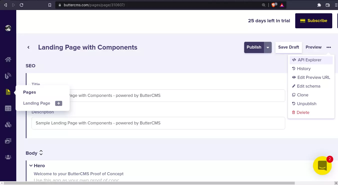
Now, let’s try out our setup. Let’s fetch some landing page content from Butter. Go to your butter account dashboard and navigate to Pages > Landing page with components > Api Explorer (Top right corner of the page):
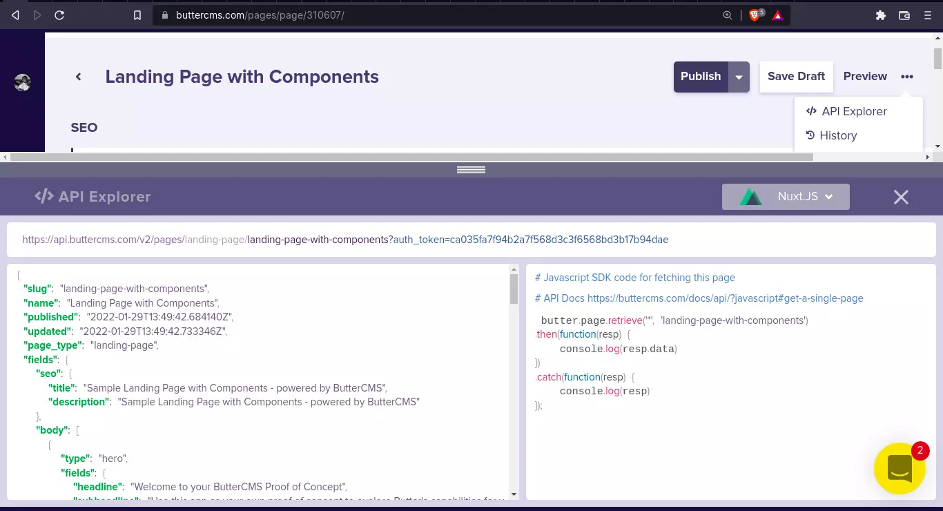
Once you click on API explorer, you should see a mini-window showing the JavaScript code for fetching the current page and the expected response, like so:
Alright. Great. To make this work in our app, let’s create a new page component - pages/index.vue
 // pages/index.vue

 <template>
   <header>
     <h1>{{ page.name }}</h1>
   </header>
 </template>

 <script setup lang="ts">
   const page = await $butter.page
     .retrieve("*", "landing-page-with-components")
     .then((res) => res.data.data)
     .catch((err) => console.log(err.response));
 </script>
Here, we're using the Butter SDK function to retrieve the page - "landing-page-with-components" into the page variable. In the template, we display the page name - page.name. Let’s start our app to see how that works ✨.
<span style="font-weight: 400;">npm run dev</span>
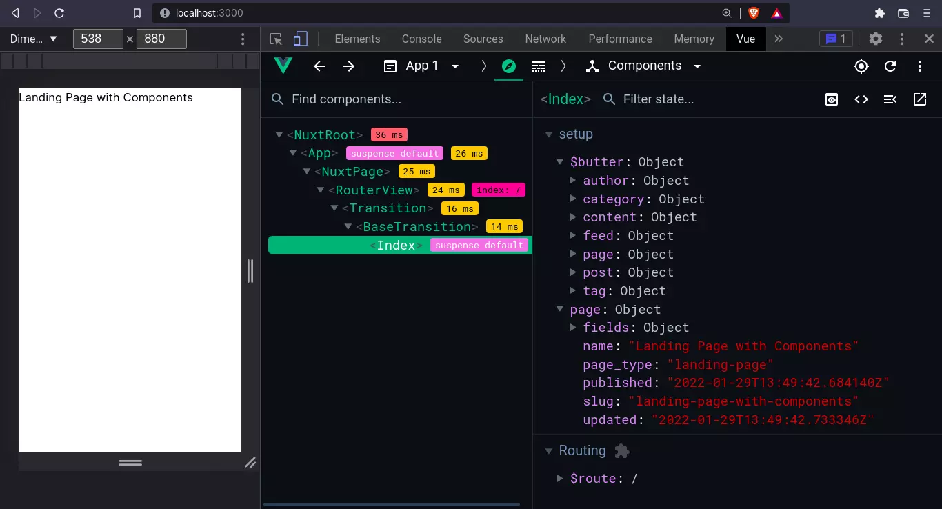
Once our app is up, if we check our Vue dev tools (you can download it from the chrome web store for chromium-based browsers), you’ll see the data pulled from our Butter page.
Awesome! Now let’s create a new page in Butter for our hospital portal.
Creating the patient portal homepage
The portal homepage is going to be a combination of multiple content types. We will rely heavily on Butter’s two main content types: Collections and Page types.
Let’s quickly review them.
Content Types
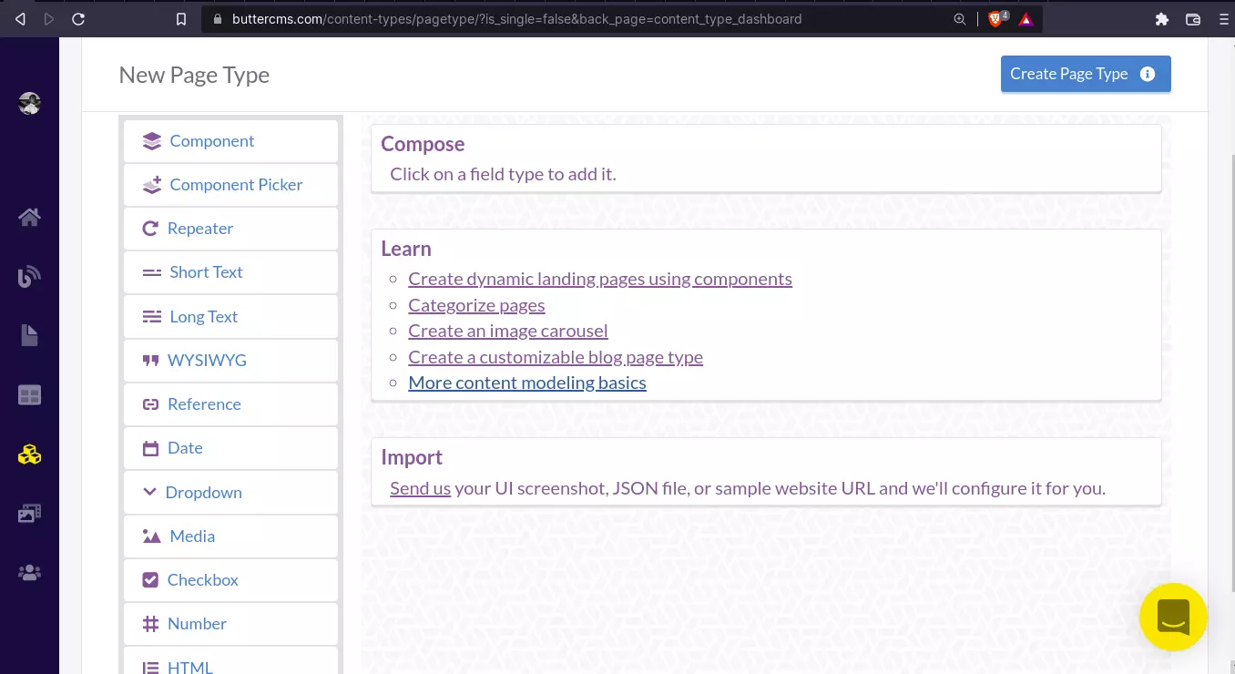
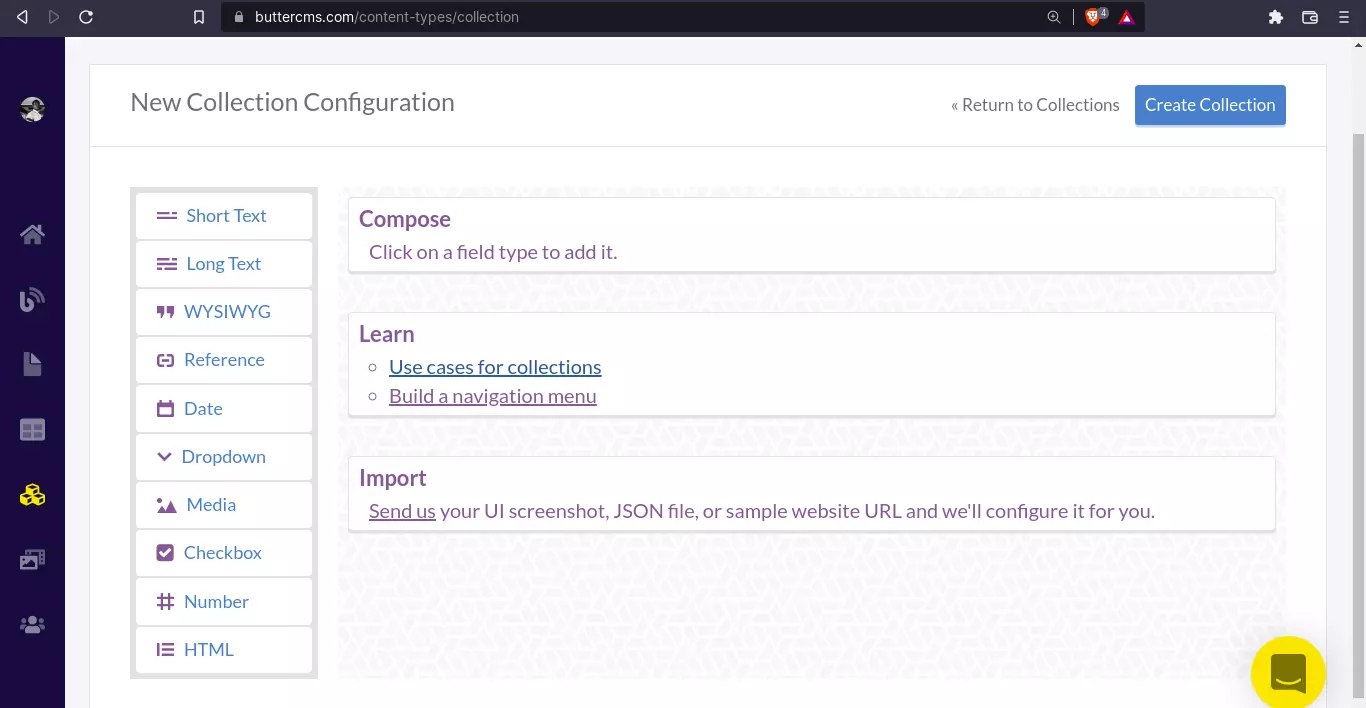
A content type can be referred to as the “schema” of some content. It determines the available fields that will be used to create content of that type. To create a content type, click on the three building blocks in the sidebar which will take you to the content types page.
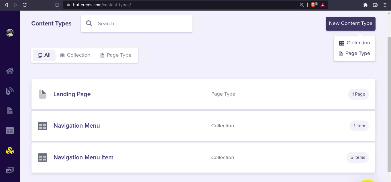
In the screenshot above, we can see the content types page and a list of created content types: page types and collections. To create a new content type, we can click on the New Content Type button at the top right. Then, select the type.
- Page Types: A page type is excellent for defining the structure of the content that will be displayed on a page.
- Collections: A collection is similar to a page type but is typically used to store reusable promotional content that can be referenced by multiple pages. It also doesn’t have the component and component picker fields we see in pages. You can check out the use cases for collections from the ButterCMS knowledge base to learn more about collections.
We’ll be building the page bit by bit using both content types: Page types and collections. Here’s a quick overview of what the homepage will contain:
- An announcement alert (from the Announcements collection)
- Recent appointments (from the appointments collection)
Let’s start by creating an announcements collection.
Create announcements collection
To create a new collection, navigate to Content Types > click on create New content type > choose collection
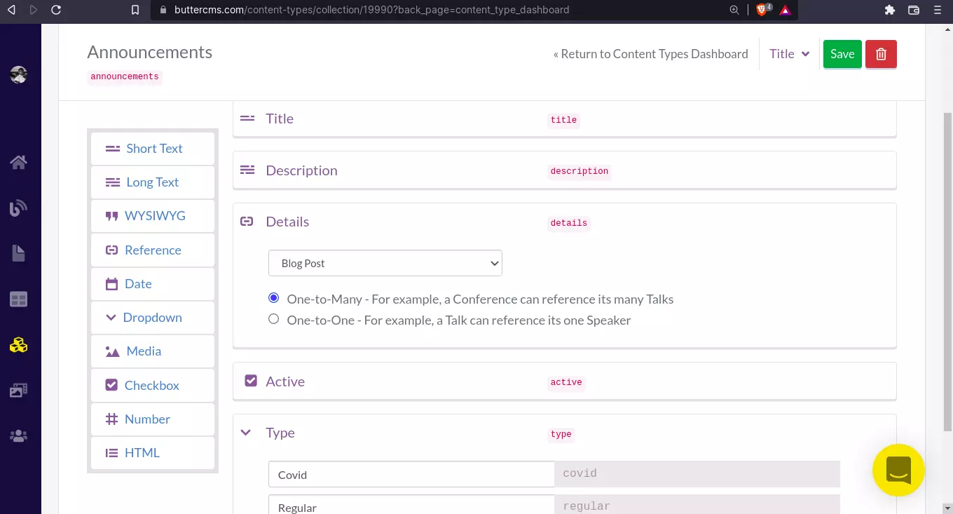
An announcement has the following schema:
- “Title” - Short Text
- “Description” - Long text
- “Active” (whether the announcement should be shown as an alert or not ) - Checkbox
- “Type” - Dropdown
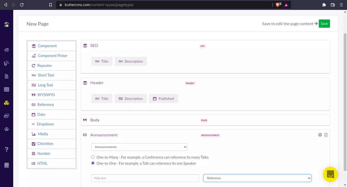
- “Details” (This will be created later since it’s going to reference a page type (Blog post) that has not yet been created) - Reference
We’ll save this announcements collection content type for now. We have to create our “Blog Post” or “Article” content type for our “Details” reference before we proceed.
Create a blog post page type
This will be a Page Type. Navigate to Content Types > click on create New content type > Choose Page Type. Here’s what the schema for our blog post will look like:
- “SEO” - Component:
- “Text” - Short Text
- “Description” - Long Text
- “Header” - Component:
- “Text” - Short Text
- “Description” - Long Text
- “Published” - Date
- “Body” - WYSIWYG
- “Announcement” - Reference (to announcements collection, One-to-one)
To get this, first, we create a component by going to the menu at the right and clicking on the Component field type. A component is a very useful feature in Butter because it allows you to “group” similar field types and reuse them later on.
Once, you’ve added a component, you’ll see two options:
- Create Component
- Add from Library
Click on the Add from Library option and you’ll see a bunch of pre-made libraries.
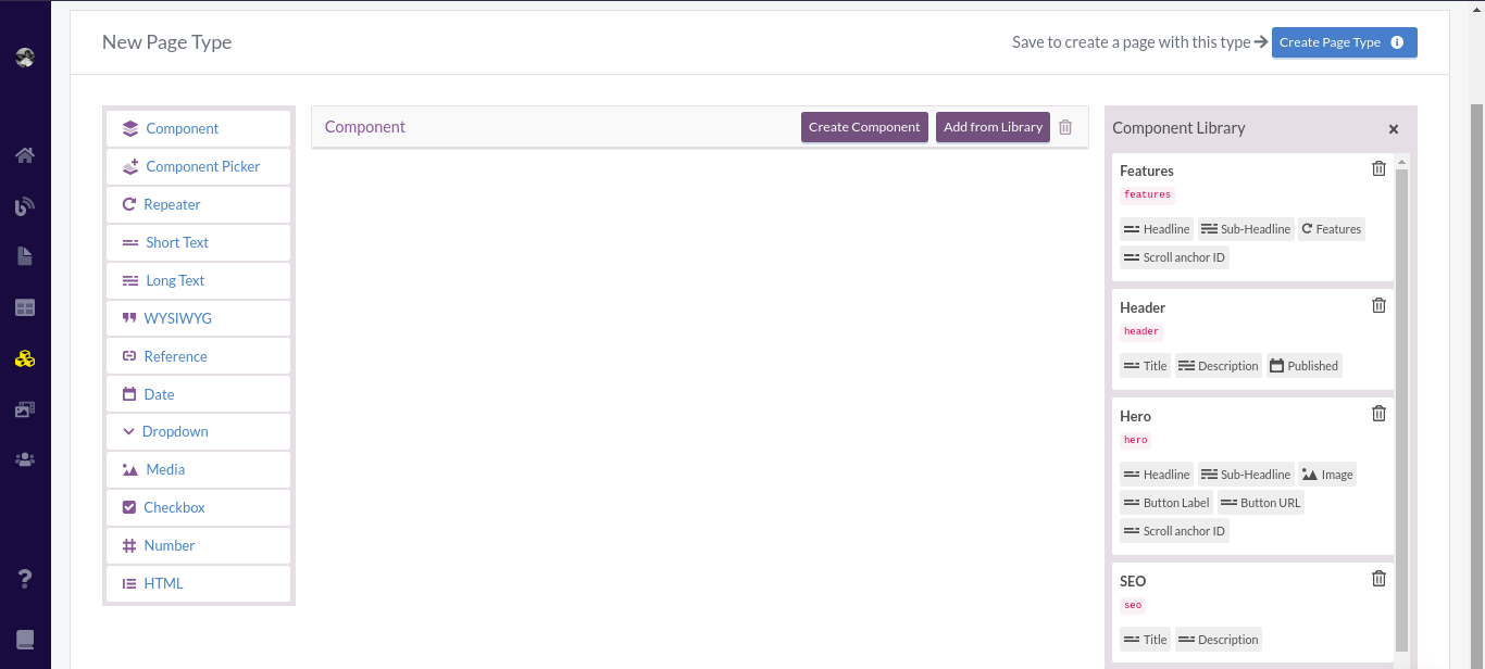
Select the SEO library and viola! You have a component with two sub-fields:
- “Title” - Short Text
- “Description” - Long Text
You can even add more if you want. Just click Edit and you’ll see more field types to choose from and add to your component. Here’s what the final schema should look like:
Great!
Finishing up the announcements collection
Now back to the Announcements collection. Navigate to Content Type > Collections > Announcements. Add a new field:
- “Details” - Reference (To Blog Post Page Type)
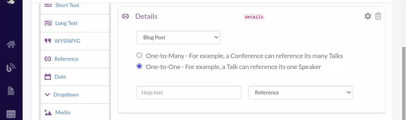
So, the final schema should be something like this:
Click on Save to save the collection. Now, we’re going to create a new announcement alert with this collection type. First, we will create a new blog post with our previously created Blog Post page type to serve as the “details” for that announcement and also as “updates” later on in our customer portal.
Create a new blog post with the Blog Post page type
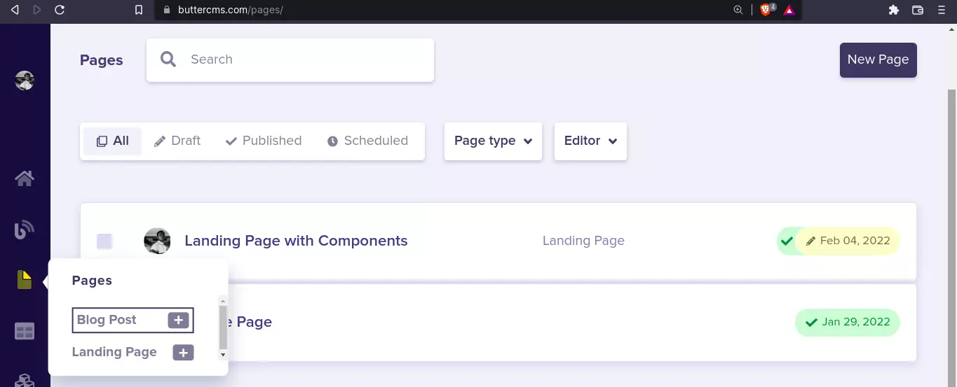
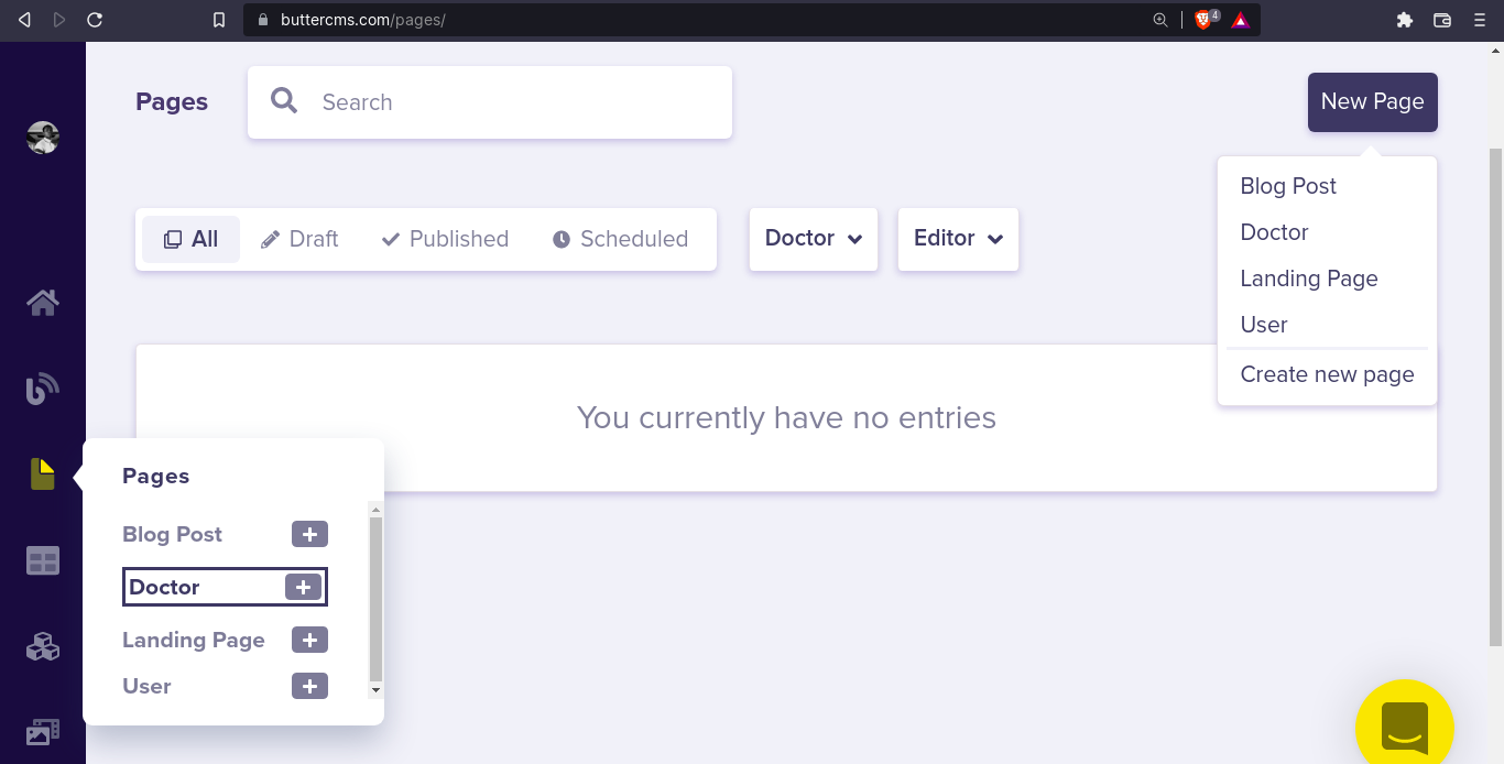
We’re going to create a Blog Post that will serve as the “Details” of our announcements and also as updates. To do that, navigate to Pages by hovering the page icon at the right side nav and selecting Blog Post.
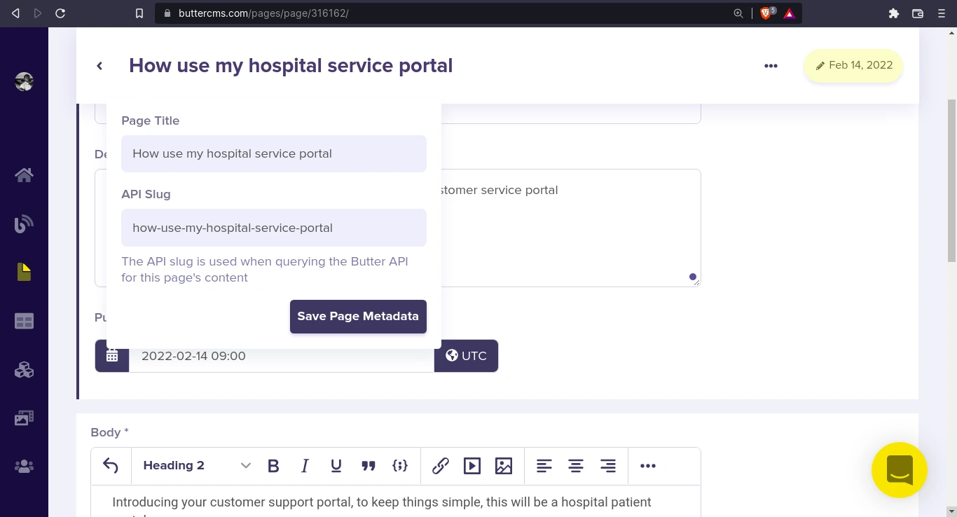
First, we add our page metadata:
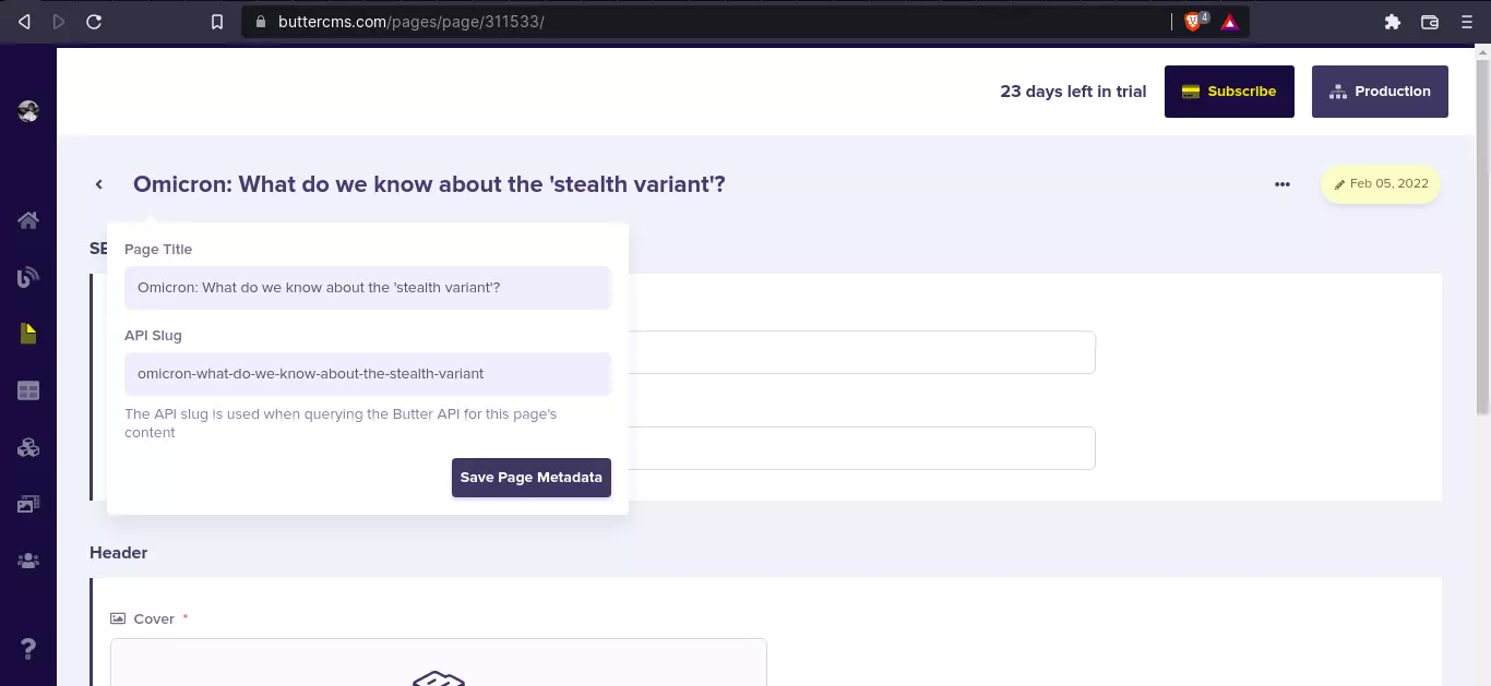
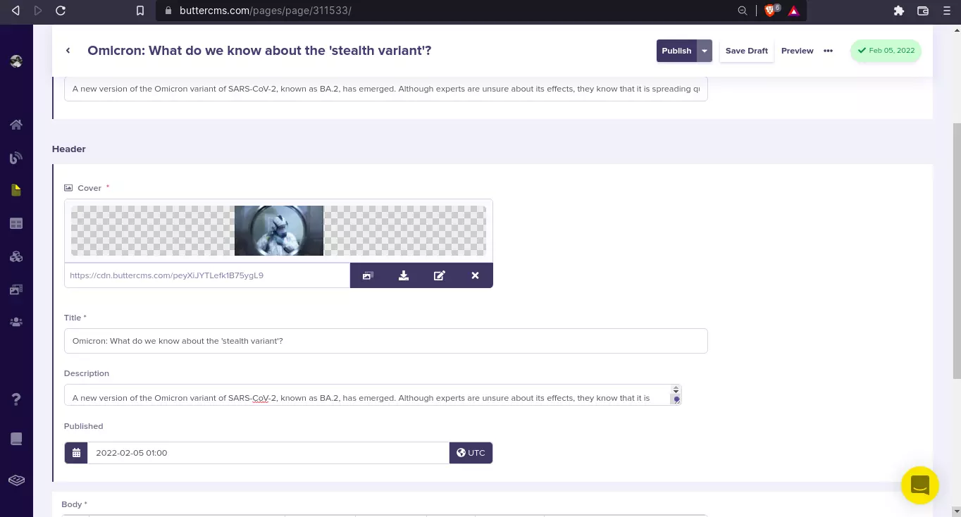
Then, fill in our content. To add our Cover, click on the field and click on Choose Media.
Here’s a screenshot of what mine looks like:
Now, click on Publish to publish it. We can now add it to our announcements.
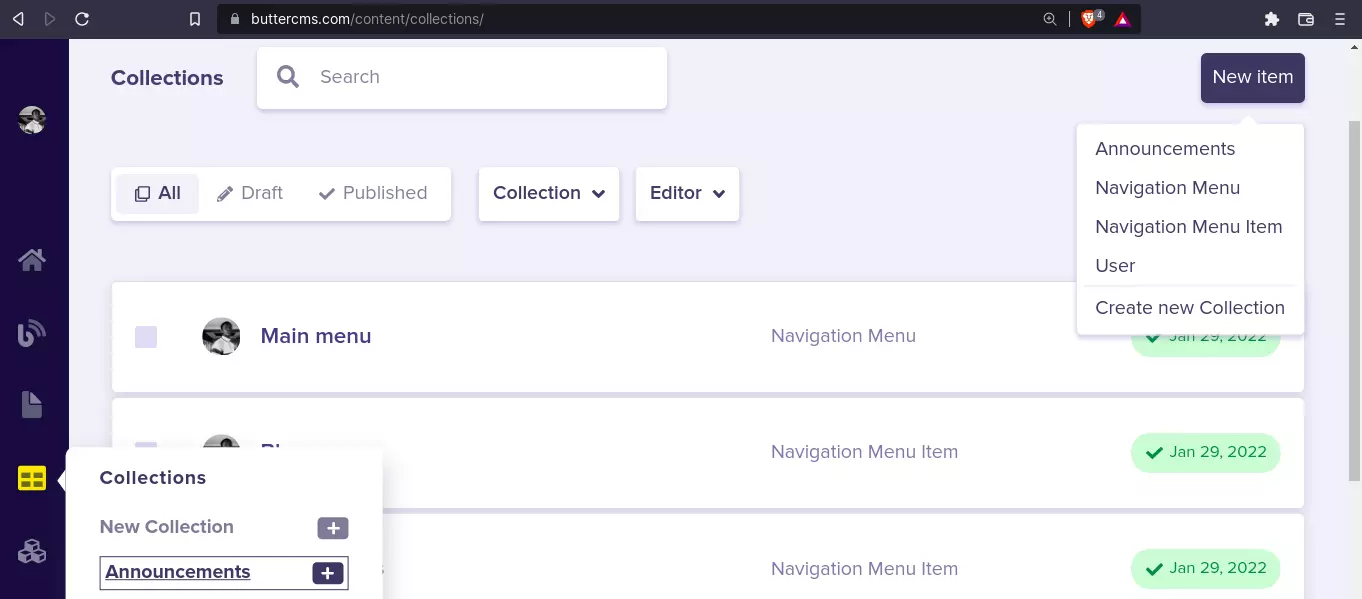
Create a new announcement
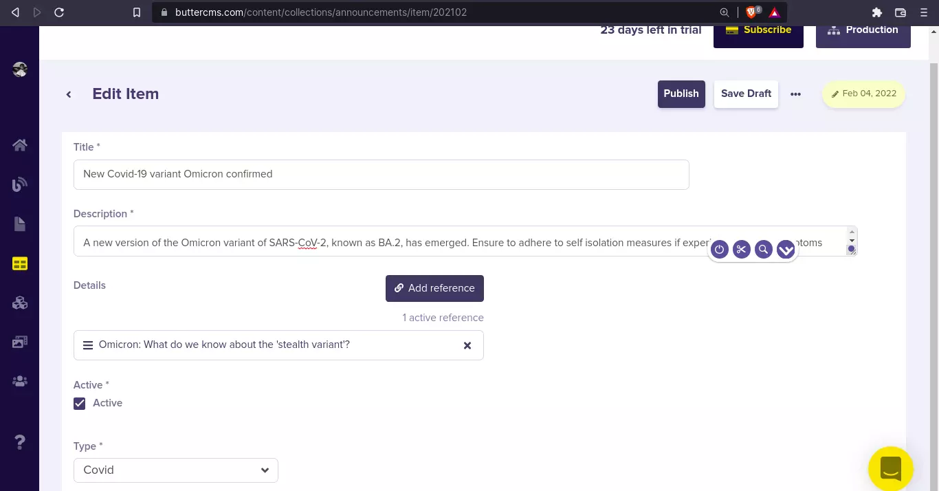
To create a new collection, navigate to the collections page by hovering on the Collection icon link in the side nav and clicking on the plus (+) icon right next to Announcements to create a new announcement.
Fill in the fields and add a reference. This modal pops up where you can select the Blog Post you want to reference.
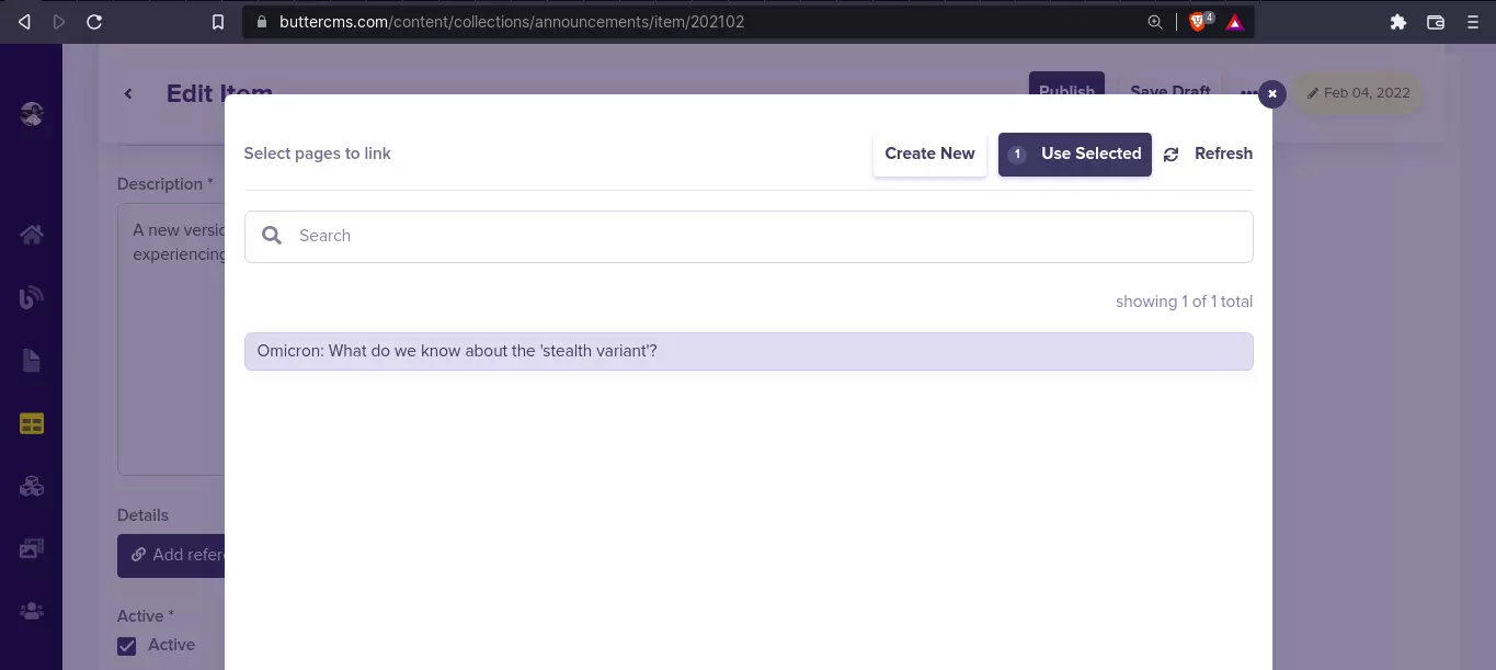
Here’s what my announcement looks like:
Let’s see what this looks like in our API Explorer. Click on the three dots (...) right next to the Save Draft button.
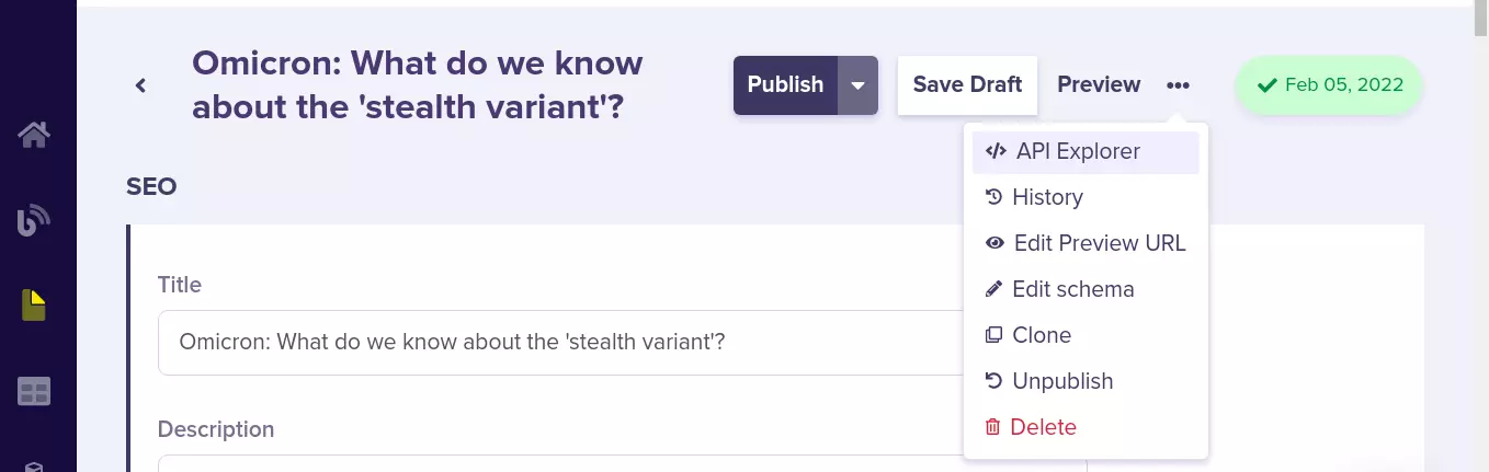
Click on API Explorer and we have the code to get the data and the expected response.
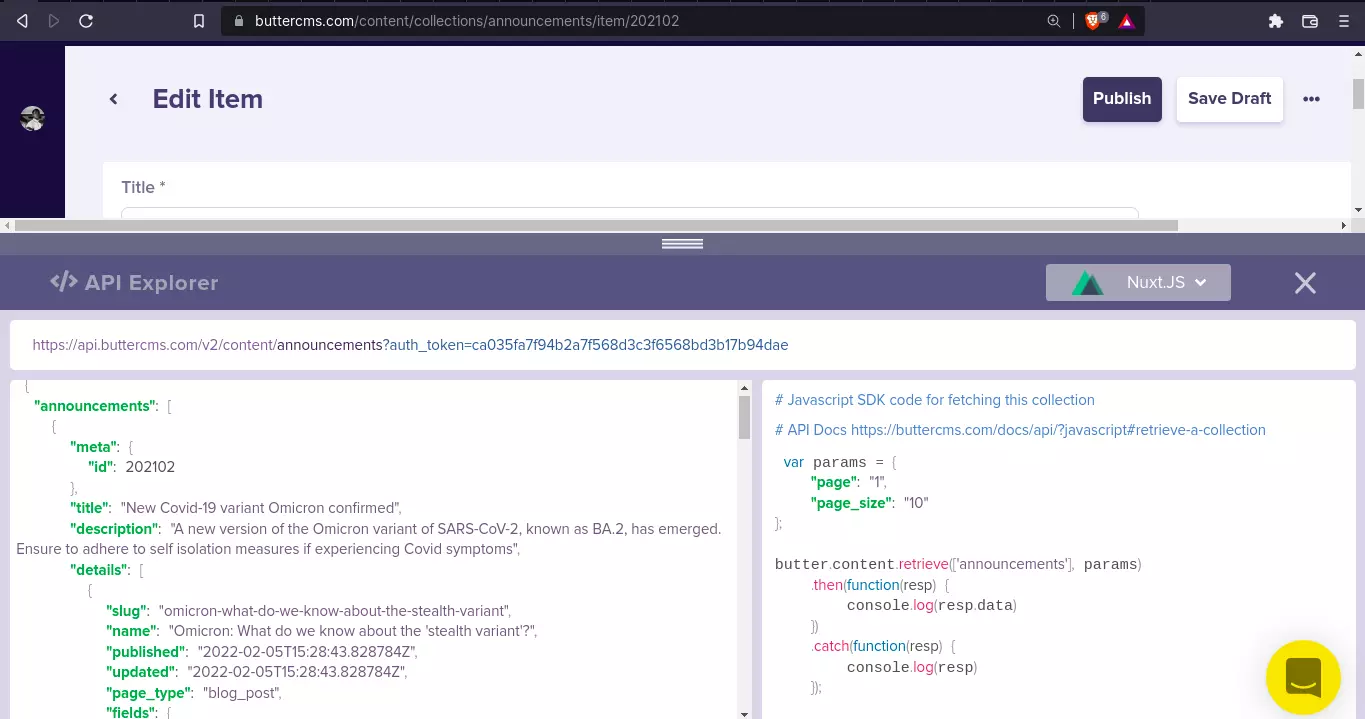
Take note of this line of code: butter.content.retrieve(['announcements'], params). That’s how we’ll be able to retrieve our announcements. Let’s implement this in our code and see how we can display the data in our website.
Create a default layout in Nuxt
First, we’ll create a default layout for our portal. To do that, create a layouts/default.vue file with the following code:
 <!-- layouts/default.vue -->

 <template>
   <div class="body flex">
     <nav class="w-full min-h-screen w-xs min-w-xs bg-white">
       <div class="wrapper flex flex-col gap-4">
         <header class="h-18 px-7 py-4 mb-4 border-r border-b border-gray-200">
           <div class="wrapper flex items-center h-full">
             <figure class="logo">
               <h1 class="font-bold text-cyan-600 text-xl">Patient Portal</h1>
             </figure>
           </div>
         </header>

         <section class="nav-section">
           <header class="nav-section-header">
             <h4 class="text-gray-400">Personal</h4>
           </header>
           <ul class="links">
             <li class="link-item">
               <span> Home </span>
             </li>
             <li class="link-item">
               <span> Personal Information </span>
             </li>
             <li class="link-item">
               <span> Appointments </span>
             </li>
           </ul>
         </section>
         <section class="nav-section">
           <header class="nav-section-header">
             <h4 class="text-gray-400">Support</h4>
           </header>
           <ul class="links">
             <li class="link-item">
               <span> FAQs for patient accounts </span>
             </li>
             <li class="link-item">
               <span> Knowledge Base </span>
             </li>
             <li class="link-item">
               <span> Recent Updates </span>
             </li>
           </ul>
         </section>
       </div>
     </nav>

     <div class="cont flex-grow">
       <header class="h-18 py-4 px-6 border-b border-b-gray-200 bg-white">
         <div class="wrapper flex items-center justify-between w-full h-full">
           <form action="">
             <div class="form-control flex gap-2 items-center">
               <hero-icon name="search" class="text-cyan-600" />
               <input
                 type="search"
                 name="search"
                 id="search"
                 class="form-input"
                 placeholder="Search"
               />
             </div>
           </form>

           <div class="cont flex gap-4">
             <button class="text-cyan-600">
               <hero-icon name="bell" />
             </button>

             <div class="account-info flex gap-2">
               <div class="img-cont w-10 h-10 rounded-full bg-cyan-600"></div>
               <div class="details">
                 <h3>Patient Name</h3>
                 <p class="text-xs text-gray-400">Patient</p>
               </div>
             </div>
           </div>
         </div>
       </header>

       <main class="main">
         <div class="cont">
           <!--TODO: Announcement component goes here -->
         </div>
         <slot />
       </main>
     </div>
   </div>
 </template>

 <script setup>
   const { $heroIcons } = useNuxtApp();
 </script>

 <style scoped>
   .nav-section {
     @apply px-4;
   }

   .nav-section .nav-section-header {
     @apply mb-2 px-3;
   }
   .links {
     @apply flex flex-col;
   }

   .links .link-item {
     @apply p-2 px-3 hover:(bg-cyan-50 text-cyan-600) rounded-lg cursor-pointer;
   }
 </style>
That’s the default layout for the portal home page—nothing fancy. But if you look closely, you’ll notice a few things:
<hero-icon /> component<script>, const { $heroIcons } = useNuxtApp();
This is how I added SVG icons to my Nuxt app. Let’s see how it works.
Create an SVG icon component
For this to work, we need to get SVG icons. You can get the Hero Icons pack from this GitHub repository, copy the SVG files into assets/svg/heroicons/outline/. Then, create a new plugin plugins/heroIcons.js:
import { defineNuxtPlugin } from "#app";
import search from "~/assets/svg/heroicons/outline/search.svg?raw";
import bell from "~/assets/svg/heroicons/outline/bell.svg?raw";
import informationCircle from "~/assets/svg/heroicons/outline/information-circle.svg?raw";
import x from "~/assets/svg/heroicons/outline/x.svg?raw";
export default defineNuxtPlugin(() => {
return {
provide: {
heroIcons: {
search,
bell,
informationCircle,
x,
},
},
};
});
Here, we’re importing the icons as raw code and returning them into the heroIcons provider. This means that we can easily inject these imports into the v-html directive of any element to create the SVG for the icon with $heroIcons. That’s what we’ll be doing in this components/heroIcon.vue component:
 <!-- components/heroIcon.vue -->
 <template>
   <span
     class="inline-flex stroke-current"
     v-html="$heroIcons[`${name}`]"
   ></span>
 </template>
 <script>
   export default defineComponent({
     props: ["name"],
     setup() {
       const { $heroIcons } = useNuxtApp();
     },
   });

 </script>
Here, we’re using template literal to dynamically insert the name of the icon to render. The name is derived from the component's props. Now, if we write something like this <hero-icon name="search" />, we’ll get the equivalent SVG code for that icon within the <span> element. The code for our homepage pages/index.vue looks like this:
 <!-- pages/index.vue -->

 <template>
   <nuxt-layout name="default">
   </nuxt-layout>
 </template>

 <script setup lang="ts">
   definePageMeta({
     layout: false,
   });

   const { $butter } = useNuxtApp();
   const params = {
     page: "1",
     page_size: "10",
   };
 </script>
Moving on, if we start our app with npm run dev, we should see something like this:
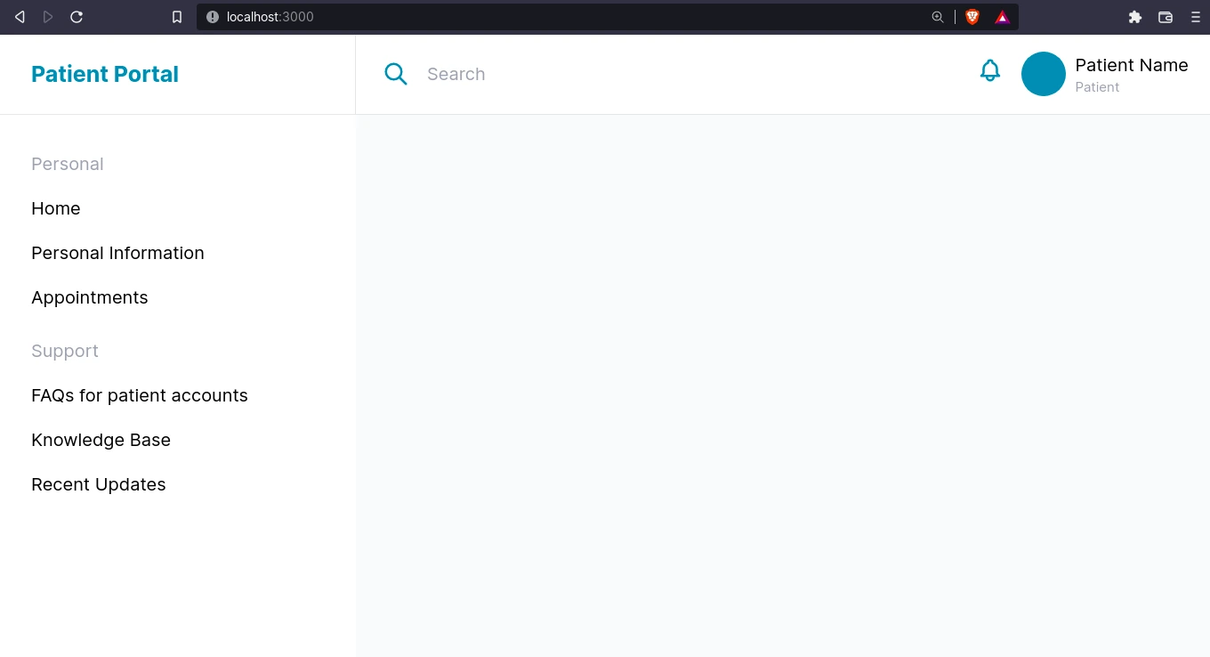
Great! In the screenshot above, you can see the “search” and “notification bell” custom SVG icons we added earlier.
Create an announcement component in Nuxt
Now, to add our announcement component. Create the new component file components/announcement.vue with the following code:
 <!-- components/announcement.vue -->

 <template>
   <div class="hidden announcement p-4 w-full" :class="{ 'active' : active }">
     <div class="wrapper flex gap-2 w-full p-2 bg-white shadow rounded-lg">
       <div
         class="icon-cont flex-shrink-0 h-auto w-12 flex items-center justify-center bg-cyan-100 text-cyan-600 rounded-md"
       >
         <hero-icon name="informationCircle" />
       </div>

       <div class="details">
         <h3 class="font-bold text-xl">{{ announcement?.title }}</h3>
         <p>{{ announcement?.description }}</p>
       </div>

       <div class="action-cont">
         <button
           @click="active = false"
           class="flex text-cyan-600 bg-cyan-100 p-1 h-min rounded-md"
         >
           <hero-icon name="x" />
         </button>
       </div>
     </div>
   </div>
 </template>

 <script setup>
   const { $butter } = useNuxtApp();
   const params = {
     page: "1",
     page_size: "10",
   };

   const announcement = await $butter.content
     .retrieve(["announcements"], params)
     .then(({ data: { data } }) =>
       data.announcements.find((x) => {
         return x.active;
       })
     )
     .catch((err) => console.log(err.response));

   const active = ref(announcement ? true : false);
 </script>

 <style scoped>
   .active {
     @apply block;
   }
 </style>
We’re doing a couple of things here:
- In
<script setup>, we include the $butter helper and set our params
- We retrieve announcements using
$butter.content.retrieve(["announcements"], params)
- In our .then function, we use object destructuring
({ data: { data } }) to get the announcements data.
- Also, in order to get the first active announcement from the array of announcements to serve as our announcement alert, we use:
data.announcements.find((x) => {
return x.active;
})
- From there, we display the data in our
<template>
- We also have a close button that removes the
.active class from the announcement component when clicked.
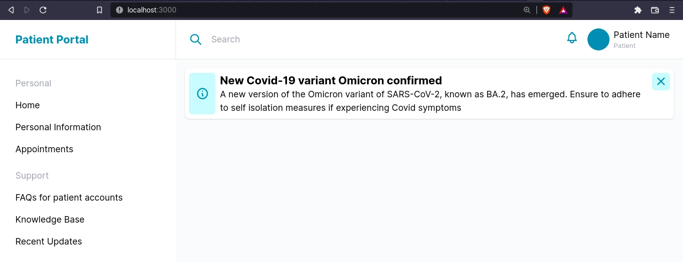
So far our portal homepage should look something like this:
Now that we know how to create content in Butter and integrate it into our Nuxt.js app, let’s create some more. We’ll create the pages and collections for personalized information like appointments and health information next. The content will be shown when the user navigates to the Appointments and Personal Information pages.
Create a Users page type for personal health information
Back in our Butter dashboard, let’s create a new page type for Users since user information should be shown on its own page. Navigate to Content Types > New Page Type.
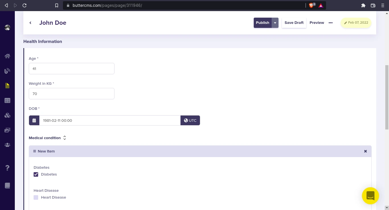
Here’s what the schema should look like:
- “SEO” - Component:
- “Name” - Short Text
- “First Name” - Short Text
- “Last Name” - Short text
- “Bio” - Long Text
- “Gender” - Short Text
- “Health Information” - Component:
- “Age” - Number
- “Weight in KG” - Number
- “DOB” - Date
- “Medical condition” - Repeater
- “Diabetes” - Check box
- “Heart Disease” - Check box
- “Stroke” - Check box
- “Asthma” - Check box etc.
- “Other Medical condition” - Short Text
- “Allergies” - Long Text
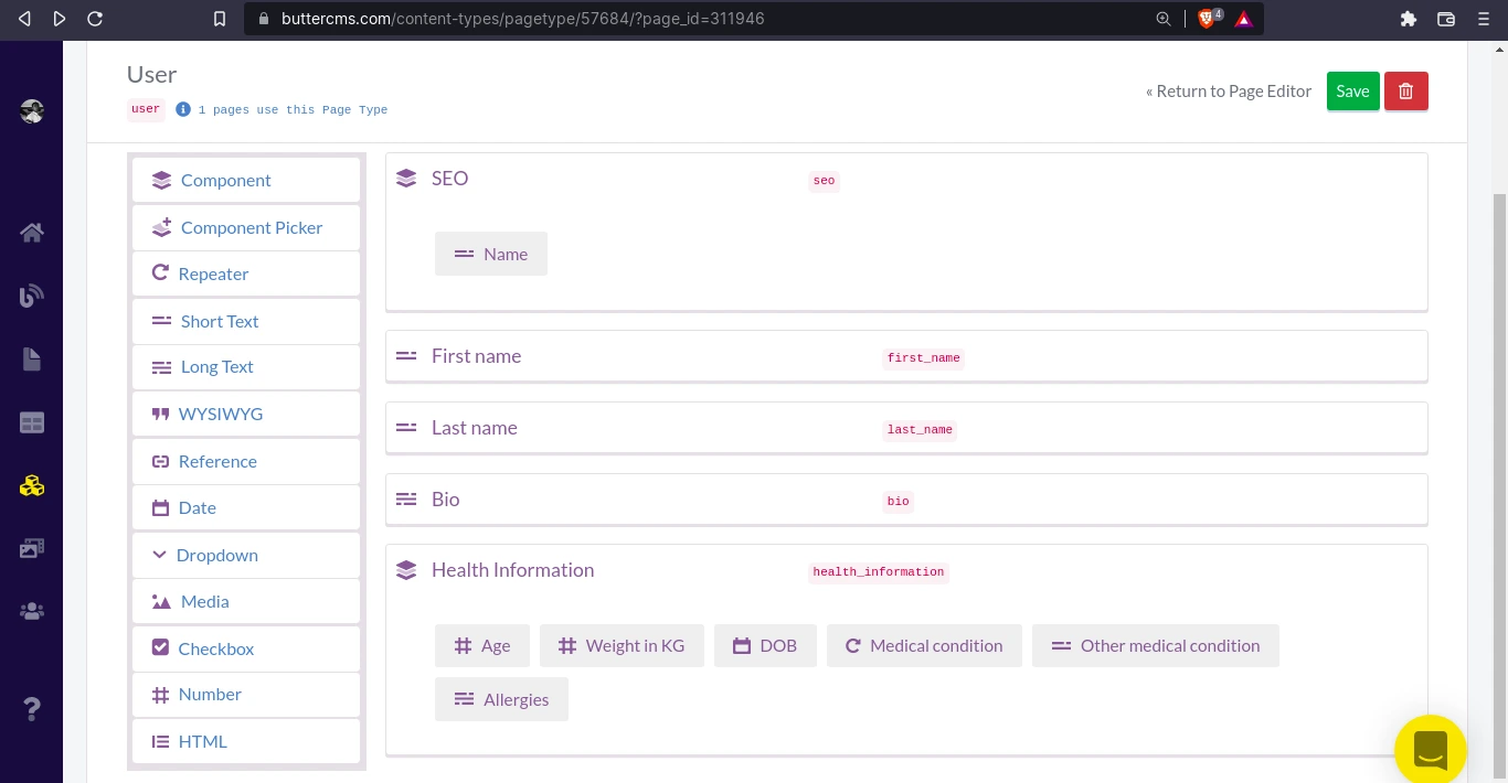
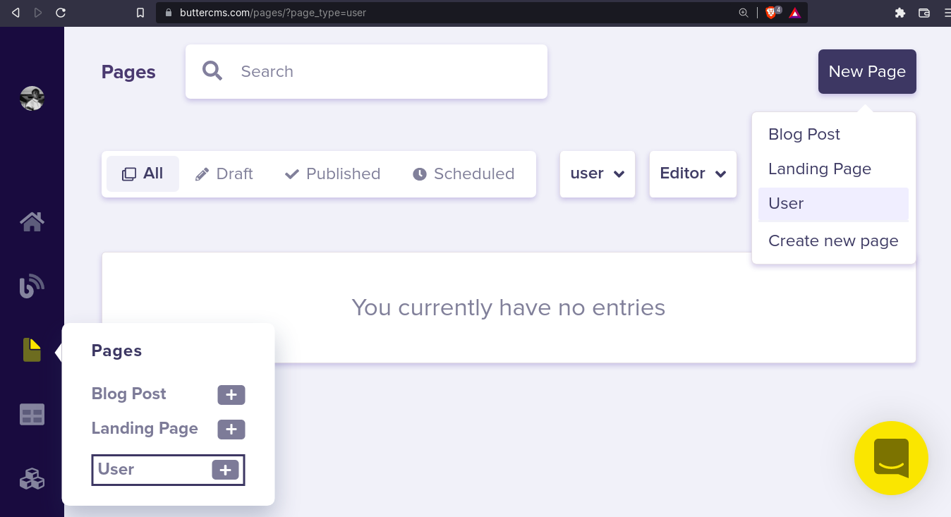
Save the page type as “User” and let’s proceed to create a new user.
Create a new user
Navigate to Pages and click on New Page and select User to create a new user:
Now, we can enter the details to create a new User. But first, we supply the Page metadata which will be used to retrieve our content:
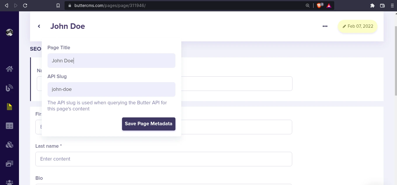
After that, fill in the details to create a new user:
Let’s check the API Explorer to see how to get our user:
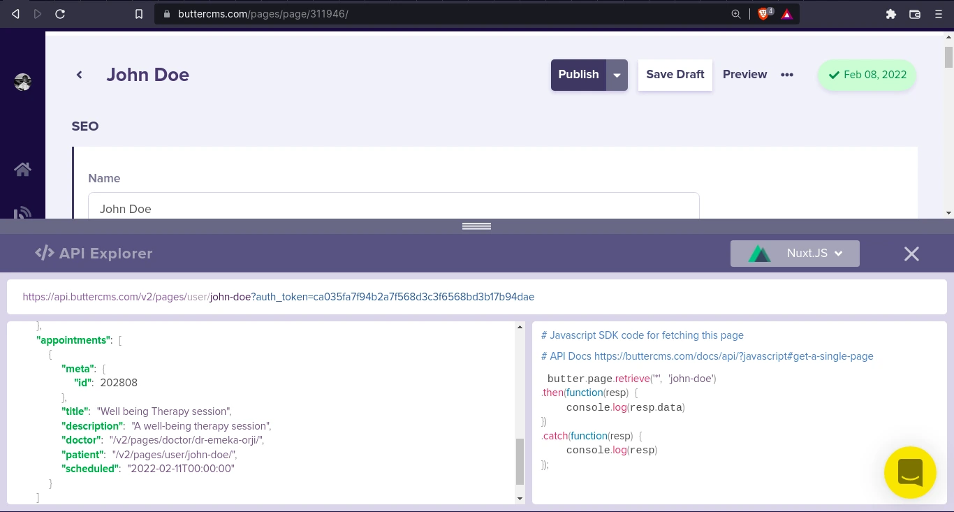
Great! So, we’re going to use butter.page.retrieve('*', 'john-doe') to get the data of this user.
Build a User page in Nuxt
To create a user page in Nuxt, using the default layout, create a new file pages/user.vue:
<!-- pages/user.vue -->
<template>
  <nuxt-layout name="default">
    <div class="wrapper p-4">
      <header>
        <h1>Personal Information</h1>
      </header>
      <section class="py-4">
        <header class="mb-2">
          <h2 class="font-bold text-3xl">{{ patient.name }}</h2>
        </header>
        <form action="" class="site-form">
          <div class="wrapper form-wrapper">
            <div class="form-group">
              <div class="form-control">
                <label for="first-name">First Name</label>
                <input
                  type="text"
                  name="first-name"
                  id="first-name"
                  v-model="patient.fields.first_name"
                  class="form-input"
                  required
                />
              </div>
              <div class="form-control">
                <label for="last-name">Last Name</label>
                <input
                  type="text"
                  name="last-name"
                  id="last-name"
                  v-model="patient.fields.last_name"
                  class="form-input"
                  required
                />
              </div>
            </div>
            <div class="form-group">
              <div class="form-control">
                <label for="age">Age</label>
                <input
                  type="number"
                  name="age"
                  id="age"
                  v-model="patient.fields.health_information.age"
                  class="form-input"
                  required
                />
              </div>
              <div class="form-control">
                <label for="dob">Date of Birth</label>
                <input
                  type="date"
                  name="dob"
                  id="dob"
                  v-model="patientDOB"
                  class="form-input"
                  required
                />
              </div>
            </div>
            <div class="form-control">
              <label for="weight">Weight in KG</label>
              <input
                type="number"
                name="weight"
                id="weight"
                v-model="patient.fields.health_information.weight_in_kg"
                class="form-input"
                required
              />
            </div>
            <div class="form-group">
              <div
                v-for="(value, name) in patient.fields.health_information
                  .medical_condition[0]"
                class="form-control form-check-control"
              >
                <label :for="name" class="capitalize">
                  {{ name.replace("_", " ") }}
                </label>
                <input
                  type="checkbox"
                  :name="name"
                  :id="name"
                  :checked="value"
                  v-model="
                    patient.fields.health_information.medical_condition\[0\][name]
                  "
                  class="form-input form-checkbox"
                />
              </div>
            </div>
            <div class="form-control">
              <label for="other">Other medical condition</label>
              <input
                type="text"
                name="other"
                id="other"
                v-model="
                  patient.fields.health_information.other_medical_condition
                "
                class="form-input"
              />
            </div>
            <div class="form-control">
              <label for="allergies">Allergies</label>
              <input
                type="text"
                name="allergies"
                id="allergies"
                v-model="patient.fields.health_information.allergies"
                class="form-input"
                required
              />
            </div>
          </div>
          <div class="action-cont py-4">
            <button class="cta">Update patient data</button>
          </div>
        </form>
      </section>
    </div>
  </nuxt-layout>
</template>
<script setup lang="ts">
  import { useUser } from "~~/composables/states";
  definePageMeta({
    layout: false,
  });
  const patient = useUser();
  const patientDOB = ref(
    new Date(new Date(patient.value.fields.health_information.dob).setHours(1))
      .toISOString()
      .substring(0, 10)
  );
  patient.value.fields.health_information.dob = computed(() => {
    return new Date(patientDOB.value).toISOString();
  });
</script>
This code can be retrieved from the GitHub repository: https://github.com/ButterCMS/create-customer-support-portal/blob/main/pages/user.vue
There are a few things going on. A very important one that we should take note of, however, is how we get patient data from these lines here:
import { useUser } from "~~/composables/states"
...
const patient = useUser()
There, we're importing the useUser state from composables and assigning it to “patient” in order to be used in our <template>.
To get the User data into our Nuxt app state, we’ll create a composables/states.js file to manage our state:
import { useState } from "#app";

export const useUser = () => useState("user", async () => {});
export const useUpdateUser = (data) => useState("update-user", () => (useUser().value = data));
That’s basically it for this file. We have two exports - useUser and useUpdateUser. We’ll use useUser to store the value of our User across our Nuxt instance and useUpdateUser to mutate that value. useUpdateUser takes a value data and assigns it to useUser().value.
We are going to fetch and update the User state from app.vue. Here’s how:
<!-- app.vue -->
...
<script setup>
  import "~/assets/css/main.css";
  import { useUpdateUser } from "./composables/states";
  const { $butter } = useNuxtApp();
  const user = await $butter.page
    .retrieve("*", "john-doe")
    .then(({ data: { data } }) => data)
    .catch((err) => console.log(err.response));
  useUpdateUser(user);
</script>
This is how we retrieve the user data of john doe using $butter.page.retrieve("*", "john-doe") and assign the data obtained from destructuring the response to the user. Finally, we pass the user into the useUpdateUser() function and save it to our state. Now, we can access our user data from useUser() across our Nuxt app.
Ok, back to pages/user.vue, we access the user data by importing and assigning it to patient:
import { useUser } from "~~/composables/states"
...
const patient = useUser()
And here’s what patient data looks like from our Vue Devtools when you navigate to http://localhost:3000/user
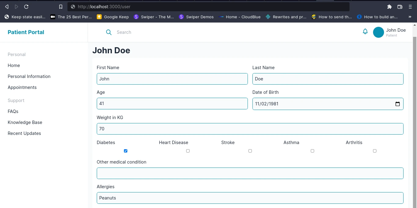
Then in the <template>, we have a <form> where we’re setting up two-way binding on our patient data using a v-model in our inputs. For example, for the first name and last name, we have:
<!-- pages/user.vue -->
...
<div class="form-group">
  <div class="form-control">
    <label for="first-name">First Name</label>
    <input
      type="text"
      name="first-name"
      id="first-name"
      v-model="patient.fields.first_name"
      class="form-input"
      required
    />
  </div>
  <div class="form-control">
    <label for="last-name">Last Name</label>
    <input
      type="text"
      name="last-name"
      id="last-name"
      v-model="patient.fields.last_name"
      class="form-input"
      required
    />
  </div>
</div>
...
In the code below, for the medical_condition, use a v-for to loop through the first object of the array and get the object key and value *v-for*``="(value, name) in patient.fields.health_information.medical_condition[0]"
<div class="form-group">
  <div
    v-for="(value, name) in patient.fields.health_information
      .medical_condition[0]"
    class="form-control form-check-control"
  >
    <label :for="name" class="capitalize">
      {{ name.replace("_", " ") }}
    </label>
    <input
      type="checkbox"
      :name="name"
      :id="name"
      :checked="value"
      v-model="
        patient.fields.health_information.medical_condition\[0\][name]
      "
      class="form-input form-checkbox"
    />
  </div>
</div>
For the input <label>, we get the key, i.e. name, and replace _ with whitespace: " ". This way heart_disease becomes heart disease.
In the checkbox <input>, v-model binds to patient.fields.health_information.medical_condition\[0\][name]. That way, when the input is checked or unchecked, it reflects in our patient data.
This way, we can add a @submit listener to our form which calls a function which sends the updated data back to Butter using Butter’s Write API.
Again, the full code for this page can be obtained from the GitHub repo: pages/user.vue.
Next, let’s take a look at how we can create user appointments collections. These appointments will be displayed on the home page and in the Appointments page in Nuxt.
Creating and adding user appointments
In this section we’ll walk through creating appointments collection type, adding references to users and doctors in that collection type and building the appointments component and page in Nuxt.
Create a user appointments collection
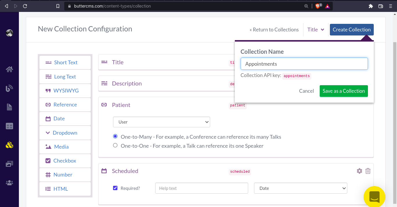
Navigate to Content Type > New Content Type > Collection. We’re already pretty familiar with how to create collections and page types by now, let’s quickly create an appointments collection with this schema:
- “Title” - Short Text
- “Description” - Long Text
- “Doctor” - Reference: One-to-one relationship (to Doctor Page Type)
- “Patient” - Reference: One-to-one relationship (to Patient Page Type)
- "Schedule" - Date
We’re adding a reference to a Doctor page type since appointments are typically between patients and doctors. So if we retrieve announcements, we should know that the doctor and the patient are having that appointment. But, we don’t have a doctor page type yet. So let’s create a page type for Doctors.
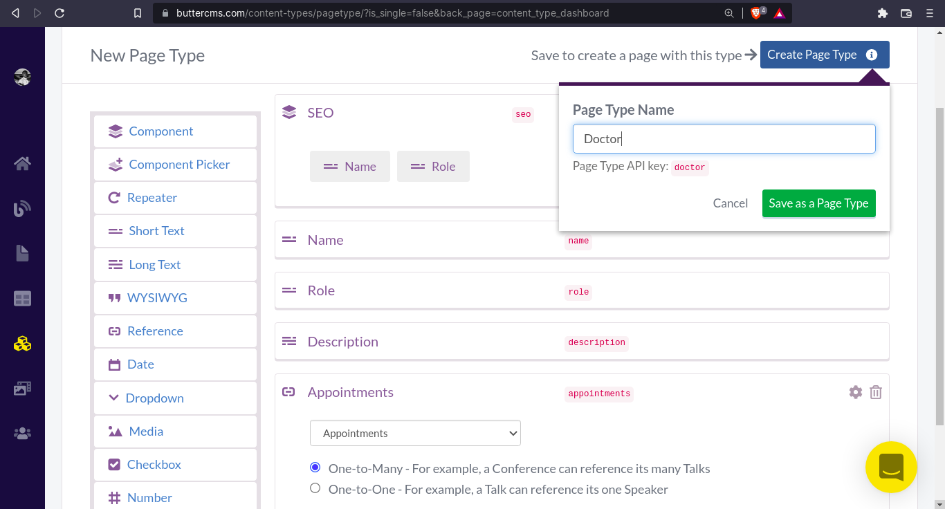
Creating a doctor page type
Navigate to Content Type > New Content Type > Page Type. Here’s what the schema for the Doctor page type would look like:
- “SEO” - Component:
- “Name” - Short Text
- “Role” - Short Text
- “Name” - Short Text
- “Role” - Short Text
- “Description” - Long Text
- “Appointments” - Reference: One-to-Many (to Appointments collection)
Update appointments collection with “Doctor” reference
Now that we’ve created the Doctor page type, we can add it as a Reference to the Appointments collection. Go back to the Content Type page and select the Appointments collection. Now, add a new field
- “Doctor” - Reference: One-to-one relationship (to Doctor Page Type)
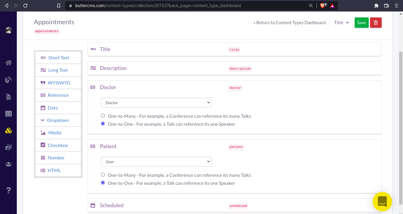
Add appointments reference to the User page type
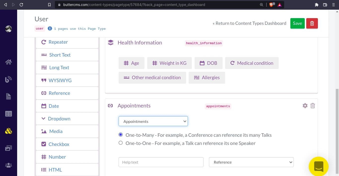
In our User Page Type we will add a reference to the Appointments collection. This way, when we retrieve a user, we can access the appointments for that user.
Great! Now let’s create a new Doctor so that we can arrange an appointment between our new Doctor and John Doe (User/Patient).
Create a new Doctor page
Go to Pages > New Page > Doctor and fill in the details to create a new doctor.
First, we’ll define the page metadata which will determine what we’ll use to fetch the page details:
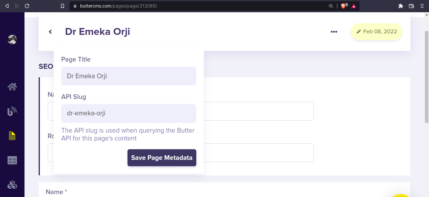
Then, we can fill in the details:
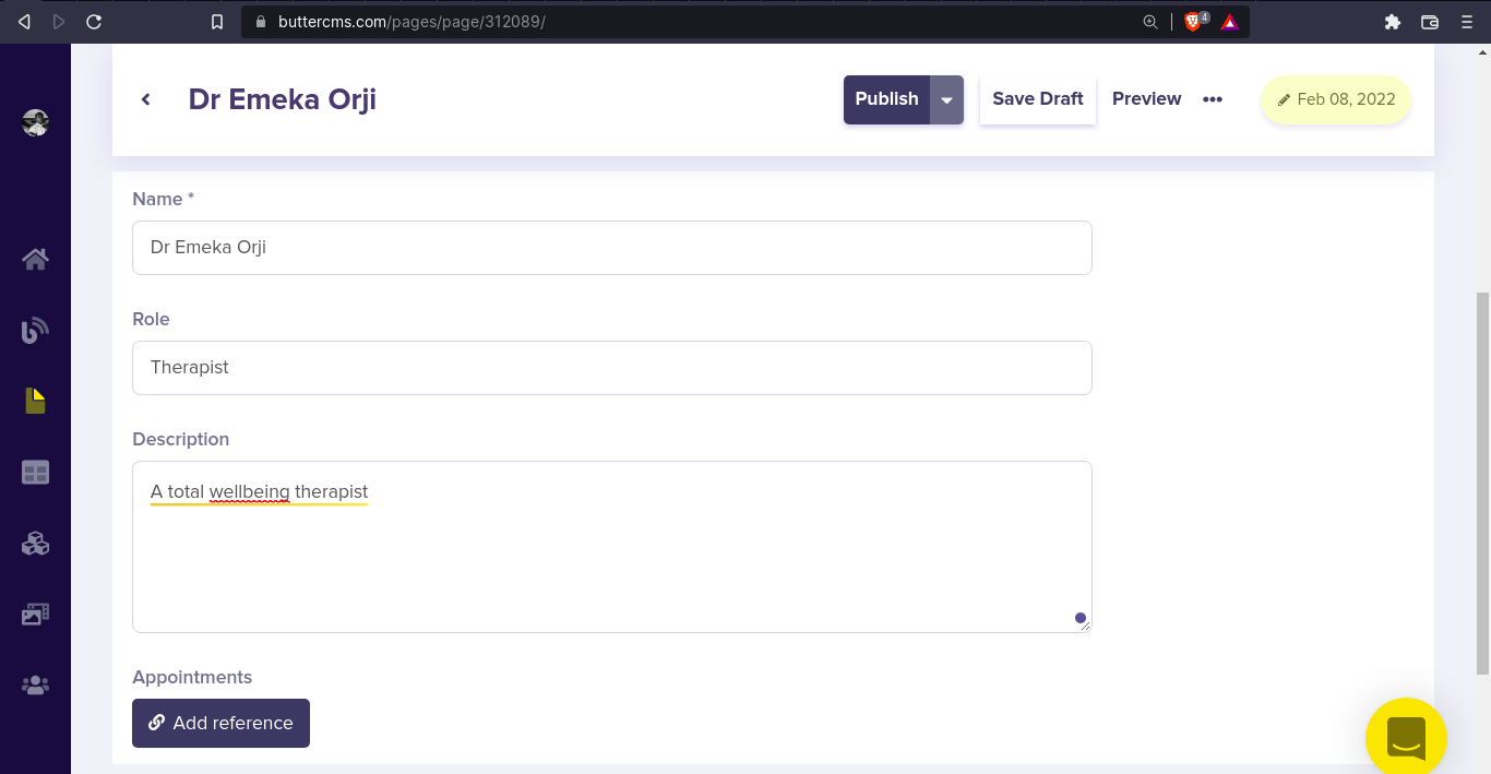
We currently do not have any appointments to reference yet. Let’s publish this page and create an appointment.
Create a new appointment
Go to Collections > New Item > Appointment to create a new appointment and fill in the fields, here’s what mine looks like:
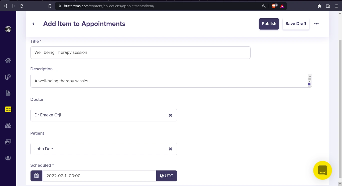
Click Publish to save and publish this appointment. We can now add this new appointment as a reference in both our User and Doctor page types.
Add an appointment to Doctor and User pages
Go to Pages and open the Doctor Page we just created: “Dr Emeka Orji”. Add a reference to the appointment we just created:
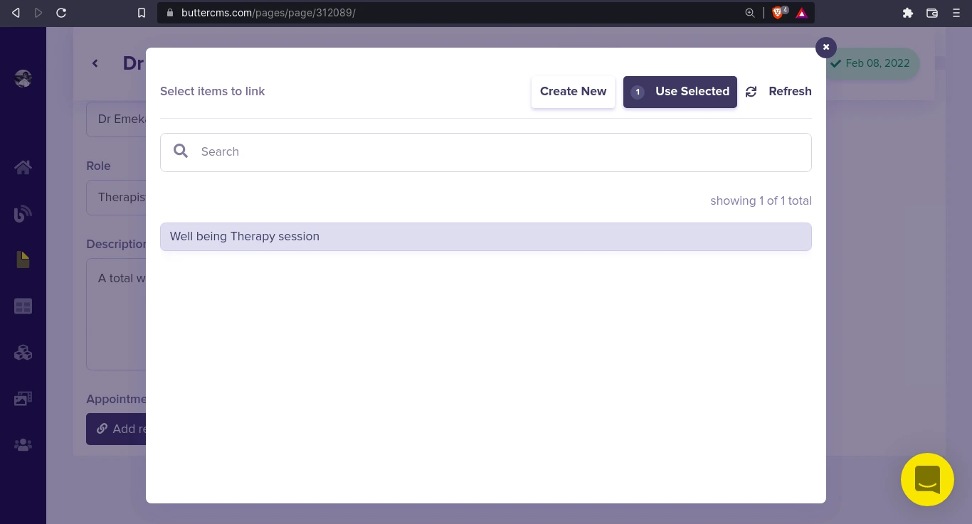
Once completed, click on Publish. Next, we’ll do the same for the User “John Doe”. Go to Pages and open our User page “John Doe” to add the appointment reference:
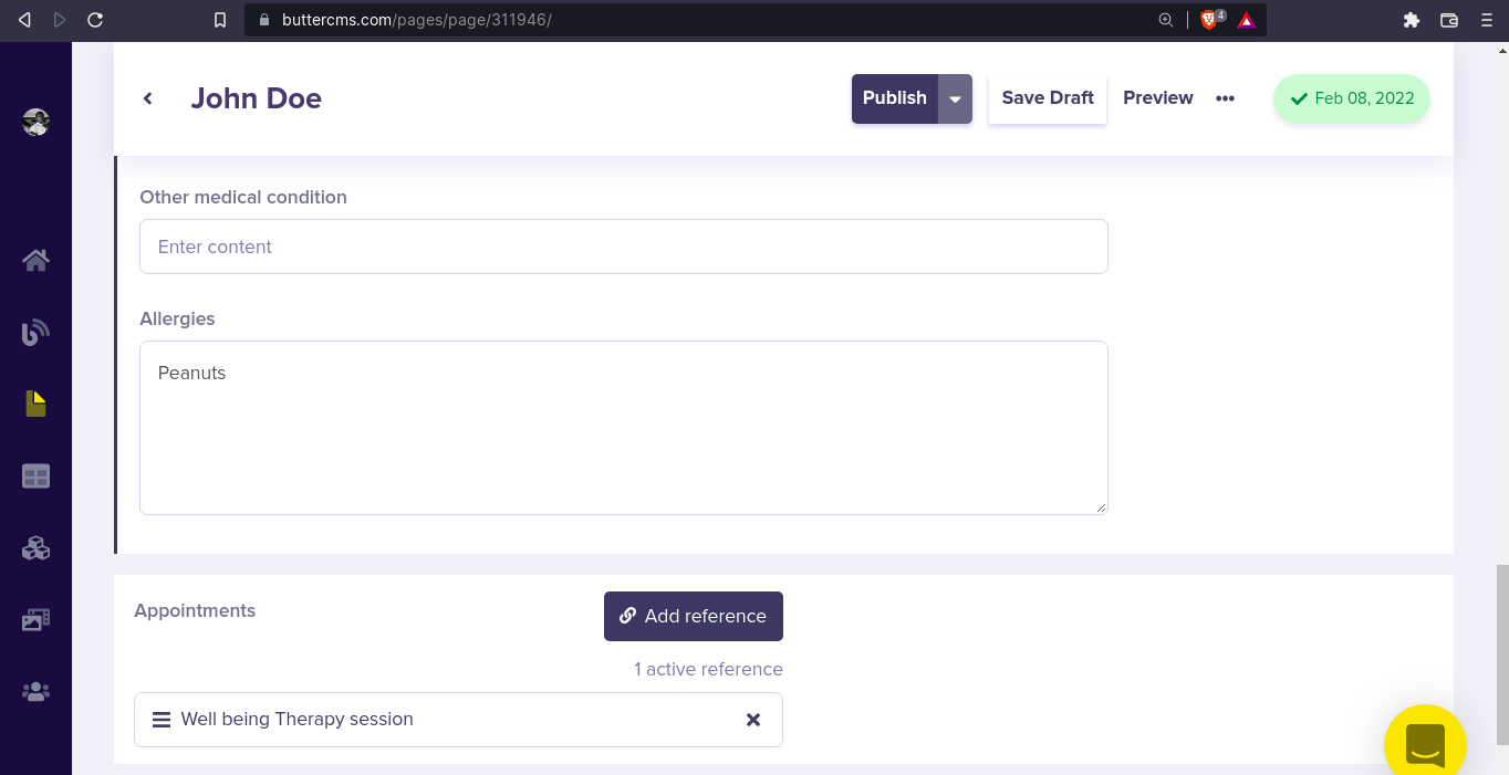
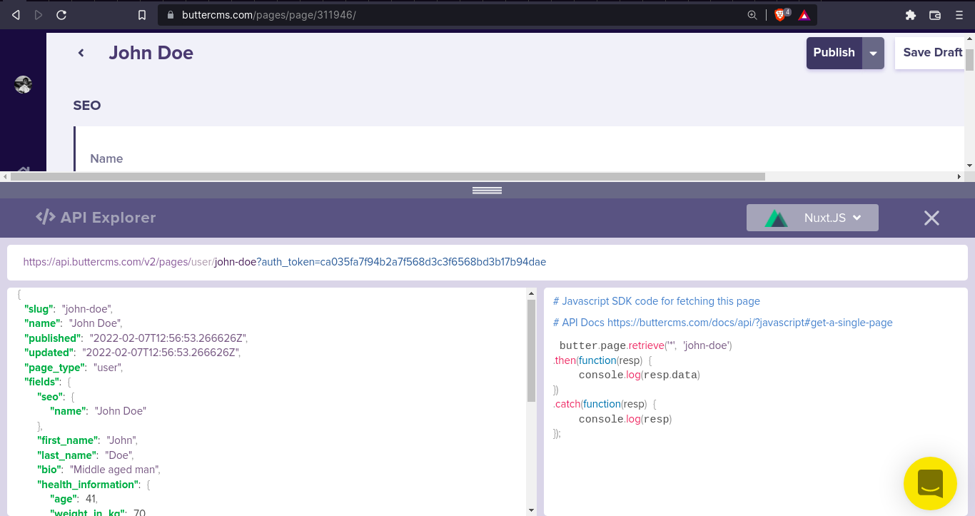
Great! Now, when we fetch our user, we should see the appointment. Let’s check this out in the API Explorer.
Click on the Three Dots(…) next to the Preview option in the top menu and select API Explorer from the drop-down:
Alright. Next, let’s build a component and a page for user appointments.
Build component and page for user appointments in Nuxt
Create a new file components/appointment.vue.
In this component, we get the appointment data as “props” using Nuxt’s defineProps() method:
const props = defineProps({
  appointment: Object,
});
Now, props.appointment will return our appointment data and we can use that in our template. Remember that the appointments property in the User object looks like this:
{
  ...
  "appointments": [
      {
        "meta": {
          "id": 202808
        },
        "title": "Well being Therapy session",
        "description": "A well-being therapy session",
        "doctor": "/v2/pages/doctor/dr-emeka-orji/",
        "patient": "/v2/pages/user/john-doe/",
        "scheduled": "2022-02-11T00:00:00"
      },
  ]
  ...
}
If you notice, from the response above, the "doctor" and "patient" fields are just links to those pages and don’t give us the data. We’ll need the doctor data to display the doctor's name in the template. We can do that by extracting the slug from the link provided and using $butter.page.retrieve() to get the data we need, like so:
<script setup>
  const props = defineProps({
    appointment: Object,
  });
  const { $butter } = useNuxtApp();
  const docRoute = props.appointment.doctor;
  const doctorSlug = computed(() => {
    let array = props.appointment.doctor.split("/").slice(0, -1);
    return array[array.length - 1];
  });
  const doctor = await $butter.page
    .retrieve("*", doctorSlug.value)
    .then(({ data: { data } }) => data)
    .catch((err) => console.log(err));
</script>
Now, we can display our data in the <template>. Everything plus the <template> should look like this in components/appointment.vue:
<!-- components/appointment.vue -->

<template>
  <article class="border bg-gray-50 rounded-md">
    <div class="wrapper p-4">
      <header class="pb-2">
        <div class="wrapper">
          <h3 class="font-semibold text-2xl">{{ appointment.title }}</h3>
          <p>{{ appointment.description }}</p>
        </div>
      </header>
      <ul class="details">
        <li class="pt-2">
          <header class="label">
            <hero-icon name="user" class="text-cyan-600 w-5 h-5" />
            <h4 class="">Doctor</h4>
          </header>
          <p class="">{{ doctor.name }}</p>
        </li>
        <li class="pt-2">
          <header class="label">
            <hero-icon name="clock" class="text-cyan-600 w-5 h-5" />
            <h4 class="">Scheduled</h4>
          </header>
          <p class="">
            {{ new Date(appointment.scheduled).toDateString() }} |
            {{ new Date(appointment.scheduled).toTimeString() }}
          </p>
        </li>
      </ul>
    </div>
  </article>
</template>
<script setup>
  const props = defineProps({
    appointment: Object,
  });
  const { $butter } = useNuxtApp();
  const docRoute = props.appointment.doctor;
  const doctorSlug = computed(() => {
    let array = props.appointment.doctor.split("/").slice(0, -1);
    return array[array.length - 1];
  });
  const doctor = await $butter.page
    .retrieve("*", doctorSlug.value)
    .then(({ data: { data } }) => data)
    .catch((err) => console.log(err));
</script>
<style scoped>
  .label {
    @apply flex gap-2 w-min p-1 px-2 text-cyan-600 bg-cyan-200 mb-1 rounded-md;
  }
</style>
And that’s our components/appointment.vue component. You can view the code for the component on GitHub.
Next, on the home page pages/index.vue, we use v-for to loop through all user appointments and pass the appointment as “props” to the <appointment> component:
<!--pages/index.vue -->

<template>
  <nuxt-layout name="default">
    <div class="wrapper p-4">
      <header>
        <div class="wrapper">
          <h2 class="font-bold text-3xl">Hey, {{ user.name }}</h2>
        </div>
      </header>
      <section class="py-4">
        <div class="wrapper bg-white rounded-lg">
          <header class="p-4 border-b border-b-gray-200">
            <h3 class="font-semibold text-xl">Your appointments</h3>
          </header>
          <ul class="cont p-4">
            <li v-for="appointment in appointments" :key="appointment.meta.id">
              <appointment :appointment="appointment" />
            </li>
          </ul>
        </div>
      </section>
    </div>
  </nuxt-layout>
</template>
<script setup>
  import Appointment from "~~/components/appointment.vue";
  import { useUser } from "~~/composables/states";
  definePageMeta({
    layout: false,
  });

  // Get user from state
  const user = useUser();
  const appointments = user.value.fields.appointments;
</script>
You can view the code for this page on GitHub.
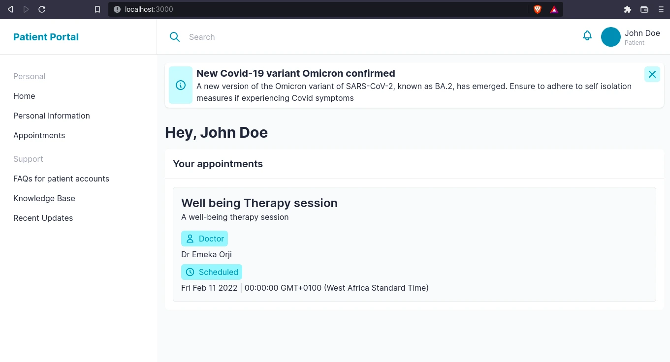
This is what we get:
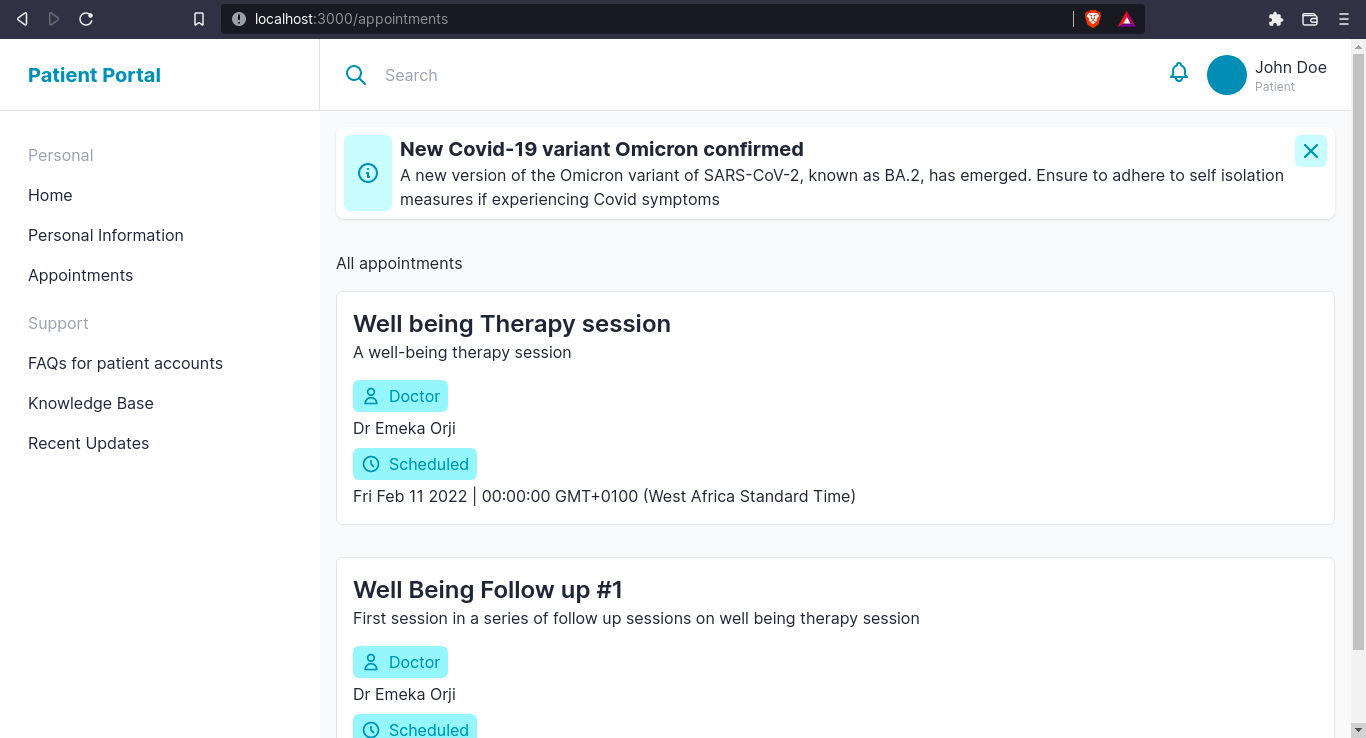
Now, for the appointments page that will display all appointments, we’ll create a new page, pages/appointments.vue:
<!--pages/appointment.vue-->

<template>
  <nuxt-layout name="default">
    <div class="wrapper p-4">
      <header>
        <h1>All appointments</h1>
      </header>
      <section
        v-for="appointment in appointments"
        :key="appointment.meta.id"
        class="flex flex-col gap-4 cont py-4"
      >
        <appointment :appointment="appointment" class="!bg-white" />
      </section>
    </div>
  </nuxt-layout>
</template>
<script setup>
  import { useUser } from "~~/composables/states";
  definePageMeta({
    layout: false,
  });
  const user = useUser();
  const appointments = user.value.fields.appointments;
</script>
You can view the code for this page on GitHub.
We should have something like this:
It's looking good! Next, we’ll add collections and content for FAQs, Knowledge Base, and Recent Updates pages (which will be blogs/articles for this tutorial).
Create FAQ and Category collections
Now we can move on to creating the collection types for FAQ and Categories. The Category collection type lists the category a FAQ belongs to. For example, a FAQ about the portal features can belong to the Category of “Features”. We’ll create the category collection first.
Navigate to Content Types > New Content Type > Collection to create a new collection with this schema:
- “Name” - Short Text
- “Slug” - Short Text
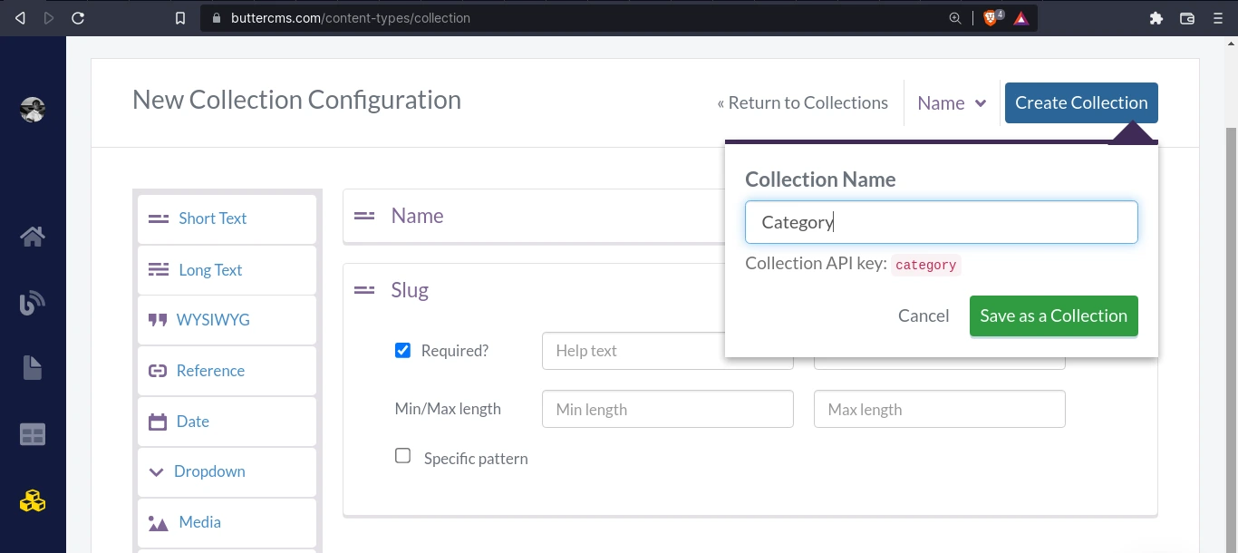
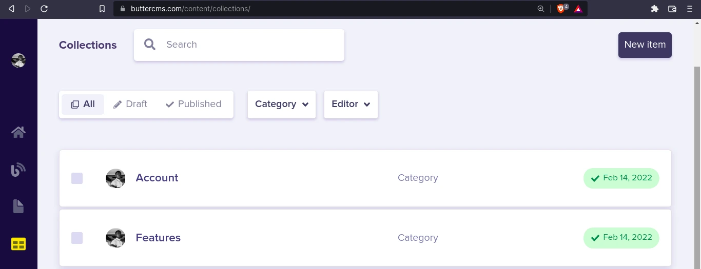
Go to Collection > New Item > Category to create a few new category items:
Here, I’m creating a category called features.
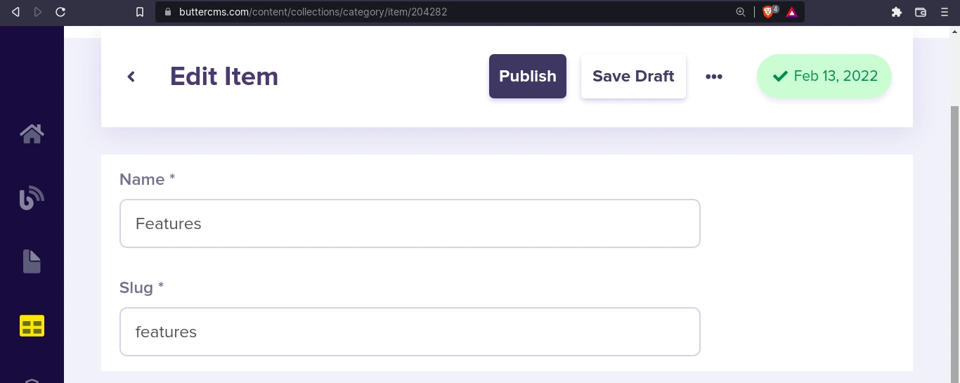
Here are a few categories:
Let’s go back and navigate to Content Types > New Content Type > Collection to create a new collection for FAQs. Here’s what the schema would look like:
- “Title” - Short Text
- “Answer”- Long Text
- “Category” - Relation (To category collection, One-to-many**, since one FAQ can cover multiple categories)
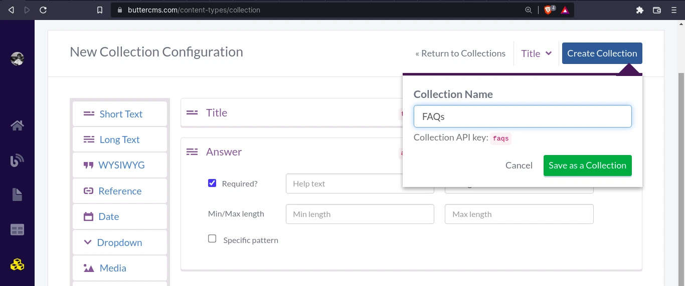
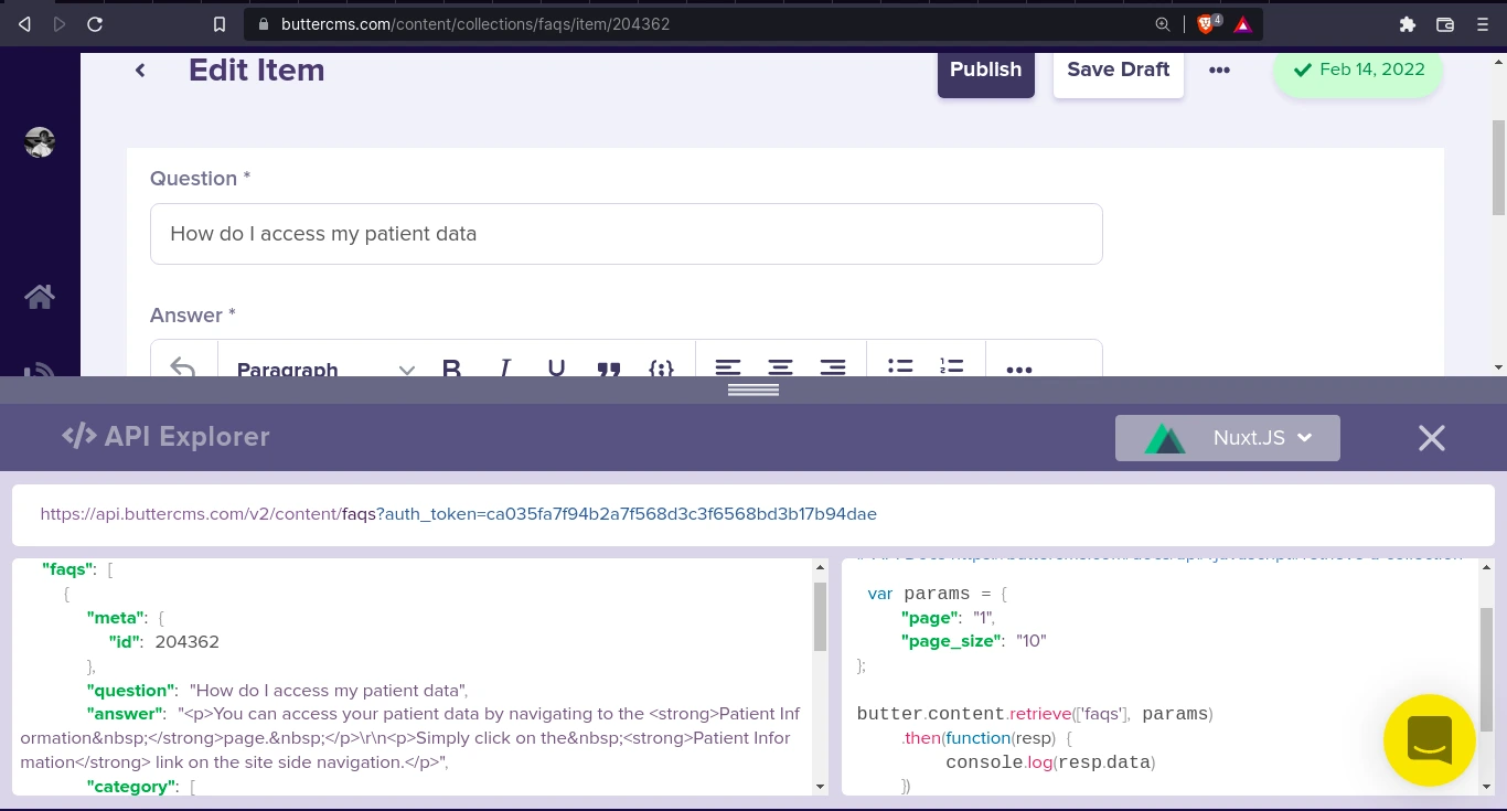
Once the collection has been saved, we can create a few FAQs. Here’s one:
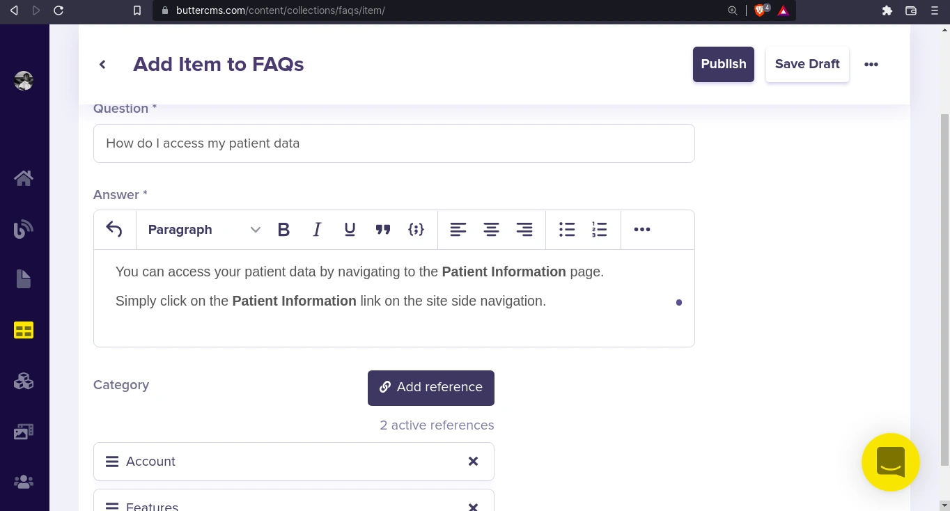
Once, published we can see a preview of the FAQ data with the API Explorer:
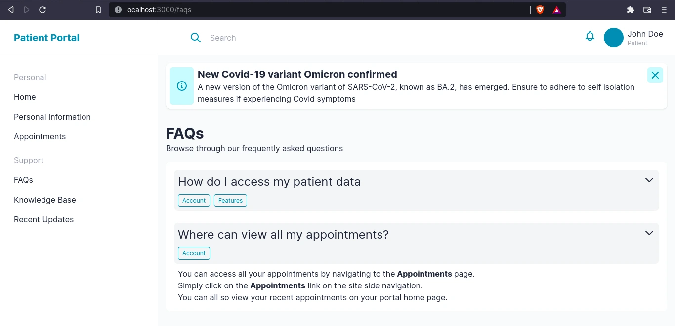
Awesome. Now that our data is ready, we can build the FAQ page in Nuxt.
Build the FAQ page in Nuxt
Let’s create a new page pages/faqs.vue. First, we get the faqs content using $butter:
<!--pages/faqs.vue -->
<script setup>
...
const { $butter } = useNuxtApp();

const params = { page: "1", page_size: "10" };
const faqs = await $butter.content
        .retrieve(["faqs"], params)
        .then(({ data: { data } }) => data.faqs)
        .catch((err) => console.log(err.respoonse));
</script>
Then in our template, in order to render the body from the WYSIWYG editor, we use v-html to render the content in HTML. It’s very important to note the <client-only> component. We’re using it to render the element on the client side and avoid any mismatching or hydration errors.
<!--pages/faqs.vue -->
...
<ul class="flex flex-col gap-4 cont p-4">
  <li
    v-for="faq in faqs"
    :key="faq.meta.id"
    @click="toggleFAQ"
    class="faq"
  >
    <client-only>
      <header class="p-2 bg-gray-100 rounded-lg mb-2">
        <div class="wrapper flex justify-between gap-4">
          <h2 class="text-2xl">{{ faq.question }}</h2>
          <hero-icon name="chevronDown" />
        </div>
        <ul v-if="faq.category" class="categories flex gap-2 pt-2">
          <li v-for="category in faq.category">
            <button
              class="cta !p-1 !px-2 !text-cyan-600 text-xs border !border-cyan-600 !bg-transparent !rounded"
            >
              {{ category.name }}
            </button>
          </li>
        </ul>
      </header>
      <article
        v-html="faq.answer"
        class="answer max-h-0 px-2 overflow-hidden"
      ></article>
    </client-only>
  </li>
</ul>
...
You can view the full code for this page on GitHub. Here’s what it looks like:
Moving on, we’ll create the pages for the last two features of our portal: the Knowledge Base and Updates pages.
Create page types and content for knowledge base and recent updates
The knowledge base is going to be a list of all Article pages. Let’s create an Article page type. Its schema will be similar to that of the Blog Post page type. Here’s what the schema for our blog post would look like:
- “SEO” - Component:
- “Text” - Short Text
- “Description” - Long Text
- “Header” - Component:
- “Text” - Short Text
- “Description” - Long Text
- “Published” - Date
- “Body” - WYSIWYG
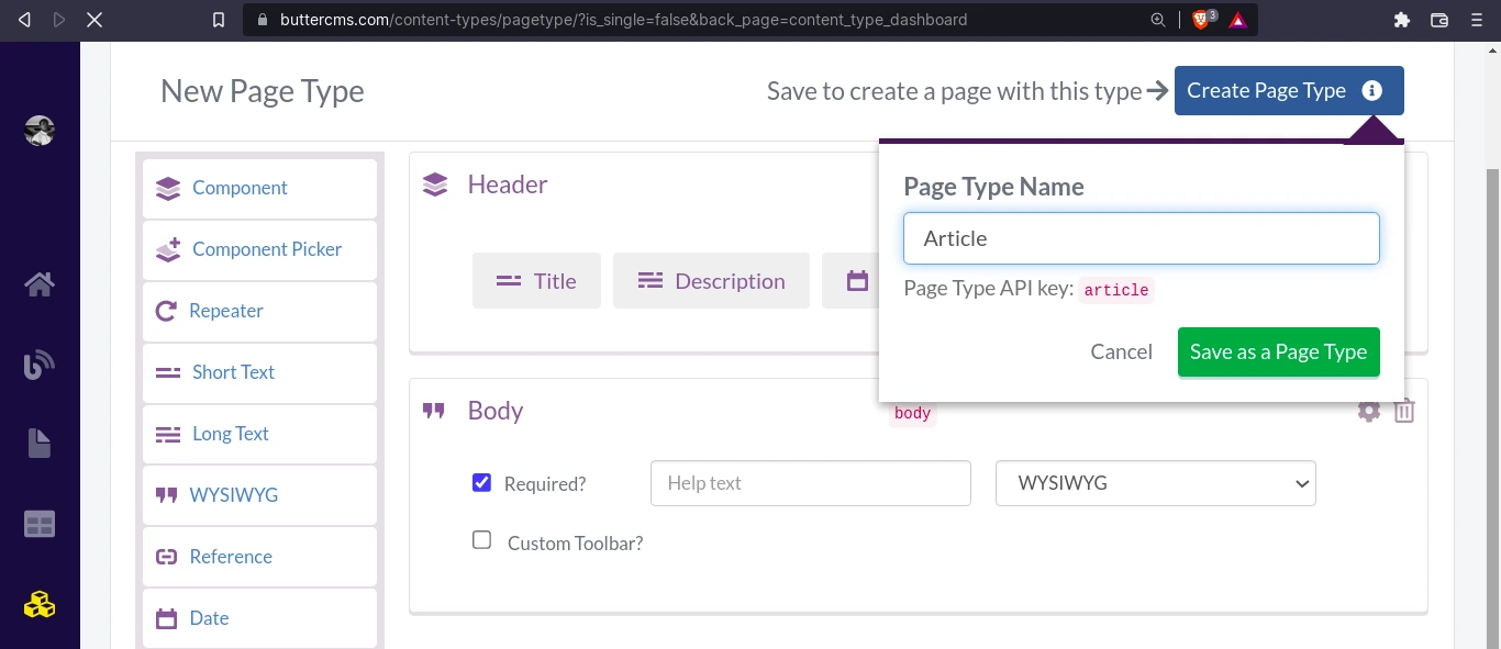
Now, create a few articles. Here’s one of mine:
As for the Updates page, we’ll use the Blog Post page type we created a while back. Let’s build the pages now in Nuxt.
Build knowledge base and blog post views in Nuxt
To build the Knowledge Base page, which will contain a list of published articles, we’ll first create the articles.vue component which will display the title and description of a single article in the list. Create a new file components/articleItem.vue:
<!-- components/articleItem.vue -->

<template>
  <li
    class="bg-white transition-all p-4 hover:shadow-md rounded-lg cursor-pointer"
  >
    <nuxt-link :to="`/kb/${article.slug}`">
      <header>
        <div class="wrapper">
          <h2 class="font-bold text-2xl">
            {{ article.fields.header.title }}
          </h2>
          <p>{{ article.fields.header.description }}</p>
          <span class="label mt-2">
            <hero-icon name="clock" class="text-cyan-600 w-5 h-5" />
            <h4 class="">
              {{
                new Date(article.fields.header.published).toLocaleDateString()
              }}
            </h4>
          </span>
        </div>
      </header>
    </nuxt-link>
  </li>
</template>
<script setup>
  const props = defineProps({
    article: Object,
  });
</script>
You can view the full code for this component on GitHub. Now we can use this component to display a preview for our Knowledge Base articles and Blog Post updates.
For the Knowledge Base page, create the new file pages/kb/index.vue. Fetch the articles and display them using the article-item component:
<!-- pages/kb/index.vue -->
<template>
<nuxt-layout name="default">
<div class="wrapper p-4">
<header>
<div class="wrapper">
<h2 class="font-bold text-3xl">Knowledge Base</h2>
<p>Browse through our collection of helpful articles and resources</p>
</div>
</header>
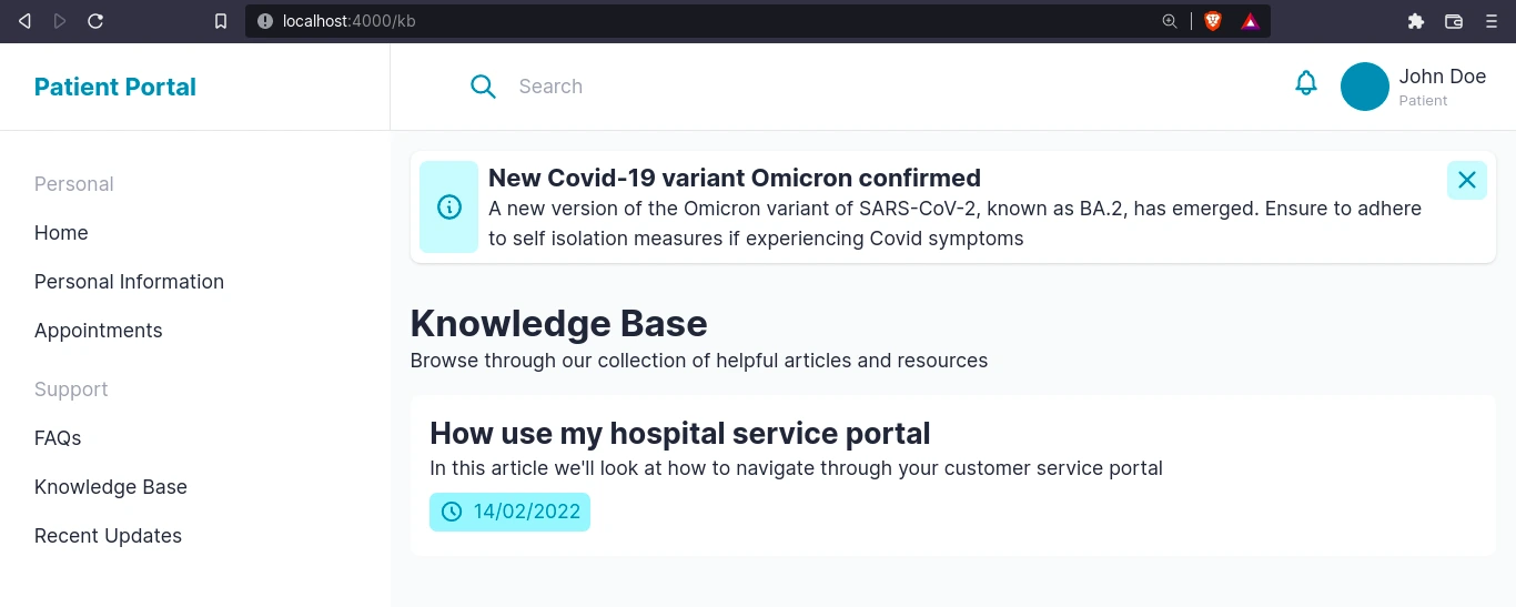
<section class="py-4">
<div class="wrapper">
<ul class="flex flex-col gap-4 cont">
<article-item v-for="article in articles" :key="article.slug" :article="article"></article-item>
</ul>
</div>
</section>
</div>
</nuxt-layout>
</template>
<script setup>
definePageMeta({
layout: false,
});
const { $butter } = useNuxtApp();
const params = { page: 1, page_size: 10 };
const articles = await $butter.page
.list("article", params)
.then(({ data: { data } }) => data)
.catch((err) => console.log(err));
</script>
You can view the full code for this component on GitHub. Here’s what it should look like:
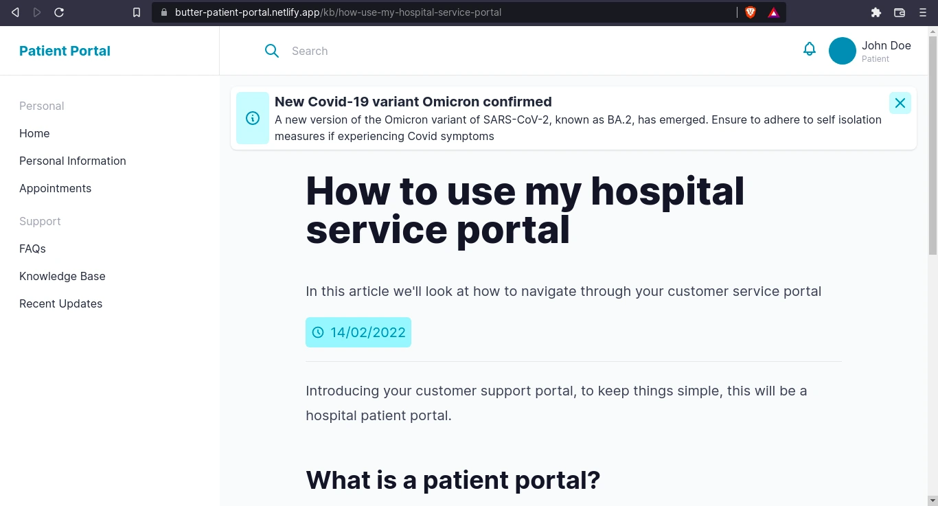
Next, we’ll create the pages/kb/[slug].vue dynamic page which will display individual knowledge base articles. Here, we get the slug from the route parameters and use it to fetch our article in butter with $butter.page.retrieve.
<!-- pages/kb/[slug].vue -->
...
<script setup>
...

const route = useRoute();
const slug = route.params.slug;

const route = useRoute();
  const slug = route.params.slug;
  const { $butter } = useNuxtApp();
  const article = await $butter.page
    .retrieve("*", slug)
    .then(({ data: { data } }) => data)
    .catch((err) => console.log(err));
</script>
You can view the code on GitHub. Now, in our <template>, we’ll set up the WindiCSS typography plugin so that we can make use of the .prose class to style our article. Create the [windi.config.js](https://github.com/miracleonyenma/butter-patient-portal/blob/main/windi.config.js) file and add the following lines:
export default {
  plugins: [require("windicss/plugin/typography")],
};
Great! Now go back to pages/kb/[slug].vue and in the template, we can use the .prose class:
<!-- pages/kb/[slug].vue -->
<template>
  ...
    <article class="">
      <div class="wrapper prose prose-xl p-4 m-auto">
        <header class="pb-4 mb-6 border-b border-b-gray-200">
          <div class="wrapper">
            <h1 class="font-bold text-5xl">
              {{ article.fields.header.title }}
            </h1>
            <p class="text-xl">{{ article.fields.header.description }}</p>
            <span class="label mt-2">
              <hero-icon name="clock" class="text-cyan-600 w-5 h-5" />
              <span class="">
                {{
                  new Date(article.fields.header.published).toLocaleDateString()
                }}
              </span>
            </span>
          </div>
        </header>
        <client-only>
          <p v-html="article.fields.body"></p>
        </client-only>
      </div>
    </article>
  ...
</template>
...
You can view the full code for this page on GitHub. Here’s what it should look like:
In order to build the pages for the Updates page, we can follow the same steps for the knowledge base pages. Create the pages/updates/index.vue page. You can view the code for this page on Github.
For individual blog posts, similarly create a dynamic page pages/updates/[slug].vue. You can view the code for this page on Github.
Awesome! We’ve managed to build a hospital portal with a number of functionalities and features using ButterCMS. Let’s see how we can add more to it. You can check out the deployed project, hosted on Netlify.
Add more features and functionality to your patient portal
Fortunately, we can drastically improve what we have so far and add more functionality. For example, we can include a signup feature for the ability to add more users by including authentication services in our Nuxt app.
With authentication and authorization in place, users will not only be able to view health information and appointments, but also update their health information and book new appointments. This requires sending data to the ButterCMS back-end and this can be achieved using Butter’s Write API.
Authentication and authorization services
This can easily be included into the Nuxt app by integrating one of the many authentication services out there. I’ll list a few:
Feel free to look up how to integrate these services with Nuxt. Hopefully, in a future article, we’ll cover how to integrate one of these authentication services into our app.
Conclusion
So far, we’ve covered a lot in this tutorial. From what the customer support portal is, why it is important, and what its benefits are, to how we can build one with ButterCMS and Nuxt.
We created a self-service/customer support portal for customers. In this case, it was a hospital patient portal that showcases the following content from the CMS backend:
- Personalized content: appointments, messages, personal medical information
- Recent hospital announcements
- Covid updates
We mentioned the appropriate collection types and pages with links to the documentation on ButterCMS and saw how to create these collections and pages.
We also highlighted how Butter can be used to build the following:
- Knowledge Base & Resource pages
- FAQs
- Recent Updates
We’ve also discussed how even more functionalities can be added to the customer portal by including authentication and authorization services.
Do you want your product or marketing team to test Butter CMS? We can set up a live demo to walk your team through the fast, easy-to-use interface.
