
- What is Nuxt?
- What is ButterCMS?
- Tutorial prerequisites
- Tutorial: Building a performant Nuxt landing page powered by ButterCMS
- Create a new page type in ButterCMS
- Creating our components in ButterCMS
- Creating a landing page using the created page type
- Project setup: Installing the Nuxt application
- Creating our components in the Nuxt application
- Viewing the rendered landing page
- Final thoughts
A landing page is a stand-alone web page designed specifically for marketing or advertising purposes. Landing pages are an integral part of most marketing/advertising campaigns. However, creating landing pages comes with challenges; of which, the most predominant is content management.
In many cases, landing page content needs to be changed quickly in real-time in response to the ever-changing nature of marketing/advertising campaigns—be that accommodating a specific audience segment or a seasonal sale. Manually making these changes to most pre-existing landing pages would require immense manpower and technical assistance. This can lead to the slow delivery of new content as well as the slow removal of outdated content. This challenge can be solved if the content is served to the landing pages in real time through a headless content management system (CMS).
In this article, we will be building a landing page using ButterCMS, a headless CMS, and Nuxt, a Vue framework.
Table of contents
What is Nuxt?
Nuxt.js is the most user-friendly Vue framework available today. It enhances the power of Vue.js by incorporating server-side rendering features. With Nuxt, you can create a complete server-side rendered application or a single-page application quickly and efficiently.
Nuxt is also intuitive, which means that it provides many features of Vue.js out of the box such as pages, routing, middleware, and plugins. Nuxt also solves the problem of structuring your Vue project by providing an enterprise-ready, front-end development architecture. Nuxt’s features are already structured under industry standards for developing enterprise applications.
What is ButterCMS?
Since ButterCMS is a headless CMS, there are no worries about the type of technologies used to render your content. ButterCMS provides a CMS platform that comprises a robust CMS dashboard and a content API. You can manage your content in a single place (the CMS Dashboard) while serving that content to different platforms or technologies using its content API. ButterCMS is a flexible, headless CMS and is supercharged with features like components, collections, and page types (to name a few), which makes structuring, creating, and managing content on the CMS dashboard relatively easy.
Tutorial prerequisites
To follow along with this tutorial, you will need to have the following:
- Basic knowledge of JavaScript
- Basic knowledge of the Vue framework
- Node.js installed on your local machine
- Package managers like Yarn or npm (npx) installed and confirmed working
- Visual Studio Code (VS Code) Editor
- An active ButterCMS trial account
Tutorial: Building a performant Nuxt landing pages powered by ButterCMS
Tutorial objectives: Our main objective for this tutorial is to learn how to build a simple landing using Nuxt and ButterCMS. After this tutorial, we will be able to create a page from a custom landing page type as well as learn how to create components and collections. We will also learn how to integrate ButterCMS into a Nuxt application.
Case study: In this tutorial, we will use the landing page at https://codepen.io/thedevenv/pen/gORwVZv as an inspiration to illustrate how to build a Nuxt.js landing page with ButterCMS.
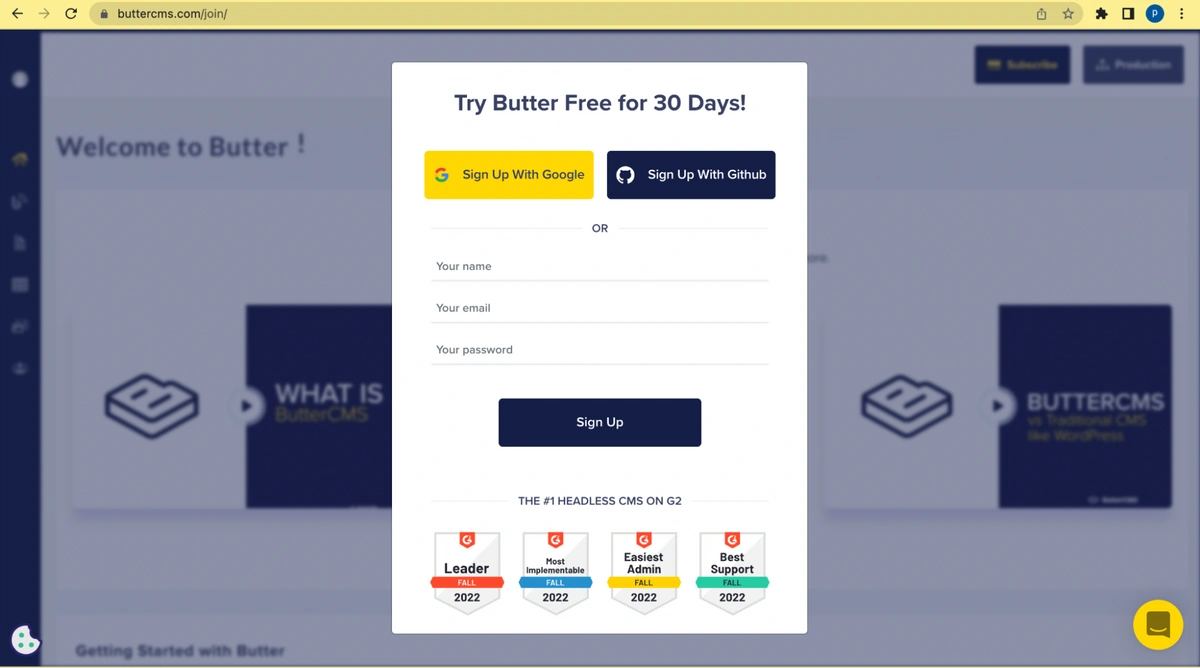
Getting started with ButterCMS
To start with Butter, you will need to sign up for ButterCMS. There are several ways to sign up, including via email, Google sign-in, or GitHub sign-in.
Setting up a landing page in ButterCMS
On signup, you will be redirected to the ButterCMS dashboard where you can manage your content. To create a landing page, select the Landing Page link in the Pages menu.
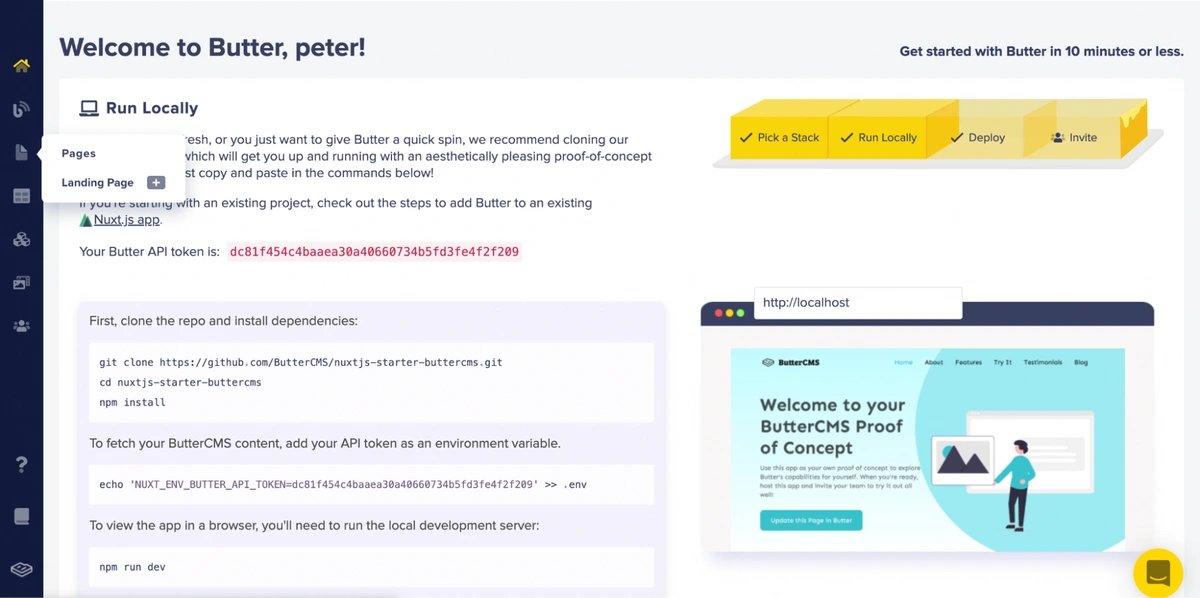
Welcome to the Butter page
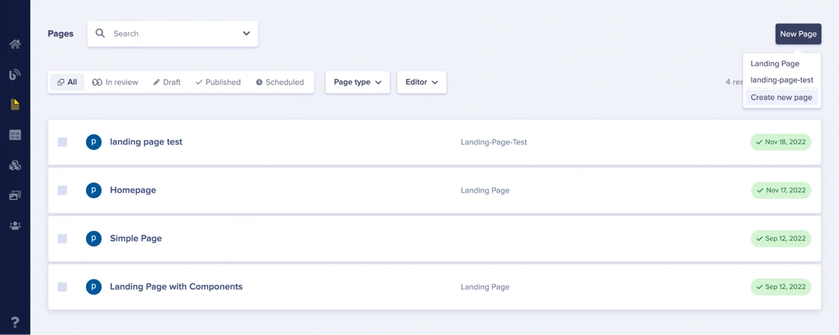
Upon selecting the Landing Page link, you will be redirected to the Pages menu where you can view existing landing pages and create new ones.
Create a new page type in ButterCMS
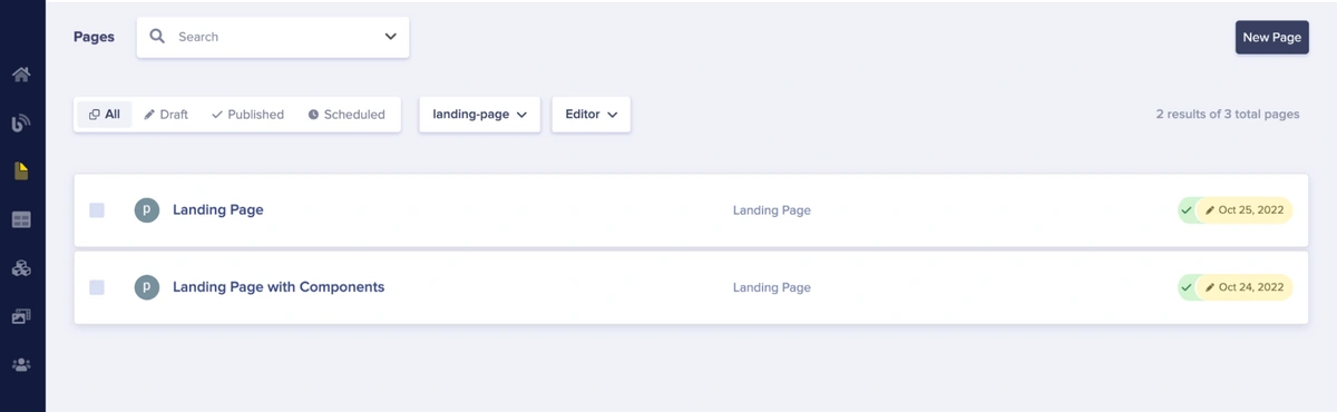
ButterCMS Pages list page
To create a page type, click the New Page button. This will bring up a dropdown that displays Landing Page and Create New Page and also show custom-created pages if you have created any before.
Creating a new page in Butter
Butter can create a landing page by using its landing page type template (the Landing Page link in the dropdown menu). However, we will not be using that, but rather creating our own custom landing page type by using the New Page feature.
To create a new page, click the Create New Page link. Upon clicking that link, you will be navigated to a new page where you will create a new page type. Keep in mind that you can first compose your page and then turn it into a page type by going to the page in Butter, selecting the three dots in the top right corner, select edit schema, and then click create page type and save.
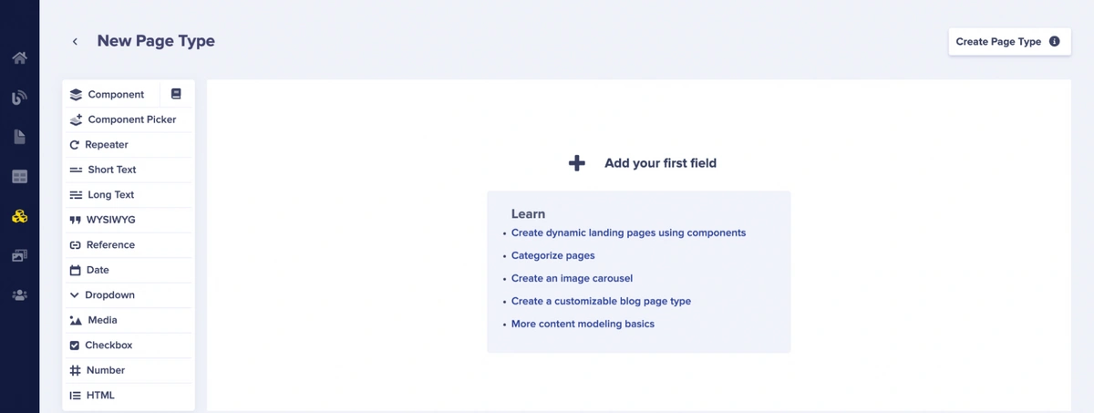
Configure new page type page
On the new page, we will create the structure of our page type by using components. In Butter, components are like reusable units you can add to your pages. For example, if you create a component that handles page headings, you do not need to add headings to your pages from scratch anytime you desire to create a page. Instead, you can reuse the component that handles headings. Components in Butter speed up page creation and allow for various types of pages.
We will also learn how to create custom components in the article but, firstly, we will learn how to add components that Butter provides for us by default to our new page type. To do this, click the component icon on the right side of the component menu on the left sidebar of the page.
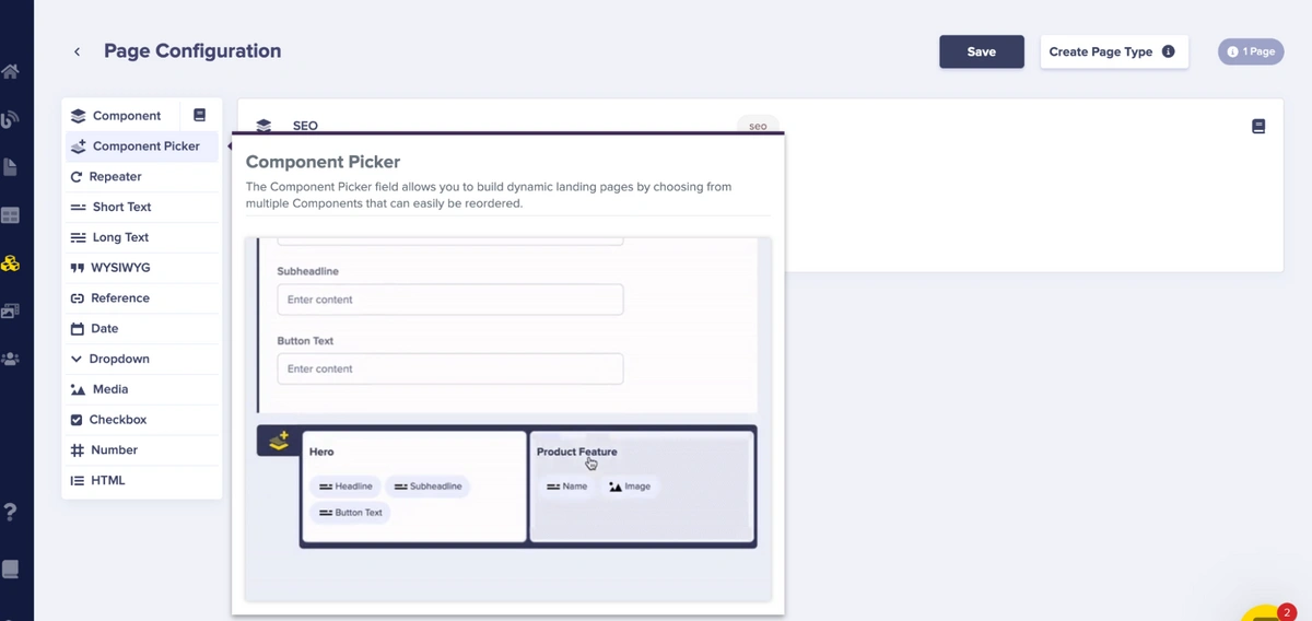
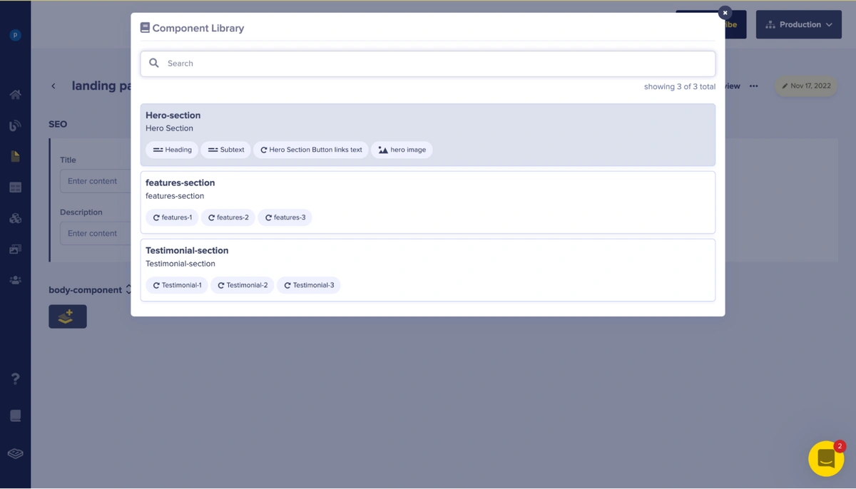
Upon clicking the icon, a modal pops up. This modal shows the Component Library which contains a list of components we can currently reuse.
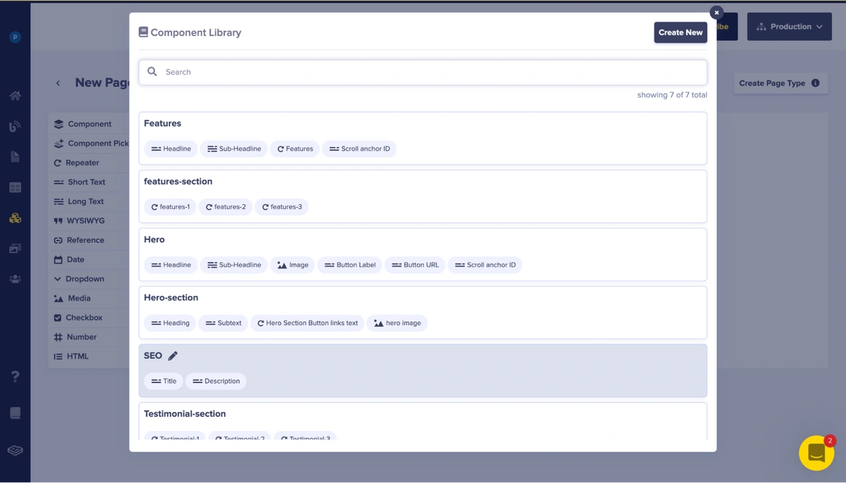
Modal of the Component Library
In the modal, we can see various components (some custom-built and some built by Butter). We will select the SEO component as we want to add it to our page first. The SEO component is built-in to Butter by default and it handles things like the title of page, description of page, and other meta-tag information.
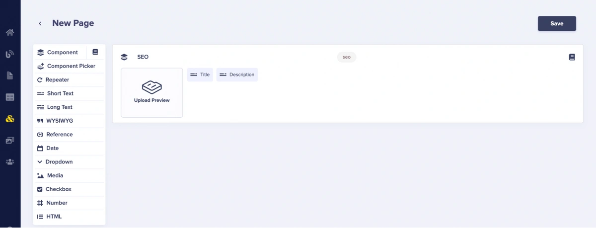
Added SEO component on the new page
We can click the icon on the top-right corner of the SEO component to view the SEO content and also customize some fields in it, if necessary.
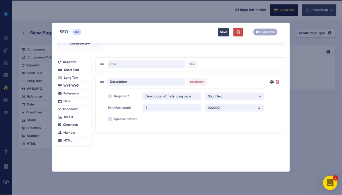
Viewing the SEO component
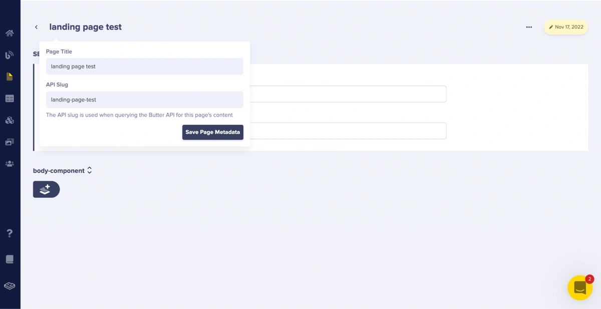
Upon adding the SEO component, we will save this new page type by clicking the Save button on the new page. After saving, you will be redirected to a page where you will insert the page title and the page’s API slug. After inserting these details, you can save the data by clicking the Save Page Metadata button.
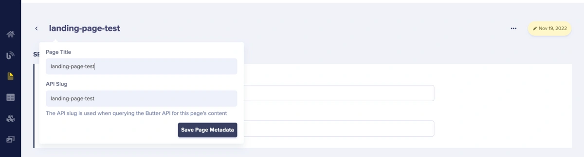
Save page title and meta data in Butter
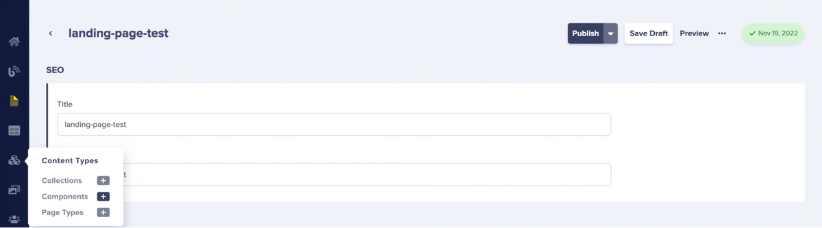
Upon saving the page’s metadata, we will also publish the page to make it available in Butter’s content API. To publish, click the Publish button.
Publishing a page in Butter

Creating our components in ButterCMS
After creating the page type, we will subsequently create the custom components that the created page type will utilize. To create a component, click the + icon beside Components in the Content Types menu in the sidebar.
Selecting the Content Types menu to create a component in Butter
In this article, we will be creating 3 components:
- Hero component– responsible for the hero section of the created page type
- Features component– responsible for the features section of the created page type
- Testimonial component– responsible for the testimonial section of the created page type
Building our hero component
Firstly, we will create the hero component. The hero component consists of the fields heading, subtext, and hero section button links text.
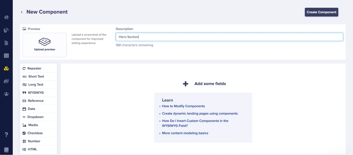
Naming the hero component
In the picture above, we gave the hero component a description that says hero section.
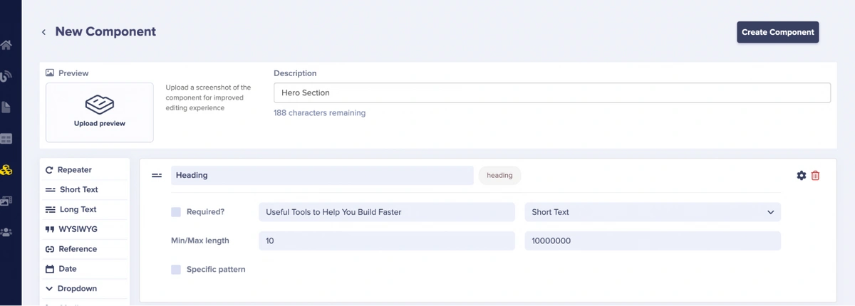
Adding the heading field to the hero component
For the heading field, we will choose short text and also include the minimum and maximum length of the text as well as some help text to show what can go into the field.
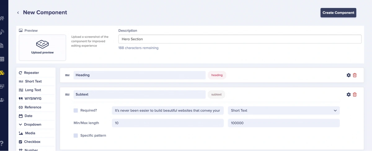
The subtext field of the hero component
For the subtext field, we will choose short text and also include the minimum and maximum length of the text as well as some help text to show what can go into the field.
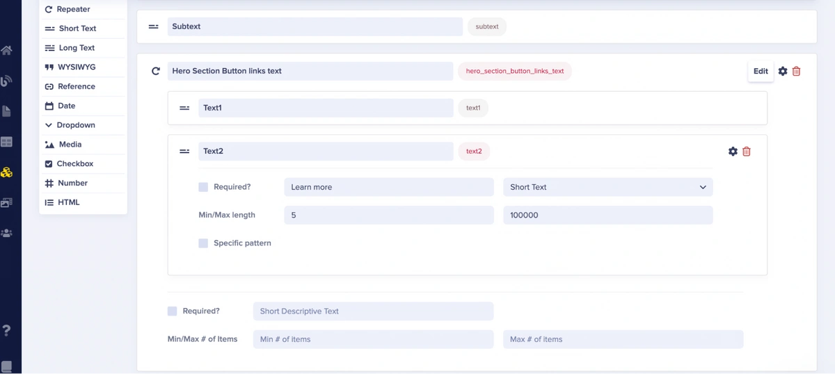
The hero section button links the text field of the hero component
From the picture above, the hero section button links text field is a repeater. A repeater is a field that lets us group one or more content fields such as texts and dates that can be repeated multiple times on a page. In our case, the hero section button links text field will contain Text1 and Text2 fields which are short text fields.
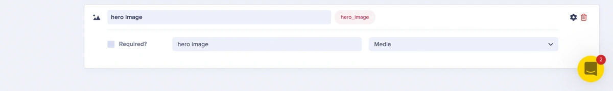
Add hero image field
We also include a hero image field, which is a media field. This field supports the upload of media such as images and files.
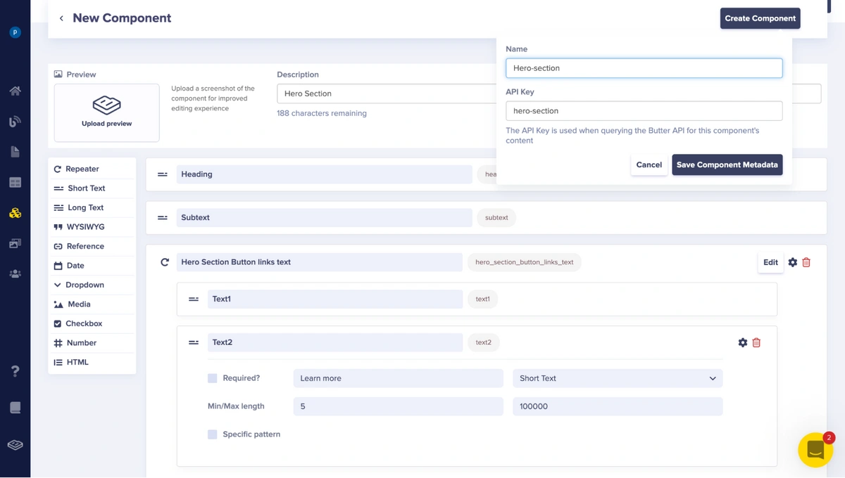
Saving the hero component
After adding these fields, we will create the component by clicking the Create Component button, which then opens a dropdown to save the component name and API key, as shown above.
Building our features-section component
Next, we will create the features-section component. The features-section component consists of features-1, features-2, and features-3 repeater fields.

The features-1 repeater field in the features-section component
From the picture above, the features-1 repeater in the features-section component contains the Heading, Subtext, list-1, list-2, and list-3 fields, which are short text fields
The features-1 repeater image field in Features-section component
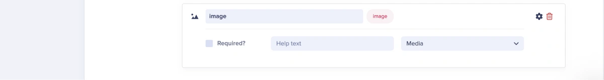
As seen in the image above, the features-1 repeater in the features-section component also contains an image field, which is a media field.
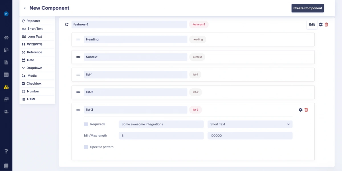
The features-2 repeater fields in the features-section component
From the picture above, the features-2 repeater in the features-section component contains the Heading, Subtext, list-1, list-2, and list-3 fields, which are short-text fields.
The features-2 repeater image field in the features-section component
The features-2 repeater in the features-section component also contains an image field, which is a media field.
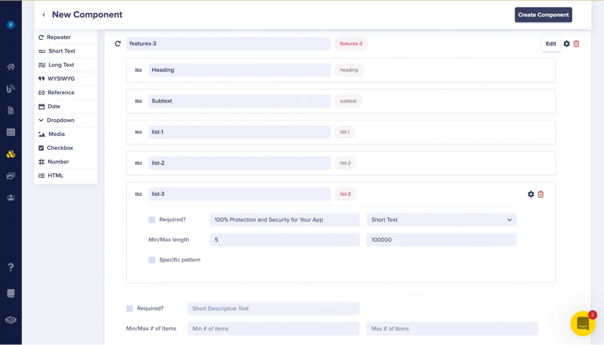
The features-3 repeater fields in the features-section component
From the picture above, the features-3 repeater in the features-section component contains the Heading, Subtext, list-1, list-2, and list-3 fields, which are short text fields.
The features-3 repeater image field in the features-section component
The features-3 repeater in the features-section component also contains an image field, which is a media field.
After adding these fields, we will create the component by clicking the Create Component button, which then opens a dropdown to save the component name and API key.
Building our testimonial component
Now, we will create the testimonial component. The testimonial component consists of the fields testimonial-1, testimonial-2, and testimonial-3.
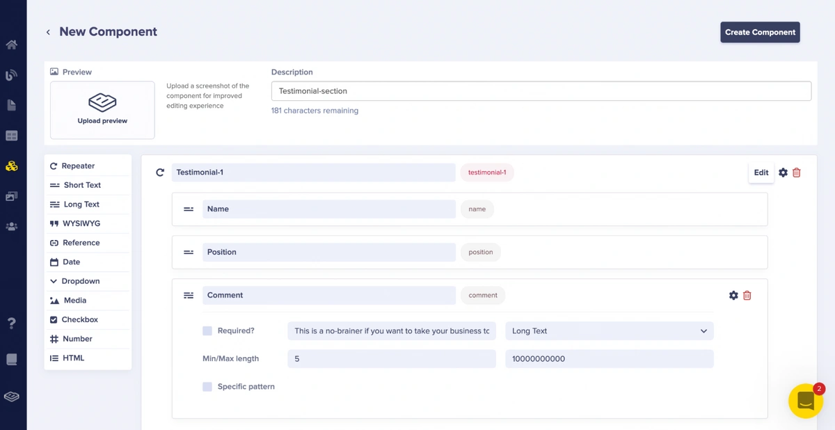
From the picture above, the Testimonial-1 field is a repeater that contains Name, Position, and Comment fields, which are short text and long text fields.
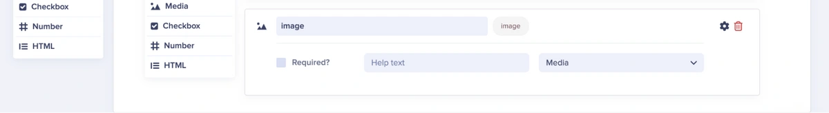
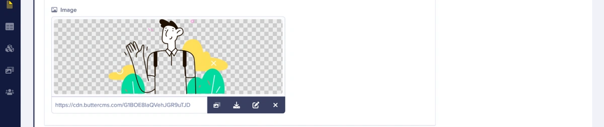
The testimonial-1 repeater image field in the Testimonial-section component
The testimonial-1 repeater in the Testimonial-section component also contains an image field, which is a media field.
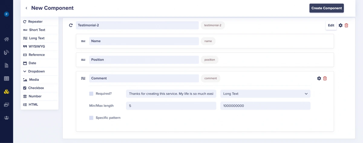
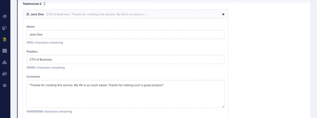
From the picture above, the Testimonial-2 field is a repeater that contains Name, Position, and Comment fields, which are short text and long text fields.
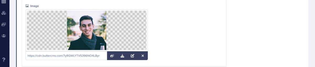
The testimonial-2 repeater image field in the Testimonial-section component
The Testimonial-2 repeater in the Testimonial-section component also contains an image field which is a media field.
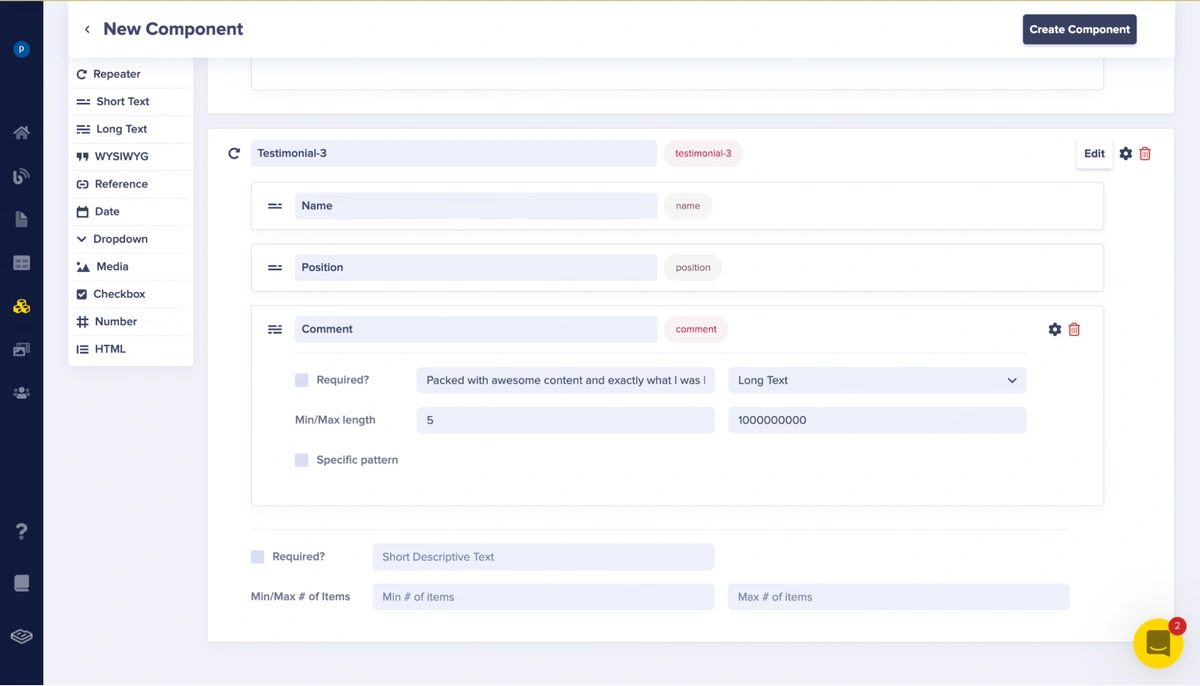
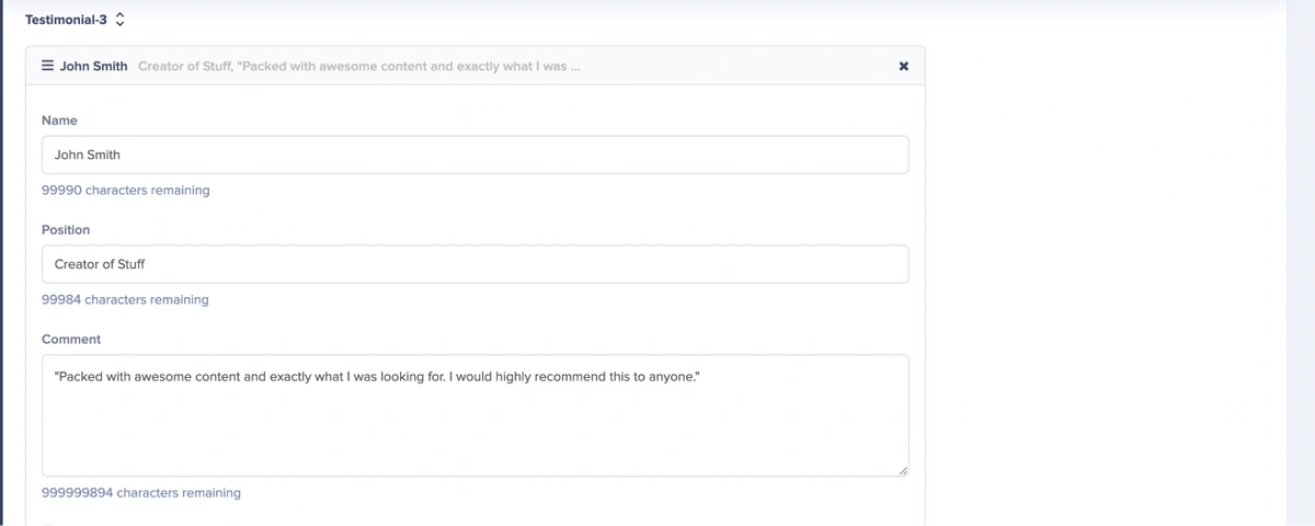
From the picture above, the testimonial-3 field is a repeater that contains Name, Position, and Comment fields which are Short Text and LongText fields.
The Testimonial-3 repeater image field in the Testimonial-section component
The Testimonial-3 repeater in the Testimonial-section component also contains an image field, which is a media field.
After adding these fields, we will create the component by clicking the Create Component button, which then opens a dropdown to save the component name and API key.
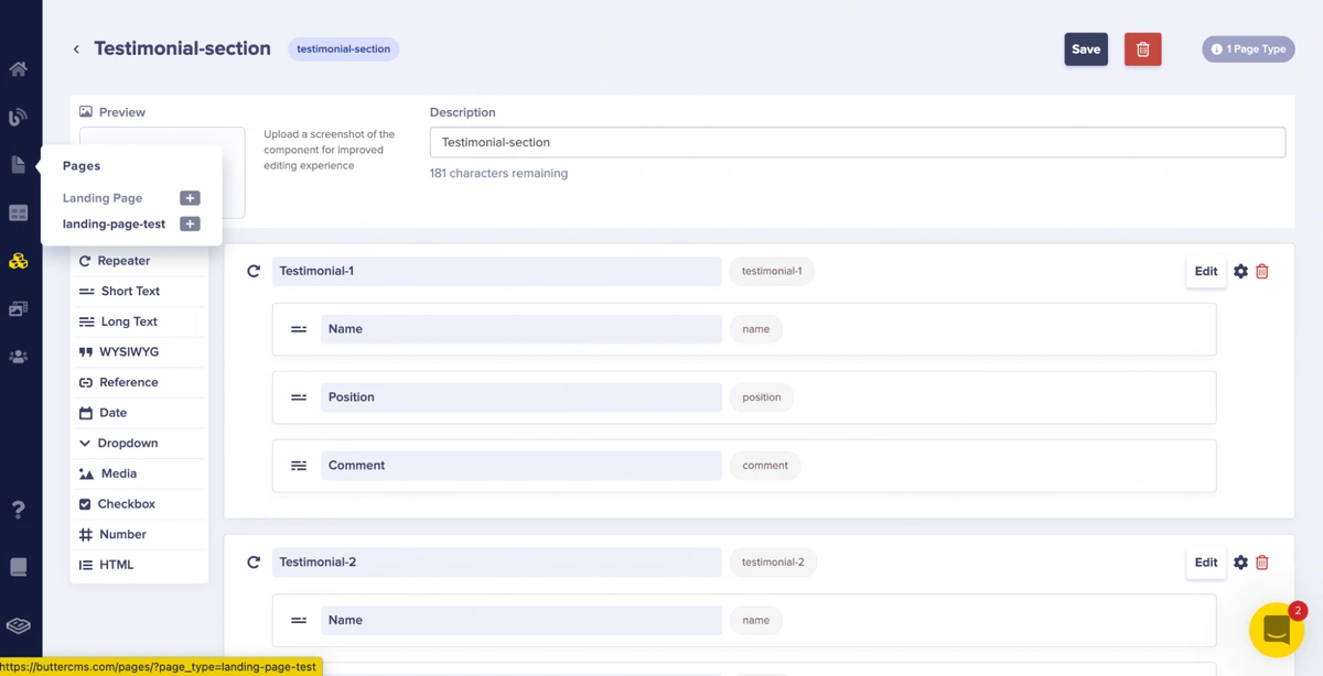
Adding the new components to the landing page configuration
Upon creating these components (hero, features, and testimonial), we will go back to our created page type to add these created components. To access our already created page type, we will click the page type name (landing-page-test) in the Pages option in the sidebar.
Selecting the created page
After clicking the page type name, you will be redirected to the page that displays the list of page types. After which, we select our created page type (landing-page-test).

Accessing the created page link
After selecting our created page type (landing-page-test), you will be redirected to a page where we can edit our schema/page type contents to add the components.
Dropdown to edit schema
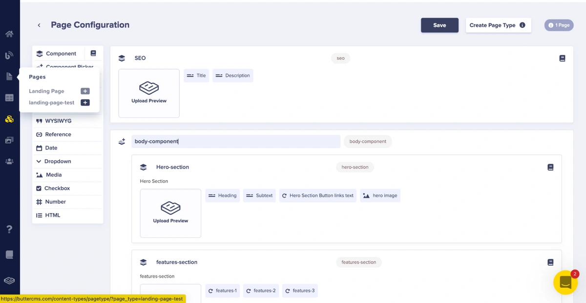
Landing Page Test configuration page
We will create a body component that houses the contents of our page (which will contain the hero, features, and testimonial components). We will do so by clicking the Component Picker option in the page's left sidebar.
Component picker field
After clicking the component picker option, we will create a component picker where we can add the components for the contents of our page. You can name the component picker any name you desire but, for this article, we will name ours body-component.
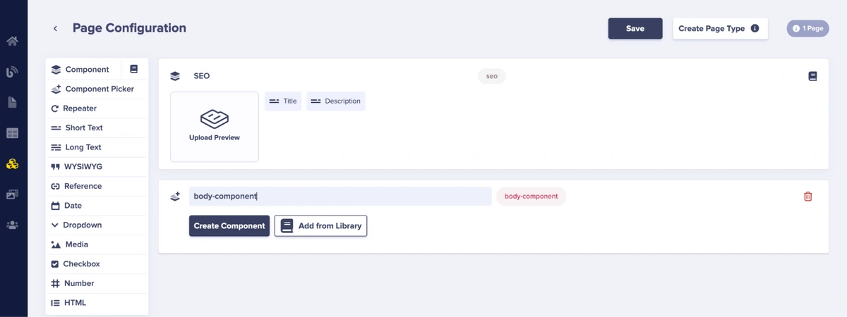
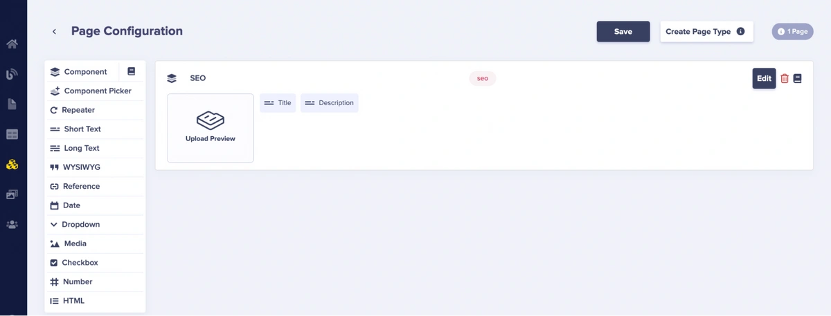
Page Configuration
In the body-component picker, there are options to create a component from scratch or to add a component from the library. We will add the components from our library.
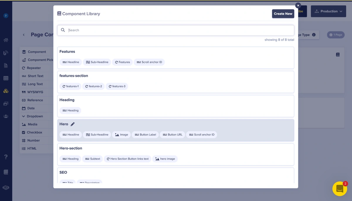
The Component Library
We will select the hero-section, features-section, and testimonial-section components, in that order.
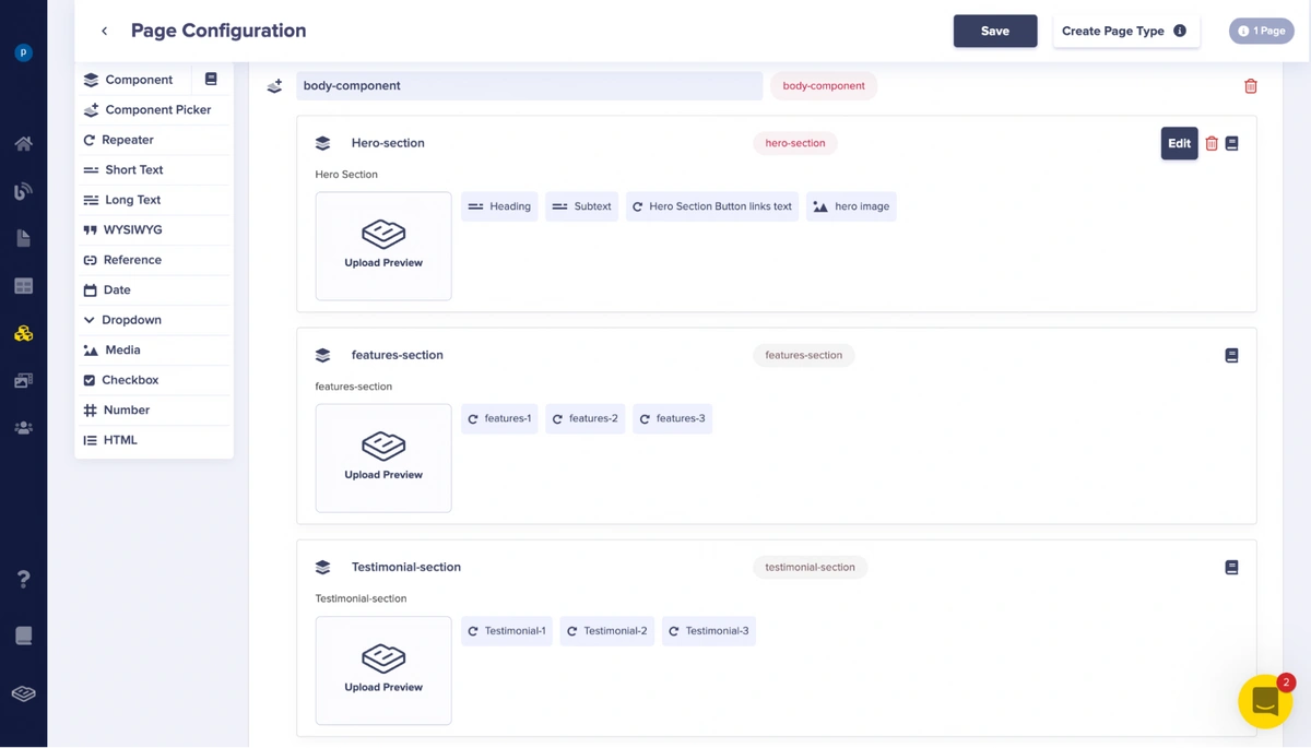
Page configuration with added components
We will save this page configuration by clicking the Save button.
Creating a landing page using the created page type
After creating the page type, we will use the page type as a base to create our actual page. To do this we will click the + icon beside the page type name we created (landing-page-test) from the Pages option in the sidebar.
Creating a page from the landing-page-test page type
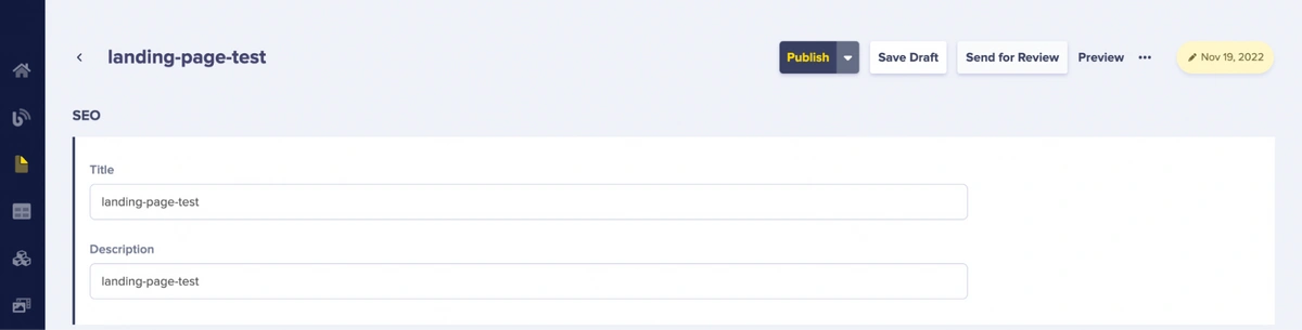
After creating a page from the page type (landing-page-test), we will add values to the SEO component such as the page title and description.
Adding a title and description to the SEO component of the page
After adding the values, we will add components to the body-component section of the page. To do this, click the + icon below the body-component text as shown in the picture above.
Upon clicking the icon, the Component Library popup comes up. Since we built the page based on the landing-page-test page type, we can only add the hero-section, features-section, and testimonial-section components to the body-component, as specified when we built the landing-page-test page type. This is fine as we only need these components on the body-component to build our page.
Component Library popup
After selecting the components, we will add content to them as well.
Firstly, we will add content to the fields of the hero-section components.
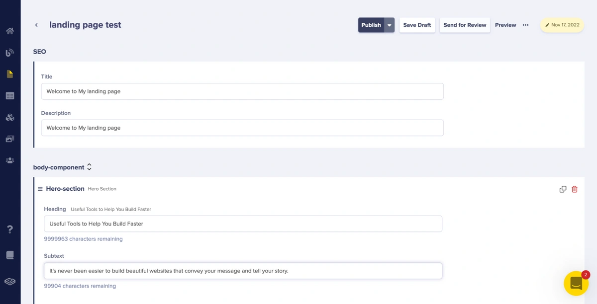
Hero section with the heading and subtext fields filled with content
As shown in the picture above, we add content to the Heading and Subtext fields.
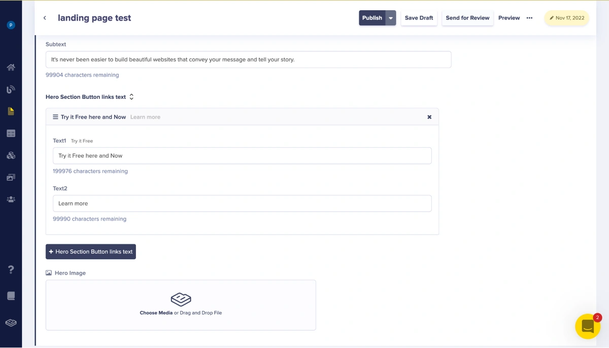
The “hero section button links text” with the heading and subtext fields filled with contents
To add content to the hero section button links text (which is simply a repeater that houses the Text1 and Text2 fields), we click the Hero Section Button Links Text button, which then shows these fields:
The “hero section button links text” with the heading and subtext fields filled with content
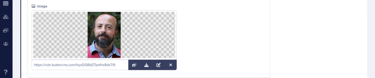
We will so add image content to the media field by uploading an image, as shown below:
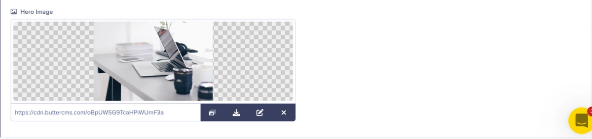
Hero section image field with uploaded media
Next, we will add content to the fields of the features-section components.
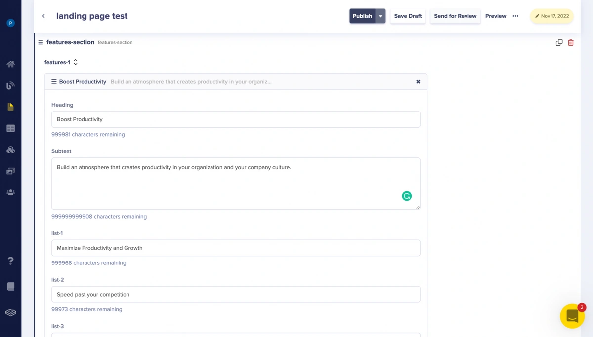
The features-1 repeater with the heading, subtext, list-1, list-2, and list-3 fields filled with content
The picture above shows content added to the features-1 repeater component of the features-section component which consists of the Heading, Subtext, list-1, list-2, and list-3 fields.
We will now add image content to the media field by uploading an image as shown below:
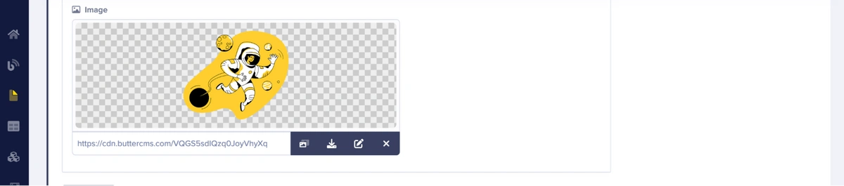
The features-1 repeater image fields with an image
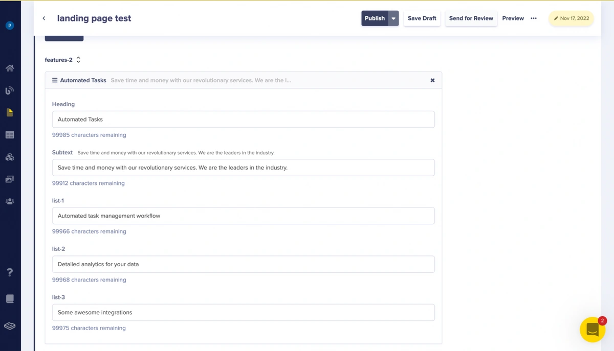
The features-2 repeater with the Heading, Subtext, list-1, list-2, and list-3 fields filled with content
The picture above shows the content added to the features-2 repeater component of the features-section component which consists of the Heading, Subtext, list-1, list-2, and list-3 fields.
We will then add image content to the media field by uploading an image as shown below:
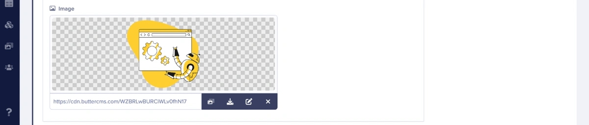
Features-2 repeater image fields with an image
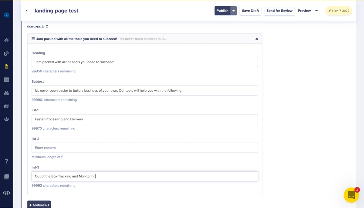
The picture above shows the content added to the features-3 repeater component of the features-section component which consists of the Heading, Subtext, list-1, list-2, and list-3 fields.
We will next add image content to the media field by uploading an image as shown below:
The features-3 repeater image fields with an image
Next, we will add content to the fields of the testimonial-section components.

The picture above shows the content added to the Testimonial-1 repeater component of the testimonial-section component which consists of Heading, Subtext, list-1, list-2, and list-3.
We will then add image content to the media field by uploading an image as shown below:
The Testimonial-1 repeater image fields with an image
The picture above shows the contents added to the testimonial-2 repeater component of the testimonial-section component which consists of the Heading, Subtext, list-1, list-2, and list-3 fields.
We will then add image content to the media field by uploading an image as shown below:

Testimonial-2 repeater image fields with an image
The picture above shows the contents added to the Testimonial-3 repeater component of the testimonial-section component which consists of the Heading, Subtext, list-1, list-2, and list-3 fields.
We will then add image content to the media field by uploading an image as shown below:
Testimonial-3 repeater image fields with an image
After adding the respective contents to the body-component section, we will click on the Publish button at the top of the page to save and make the page’s API available.

Publishing a created page
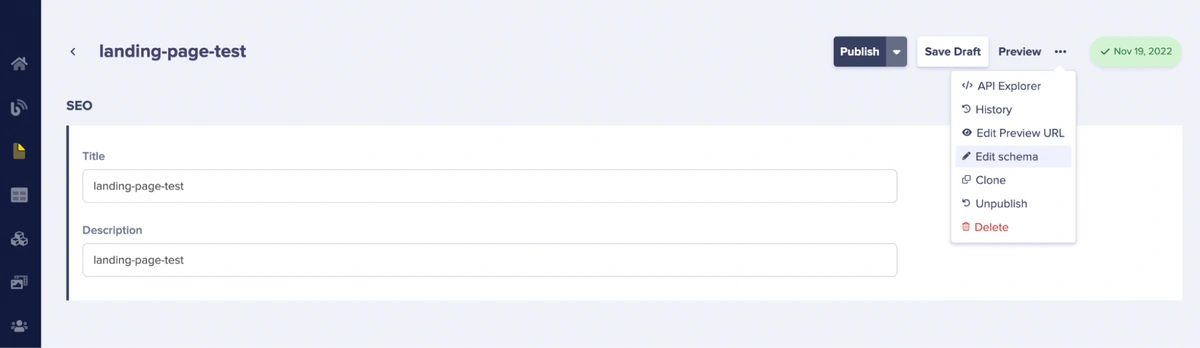
To preview the page’s API, we will click the API Explorer dropdown.
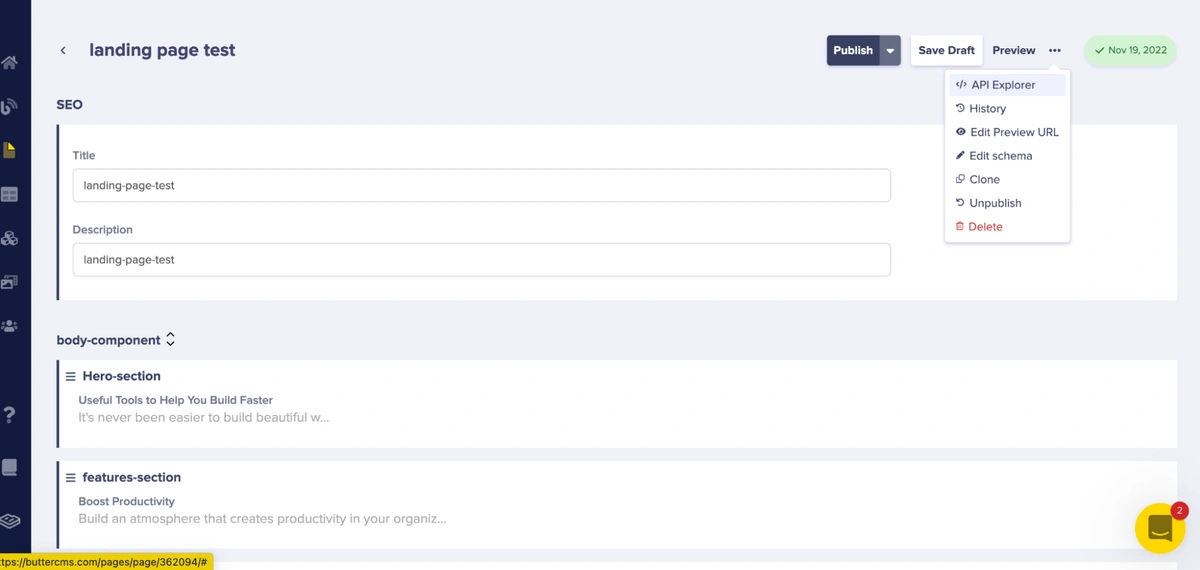
Accessing the API Explorer of the page
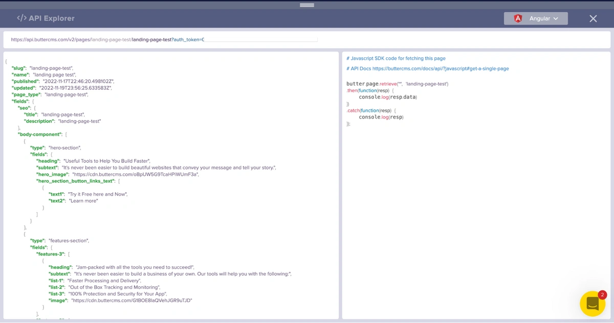
Upon clicking the dropdown, we see the response of our created page from the content API as shown below:
Create collections in ButterCMS
We are done building our landing page. However, a landing page is incomplete without its navigation items. We will create a navigation items collection that will hold the content for the page navigation.
To create a collection, click the + icon beside Collections in the Content Types option in the sidebar.
Select Collections from the Content Types menu
Upon clicking the icon, you will be redirected to a page where you can create a custom collection.
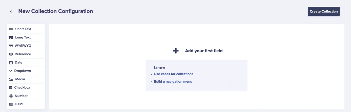
The New Collection Configuration page
Next, we will be creating 4 items, namely: Home, About, Blog, and Try It collections. But first, we will create a navigation menu item collection with the fields label and url, which are short text fields. This collection will be a base that we will use to create our desired collections (the Home, About, Blog, and Try It collections).
Creating the Navigation Menu Item collection
Upon clicking Save as Collection, the Navigation Menu Item collection is created. To use this collection to create our desired collection, click the + icon beside Navigation Menu Item from the Collections option in the sidebar.
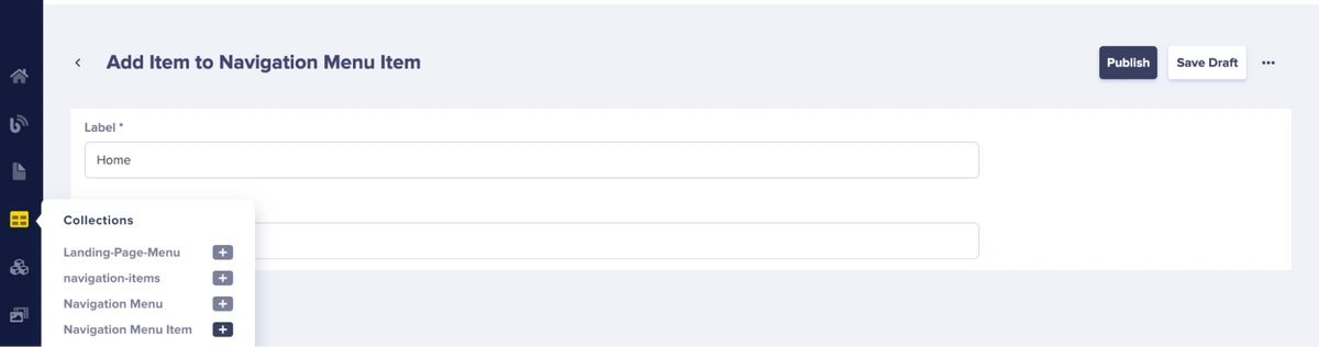
Create a collection item from the navigation menu item collection
After clicking the icon, you will be redirected to the page above where we can create a collection item. We created the Home collection item which has the label and url fields. Repeat the procedure to create collection items for the About, Try It, and Blog Navigation.
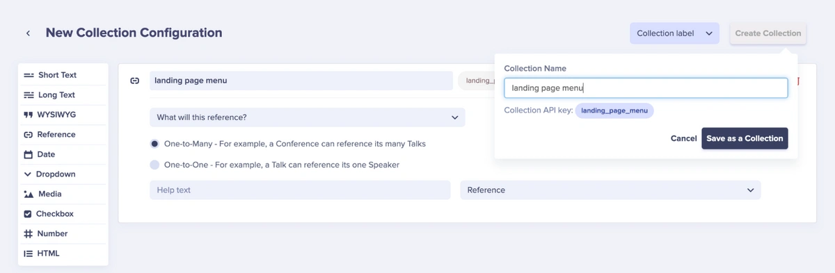
After this, we will create another collection that consolidates the collection items created into one collection as a reference.
After creating the collection, as seen below, we will name it the “landing page menu”. This collection will have a reference type with a one-to-many relationship, which means that the collection can have many collection item references in it. In this case, the references will be the About, Try It, and Blog collection items we created previously.
Creating a new collection with reference fields
Upon saving the collection, we will be redirected to the page where we can add collection items to the collection.
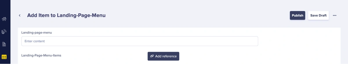
Adding items and reference to the newly created landing page menu collection item
We will then add the reference items to the landing page menu collection as specified above. We do this by clicking the Add Reference button.
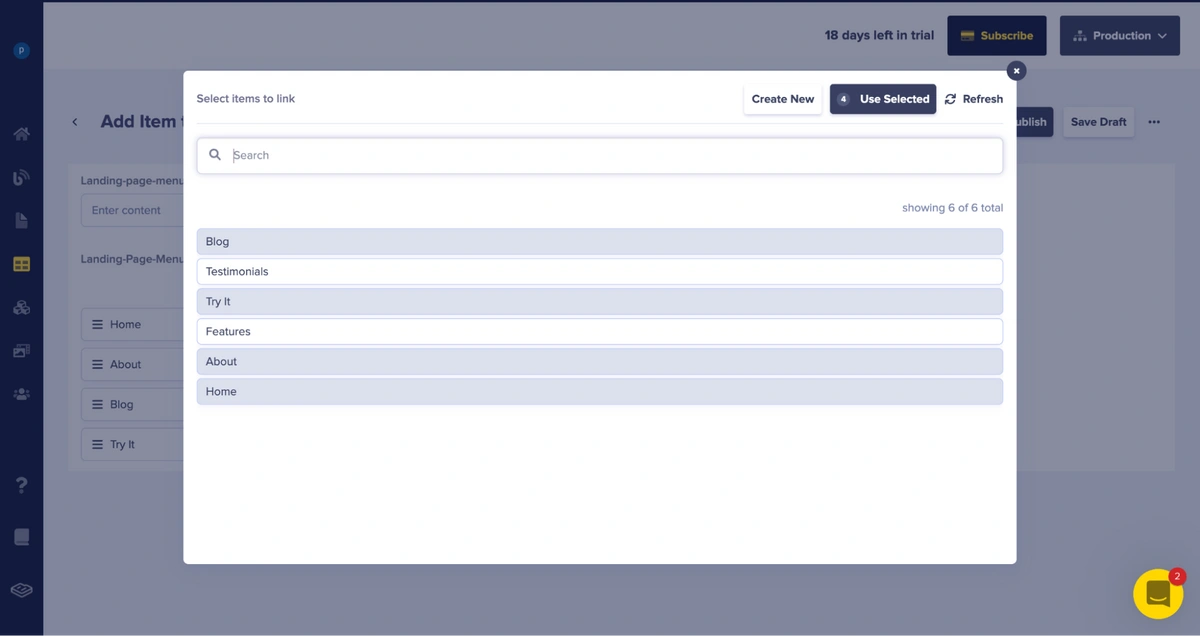
Selecting items to reference and link to the newly created “landing page menu” collection
Upon clicking the Add Reference button, it brings up a popup that shows us reference items we can link to our landing page menu collection.
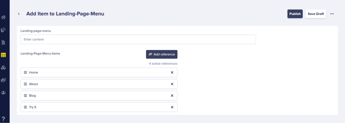
Selected collection items referenced to the newly created “landing page menu” collection
Upon adding the references, we will click the Publish button at the top of the page to save and make the page’s API available.
To preview the collection’s API, we will click the API Explorer dropdown.
Upon clicking the dropdown, we see the response of our created collection from the content API, as shown below:
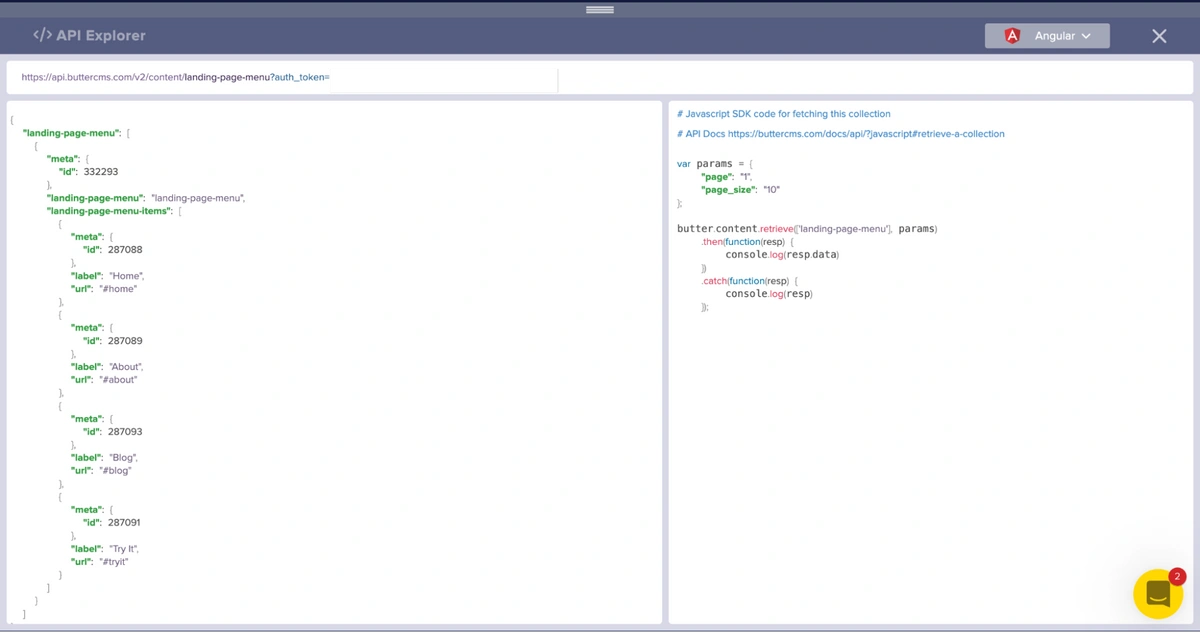
API response of a page created from the “landing page menu” collection item
Project setup: Installing the Nuxt application
We will be using Nuxt 3 to build the landing page. To install Nuxt 3, type the following commands in sequence:
npx nuxi init <project-name>
code <project-name>
yarn install
After installation, in the root directory of the newly created Nuxt application, we will create the pages, plugins, assets, and components folders. Upon adding these folders, the application structure should look as follows:
ButterCMS-LANDING-PAGE-NUXT3    (Root Directory)
├─ components
├─ assets
├─ pages
├─ plugins
├─ nuxt.config.js
├─ package.json
└─ yarn.lock
We will be using Tailwind CSS as our CSS library. To configure Tailwind CSS in your Nuxt 3 application, visit here.
Next up, we will install the ButterCMS JavaScript client which we will use to handle requests sent to Butter. To install these, type the command below:
For NPM:
npm i buttercms
For Yarn:
Yarn add buttercms
Next, we will create a .env file in the root directory of our project which will hold the API read token credential we will be adding to our ButterCMS JavaScript client.
You can always get your API read token from the API Explorer on the ButterCMS dashboard.
Here is the folder structure for Adding the .env file:
├─ components
├─ assets
├─ pages
├─ plugins
├─ nuxt.config.js
├─ package.json
└─ yarn.lock
└─ .env
API_READ_TOKEN = ''
Environment variable present in the .env file in the root directory of our application
Furthermore, we will inject it into the Nuxt application to make the Butter JavaScript client readily available in our application. We will do this with the aid of plugins. Therefore, we go to our previously created plugins folder and create an api.ts file. After doing so, we will paste the snippet of code below:
import Butter from "buttercms";
export default defineNuxtPlugin(nuxtApp => {
 const config = useRuntimeConfig();
 const butter = Butter(config.API_READ_TOKEN);
 nuxtApp.provide('butter', butter)
})
API class code present in /plugins/api.ts in the root directory of our application
In the code above, we simply import the Butter JavaScript client and attach the API read token obtained from our .env file to it.
Creating our components in the Nuxt application
We will create components for the Navbar, Hero, Features, and Testimonial sections of our landing page. We will also create an index.vue file in the pages folder.
Here is the folder structure for adding the components and index.vue file:
├─ components
─ Hero.vue
─ Features.vue
─ Testimonial.vue
─ Navbar.vue
├─ assets
├─ pages
              ─ index.vue
├─ plugins
├─ nuxt.config.js
├─ package.json
└─ yarn.lock
└─ .env
Integrate the ButterCMS API into the landing page
On the index.vue file, we will paste these snippets of code below:
<template>
 <div>
   <div v-if="loading">
     <div class="h-screen flex items-center justify-center">
       <h1 style="font-size: 8rem"> loading.... </h1>
     </div>
   </div>

   <div v-if="!loading && error">
     <div class="h-screen flex items-center justify-center">
       <h1 style="font-size: 8rem"> There was an error fetching contents from Butter </h1>
     </div>
   </div>

   <div v-if="!loading && !error">
     <div class="bg-white">
       <Navbar :content="menu" />
       <Hero :content="hero" />
       <Features :content="features" />
       <Testimonials :content="testimonials" />
     </div>
   </div>
 </div>
</template>


<script setup lang="ts">
 const { $butter } = useNuxtApp();

 const contents = ref<any>();
 const hero = ref<any>();
 const features = ref<any>();
 const testimonials = ref<any>();
 const menu = ref<any>();
 const loading = ref<boolean>(false);
 const error = ref<boolean>(false);


 onMounted(async () => {
   console.log('------request starts-------');

   try {
     loading.value = true;
     const params = {
       "page": "1",
       "page_size": "10"
     };

     const contents = await $butter.page.retrieve("*", "landing-page-test");
     const navItems = await $butter.content.retrieve(['landing-page-menu'], params);

     // get the hero, features, testimonial values
     hero.value = contents.data.data.fields['body-component'][0];
     features.value = contents.data.data.fields['body-component'][1];
     testimonials.value = contents.data.data.fields['body-component'][2];
     console.log('response page', contents.data.data, hero.value, features.value, testimonials.value);

     // get the landing-page-menu
     menu.value = navItems.data.data["landing-page-menu"][0]["landing-page-menu-items"];
     console.log('resp menu', navItems.data.data["landing-page-menu"][0]["landing-page-menu-items"])

   } catch(err: any) {
     error.value = true;
     throw new Error(`caught api error menu--- ${err?.response?.data}`);
   } finally {
     loading.value = false;
   }
 });
</script>

<style>

</style>
The code present in /components/Navbar.vue in the root directory of our application
The code above simply fetches the landing page (landing page test) and the landing page menu (landing page menu) we created from Butter into our Nuxt application. After which, we pass the respective sections fetched from the content API into their respective components using props.
Let’s look into the components and explain them individually.
Navbar.vue
In Navbar.vue, we will paste the code snippet below:
<template>
 <!-- Section 1 -->
 <section class="w-full px-8 text-gray-700 bg-white">
   <div
     class="
       container
       flex flex-col flex-wrap
       items-center
       justify-between
       py-5
       mx-auto
       md:flex-row
       max-w-7xl
     "
   >
     <div class="relative flex flex-col md:flex-row">
       <a
         href="#_"
         class="
           flex
           items-center
           mb-5
           font-medium
           text-gray-900
           lg:w-auto lg:items-center lg:justify-center
           md:mb-0
         "
       >
         <span
           class="
             mx-auto
             text-xl
             font-black
             leading-none
             text-gray-900
             select-none
           "
           >AI<span class="text-indigo-600">.</span></span
         >
       </a>
       <nav
         class="
           flex flex-wrap
           items-center
           mb-5
           text-base
           md:mb-0 md:pl-8 md:ml-8 md:border-l md:border-gray-200
         "
       >
         <a
           v-for="link in props.content"
           :key="link"
           :href="link.url"
           class="mr-5 font-medium leading-6 text-gray-600 hover:text-gray-900"
         >
           {{ link.label}}
         </a
         >
       </nav>
     </div>
   </div>
 </section>
</template>


<script setup lang="ts">
console.log("features", props.content);

const props = defineProps<{
 content: any;
}>();
</script>
In the code above, we simply get the props passed from the index.vue file and render it on this component. In this case of the Navbar, the props are the navigation menu items collection we created in the dashboard sent as a response from the content API.
Hero.vue
In Hero.vue, we will paste the code snippet below:
<template>
  <!-- Section 2 -->
  <section class="px-2 py-32 bg-white md:px-0">
   <div class="container items-center max-w-6xl px-8 mx-auto xl:px-5">
     <div class="flex flex-wrap items-center sm:-mx-3">
       <div class="w-full md:w-1/2 md:px-3">
         <div
           class="
             w-full
             pb-6
             space-y-6
             sm:max-w-md
             lg:max-w-lg
             md:space-y-4
             lg:space-y-8
             xl:space-y-9
             sm:pr-5
             lg:pr-0
             md:pb-0
           "
         >
           <h1
             class="
               text-4xl
               font-extrabold
               tracking-tight
               text-gray-900
               sm:text-5xl
               md:text-4xl
               lg:text-5xl
               xl:text-6xl
             "
           >
             <span class="block text-indigo-600 xl:inline">
               {{ props.content?.fields?.heading }}
             </span>
           </h1>
           <p
             class="
               mx-auto
               text-base text-gray-500
               sm:max-w-md
               lg:text-xl
               md:max-w-3xl
             "
           >
             {{ props.content?.fields?.subtext }}
           </p>
           <div class="relative flex flex-col sm:flex-row sm:space-x-4">
             <a
               href="#_"
               class="
                 flex
                 items-center
                 w-full
                 px-6
                 py-3
                 mb-3
                 text-lg text-white
                 bg-indigo-600
                 rounded-md
                 sm:mb-0
                 hover:bg-indigo-700
                 sm:w-auto
               "
             >
               {{ props.content?.fields?.hero_section_button_links_text[0]?.text1 }}
               <svg
                 xmlns="http://www.w3.org/2000/svg"
                 class="w-5 h-5 ml-1"
                 viewBox="0 0 24 24"
                 fill="none"
                 stroke="currentColor"
                 stroke-width="2"
                 stroke-linecap="round"
                 stroke-linejoin="round"
               >
                 <line x1="5" y1="12" x2="19" y2="12"></line>
                 <polyline points="12 5 19 12 12 19"></polyline>
               </svg>
             </a>
             <a
               href="#_"
               class="
                 flex
                 items-center
                 px-6
                 py-3
                 text-gray-500
                 bg-gray-100
                 rounded-md
                 hover:bg-gray-200 hover:text-gray-600
               "
             >
               {{ props.content?.fields?.hero_section_button_links_text[0]?.text2 }}
             </a>
           </div>
         </div>
       </div>
       <div class="w-full md:w-1/2">
         <div
           class="
             w-full
             h-auto
             overflow-hidden
             rounded-md
             shadow-xl
             sm:rounded-xl
           "
         >
           <img
             :src="props.content?.fields?.hero_image"
           />
         </div>
       </div>
     </div>
   </div>
 </section>
</template>


<script setup lang="ts">
 console.log('hero', props.content);

 const props = defineProps<{
   content: any,
 }>()
</script>
In the code above, we simply get the props passed from the index.vue file and render it on this component. In this case of the Hero component, the props are the hero-section of the body-component of the landing page we created in the dashboard sent as a response from the content API.
Features.vue
In Features.vue, we will paste the code snippet below:
<template>
 <!-- features-1 -->
 <section class="w-full bg-white pt-7 pb-7 md:pt-20 md:pb-24">
   <div
     class="
       box-border
       flex flex-col
       items-center
       content-center
       px-8
       mx-auto
       leading-6
       text-black
       border-0 border-gray-300 border-solid
       md:flex-row
       max-w-7xl
       lg:px-16
     "
   >
     <div
       class="
         box-border
         relative
         w-full
         max-w-md
         px-4
         mt-5
         mb-4
         -ml-5
         text-center
         bg-no-repeat bg-contain
         border-solid
         md:ml-0 md:mt-0 md:max-w-none
         lg:mb-0
         md:w-1/2
         xl:pl-10
       "
     >
       <img
         :src="props.content?.fields['features-1'][0].image || ''"
         class="p-2 pl-6 pr-5 xl:pl-16 xl:pr-20"
       />
     </div>

     <!-- features-2 -->
     <div
       class="
         box-border
         order-first
         w-full
         text-black
         border-solid
         md:w-1/2 md:pl-10 md:order-none
       "
     >
       <h2
         class="
           m-0
           text-xl
           font-semibold
           leading-tight
           border-0 border-gray-300
           lg:text-3xl
           md:text-2xl
         "
       >
       {{ props.content?.fields['features-1'][0].heading || '' }}
       </h2>
       <p
         class="
           pt-4
           pb-8
           m-0
           leading-7
           text-gray-700
           border-0 border-gray-300
           sm:pr-12
           xl:pr-32
           lg:text-lg
         "
       >
         {{ props.content?.fields['features-1'][0].subtext || '' }}
       </p>
       <ul class="p-0 m-0 leading-6 border-0 border-gray-300">
         <li
           class="
             box-border
             relative
             py-1
             pl-0
             text-left text-gray-500
             border-solid
           "
         >
           <span
             class="
               inline-flex
               items-center
               justify-center
               w-6
               h-6
               mr-2
               text-white
               bg-yellow-300
               rounded-full
             "
             ><span class="text-sm font-bold">✓</span></span
           >
           {{ props.content?.fields['features-1'][0]['list-1'] || '' }}
         </li>
         <li
           class="
             box-border
             relative
             py-1
             pl-0
             text-left text-gray-500
             border-solid
           "
         >
           <span
             class="
               inline-flex
               items-center
               justify-center
               w-6
               h-6
               mr-2
               text-white
               bg-yellow-300
               rounded-full
             "
             ><span class="text-sm font-bold">✓</span></span
           >
           {{ props.content?.fields['features-1'][0]['list-2'] || '' }}
         </li>
         <li
           class="
             box-border
             relative
             py-1
             pl-0
             text-left text-gray-500
             border-solid
           "
         >
           <span
             class="
               inline-flex
               items-center
               justify-center
               w-6
               h-6
               mr-2
               text-white
               bg-yellow-300
               rounded-full
             "
             ><span class="text-sm font-bold">✓</span></span
           >
           {{ props.content?.fields['features-1'][0]['list-3'] || '' }}
         </li>
       </ul>
     </div>
     <!-- End  Content -->
   </div>


   <div
     class="
       box-border
       flex flex-col
       items-center
       content-center
       px-8
       mx-auto
       mt-2
       leading-6
       text-black
       border-0 border-gray-300 border-solid
       md:mt-20
       xl:mt-0
       md:flex-row
       max-w-7xl
       lg:px-16
     "
   >
     <!-- Content -->
     <div
       class="
         box-border
         w-full
         text-black
         border-solid
         md:w-1/2 md:pl-6
         xl:pl-32
       "
     >
       <h2
         class="
           m-0
           text-xl
           font-semibold
           leading-tight
           border-0 border-gray-300
           lg:text-3xl
           md:text-2xl
         "
       >
         {{ props.content?.fields['features-2'][0].heading || ''}}
       </h2>
       <p
         class="
           pt-4
           pb-8
           m-0
           leading-7
           text-gray-700
           border-0 border-gray-300
           sm:pr-10
           lg:text-lg
         "
       >
         {{ props.content?.fields['features-2'][0].subtext || '' }}
       </p>
       <ul class="p-0 m-0 leading-6 border-0 border-gray-300">
         <li
           class="
             box-border
             relative
             py-1
             pl-0
             text-left text-gray-500
             border-solid
           "
         >
           <span
             class="
               inline-flex
               items-center
               justify-center
               w-6
               h-6
               mr-2
               text-white
               bg-yellow-300
               rounded-full
             "
             ><span class="text-sm font-bold">✓</span></span
           >
           {{ props.content?.fields['features-2'][0]['list-1'] || '' }}
         </li>
         <li
           class="
             box-border
             relative
             py-1
             pl-0
             text-left text-gray-500
             border-solid
           "
         >
           <span
             class="
               inline-flex
               items-center
               justify-center
               w-6
               h-6
               mr-2
               text-white
               bg-yellow-300
               rounded-full
             "
             ><span class="text-sm font-bold">✓</span></span
           >
           {{ props.content?.fields['features-2'][0]['list-2'] || '' }}
         </li>
         <li
           class="
             box-border
             relative
             py-1
             pl-0
             text-left text-gray-500
             border-solid
           "
         >
           <span
             class="
               inline-flex
               items-center
               justify-center
               w-6
               h-6
               mr-2
               text-white
               bg-yellow-300
               rounded-full
             "
             ><span class="text-sm font-bold">✓</span></span
           >
           {{ props.content?.fields['features-2'][0]['list-3'] || ''}}
         </li>
       </ul>
     </div>
     <!-- End  Content -->

     <!-- Image -->
     <div
       class="
         box-border
         relative
         w-full
         max-w-md
         px-4
         mt-10
         mb-4
         text-center
         bg-no-repeat bg-contain
         border-solid
         md:mt-0 md:max-w-none
         lg:mb-0
         md:w-1/2
       "
     >
       <img
         :src="props.content?.fields['features-2'][0].image || ''"
         class="pl-4 sm:pr-10 xl:pl-10 lg:pr-32"
       />
     </div>
   </div>
 </section>


 <!-- features-3 -->
 <section class="py-20 bg-gray-50">
   <div
     class="
       container
       items-center
       max-w-6xl
       px-4 px-10
       mx-auto
       sm:px-20
       md:px-32
       lg:px-16
     "
   >
     <div class="flex flex-wrap items-center -mx-3">
       <div class="order-1 w-full px-3 lg:w-1/2 lg:order-0">
         <div class="w-full lg:max-w-md">
           <h2
             class="
               mb-4
               text-3xl
               font-bold
               leading-tight
               tracking-tight
               sm:text-4xl
               font-heading
             "
           >
             {{ props.content?.fields['features-3'][0].heading || ''}}
           </h2>
           <p class="mb-4 font-medium tracking-tight text-gray-400 xl:mb-6">
             {{ props.content?.fields['features-3'][0].subtext || ''}}
           </p>
           <ul>
             <li class="flex items-center py-2 space-x-4 xl:py-3">
               <svg
                 class="w-8 h-8 text-pink-500"
                 fill="none"
                 stroke="currentColor"
                 viewBox="0 0 24 24"
                 xmlns="http://www.w3.org/2000/svg"
               >
                 <path
                   stroke-linecap="round"
                   stroke-linejoin="round"
                   stroke-width="2"
                   d="M9 3v2m6-2v2M9 19v2m6-2v2M5 9H3m2 6H3m18-6h-2m2 6h-2M7 19h10a2 2 0 002-2V7a2 2 0 00-2-2H7a2 2 0 00-2 2v10a2 2 0 002 2zM9 9h6v6H9V9z"
                 ></path>
               </svg>
               <span class="font-medium text-gray-500">
                 {{ props.content?.fields['features-3'][0]['list-1'] || ''}}
               </span>
             </li>
             <li class="flex items-center py-2 space-x-4 xl:py-3">
               <svg
                 class="w-8 h-8 text-yellow-500"
                 fill="none"
                 stroke="currentColor"
                 viewBox="0 0 24 24"
                 xmlns="http://www.w3.org/2000/svg"
               >
                 <path
                   stroke-linecap="round"
                   stroke-linejoin="round"
                   stroke-width="2"
                   d="M20 7l-8-4-8 4m16 0l-8 4m8-4v10l-8 4m0-10L4 7m8 4v10M4 7v10l8 4"
                 ></path>
               </svg>
               <span class="font-medium text-gray-500">
                 {{ props.content?.fields['features-3'][0]['list-2'] || ''}}
               </span>
             </li>
             <li class="flex items-center py-2 space-x-4 xl:py-3">
               <svg
                 class="w-8 h-8 text-green-500"
                 fill="none"
                 stroke="currentColor"
                 viewBox="0 0 24 24"
                 xmlns="http://www.w3.org/2000/svg"
               >
                 <path
                   stroke-linecap="round"
                   stroke-linejoin="round"
                   stroke-width="2"
                   d="M9 12l2 2 4-4m5.618-4.016A11.955 11.955 0 0112 2.944a11.955 11.955 0 01-8.618 3.04A12.02 12.02 0 003 9c0 5.591 3.824 10.29 9 11.622 5.176-1.332 9-6.03 9-11.622 0-1.042-.133-2.052-.382-3.016z"
                 ></path>
               </svg>
               <span class="font-medium text-gray-500">
                 {{ props.content?.fields['features-3'][0]['list-3'] || ''}}
               </span>
             </li>
           </ul>
         </div>
       </div>
       <div class="w-full px-3 mb-12 lg:w-1/2 order-0 lg:order-1 lg:mb-0">
         <img
           class="mx-auto sm:max-w-sm lg:max-w-full"
           :src="props.content?.fields['features-3'][0].image || ''"
           alt="feature image"
         />
       </div>
     </div>
   </div>
 </section>
</template>


<script setup lang="ts">
console.log("features", props.content);

const props = defineProps<{
 content: any;
}>();
</script>
In the code above, we simply get the props passed from the index.vue file and render it on this component. In this case of the Features component, the props are the features-section of the body-component of the landing page we created in the dashboard sent as a response from the content API.
Testimonial.vue
In Testimonial.vue, we will paste the code snippet below:
<template>
 <!-- Section 5 -->
 <section class="flex items-center justify-center py-20 bg-white min-w-screen">
   <div class="px-16 bg-white">
     <div class="container flex flex-col items-start mx-auto lg:items-center">
       <p
         class="
           relative
           flex
           items-start
           justify-start
           w-full
           text-lg
           font-bold
           tracking-wider
           text-purple-500
           uppercase
           lg:justify-center lg:items-center
         "
       >
         Don't just take our word for it
       </p>

       <h2
         class="
           relative
           flex
           items-start
           justify-start
           w-full
           max-w-3xl
           text-5xl
           font-bold
           lg:justify-center
         "
       >
         <svg
           xmlns="http://www.w3.org/2000/svg"
           fill="currentColor"
           class="
             absolute
             right-0
             hidden
             w-12
             h-12
             -mt-2
             -mr-16
             text-gray-200
             lg:inline-block
           "
           viewBox="0 0 975.036 975.036"
         >
           <path
             d="M925.036 57.197h-304c-27.6 0-50 22.4-50 50v304c0 27.601 22.4 50 50 50h145.5c-1.9 79.601-20.4 143.3-55.4 191.2-27.6 37.8-69.399 69.1-125.3 93.8-25.7 11.3-36.8 41.7-24.8 67.101l36 76c11.6 24.399 40.3 35.1 65.1 24.399 66.2-28.6 122.101-64.8 167.7-108.8 55.601-53.7 93.7-114.3 114.3-181.9 20.601-67.6 30.9-159.8 30.9-276.8v-239c0-27.599-22.401-50-50-50zM106.036 913.497c65.4-28.5 121-64.699 166.9-108.6 56.1-53.7 94.4-114.1 115-181.2 20.6-67.1 30.899-159.6 30.899-277.5v-239c0-27.6-22.399-50-50-50h-304c-27.6 0-50 22.4-50 50v304c0 27.601 22.4 50 50 50h145.5c-1.9 79.601-20.4 143.3-55.4 191.2-27.6 37.8-69.4 69.1-125.3 93.8-25.7 11.3-36.8 41.7-24.8 67.101l35.9 75.8c11.601 24.399 40.501 35.2 65.301 24.399z"
           ></path>
         </svg>
         See what others are saying
       </h2>
       <div
         class="block w-full h-0.5 max-w-lg mt-6 bg-purple-100 rounded-full"
       ></div>

       <div class="items-center justify-center w-full mt-12 mb-4 lg:flex">

         <div
           class="
             flex flex-col
             items-start
             justify-start
             w-full
             h-auto
             mb-12
             lg:w-1/3 lg:mb-0
           "
         >
           <div class="flex items-center justify-center">
             <div
               class="w-16 h-16 mr-4 overflow-hidden bg-gray-200 rounded-full"
             >
               <img
                 :src="props.content?.fields['testimonial-1'][0].image || ''"
                 class="object-cover w-full h-full"
               />
             </div>
             <div class="flex flex-col items-start justify-center">
               <h4 class="font-bold text-gray-800">
                 {{ props.content?.fields['testimonial-1'][0].name || ''}}
               </h4>
               <p class="text-gray-600">
                 {{ props.content?.fields['testimonial-1'][0].position || ''}}
               </p>
             </div>
           </div>
           <blockquote class="mt-8 text-lg text-gray-500">
             {{ props.content?.fields['testimonial-1'][0].comment || ''}}
           </blockquote>
         </div>


         <div
           class="
             flex flex-col
             items-start
             justify-start
             w-full
             h-auto
             px-0
             mx-0
             mb-12
             border-l border-r border-transparent
             lg:w-1/3 lg:mb-0 lg:px-8 lg:mx-8 lg:border-gray-200
           "
         >
           <div class="flex items-center justify-center">
             <div
               class="w-16 h-16 mr-4 overflow-hidden bg-gray-200 rounded-full"
             >
               <img
                 :src="props.content?.fields['testimonial-2'][0].image || ''"
                 class="object-cover w-full h-full"
               />
             </div>
             <div class="flex flex-col items-start justify-center">
               <h4 class="font-bold text-gray-800">
                 {{ props.content?.fields['testimonial-2'][0].name || ''}}
               </h4>
               <p class="text-gray-600">
                 {{ props.content?.fields['testimonial-2'][0].position || ''}}
               </p>
             </div>
           </div>
           <blockquote class="mt-8 text-lg text-gray-500">
             {{ props.content?.fields['testimonial-2'][0].comment || ''}}
           </blockquote>
         </div>


         <div
           class="
             flex flex-col
             items-start
             justify-start
             w-full
             h-auto
             lg:w-1/3
           "
         >
           <div class="flex items-center justify-center">
             <div
               class="w-16 h-16 mr-4 overflow-hidden bg-gray-200 rounded-full"
             >
               <img
                 :src="props.content?.fields['testimonial-3'][0].image || ''"
                 class="object-cover w-full h-full"
               />
             </div>
             <div class="flex flex-col items-start justify-center">
               <h4 class="font-bold text-gray-800">
                 {{ props.content?.fields['testimonial-2'][0].name || ''}}
               </h4>
               <p class="text-gray-600">
                 {{ props.content?.fields['testimonial-2'][0].position || ''}}
               </p>
             </div>
           </div>
           <blockquote class="mt-8 text-lg text-gray-500">
             {{ props.content?.fields['testimonial-2'][0].comment || ''}}
           </blockquote>
         </div>
       </div>
     </div>
   </div>
 </section>
</template>


<script setup lang="ts">
 console.log('testimonials', props.content);

 const props = defineProps<{
   content: any,
 }>()
</script>
In the code above, we simply get the props passed from the index.vue file and render it on this component. In this case of the Testimonial component, the props are the Testimonial-section of the body-component of the landing page we created on the dashboard sent as a response from the content API.
Viewing the rendered landing page
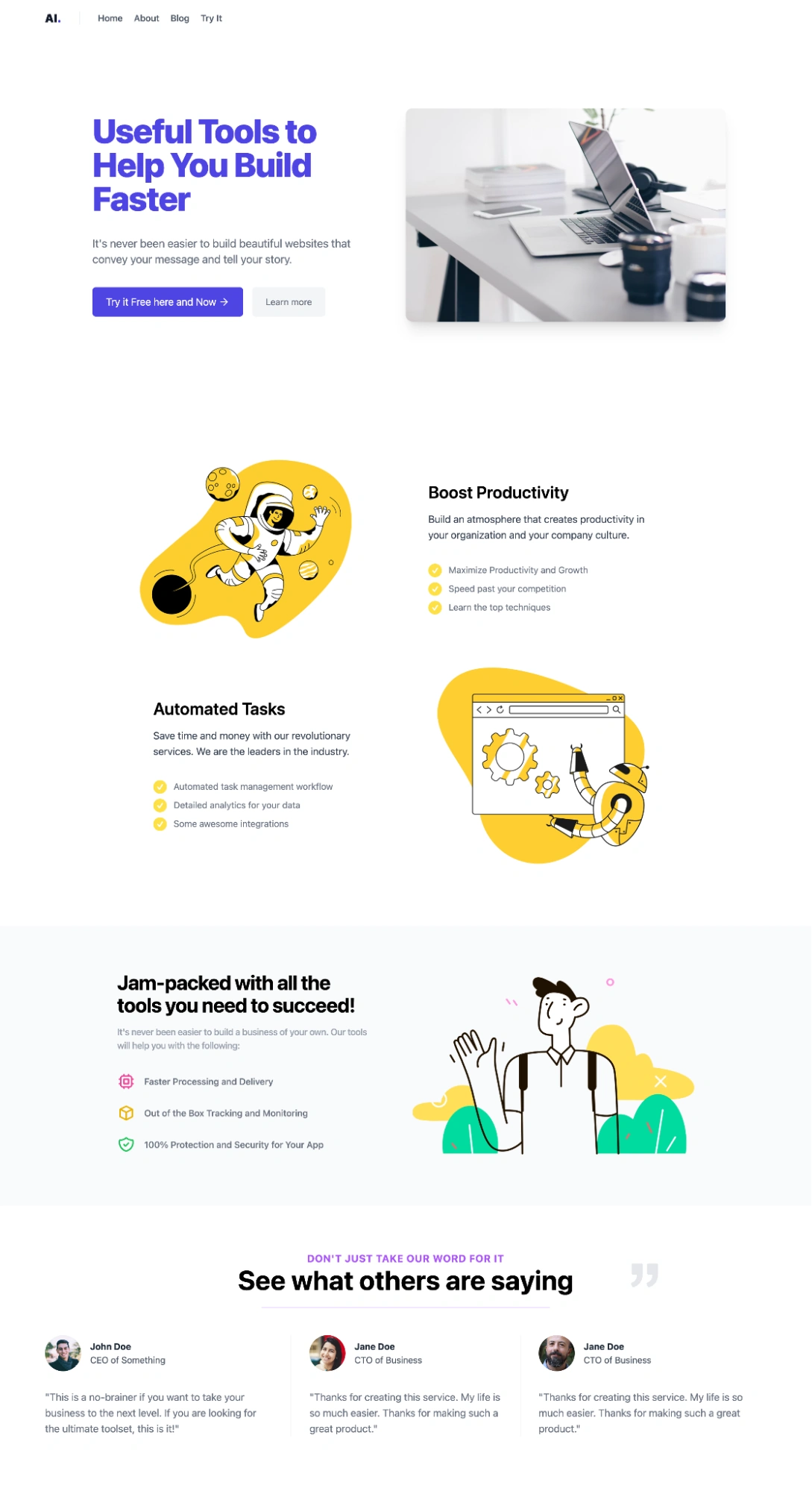
When we combine all the components we have built together, it results in a well-built landing page as shown below
Final thoughts
In this tutorial, we learned how to build a Nuxt.js landing page with ButterCMS using features such as page types, pages, components, and collections. To further explore more on how to build landing pages with ButterCMS, you can visit here.
Resources
Code for the landing page: https://github.com/Gitarackur/ButterCMS-landing-page

