
- Why use Astro?
- Why use ButterCMS?
- Astro tutorial: Building a landing page with Astro, Tailwind, and ButterCMS
- Creating our navigation and footer with ButterCMS collections
- Creating components for our landing page in ButterCMS
- Adding components to the landing page
- Adding content to our landing page components
- Getting our API key
- Scaffolding our Astro application
- Adding Tailwind CSS for styling
- Adding global and custom reusable styles
- Adding the ButterCMS SDK into our Astro app
- Creating our landing page layout
- Final thoughts
Get ready to spice up your Astro application with this tutorial! We'll walk you through the process of adding awesome landing pages to your Astro app, using the ButterCMS as your content backend. You'll learn how you can store and manage all your text and images with ButterCMS's user-friendly interface, and how to fetch that data and easily integrate it into your Astro app. It's time to take your web experience to the next level with dynamic and engaging content! Let's dive in and transform your Astro app!
Table of contents
Why use Astro?
Astro is an open-source web framework built on top of popular UI tools and frameworks like TypeScript, React, Vue, and Svelte that let users build highly performant and content-rich websites ranging from blog sites to marketing sites to portfolios and web applications while utilizing zero or no JavaScript. Astro ships in little or no JavaScript by default to minimize load time. It does this by pre-rendering pages in the server unless developers define a component as interactive, in which case Astro will deliver the smallest amount of JavaScript required for interactivity. Other than that, it leaves the rest of the page as static HTML.
Astro's design principles make it accessible to every web developer. It supports popular UI component languages, including React, Preact, Svelte, Vue, and Solid, as well as easy integration with headless content management systems (CMSs) and third-party libraries such as Tailwind, MDX, and Markdoc.
Astro offers the following benefits:
-
Speed: Astro is fast by default and offers great performance which helps improve the user’s experience. It also offers a great developer experience—you don’t need to be an expert to use Astro, you can create a website in Astro with just HTML and CSS.
-
Performance: Astro leverages server-side rendering (SSR). Its server-first Multi Page App (MPA) architecture offers better performance and simplicity than other modern JavaScript web frameworks that follow the Single Page App (SPA) model.
-
Interoperability: Astro offers easy integration with headless CMSs. Using Astro, you can easily fetch content from your CMS and display it on your website any way you like.
-
Simplicity: Astro is easy to use. It doesn't want you to have to spend time learning a brand-new syntax. It enables you to utilize your preferred front-end frameworks, such as React and Vue, while letting Astro handle your application's internal workings.
-
Full-featured: Astro offers features such as file-based routing, asset handling, bundling, optimizations, data-fetching, code splitting, and more that are required to create a website.
Why use ButterCMS?
ButterCMS is an API-first headless CMS that assists organizations and businesses in creating, managing, and delivering digital content to their website or application. Some key features of ButterCMS you’ll be utilizing in this tutorial include:
-
Page types: Page types provide a flexible way to define and manage the content of a website. When creating a landing page using ButterCMS, users can define a custom page type that includes fields for the page header, subheaders, hero images, call-to-action buttons, testimonials, and other elements. By using ButterCMS page types to create landing pages, you can ensure that each landing page on your website follows a consistent structure and layout, while still allowing for the customization of individual elements.
-
Pages: Pages in ButterCMS refer to the individual instances of a page type, representing the actual pages on your website. When you create a new page in ButterCMS, you select the corresponding page type and fill in the fields with your content. Pages can be organized into categories or collections, making it easy to manage and update your website's content.

-
Components: Components are pre-built, reusable elements that can be used to create dynamic content for your website or web application. Components in ButterCMS are designed to be flexible and customizable, allowing you to easily add dynamic content to your website without having to write custom code. For example, the Features component allows you to display the key features and benefits of your product. You can customize the number of features to display, the layout, and the order in which they are displayed. You can also rearrange them and use them in other page configurations.
-
Collections: Collections is a feature in ButterCMS that provides users with an easy and efficient way to manage structured content. It allows users to define custom content types with their own fields and data structure. Collections enable easy filterability and categorization of content and can be used to schedule releases. They are used for navigation menus, testimonials, etc.
We will use ButterCMS collections to create the navigation menu and footer section of our site. Then, we will use component types to create our Hero, Features, Download, and FAQ sections. These different content types will significantly improve and simplify our workflow for creating, editing, and deleting page types.
Astro tutorial: Building a landing page with Astro, Tailwind, and ButterCMS
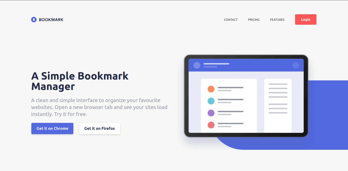
In this section, we’ll create a landing page from scratch using Astro and Tailwind. We will replicate this design from the Frontend Mentor challenges. (Note that you’ll need to sign into GitHub to view the design.)
We will store our images and text in ButterCMS and then we will use Tailwind CSS, a utility-first CSS framework that provides a set of pre-designed, highly-configurable CSS classes. Tailwind allows developers to quickly add styles to their projects without having to write a lot of custom CSS code.
We will set up ButterCMS, create different content types, update the content in our ButterCMS dashboard, and make data available in our ButterCMS API. We will then examine how to connect and fetch data from ButterCMS to Astro. At the end of the tutorial, this should be what our site looks like:

Tutorial prerequisites
To follow along with this tutorial, you need:
-
Node >= 16.12.2 or yarn installed
-
A ButterCMS account
-
a Basic understanding of HTML, JavaScript, and the REST API
-
An understanding of how Tailwind CSS works
Creating our navigation and footer with ButterCMS collections
Once you have created an account with ButterCMS you’ll be directed to the dashboard homepage where you can start creating the content types.
In this section, we will create collections for our navigation and our footer. First, let’s start with creating the navigation menu on our landing page. We will create a menu collection that will handle the page navigation. We will begin by creating the Navigation Items (features, pricing, and contact) collection first, then the Main menu (logo and a reference to the navigation items). To do this, let’s follow the steps below:
To create our navigation items, navigate to Content Types > Collections and create a new collection called nav items. Now, add the following fields and click Save:
-
A short text field with the value label for the navigation item name
-
A short text field with the value URL for the navigation item URL

To add content to our nav items, navigate to Collections, click on New Item > nav items, fill out the fields, and click Publish.
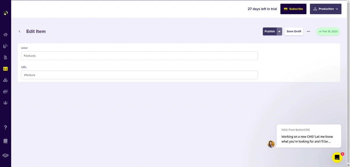
Add more content for Pricing and Contact by clicking on New Item.
Next, we will create another collection to group our navigation items. We'll name this collection Menu. Create a new collection called Menu. Now add the following fields and click Save:
-
A
mediafield with the value logo for the navigation item name -
A
referencefield to reference the nav items collection
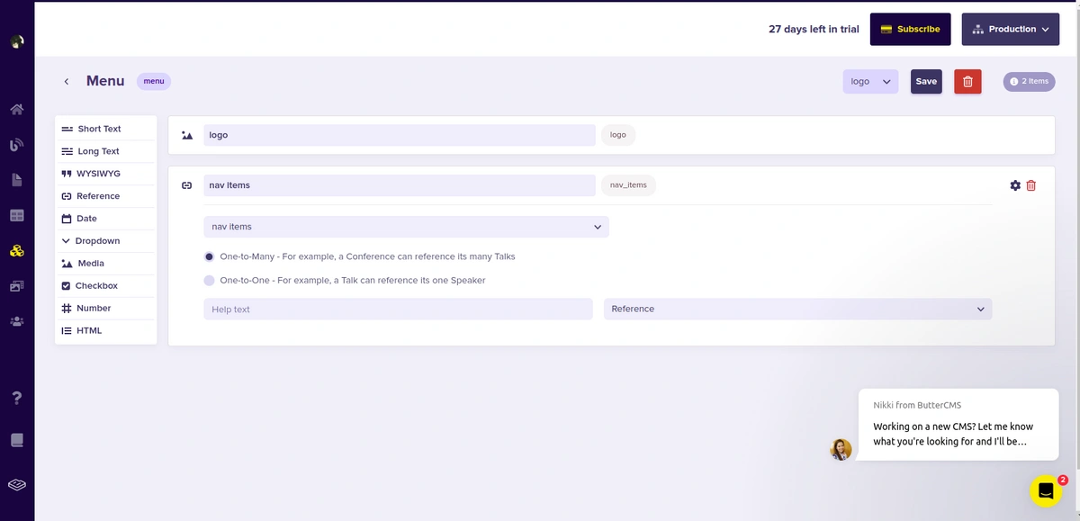
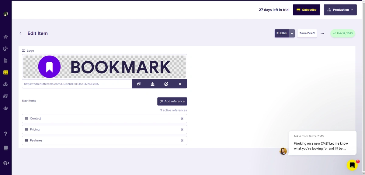
Add content to the Menu collection by navigating to Collections, clicking on New Item > Menu, filling out the fields, and clicking Publish.
If you look at the design we are replicating, you will notice that the footer logo has a different color than the navigation logo.
Next, we will create another collection for our footer items. We'll name this collection Footer menu. Now, add the following fields and click Save:
-
A
mediafield with the value footer logo for the navigation item name -
A
referencefield to reference the nav items collection -
Two
mediafields with the values of Facebook and Twitter
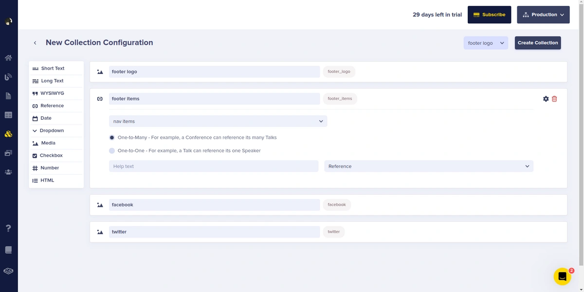
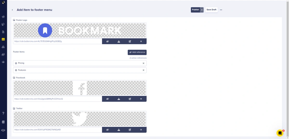
Add content to the Footer menu, by navigating to Collections, clicking on New Item > Footer menu, filling out the fields, and clicking Publish.
Creating components for our landing page in ButterCMS
In this section, we will create four components: the Hero, Features, Download, and FAQ components. Let’s start with creating the Hero component.
To create our Hero component, navigate to Content Types > Component and create a component called Hero. Now, add the following fields and click Save:
-
A
short textfield with the value Heading -
A
short textfield with the value Sub_heading -
A
mediafield with the value Hero image -
A
short textfield with the value Chrome button label -
A
short textfield with the value Firefox button label
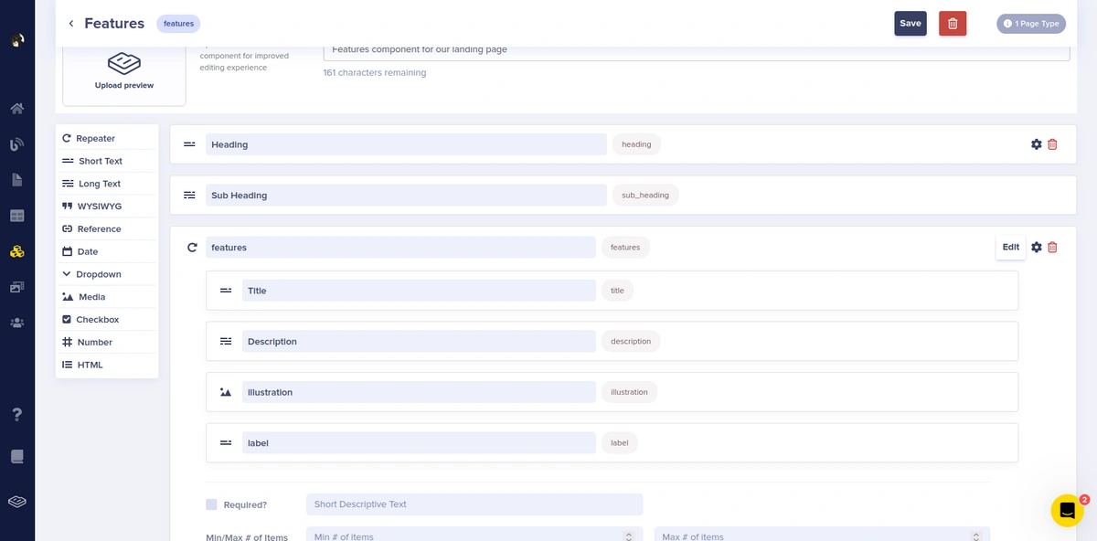
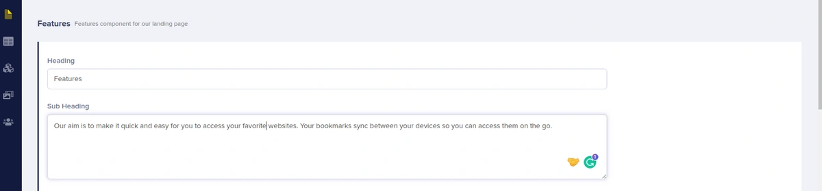
Next, let’s create the Features component. navigate to Content Types > Component and create a component called Features. Now, add the following fields and click Save:
-
A
short textfield with the value Heading -
A
short textfield with the value Sub_heading -
A
Repeaterfield with the value features—for the features, we will choose the following: -
A
short textfield with the value Title -
A
long textfield with the value Description -
A
mediafield with the value illustration -
A
short textfield with the value Label
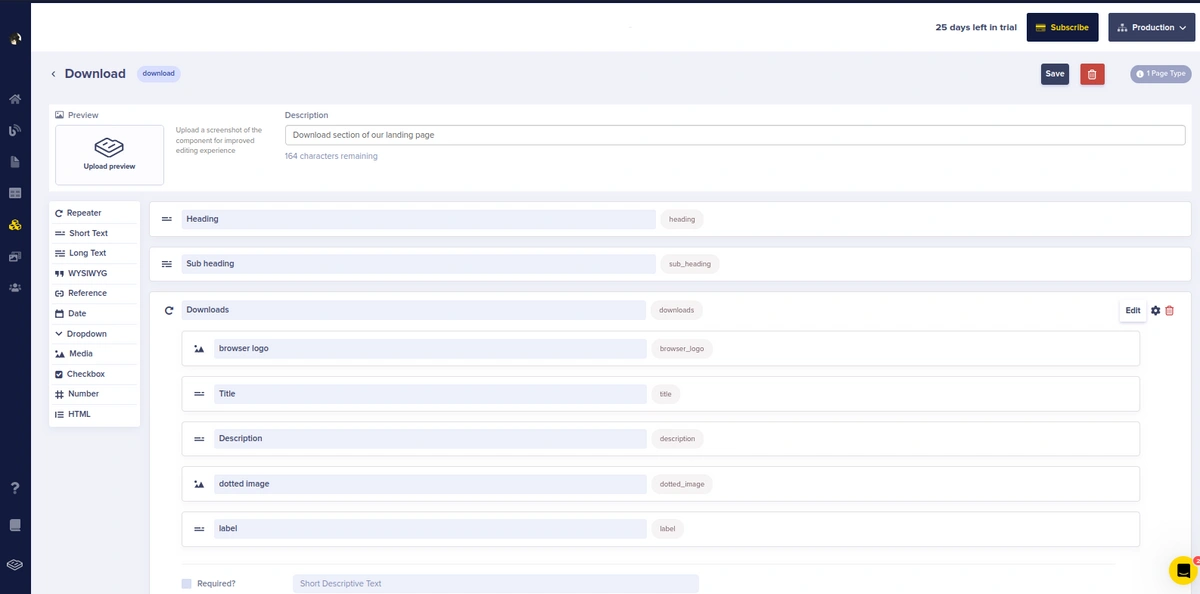
Now, to create the Download component, navigate to Content Types > Component, and create a component called Download. Now, add the following fields and click Save:
-
A
short textfield with the value Heading -
A
short textfield with the value Sub_heading -
A
Repeaterfield with the value Downloads—for the downloads, we will choose the following: -
A
short textfield with the value Title -
A
long textfield with the value Description -
A
mediafield with the value illustration -
A
mediafield with the value dotted image -
A
short textfield with the value Label
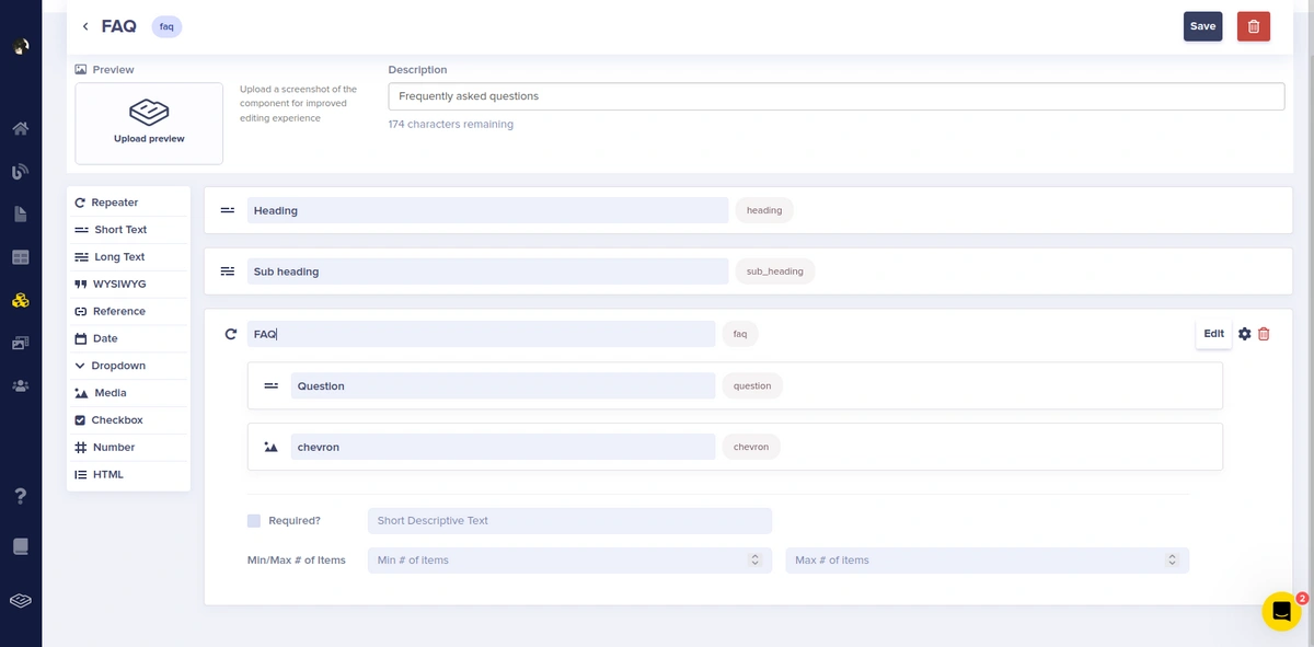
Next, let’s create the FAQ component. navigate to Content Types > Component and create a component called FAQ. Now, add the following fields and click Save:
-
A
short textfield with the value Heading -
A
short textfield with the value Sub_heading -
A
repeaterfield with the value FAQ—for the features we will choose the following: -
A
short textfield with the value Questions -
A
mediafield with the value Chevron
Adding components to the landing page
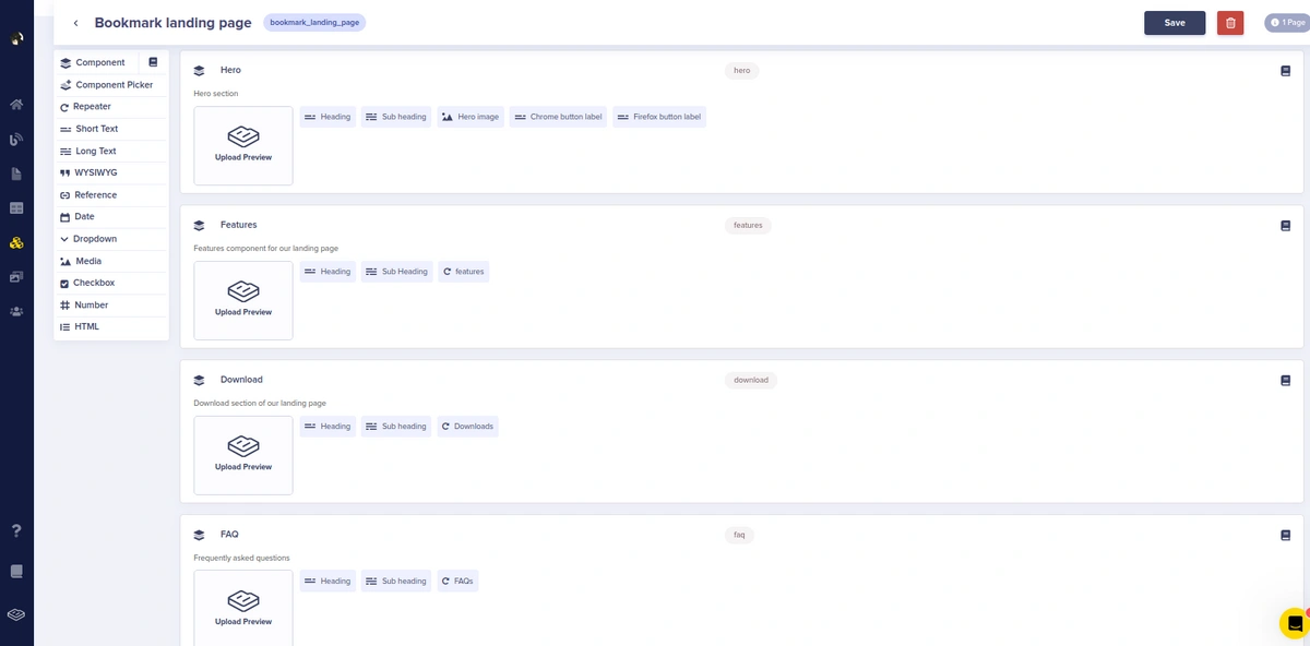
Navigate to Content Types > Page Type and create a new content type named Bookmark landing page. Now click Component > Add from Library and select the components created in the last section then click Save.
Adding content to our landing page components
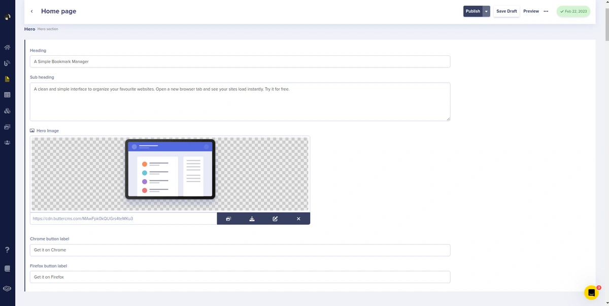
To add content to our components, navigate to Pages and you’ll notice the newly created Page Type - Bookmark landing page. Click on it to create a new page for that specific page type and you’ll be prompted to create metadata. In our case, we will call it Home page. Fill in the details of the Hero component as shown in the image below:
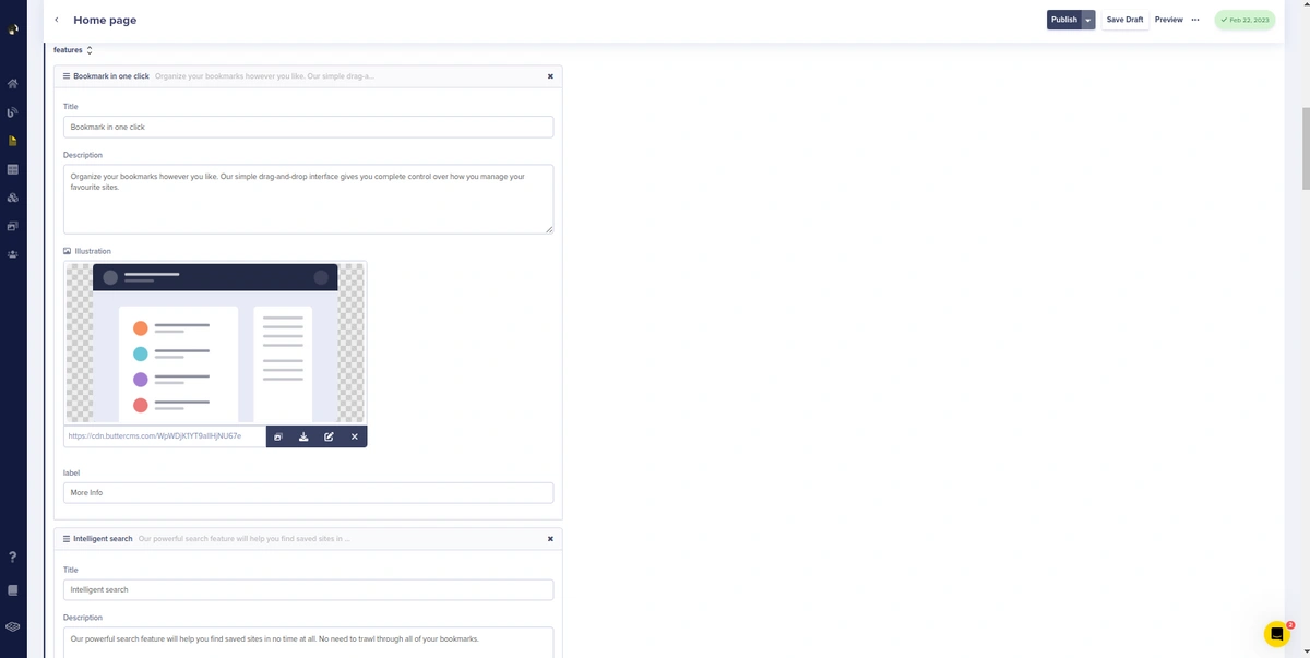
Now fill in the details for the heading, subheading, image, and button of our Features component. Click on the Features column to add details for the heading and sub-heading of our Features component as shown in the image below:
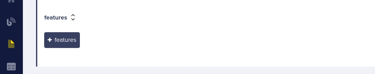
Now to add a list of features, click on the +features button and add three features.
Fill in the details for the heading, subheading, image, and button for the list of the Features component.
Do the same thing to add content for the Download and FAQ components as they are also repeaters. Then, click Publish.
Getting our API key
We must first obtain our API key before using Astro to query our data (content) from ButterCMS. Click on the account profile picture and then select Settings.
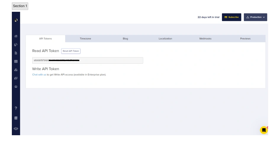
The Read API Token should be copied and safely stored. We'll use it afterward to authenticate and retrieve data using Astro.
Scaffolding our Astro application
In this section, we'll configure Astro and build our landing page's user interface. Now, let's install Astro by executing each of the commands listed below:
# create a new project with npm
npm create astro@latest

Or

# create a new project with yarn
yarn create astro
Note: for the rest of this application, we’ll be using yarn.
The above command will bootstrap the project's application setup and guide you through each stage of creating your new Astro project. Your choices should look like the ones shown in the image below:
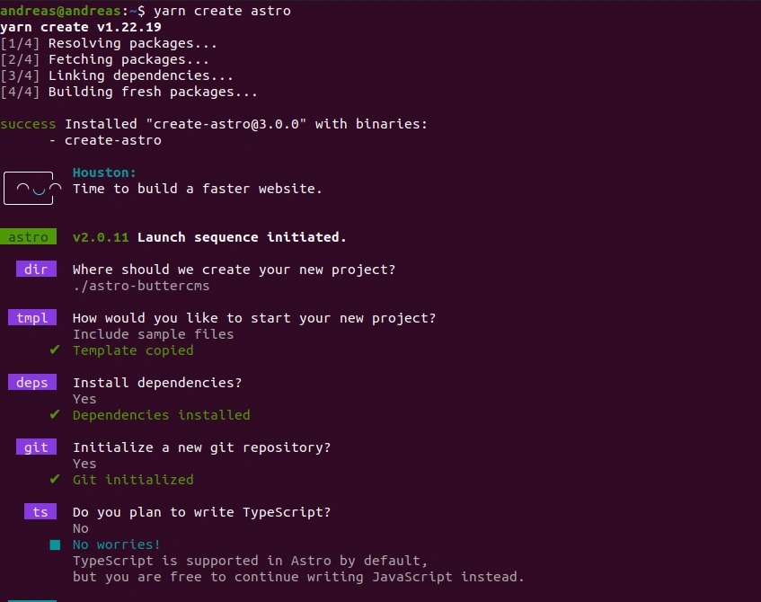
Change to the project directory with cd and run the command below to launch the application:
yarn dev
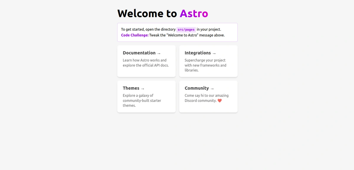
Now, open your browser and go to http://localhost:3000/. What you will see is as follows:
Now, looking through the folder structure, you’ll notice that all Astro components use the .astro extension. Installing this plugin will enable intellisense functionality for VS Code.
Adding Tailwind CSS for styling
Let's set up Tailwind, a utility-first CSS framework, before we begin creating our landing page layouts.
To install Tailwind CSS, launch the terminal at the project's root and enter the following commands:
yarn astro add tailwind
The command above will construct a basic tailwind.config.cjs file with all the required configurations in addition to installing dependencies.
/** @type {import('tailwindcss').Config} */
module.exports = {
    content: ['./src/**/*.{astro,html,js,jsx,md,mdx,svelte,ts,tsx,vue}'],
    theme: {
        extend: {},
    },
    plugins: [],
}
Looking at your astro.config.mjs file, you’ll notice that Astro has automatically incorporated Tailwind into your project.
import { defineConfig } from 'astro/config';
// https://astro.build/config
import tailwind from "@astrojs/tailwind";
// https://astro.build/config
export default defineConfig({
  integrations: [tailwind()]
});
Before we begin creating the layouts for our landing page, let's create a .env file in our root folder and paste our ButterCMS token into it.
//.env
BUTTERCMS_API_TOKEN= your api token
Adding global and custom reusable styles
In your tailwind.config.cjs file, add the code below:
/** @type {import('tailwindcss').Config} */
module.exports = {
    content: ['./src/**/*.{astro,html,js,jsx,md,mdx,svelte,ts,tsx,vue}'],
    theme: {
        extend: {
            colors: {
                'bookmark-blue': 'hsl(231, 69%, 60%)',
                'bookmark-red': 'hsl(0, 94%, 66%)',
                'grayish-blue': 'hsl(229, 8%, 60%)',
                'dark-blue': 'hsl(229, 31%, 21%)'
            },
        },
        container:{
            center: true,
        }
    },
    plugins: [],
}
Based on the code above, we will be using these custom colors throughout our application. Now, replace the code in your pages/index.astro file with the code below:
---
import Layout from '../layouts/Layout.astro';
import Hero from '../components/Hero.astro';
import Features from '../components/Features.astro';
import Download from '../components/Download.astro';
import FAQ from '../components/FAQ.astro';
import Contact from '../components/Contact.astro';
---
<Layout title="Welcome to Bookmark landing page.">
    <Hero />
    <main>
        <Features />
        <Download />
        <FAQ />
        <Contact />
    </main>
</Layout>

<style is:global>
*{
    margin: 0;
    padding: 0;
    box-sizing: border-box;
}
html{
    scroll-behaviour: smooth;
}
@tailwind base;
@layer base {
    .btn{
        @apply shadow-md py-3 px-6 rounded-md transition duration-300 font-medium lg:font-semibold
    }
    .btn-blue{
        @apply bg-bookmark-blue text-white
    }
    .btn-white{
        @apply bg-white text-dark-blue
    }
}
</style>
As we go along, we will create the components and layout we imported.
Adding the ButterCMS SDK into our Astro app
In this section, we will install and configure ButterCMS into our Astro app. First of all, let’s create a .env file at the root of your project and add your API token as an environment variable:
BUTTER_TOKEN=YOUR_API_TOKEN_HERE
Now, to install the ButterCMS SDK, run the command below:
yarn add buttercms
In your project's new src/lib/ directory, add a buttercms.js file:
import Butter from "buttercms";

export const butterClient = Butter(import.meta.env.BUTTERCMS_API_TOKEN);
Your API Token authenticates the SDK and exports it for usage across your project. You'll also notice that we use import.meta.env rather than process.env. This is from the compiler Vite, which Astro uses to return a user environment object.
Creating our landing page layout
Let’s start by creating our landing page layout. Astro layouts are used to create reusable components. The layout will house our navigation and footer. Replace the content in layouts/Layout.astro with the code below:
---
---
import hamburger from '../images/icon-hamburger.svg';
import facebook from '../images/icon-facebook.svg';
import twitter from '../images/icon-twitter.svg';
import { butterClient } from "../lib/buttercms";


const response = await butterClient.content.retrieve(["menu"]);
const footerResponse = await butterClient.content.retrieve(["footer_menu"]);


const headerMenu = response.data.data.menu[0]
const footerMenu = footerResponse.data.data.footer_menu[0]
console.log(footerMenu)


export interface Props {
   title: string;
}


const { title } = Astro.props;
---


<!DOCTYPE html>
<html lang="en">
   <head>
       <meta charset="UTF-8" />
       <meta name="viewport" content="width=device-width" />
       <link rel="icon" type="image/svg+xml" href="/favicon.svg" />
       <meta name="generator" content={Astro.generator} />
       <title>{title}</title>
   </head>
   <body class="bg-white">
       <nav class='container mx-auto lg:px-28 px-10 flex items-center py-4 mt-4 sm:mt-12'>
           <div>
               <img src={headerMenu.logo} alt="Bookmark SVG" />
           </div>
           <div class="hidden md:flex flex-1 justify-end items-center gap-12 uppercase">
               <ul class="hidden md:flex flex-1 justify-end items-center gap-12 text-sm">
                   {
                       headerMenu.nav_items.map(item => (
                               <li><a href={item.url}>{item.label}</a></li>
                       ))
                   }
               </ul>
               <button class="bg-bookmark-red text-white rounded-md px-7 py-3 font-bold hover:bg-white hover:text-bookmark-red border hover:border-bookmark-red">Login</button>
           </div>
           <div class="flex md:hidden flex-1 justify-end">
               <img src={hamburger} alt="mobile navigation">
           </div>
       </nav>
       <slot />
       <footer class="py-8 bg-dark-blue lg:px-28 px-10">
           <div class="container flex flex-col md:flex-row items-center">
               <div class="flex flex-1 flex-col md:flex-row items-center justify-center md:justify-start gap-12">
                   <img src={footerMenu.footer_logo} alt="Bookmark SVG">
                   <ul class="flex flex-col md:flex-row text-white uppercase gap-12 text-sm">
                       {
                           footerMenu.footer_items.map(item => (
                                   <li><a href={item.label}>{item.label}</a></li>
                           ))
                       }
                   </ul>


               </div>
               <div class="flex gap-10 mt-12 md:mt-0 list-none">
                   <li>
                       <img src={footerMenu.facebook} alt="facebook icon">
                   </li>
                   <li>
                       <img src={footerMenu.twitter} alt="twitter icon">
                   </li>
               </div>
           </div>
       </footer>
   </body>
</html>
The region beginning and ending with --- is called Component Script, and that is where we write our JavaScript and TypeScript code. When passing information to an Astro component and making it available for use across the component, Astro uses Astro.props. We import our butterClient and use the retrieve function to fetch content for our navigation and footer.
Astro allows us to insert child elements from other files into the component template by using the <slot /> element as a placeholder for external HTML information.
Here’s what our navigation menu looks like:

Here’s what our footer looks like:
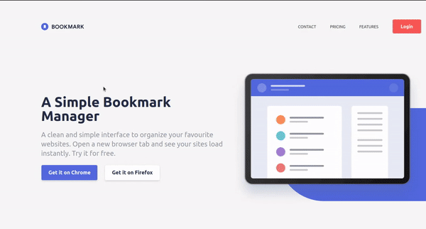
Creating the Hero component
In your component folder, create a Hero.astro file and add the following code:
---
import { butterClient } from "../lib/buttercms";
const response = await butterClient.page.retrieve('*', 'home-page');
const pageData = response.data.data;

interface Hero {
  heading: string,
  sub_heading: string,
  chrome_button_label: string,
  firefox_button_label: string,
  hero_image: any,
}
const hero = pageData.fields.hero as Hero
---
<header class="relative">
    <div class="container mx-auto px-10 lg:px-28 flex flex-col-reverse lg:flex-row items-center gap-4 mt-14 lg:mt-28">
        <div class="flex flex-1 flex-col items-center lg:items-start">
            <h2 class="font-bold text-dark-blue text-3xl md:text-4xl lg:text-5xl text-center lg:text-left mb-6">
                {hero.heading}
            </h2>
            <p class="text-grayish-blue text-center lg:text-left mb-6 text-md lg:text-2xl">
                {hero.sub_heading}
            </p>
            <div class="flex justify-center text-xs lg:text-lg gap-2 lg:gap-6">
                <button type="button" class="btn btn-blue hover:bg-white hover:text-bookmark-blue border hover:border-bookmark-blue">{hero.chrome_button_label}</button>
                <button type="button" class="btn btn-white hover:text-dark-blue border hover:border-dark-blue">{hero.firefox_button_label}</button>
            </div>
        </div>
        <figure class="flex justify-center flex-1 mb-4 md:mb-16 lg:mb-0 z-10">
            <img src={hero.hero_image} alt="Hero section illustration">
        </figure>
    </div>
    <div class="absolute h-[30%] md:h-1/2 lg:h-80 w-[80%] lg:w-2/5 top-16 lg:top-32 right-0 overflow-hidden bg-bookmark-blue rounded-l-full"></div>
</header>
Here’s what it should look like after fetching the data and adding styles:
Creating the Features component
In your component folder, create a Features.astro file and add the following code:
---
import { butterClient } from "../lib/buttercms";
const response = await butterClient.page.retrieve('*', 'home-page');
const pageData = response.data.data;
interface Features {
heading: string,
sub_heading: string,
features: any,
}
const features = pageData.fields.body[1].fields as Features
---
<section class="relative bg-white py-20 mt-20 lg:mt-60">
<div class="sm:w-3/4 lg:w-5/12 mx-auto px-2">
<h1 class="font-bold text-4xl text-center text-dark-blue">{features.heading}</h1>
<p class="text-sm lg:text-xl text-center text-grayish-blue mt-4">
{features.sub_heading}
</p>
</div>
<div class="relative mt-20 lg:mt-24">
{
features.features.map((feature) => (
<div class="container flex flex-col lg:flex-row items-center justify-center gap-x-24 px-10 lg:px-28 even:lg:flex-row-reverse lg:even:my-20">
<figure class="flex flex-1 justify-center z-10 mb-10 lg:mb-0">
<img src={feature.illustration} alt="Features illustration one">
</figure>
<div class="flex flex-1 flex-col items-center lg:items-start">
<h1 class="text-2xl lg:text-4xl text-center lg:text-left text-dark-blue font-bold">{feature.title}</h1>
<p class="text-center lg:text-left my-12 text-md lg:text-2xl text-grayish-blue">
{feature.description}
</p>
<button type="button" class="btn btn-blue hover:bg-white hover:text-bookmark-blue border hover:border-bookmark-blue hidden md:block">{feature.label}</button>
</div>
</div>
// <div class="absolute h-[35%] md:h-2/5 lg:h-3/4 w-[80%] lg:w-2/5 bottom-60 lg:-bottom-10 left-0 even:bottom-60 even:lg:-bottom-10 even:right-0 overflow-hidden bg-bookmark-blue rounded-r-full"></div>
))
}
</div>
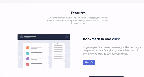
</section>Here’s what our Features section looks like:
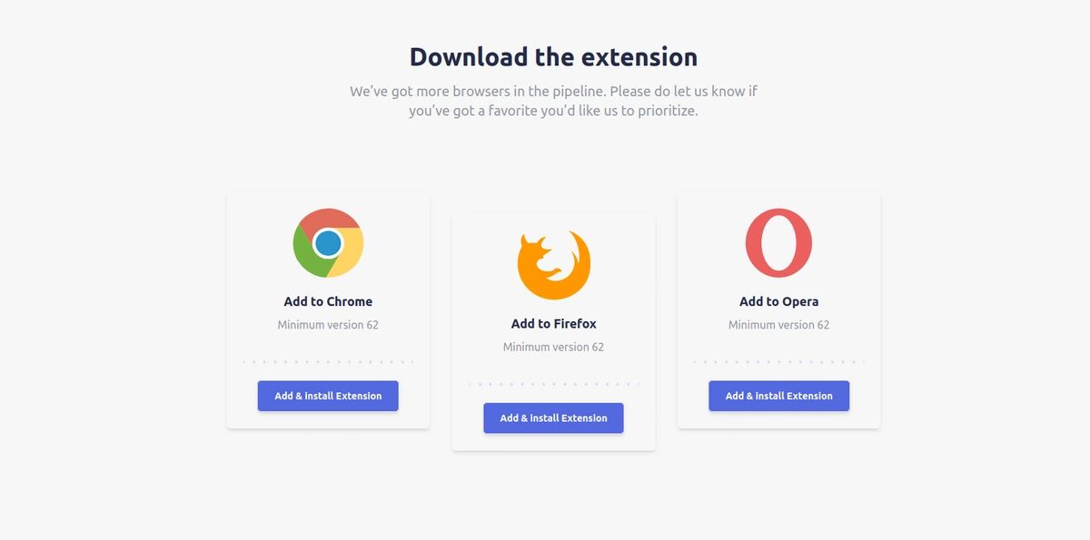
Creating the Download component
In your component folder, create a Download.astro file and add the following code:
---
import { butterClient } from "../lib/buttercms";
const response = await butterClient.page.retrieve('*', 'home-page');
const pageData = response.data.data;

interface Downloads {
  heading: string,
  sub_heading: string,
  downloads: any,
}
const downloads = pageData.fields.download as Downloads
---
<section class='py-20 mt-20'>
    <div class="sm:w-3/4 lg:w-5/12 mx-auto px-2">
        <h1 class="font-bold text-2xl lg:text-4xl text-center text-dark-blue">{downloads.heading}</h1>
        <p class="text-lg lg:text-xl text-center text-grayish-blue mt-4">
           {downloads.sub_heading}
        </p>
    </div>
    <div class='container grid grid-cols-1 md:grid-cols-2 lg:grid-cols-3 gap-8 max-w-screen-lg mt-16 p-10'>
        {downloads.downloads.map((download) => (
                <div class='flex flex-col rounded-md shadow-md lg:mb-16 even:lg:my-8'>
                    <div class='flex flex-col p-6 items-center'>
                        <img src={download.browser_logo} alt='Chrome browser illustration' />
                        <h3 class='mt-5 mb-2 text-dark-blue text-lg font-semibold'>{download.title}</h3>
                        <p class='mb-10 text-grayish-blue'>{download.description}</p>
                        <img src={download.dotted_image} alt='dotted line' class='mb-6' />
                        <button type='button' class='btn btn-blue hover:bg-white hover:text-bookmark-blue border hover:border-bookmark-blue text-sm'>{download.label}</button>
                    </div>
                </div>
        ))}
    </div>
</section>
Here’s what our Download section looks like:
Creating the FAQ component
In your component folder, create a FAQ.astro file and add the following code:
---
import { butterClient } from "../lib/buttercms";
const response = await butterClient.page.retrieve('*', 'home-page');
const pageData = response.data.data;

interface FAQ {
  heading: string,
  sub_heading: string,
  faqs: any,
}
const FAQ = pageData.fields.faq as FAQ
---
<section class='py-20 px-10'>
    <div class="sm:w-3/4 lg:w-5/12 mx-auto px-2">
        <h1 class="font-bold text-3xl text-center text-dark-blue">{FAQ.heading}</h1>
        <p class="text-sm lg:text-xl text-center text-grayish-blue mt-4">
            {FAQ.sub_heading}
        </p>
    </div>
    <div class="flex flex-col sm:w-3/4 lg:w-5/12 mt-12 mx-auto text-lg">
        <div>
            {
                FAQ.faqs.map(faq => (
                    <div class="flex items-center border-b py-4">
                        <span class="flex-1">{faq.question}</span>
                        <img src={faq.chevron} alt="Chevron icon">
                    </div>
                ))
            }
        </div>
        <button type="button" class="flex self-center mt-10 btn btn-blue hover:bg-white hover:text-bookmark-blue border hover:border-bookmark-blue">More Info</button>
    </div>
</section>
Here’s what our FAQ section looks like:
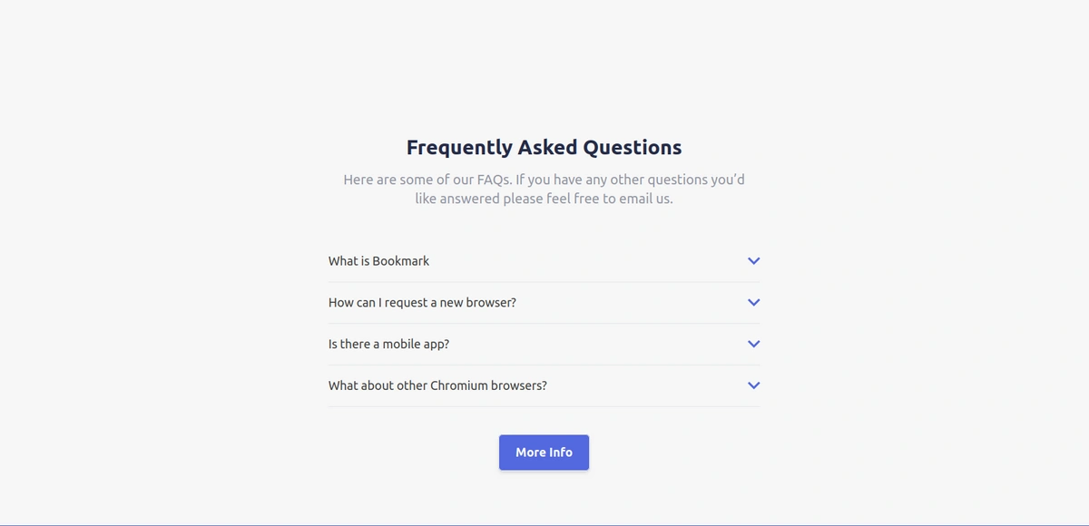
We won’t add the functionality to show the answers to the FAQs. Visit Astro scripts and event handling to learn to add JS functions to your application.
Creating the Contact component
In your component folder, create a Contact.astro file and add the following code:
---
---
<section class="bg-bookmark-blue text-center text-white py-20">
    <div class="container">
        <div class="sm:w-3/4 lg:w-2/4 mx-auto">
            <p class="font-semibole uppercase mb-8 -tracking-tight">35,000+ already joined</p>
            <h1 class="text-3xl">Stay up-to-date with what we're doing</h1>
            <div class="flex flex-col sm:flex-row gap-6 mt-8 px-10">
                <input type="email" name="email" id="email" placeholder="Enter your email address" class="focus:outline-none flex-1 px-2 py-3 rounded-md text-grayish-blue">
                <button class="text-sm bg-bookmark-red text-white rounded-md px-7 py-3 font-bold hover:bg-white hover:text-bookmark-red border-bookmark-red hover:border-bookmark-red">Contact Us</button>
            </div>
        </div>
    </div>
</section>
Our contact section will look like this:

The outcome of our final application is shown in the GIF below.
Congratulations on completing the tutorial on how to build and add flexible landing pages to our Astro application and ButterCMS! You have learned how to use Astro, a modern front-end framework, to build a responsive and interactive landing page and also learned how to integrate it with ButterCMS, a headless CMS that provides a flexible and efficient way to manage your content. With the skills you have acquired, you can now create more complex and dynamic web applications that can provide a seamless user experience for your visitors.
Final thoughts
This tutorial covered how to create a single-page application with Astro and Tailwind CSS and how to connect it to ButterCMS, which is a great content management system with awesome performance. We learned how to set up and use ButterCMS pages, components, and collections. We also learned how to manage our page content from ButterCMS. Check out ButterCMS to learn more about its awesome features.
We used Astro in this tutorial because it is designed for building content-rich websites and offers a lot of features such as speed, great performance, flexibility, server-side and client-side rendering, and code splitting, as well as allowing us to use any web framework of our choice. The link to the tutorial’s source code can be found on GitHub.
To learn more about how you can use Astro with ButterCMS, check out the tutorials below:
