

- Why use Ionic?
- Why use ButterCMS?
- Tutorial: Adding a robust landing page to an Ionic application
- Installing Iconic
- Setting up our Ionic app
- Configuring components for our landing page in ButterCMS
- Building our landing page with the content types created
- Fetching the components from ButterCMS
- Closing thoughts
A landing page in digital marketing is developed expressly for marketing or promotional purposes. A well-designed landing page may greatly enhance conversions for your marketing or advertising efforts and assist you in marketing optimization.
One situation where someone may need a landing page is when running a paid advertising campaign, such as a Google AdWords or a Facebook ad campaign. In this case, the landing page would be used as the destination for the ad, and its purpose would be to convert visitors into leads or customers by providing information about the product or service being advertised to them, a form for visitors to fill out to request more information or a way to make a purchase.
In this article, we will learn how to build an Ionic landing page powered by ButterCMS serving as your content backend.
Table of contents
Why use Ionic?
Ionic is an open-source framework that allows developers to build cross-platform mobile apps. Ionic allows developers to create apps that can run on several platforms, including iOS, Android, and the web, using a single codebase.
Ionic was created to help developers produce mobile apps that are visually appealing and function smoothly on multiple platforms with a native feel. It comes with a selection of pre-built UI components that can be customized to fit the desired design. This makes it simple and less time-intensive for developers to create professional-quality mobile apps.
Some key features of Ionic include:
- Cross-platform compatibility: Developers have the capability to develop applications that can function on different platforms, including but not limited to iOS, Android, and the web, by utilizing a unified codebase.
- UI components: Ionic offers a collection of pre-made UI components that can be customized to create an app with a professional appearance.
- Web-based development: Ionic utilizes web-based technologies such as HTML, CSS, and JavaScript, which are commonly used and familiar to many developers.
- Beginner friendly: Ionic is designed with simplicity in mind, making app development pleasant, simple to learn, and accessible to almost anybody with web programming experience.
- CLI for Ionic: The Ionic CLI, or command line interface, is a tool that offers Ionic developers various useful commands. It is a tool for launching, creating, running, and imitating Ionic apps.
- Beautiful design: Ionic is built to operate and look great on all platforms right out of the box, beginning with pre-designed components, typography, interaction paradigms, and an eye-catching (but adaptable) basic theme.
Why use ButterCMS?
ButterCMS is a headless content management system (CMS) that functions as your content backend/repository and uses APIs to allow users to manage and deliver content to your applications. Developers and marketers alike often choose it due to its versatility, ease of use, scalability, integration with third-party tools, and customization options.
Additional reasons to choose ButterCMS as your headless CMS solution include the following:
- SEO optimization: ButterCMS provides tools for optimizing content for search engines, including support for SEO-friendly URLs and customizable meta tags.
- Content modeling: ButterCMS allows developers to create custom content types and fields to suit the needs of their applications. This can be useful for organizing and structuring content in a way that makes sense for the application.
- Collaboration features: ButterCMS provides team collaboration and workflow management tools, making it easy for multiple users to work on the content together.

Tutorial: Adding a robust landing page to an Ionic application
In this tutorial, we'll build a landing page containing several sections with the Ionic framework.
Here's a GIF showing what we'll build in this tutorial:

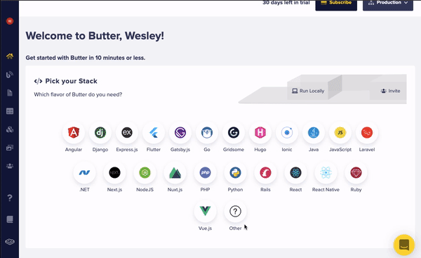
Ionic can be added to an existing JavaScript project, or a new project can be set up from scratch using the Ionic CLI (command line interface). If you need to add Ionic to an existing project, you can install the @ionic/core package as a dependency or include some static files using a CDN (content delivery network). However, using the Ionic CLI to create a new Ionic project from scratch is recommended.
Prerequisites
To use Ionic, you will need the following prerequisites:
- Basic knowledge of JavaScript and React (You may also want to learn TypeScript, an optional but recommended language for building Ionic apps)
- Node.js and either npm (Node Package Manager) or Yarn (a package manager for Node.js) installed on your computer
- A code editor for writing and editing our code, I recommend VS Code
- An active account with ButterCMS
The code for this tutorial can be found in this GitHub repo.
Installing Iconic
The Ionic CLI can quickly generate Ionic projects using Angular, React, or Vue. However, installing the CLI as a global dependency on your computer is necessary to create and manage Ionic projects from any location.
To install the Ionic CLI, we can use the following command in our terminal:
# using npmnpm install -g @ionic/cliAfter installing the Ionic CLI, we can confirm that the installation was successful by running the following command to display the version of Ionic installed on our machine:
ionic --versionThis command should output the version number of the Ionic CLI you have installed. If the command executes successfully, the Ionic CLI has been installed successfully on our machine.
Setting up our Ionic app
You can use the Ionic start command to create a new Ionic project. You will be prompted to select your preferred framework and project template by running this command without any options. Alternatively, you can pass arguments to the command to specify your project name, preferred framework, and preferred template in the following format:
ionic start [project-name] [template] –-type=[framework]For example, to create a new Ionic project with the name "ionic-app" using the React framework and the blank template, you would run the following command:
ionic start ionic-app blank --type=reactOnce the project has been created, you can navigate to the project directory and start working on your app by running the following commands:
cd my-app
ionic serve
The ionic serve command will start a development server and open a new browser window with your Ionic app. You can then start building and testing your app.
The Ionic-react template follows a component-based design similar to React, whereby the user interface is separated into multiple sections called components. For our landing page, let's get started by heading over into the component folder, creating folders such as Navbar, Hero, Features, Contact, Card, and Footer, and creating a .tsx and CSS file within each folder.
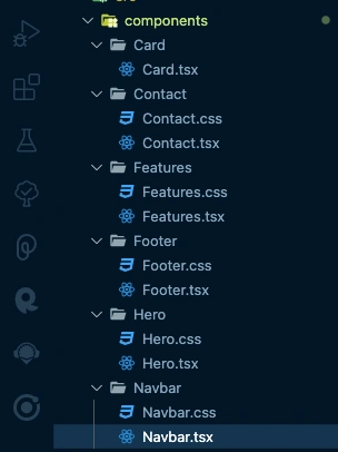
Let's also create a basic React functional component in all the files we created, return a div component, and render them by modifying our Home.tsx file, which is located in the pages folder:
import React from 'react'

const Hero:React.FC = () => {
 return (
   <div>

   </div>
 )
}

export default Hero
More modifying of our Home.tsx file:
import { IonContent, IonPage } from "@ionic/react";
import Contact from "../components/Contact/Contact";
import Features from "../components/Features/Features";
import Footer from "../components/Footer/Footer";
import Hero from "../components/Hero/Hero";
import Navbar from "../components/Navbar/Navbar";
import "./Home.css";

const Home: React.FC = () => {
 return (
   <IonPage>
     <Navbar />
     <IonContent fullscreen scrollY={true}>
       <Hero />
       <Features />
       <Contact />
       <Footer />
     </IonContent>
   </IonPage>
 );
};

export default Home;
The Home component imports several other components from the components' folder, including Contact, Features, Footer, Hero, and Navbar. It also imports the IonContent and IonPage components from the @ionic/react library, which is a library of UI components for building Ionic apps with React. It renders a page with a navbar at the top and a full-screen scrollable content area. Inside the content area, the component renders the Hero, Features, Contact, and Footer components in order. The Home.css file is also imported, containing the component's styles.
Creating the navigation bar
To create the navigation bar, let's add the following code to our Navbar.tsx file:
import { IonHeader, IonToolbar, IonImg } from "@ionic/react";
import React from "react";
import "./Navbar.css";
const Navbar: React.FC = () => {
 return (
   <>
     <IonHeader collapse="fade" className="ion-no-border" >
       <IonToolbar className="ion-padding-horizontal">
         <IonImg src="https://www.expressvpn.com/frtr/assets/images/edsv2/logo/expressvpn-logo-red.svg" />
       </IonToolbar>
     </IonHeader>
   </>
 );
};

export default Navbar;
The Navbar component renders an IonHeader element with a class of ion-no-border and a collapse prop of fade. Inside the header, it renders an IonToolbar element with a class of ion-padding-horizontal. Finally, inside the toolbar, it renders an IonImg element with an src prop that points to an image file. The Navbar.css file is also imported, containing the component's styles.
Styling the navigation bar
These custom properties are specific to the Ionic framework and allow you to style elements in an Ionic app.
ion-toolbar {
 --background: #f9f8f2;
 --color: #da4140;
}

ion-img{
   width: 200px;
}
The Hero section
To create the Hero section, let's add the following code to our Hero.tsx file:
import { IonButton, IonIcon, IonImg, IonRow, IonText } from "@ionic/react";
import React from "react";
import "./Hero.css";
import { arrowForward, star } from "ionicons/icons";
const Hero: React.FC = () => {
 return (
   <div className="hero_container">
     <div className="text_container">
       <IonText>
         <h2 className="hero_text">
           The VPN that
 just works
         </h2>
       </IonText>
     </div>

     <div className="subtitle">
       <IonText>
         <p className="hero_subtitle">
           {" "}
           <strong>Exclusive offer: Get 3 extra months FREE</strong>
         </p>
       </IonText>
     </div>

     <IonButton
       shape="round"
       size="default"
       expand="block"
       color="success"
       className="ion-margin-vertical"
     >
       Start Your Risk-Free Trial
       <IonIcon slot="end" icon={arrowForward}></IonIcon>
     </IonButton>
     <img src="https://ftr.imgix.net/21JMuWvXG3fAvOiDFKNHhT/2b8e98ddc5e35d0fe259b55732395926/co-branded-new-hero-desktop-800w.png?auto=format%2Ccompress&cs=srgb&fit=max&q=60&w=800&s=bf99ffb540be1d7917ffe5a9f1412119" />
   </div>
 );
};

export default Hero;
The Hero section renders a div with a hero_container class, which contains several other elements. It includes a div with a text_container class that contains a heading, a div with a subtitle class that has a paragraph, and an IonButton element. The button includes an IonIcon element with the arrowForward icon. It also consists of an img element with an src prop that points to an image file.
Styling the hero section
Here are the styles for our hero section:
.hero_container {
 color: #000;
 text-align: center;
 background: #f9f8f2;
 padding: 16px;
}

.hero_text {
 font-size: 2.5rem;
 letter-spacing: 0.03em;
 font-weight: 700;
}

.text_container {
 margin: 2.5rem 0;
}

ion-button {
 --padding-top: 25px;
 --padding-bottom: 25px;
}
The Feature section
To create the Feature section, let's add the following code to our Feature.tsx file:
import {
 IonText,
} from "@ionic/react";
import React from "react";
import Card from "../Card/Card";
import "./Features.css";

type FeatureTypes = {
 id: number;
 cardImg: string;
 cardTitle: string;
 cardContent: string;
};

const Features: React.FC = () => {
 const featureArr: FeatureTypes[] = [
   {
     id: 1,
     cardImg:
       "https://xvdrop.imgix.net/ultra-fast-global-connection%202@2x-899a670c01a88475344687bf60c6e5dfecde0c6c.png",
     cardTitle: "Ultra-fast global access",
     cardContent:
       "Our network of high-speed servers puts you in control. Appear to be in any of 94 countries worldwide and enjoy online freedom anywhere",
   },

   {
     id: 2,
     cardImg:
       "https://xvdrop.imgix.net/unexposed-internet-lamp-opt-68bda71f48874cf3da7ad48d3830d4956f1796b4.png",
     cardTitle: "Instant online protection",
     cardContent:
       "Take charge of your digital security in one click. ExpressVPN's best-in-class encryption keeps you safe and private on any network.",
   },
   {
     id: 3,
     cardImg:
       "https://xvdrop.imgix.net/extend-your-coverage-with-a-vpn-c23a02595bf8227df5ef3484a87e9588a21c9e31.png",
     cardTitle: "Use on every device",
     cardContent:
       "ExpressVPN works with just about everything. install the app on all your devices and enjoy up to 5 simultaneous connections with one subscription.",
   },
 ];

 return (
   <div className="features_container">
     <IonText
       color="primary"
       className="ion-text-center ion-margin-horizontal"
     >
       <h1>Why Express VPN?</h1>
     </IonText>

     {featureArr.map((item) => (
       <Card
         key={item.cardTitle}
         cardTitle={item.cardTitle}
         cardImg={item.cardImg}
         cardContent={item.cardContent}
       />
     ))}
   </div>
 );
};

export default Features;
The Feature section has an array called featureArr that contains objects representing each feature. Each object has an id, cardImg (a string representing an image URL), cardTitle, and cardContent (both strings representing the title and content of the feature).
It maps over the featureArr array and renders a Card component for each object in the array, passing the relevant data (cardTitle, cardImg, and cardContent) as props to the Card component.
Styling the feature section
Here are the styles to our feature section
ion-text {
 color: black;
}

ion-card-content {
 background: #fff;
 color: #000;
}

ion-card-header {
 background: #fff;
 border: none;
}

ion-card-title {
 color: #000;
}
The Card component
To create the Card component, let’s add the following code to our Card.tsx file:
import { IonCard, IonCardHeader, IonCardTitle, IonCardContent } from '@ionic/react'
import React from 'react'

interface CardProp {
   cardImg: string;
   cardTitle: string;
   cardContent: string;
 }

const Card:React.FC<CardProp> = (props) => {
 return (
   <IonCard className='ion-margin-bottom'>
   <img alt="Silhouette of mountains" src={props.cardImg} />
   <IonCardHeader>
     <IonCardTitle>{props.cardTitle}</IonCardTitle>
   </IonCardHeader>

   <IonCardContent>{props.cardContent}</IonCardContent>
 </IonCard>
 )
}

export default Card
The Card component has a type definition for the props it expects to receive, which includes a string for the cardImg, cardTitle, and cardContent props. It renders an IonCard element with an ion-margin-bottom class. The element includes an img element with an src prop that is set to the cardImg prop, an IonCardHeader element with an IonCardTitle element inside it, and an IonCardContent element. The text content for the title and content is set using the cardTitle and cardContent props, respectively.
The Contact section
To create the Contact section, let's add the following code to our Contact.tsx file:
import { IonButton, IonText } from "@ionic/react";
import React from "react";
import "./Contact.css";
const Contact: React.FC = () => {
 return (
   <div className="contact_container ion-padding">
     <img src="https://ftr.imgix.net/5vtGHt7FfNFaahUXC9v1C5/9f772cc812726808eeb288fc3cc2144c/home-24-hour-support.png?auto=format%2Ccompress&cs=srgb&fit=max&q=60&w=370&s=9a3a7b585235f1c5a7619ded9c2d61b2" />
     <IonText>
       <h3 className="contact_heading">Live, 24-hour customer support</h3>
     </IonText>

     <IonText>
       <p className="contact_subtitle">
         Real support from real people. We're available through instant live
         chat and email to help you set up and troubleshoot.
       </p>
     </IonText>

     <IonButton shape="round" size="default" expand="block" fill="outline">
       Contact Support
     </IonButton>
   </div>
 );
};

export default Contact;
The Contact section renders a div element with a contact_container class and an ion-padding class. Inside the div, there is an img element with a src prop set to a specific image file, an IonText element with an h3 element inside it, another IonText element with a p element inside it, and an IonButton element.
Styling the contact section
Here are the styles for our contact section
.contact_container {
 width: 100%;
 display: flex;
 flex-direction: column;
 align-items: center;
 background: #f9f8f2;
}

.contact_container img {
 width: 200px;
}

.contact_heading {
 font-size: 2rem;
 letter-spacing: 0.03em;
 font-weight: 700;
 text-align: center;
}

.contact_subtitle {
 color: #000;
 text-align: center;
}

ion-button {
 --border-color: #6be076;
 --color: #000;
 width: 100%;
}
The Footer section
To create the Footer section, let's add the following code to our Footer.tsx file:
import { IonFooter, IonToolbar, IonTitle } from '@ionic/react'
import React from 'react'

const Footer:React.FC = () => {
 return (
   <IonFooter className="ion-no-border  " translucent={true}>
   <IonToolbar className='ion-padding'>
     <IonTitle>@copyright 2022</IonTitle>
   </IonToolbar>
 </IonFooter>
 )
}

export default Footer
The footer section is at the bottom of the app and contains a copyright notice. The footer uses the IonFooter, IonToolbar, and IonTitle components from the Ionic React library to create the footer structure and display the copyright notice. The footer has a translucent background and is given a class of ion-no-border to remove the border. The IonToolbar component is given the ion-padding class to add padding around the copyright notice, which is displayed using the IonTitle component.
Here’s a preview of what our application should be looking like:
Configuring components for our landing page in ButterCMS
To begin using ButterCMS to build a landing page, we must create an account on the ButterCMS website. If you already have an account, simply log in with your credentials to access your dashboard. Once you have an account, you can start using ButterCMS to manage and deliver your content.
Building the Hero component
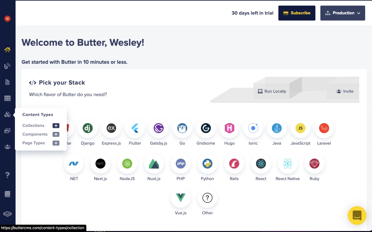
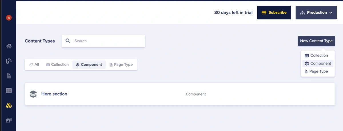
Let's access the Components section by hovering over the Content Types menu item in the sidebar and clicking on Components.
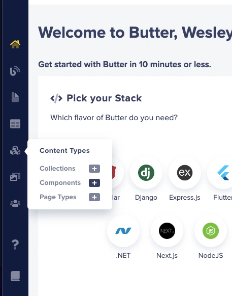
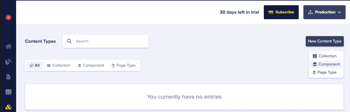
To create custom components in ButterCMS, we need to go to the Content Types page in the dashboard. Then select the Create New Content Type button in the top right corner and select Component from the drop-down menu.
Then we land on our component configuration page. From here we can create our own custom components. This involves giving the component a name and defining the fields we want it to have, such as text, images, or links.
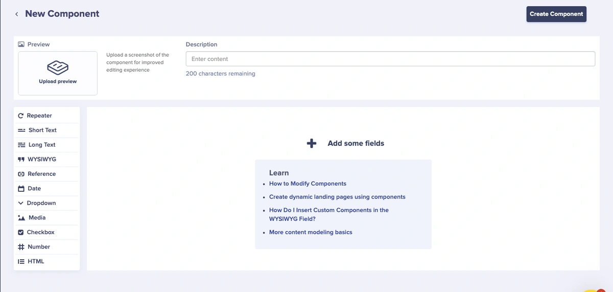
We'll add our texts as short text fields and our hero image as a long text field:
- Short text ⇢ hero_title
- Short text ⇢ hero_subtitle
- Short text ⇢ btn_text
- Long text ⇢ hero_image
NB: We will be making use of long text for the hero_image because in our code, the images are network images (links).
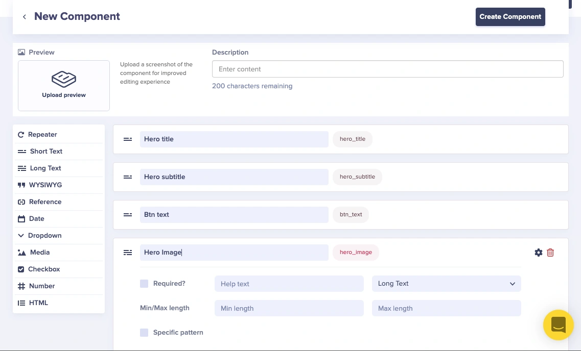
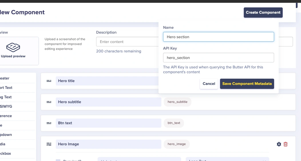
Then we click the Create Component button here and give the component a name, such as "Hero section”. This will allow us to create a component for our content.
Now, we're done creating the Hero Section component in ButterCMS.
The Features collection
Notice, in the Feature section we coded earlier in this tutorial, we mapped through an array of objects to display our data. We will be using the collections feature of ButterCMS for this. Once again, navigate to the Content Types tab located on the left side menu and either select the + sign by Collections or navigate to the Content Types page, and select the New Content Type button in the top right-hand corner, then select Collection.
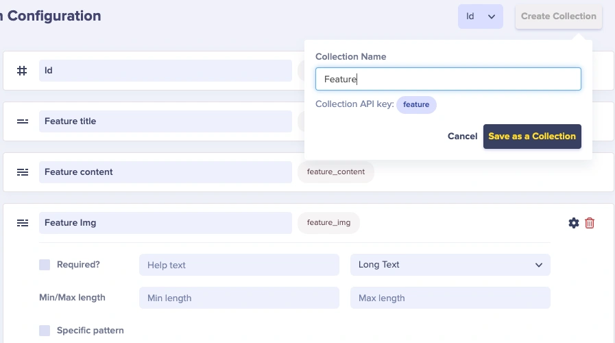
Next, configure your collection to have the following fields:
- Number ⇢ id
- Short text ⇢ feature_title
- Long text ⇢ feature_content
- Long text ⇢ feature_img
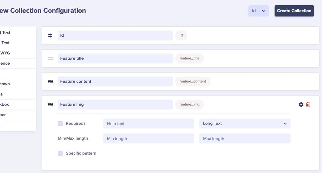
Next, save the collection's name, Feature, by clicking Create Collection.
To create a new item in the Feature collection, click on the Collections tab in the side menu, select New Item, pick Feature from the drop-down menu, and fill in the data for the Feature collection.

Repeat this process for each entry with the Features content from the Feature section. Once you have finished, click on the Publish button, and then go to the API Explorer to view the data.
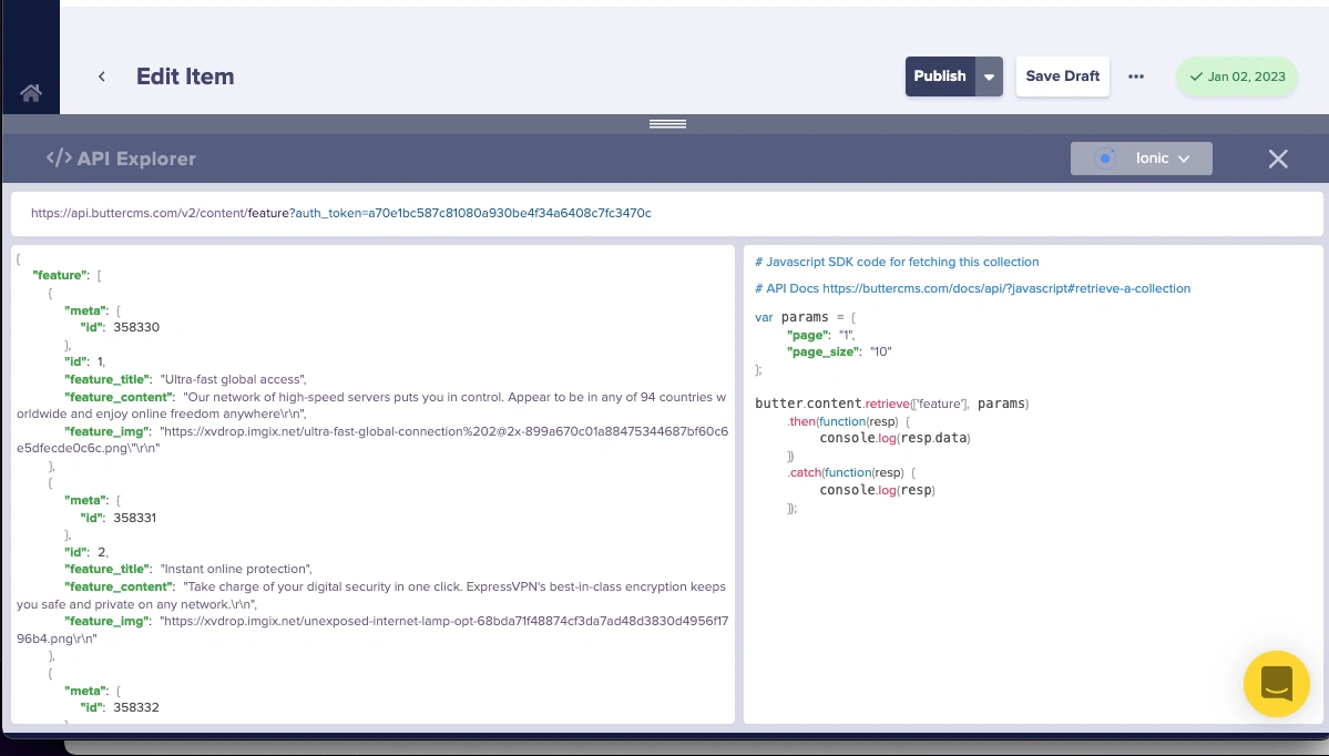
Now, we're done creating the Features collection component in ButterCMS.
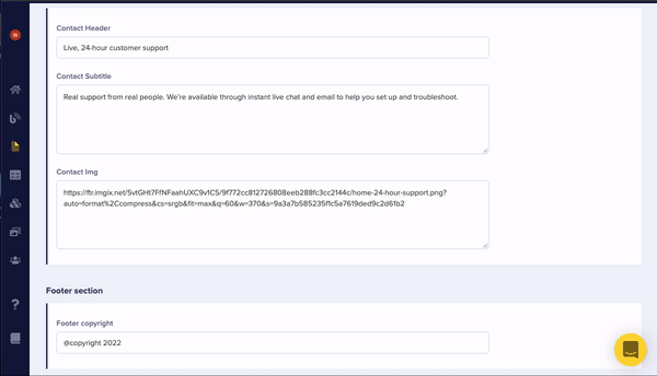
The Contact component
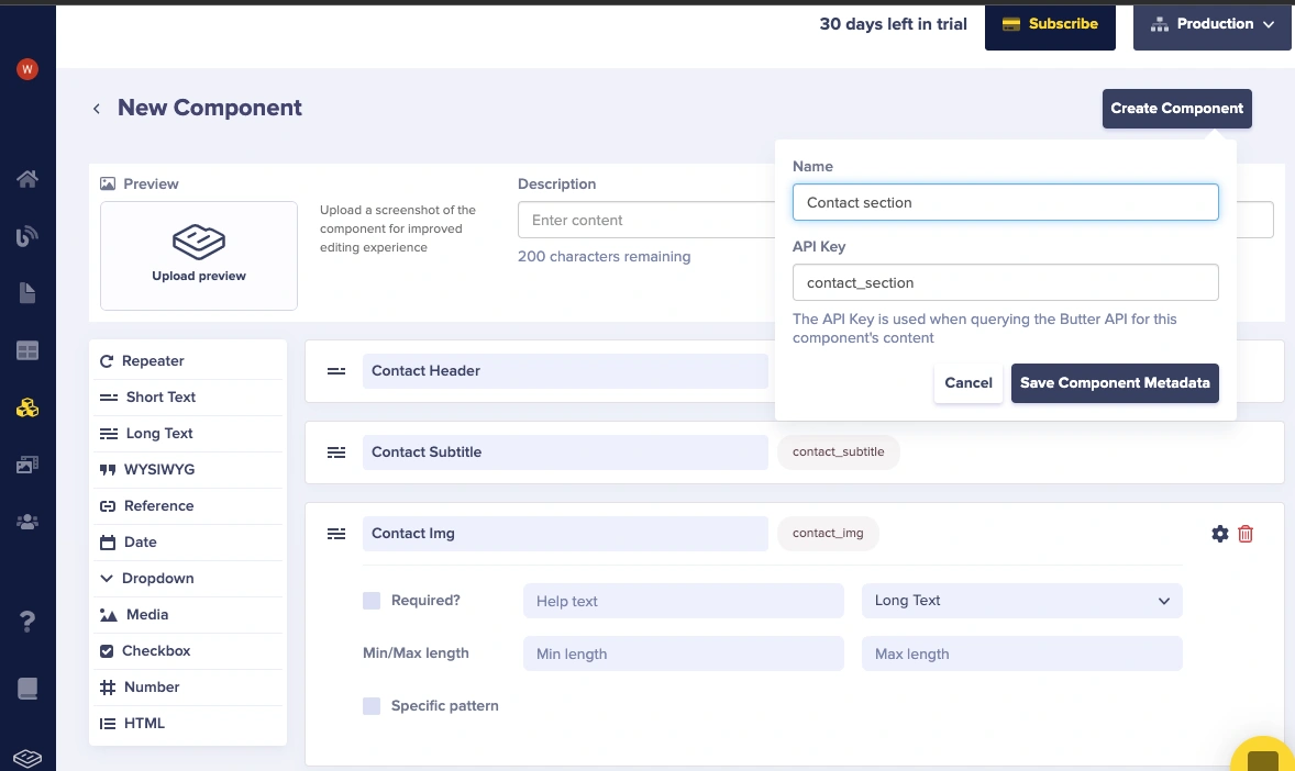
Let's now create the Contact component. Just as we did with the Hero component, click on Content Types from the side menu, click the New Content Type button, and select Component from the drop-down menu.
Just as we created the Hero components, our Contact component has a heading which will be a short text field, an Image which will be a long text field, and other text content which will be a long text field.
- Short text ⇢ contact_header
- Long text ⇢ contact_subtitle
- Long text ⇢ contact_img
Then we click the Create Component button here and give the component a name such as “Contact section”.
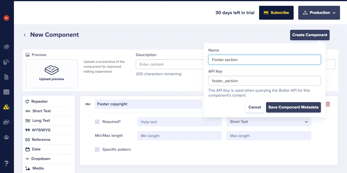
The Footer component
The Footer component contains the following field:
- Short text ⇢ footer_copyright
Save the component as “Footer section”.
Building our landing page with the content types created
We have finished creating our components in ButterCMS. The next step is to go to the Pages section in the ButterCMS dashboard and create a new page.
To create a new page, click on New Page and then select Create New Page at the bottom of the drop-down menu. Next, click on Component, and then choose Add from Library.
Let's select all the components we recently created. Next, we will click the Save button. After doing that, we will be directed to our landing page. First, we will enter and save the Page Metadata.
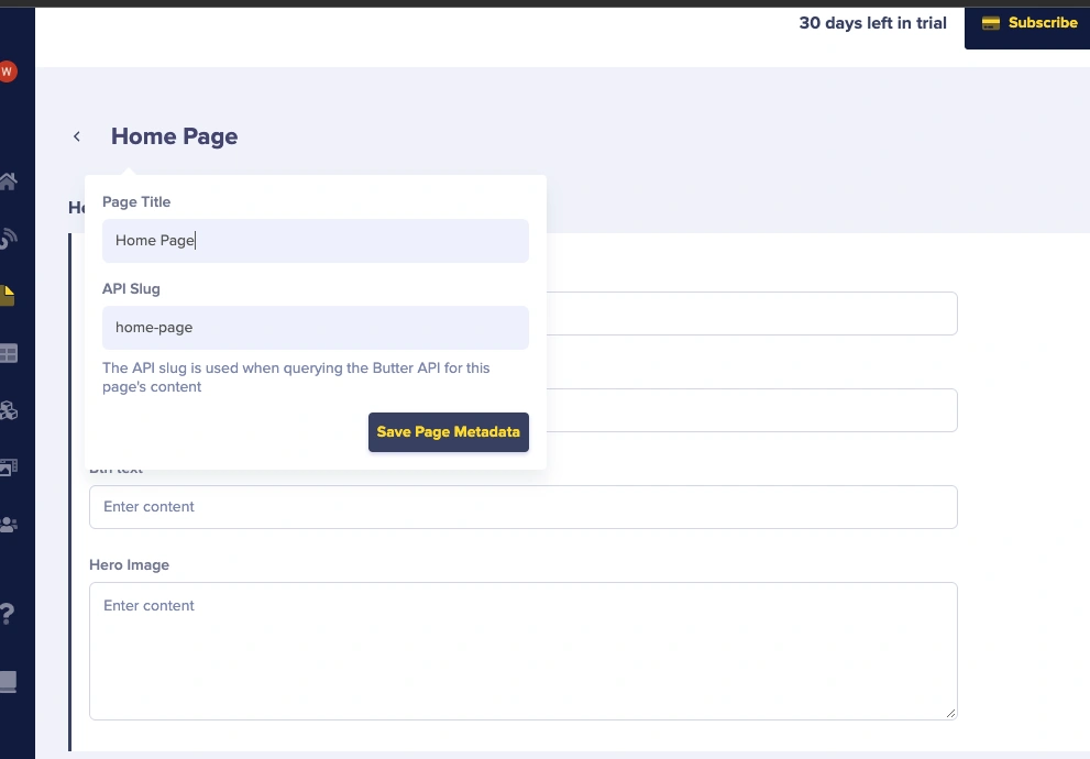
Next, enter the data into each component we created in our Ionic application into the fields.
Fetching the components from ButterCMS
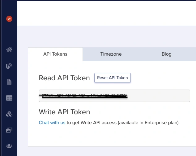
Now that you have added content to ButterCMS, let's return to our code. First, to connect our app to ButterCMS, we need to obtain an access token. We can find this on the Settings page of the ButterCMS website.
Now, let's copy our API key, as we will use it to retrieve data.
We will use Axios, a JavaScript library that simplifies making HTTP requests from a web browser. Axios is commonly used to communicate with RESTful APIs to get or send data.
To install Axios, you can use the following command:
npm i axios
We will create a GET request function in our Home.tsx file located in the pages directory to retrieve data from the CMS:
import { useEffect, useState } from "react";
import axios from "axios";
import { FeatureType, ResponseType } from "../Types";
//...
const Home: React.FC = () => {
 const [response, setResponse] = useState<ResponseType>();
 const [featuresResponse, setFeaturesResponse] = useState<FeatureType[]>();
 const access_token = "API KEY";

 useEffect(() => {
   async function getHomePage() {
     await axios
       .get(
         `https://api.buttercms.com/v2/pages/*/home-page/?auth_token=${access_token}`
       )
       .then((response) => {
         setResponse(response?.data?.data?.fields);
       })
       .catch((err) => console.error(err));
   }

   getHomePage();
 }, []);

 useEffect(() => {
   async function getFeatures() {
     await axios
       .get(
         `https://api.buttercms.com/v2/content/feature/?auth_token=${access_token}`
       )
       .then((response) => {
         setFeaturesResponse(response.data.data.feature);
       })
       .catch((err) => console.error(err));
   }

   getFeatures();
 }, []);

 return (
   <IonPage>
     <Navbar />
     <IonContent fullscreen scrollY={true}>
       <Hero data={response?.hero_section} />
       <Features data={featuresResponse} />
       <Contact data={response?.contact_section} />
       <Footer data={response?.footer_section} />
     </IonContent>
   </IonPage>
 );
};

export default Home;
The Home component has two useEffect hooks, one for fetching the data for the Hero, Contact, and Footer sections, and another for fetching the data for the feature list. The useEffect hooks use the Axios get method to send a request to the ButterCMS API, and the responses are stored in state using the setResponse and setFeaturesResponse functions.
Each component is being passed an object of its respective data type as the data prop, representing the data for each of its home page sections.
We also created a new file called Types.ts in our src directory which contains the shapes of data returned as a response from our UseEffect hook in our Home.tsx component:
export type HeroType = {
 hero_title: string;
 hero_subtitle: string;
 hero_image: string;
 btn_text: string;
};

export type ContactType = {
 contact_header: string;
 contact_subtitle: string;
 contact_img: string;
};

export type FooterType = {
 footer_copyright: string;
};

export interface ResponseType {
 hero_section: HeroType;
 contact_section: ContactType;
 footer_section: FooterType;
}

export type FeatureType = {
 id: number;
 feature_title: string;
 feature_content: string;
 feature_img: string;
};
Let’s modify each section to use CMS content:
In Hero.tsx:
//...
import { HeroType } from "../../Types";

interface HeroProps {
 data: HeroType;
}

const Hero: React.FC<HeroProps> = ({ data }) => {
 return (
   <div className="hero_container">
     <div className="text_container">
       <IonText>
         <h2 className="hero_text">{data?.hero_title}</h2>
       </IonText>
     </div>

     <div className="subtitle">
       <IonText>
         <p className="hero_subtitle">
           {" "}
           <strong>{data?.hero_subtitle}</strong>
         </p>
       </IonText>
     </div>

     <IonButton
       shape="round"
       size="default"
       expand="block"
       color="success"
       className="ion-margin-vertical"
     >
       {data?.btn_text}
       <IonIcon slot="end" icon={arrowForward}></IonIcon>
     </IonButton>
     <img src={data?.hero_image} />
   </div>
 );
};

export default Hero;
In Features.tsx:
//...
import { FeatureType } from "../../Types";

interface FeatureProps {
 data: FeatureType[];
}

const Features: React.FC<FeatureProps> = ({ data }) => {
 return (
   <div className="features_container">
     <IonText
       color="primary"
       className="ion-text-center ion-margin-horizontal"
     >
       <h1>Why Express VPN?</h1>
     </IonText>

     {data?.map((item) => (
       <Card
         key={item.id}
         cardTitle={item.feature_title}
         cardImg={item.feature_img}
         cardContent={item.feature_content}
       />
     ))}
   </div>
 );
};

export default Features;
In Contact.tsx:
//...
import { ContactType } from "../../Types";
import "./Contact.css";

interface ContactProps {
 data: ContactType;
}

const Contact: React.FC<ContactProps> = ({ data }) => {
 return (
   <div className="contact_container ion-padding">
     <img src={data?.contact_img} />
     <IonText>
       <h3 className="contact_heading">{data?.contact_header}</h3>
     </IonText>

     <IonText>
       <p className="contact_subtitle">{data?.contact_subtitle}</p>
     </IonText>

     <IonButton shape="round" size="default" expand="block" fill="outline">
       Contact Support
     </IonButton>
   </div>
 );
};

export default Contact;
In Footer.tsx:
//...
import { FooterType } from "../../Types";
interface FooterProps {
 data: FooterType;
}

const Footer: React.FC<FooterProps> = ({ data }) => {
 return (
   <IonFooter className="ion-no-border  " translucent={true}>
     <IonToolbar className="ion-padding">
       <IonTitle>{data?.footer_copyright}</IonTitle>
     </IonToolbar>
   </IonFooter>
 );
};

export default Footer;
Here’s a preview of our application after fetching our content from ButterCMS:
Closing thoughts
This tutorial covered the important aspects of creating an Ionic landing page, which is a crucial part of any digital marketing strategy. We also discussed how to create components and collections in ButterCMS, which allow you to easily reuse and organize content throughout your website. This is particularly useful when creating landing pages, as it will enable you to easily reuse common elements, such as headers and footers, across multiple pages.
Overall, this tutorial provides valuable information for anyone looking to create a landing page for their website. With ButterCMS, you can easily create and manage landing pages tailored to your specific needs.

