

- What we'll be building: Our Next.js landing page template
- Elements of a Next.js landing page
- Tutorial: Creating a landing page with Next.js and ButterCMS
- Step 1: Understanding the project’s tech stack
- Step 2: Setting up a Next.js & Tailwind CSS project
- Step 3: Installing key libraries
- Step 4: Building the landing page’s main elements
- Step 5: Building more components for our landing page
- Next.js landing page inspiration for your next project
- React vs Next.js questions
- Closing thoughts
In this article, we’re going to build a beautiful landing page using modern technologies, such as a headless CMS, that help companies and startups acquire customers through a one-page website.
While reading this article, you’ll grasp all the necessary notions and concepts you need to know while building some specific business-driven projects. We’ll go from the main reason why you need a landing page, through the tools you can make use of, to what a functional landing page is composed of, and then how to build one.
Without wasting any time, let’s dive in.
Table of contents
What we'll be building: Our Next.js landing page template
In today’s project, we’ll be building a recruiter business’ one-page website (in other words, a landing page).
Once created, the landing page will be composed of a responsive navbar, hero sections, and other informative cards such as the team members, testimonies, and so on.
Elements of a Next.js landing page
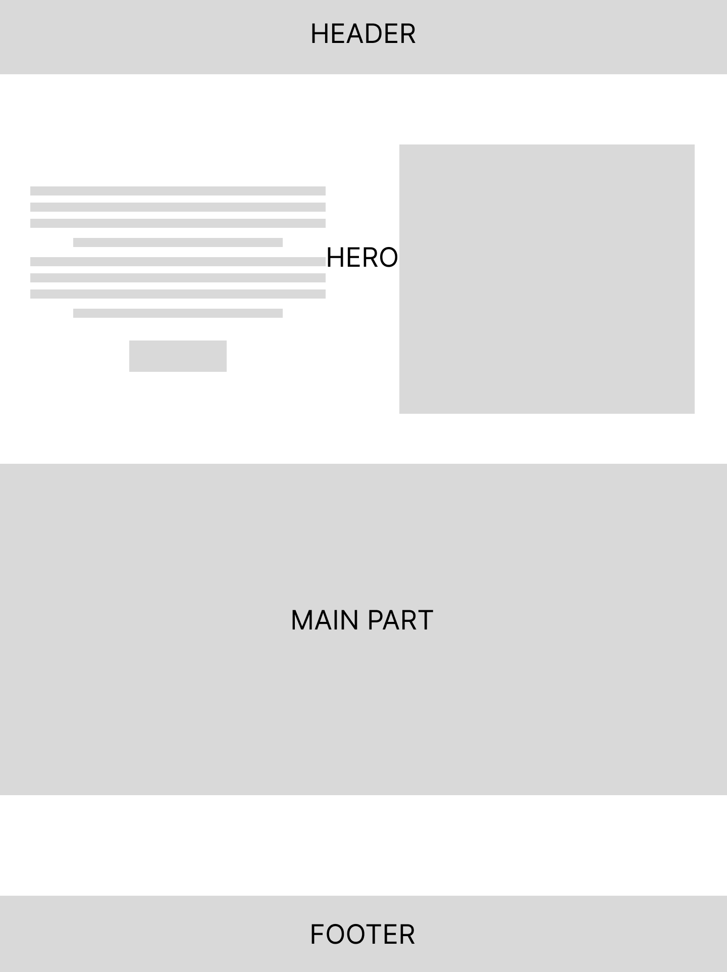
Being different from other websites built for various purposes, a landing page is a one-goal type of website with a specific business target. Hence, there are some key components to keep in mind when building a landing page, such as a header, a hero section, a testimonials section, a features or product description section, a call-to-action section, a button, a form section, and so on. We’ll look at each specific component below.
Header
A header is the central part of the top section of your website that helps to introduce your graphic charter and branding. Usually, you’ll find it on all the pages of your website.
The word “Header” contains the root word “Head”. And just like a human’s head, a header, in web design, is the website’s head. It’s where we go to find the navbar, meaning the navigation system, of the website which contains all the main links we need to browse your website.
“Don’t judge a book by its cover,” people say, but we all judge a website by its presentation. If a key aspect of your header is missing, such as links pointing to important pages or sections of your landing page or your primary CTA, your user experience (UX) will suffer and visitors may leave your website.
In the case of a landing page, a header is used for the same purposes described above as well as fulfilling a business purpose: be it selling a product or getting early users for your startup’s new product coming on the market next month.
Navbar
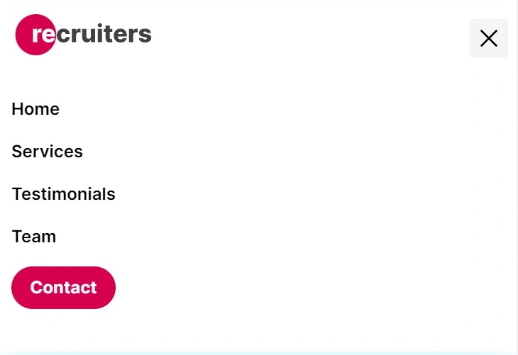
A navbar is the navigation bar in the user interface that contains all the main links that lead to other sections or pages of the website. In the navbar, we can find the product’s logo, links, and a call-to-action button.
Hero section
The hero section is typically the first thing visitors see when they land on your webpage.
As we’ll see in our case, it usually includes an image or a video used to express the main message of the website and a description that can be a slogan, a product description, some small text for details, or a call-to-action.
- An introduction image or video: Here is where the company has to introduce their product to the public with a short video or an image that tells all we need in a nutshell.
- The company’s slogan or description: Using marketing buzz words while keeping it simple for the whole message to be known by customers or visitors, this small section in the hero is one of the first impression elements that can captivate people’s attention. In addition, there is a small portion of text that gives some other details about the company’s product.
- A call-to-action button: A call-to-action (CTA) button is a button that directs your visitors to do a specific action such as signing up for the newsletter, buying the product you’re trying to sell, or joining your community. In a nutshell, it calls the website visitors to action, thus the phrase “call-to-action”. Having a strong hero section with a video or an image that tells all about your company on one side, and a description attached to it on the other side without a CTA button is “useless”. “useless”, because it’s like calling people to see the product’s details without having them buy or sign up.
Features section
The features section, as one can guess, describes the technical features of the product being sold. This section will also show how valuable the product is, and what the benefits of using this product are. Based on whatever the company’s marketing strategy is, this part is used to demonstrate how different and superior their product is from their competitors.
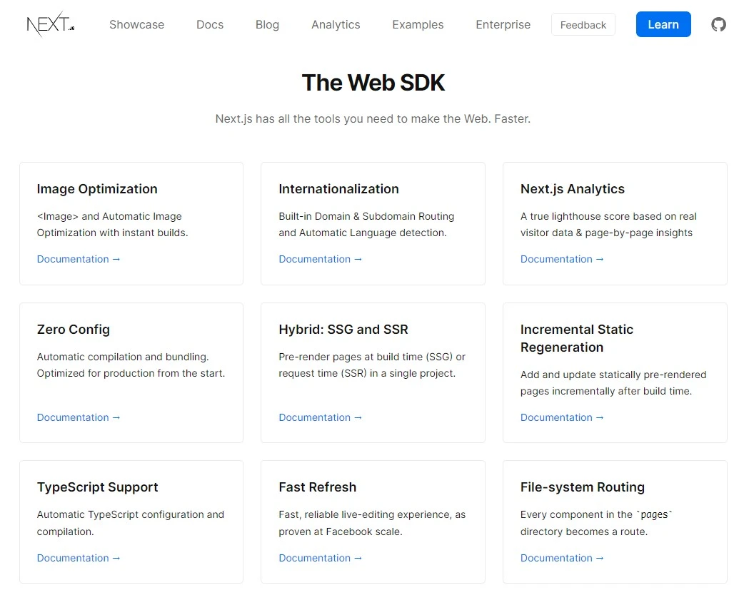
(Next.js features section)
Testimonials section
The testimonials section is a section where you can put your customers’ previous reviews and comments about how good your products or services are. It’s a great strategy used by companies to build trust, demonstrate social proof, and convince/attract new customers.
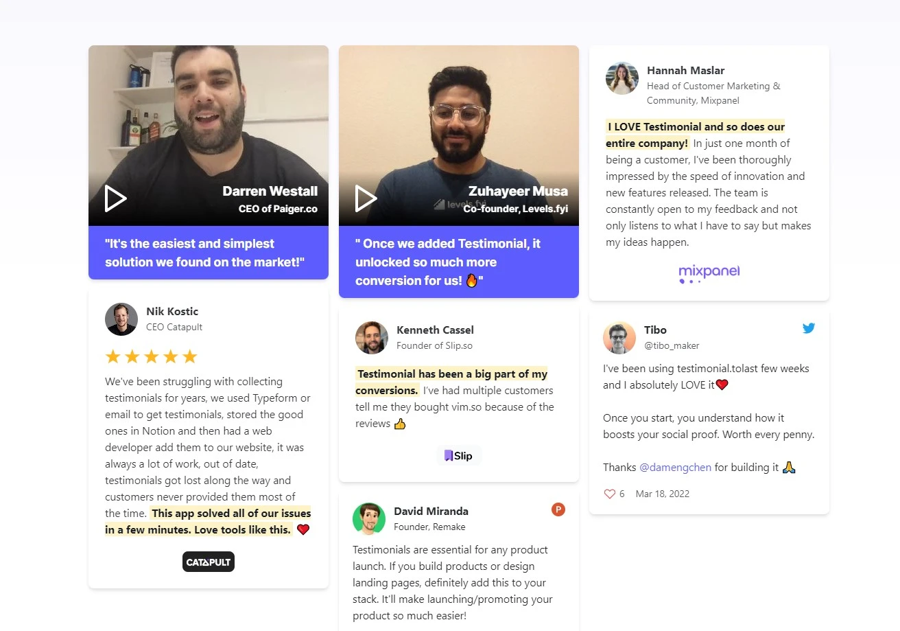
(Customers’ testimonials on testimonial.to)
Custom sections
As you can see, after looking at around 3-4 different landing pages, each company has its own specific features and offerings and, therefore, tends to add more sections on the landing page to give more details about the products or services they’re delivering. So, this tutorial is about giving developers a broad idea about the process of building landing pages—it’s about the elements to never miss while building a landing page.
Custom sections can include content like the company’s previous customers, the projects they’ve built, recent articles and tutorials, events and conferences, and so on.
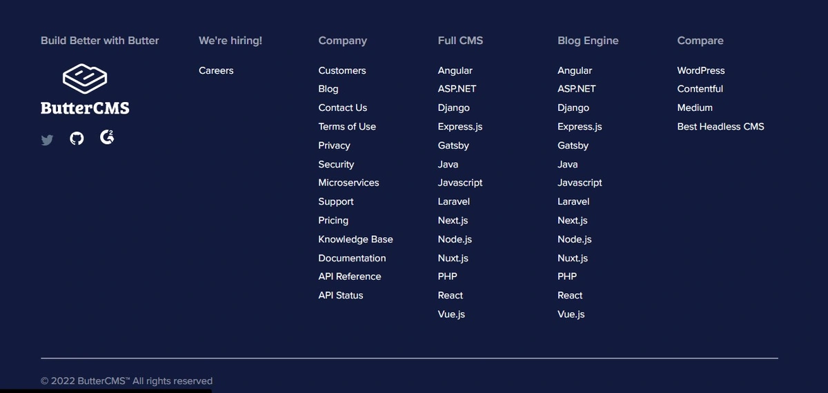
Footer
A website’s footer is the area located at the bottom of each page under the main section. From a technical standpoint, websites don’t require footers to function properly, but having a footer on your web page is still a great thing to have because it helps navigate content more efficiently by adding a well-detailed links section.
Tutorial: Creating a landing page with Next.js and ButterCMS
Alright, now that you know all the fundamentals, let’s get started! As said in the above sections, we’re going to be building a simple and beautiful recruiter’s landing page.
Step 1: Understanding the project’s tech stack
In this project, we’ll work using these three main technologies:
- Next.js: A React framework that gives developers flexibility and comes with routing based on file systems and more features out of the box, such as internationalization, optimization, incremental static regeneration, server-rendering, and so on.
- TailwindCSS: A utility-first CSS framework for rapidly building custom user interfaces. It is low-level and highly customizable and gives you all of the building blocks you need to build bespoke designs without any annoying opinionated styles you have to fight to override.
- ButterCMS: A modern solution to a traditional CMS that helps developers and startups build components-driven websites with a custom frontend (user interfaces) for their products and services. ButterCMS is going to help us create the content we would like to see on the landing page.
Netlify: A hosting platform that is one the best solutions for hosting JAMStack projects. For static pages like our landing page, using the Netlify hosting platform saves time and requires zero configuration.
Build with Ease: Sign Up for a Free 14-Day Trial of ButterCMS!
Start free trialStep 2: Setting up a Next.js & Tailwind CSS project
To get started, open the terminal and navigate to where you want to create/store your new app and execute create-next-app to bootstrap the example based on your package manager:
Using npm:
npx create-next-app --example with-tailwindcss with-tailwindcss-appUsing Yarn:
yarn create next-app --example with-tailwindcss with-tailwindcss-appUsing pnpm:
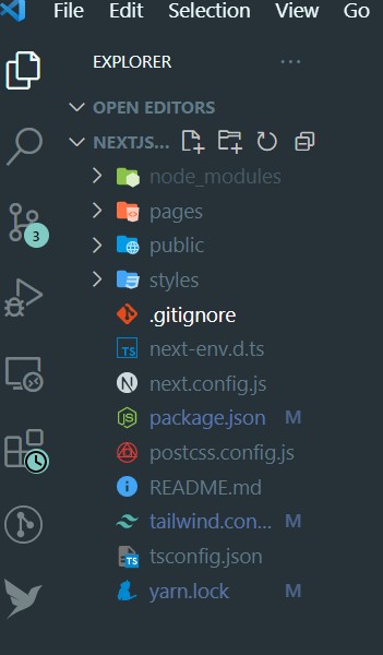
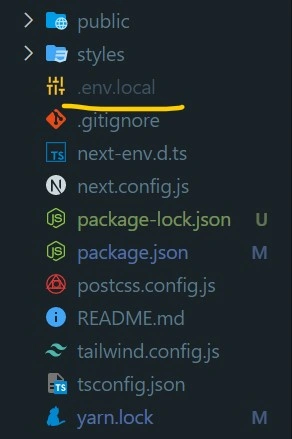
pnpm create next-app --example with-tailwindcss with-tailwindcss-appAfter running the command, open the project in your favorite text editor (I’m using Visual Studio Code). Here is the project structure:
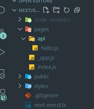
Note: Unless you’re comfortable with TypeScript, you can change the file extensions from .ts to .js in the pages folder for your project to run properly. But in this project, we’ll be using JavaScript, not TypeScript.
(Just changed file extensions)
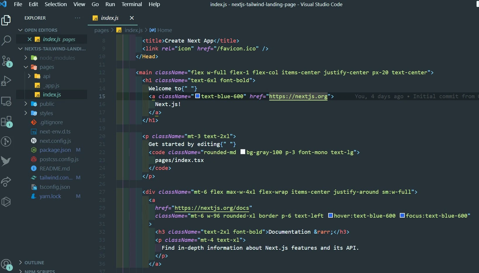
After changing the extensions inside the page folder, in the index.js file, we have:
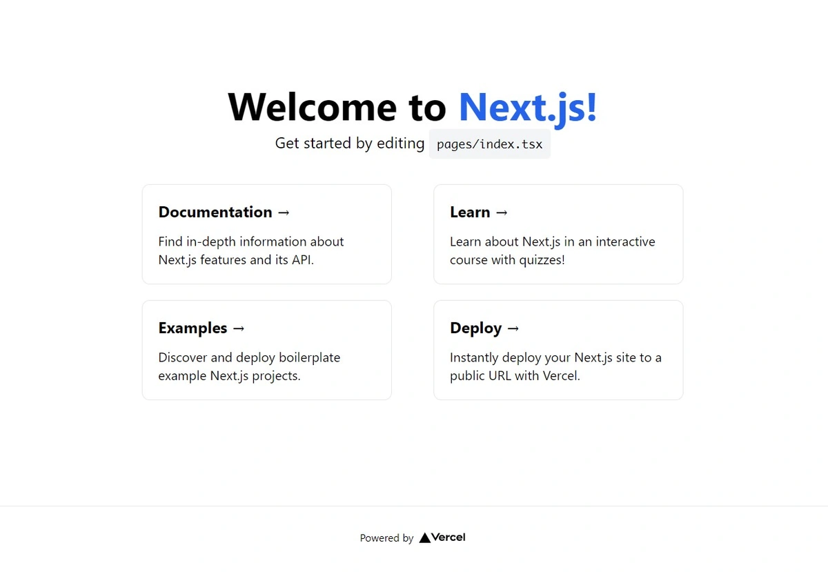
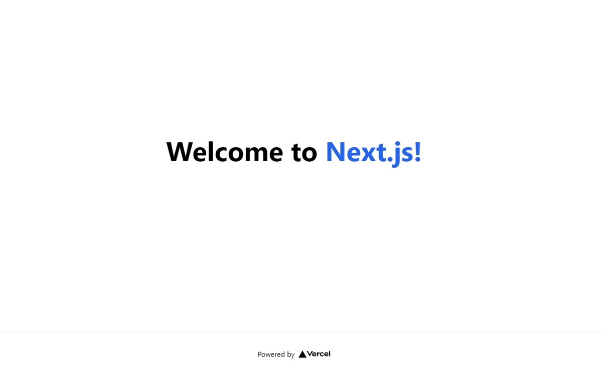
Let’s run the server and see the outcome of our first page:
npm run dev
Here is the page:
Step 3: Installing key libraries
To have this working as intended, we need to install some of the useful libraries by running this command (depending on your package managers):
Using npm:
npm install react-icons
npm install @fontsource/inter
Or using Yarn:
yarn add react-icons
yarn add @fontsource/interReact-icons: A useful library that helps developers find all the icons they need for their React.js projects. It’s a collection of different types of icons.@fontsource/inter: A self-hosted open-source fonts library bundled with NPM packages. In our case, we’ll be usingInteras our main font.
Step 4: Building the landing page’s main elements
In the index.js file (inside the pages folder), we can delete all the elements inside the main tag, leaving only the h1 tag:
import Head from "next/head";
import Image from "next/image";

const Home = () => {
  return (
    <div className="flex min-h-screen flex-col py-2">
      <Head>
        <title>Create Next App</title>
        <link rel="icon" href="/favicon.ico" />
      </Head>

      <main className="relative flex-1 lg:container text-center p-0 mx-auto overflow-x-hidden overflow-auto">
<h1 className="text-6xl font-bold">
 	Welcome to{" "}
        <a className="text-blue-600" href="https://nextjs.org">
          Next.js!
        </a>
      </h1>

      </main>

      <Footer />
    </div>
  );
};

export default Home;
Running the server again, npm run dev, here is the output:
Clean? Great! Now let’s focus on the components.
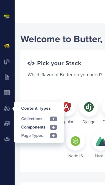
Setting up our ButterCMS project
The next step will be about building the main components. But before jumping into building our components, we need to prepare our ButterCMS project, because 80% of our data will be fetched from the CMS.
Hence, in this part, we’re going to see how to set up a ButterCMS project and create content in less than 10 minutes.
Install ButterCMS in your Next.js project with the ButterCMS SDK, to do so you'll run the following:
npm install buttercms --save(using npm)yarn add buttercms(using yarn)
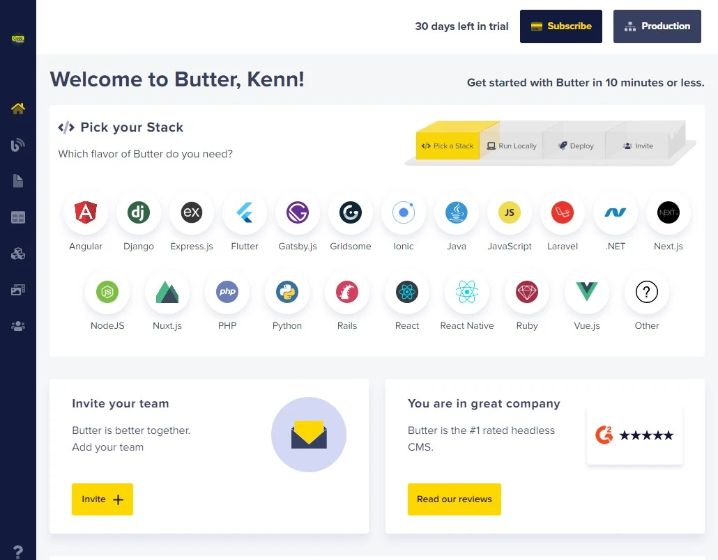
Create a Butter account:
To create a ButterCMS account, click here. After creating your account, this is the first thing you will see:
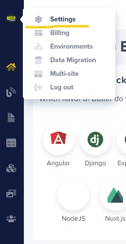
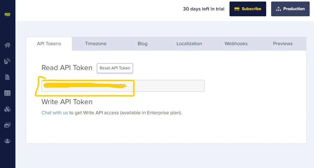
Grab the API key and create an environment variable to save it. Then go to your account and click on Settings:
Copy the API Key. (The yellow part contains your secret API key. Keep that secret to prevent other people from getting access to your website.)
Inside your text editor, create a .env.local file and save the key, as shown here:
Inside the file, we should have something similar to:
NEXT_PUBLIC_BUTTER_CMS_API_KEY=xxxxxxxxxxxxxxxxxxxxxxxxxxxxxxxx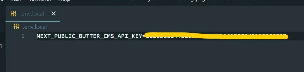
Building the components
Normally, before building an entire website, it’s better to divide the web page into small sections called components. In our project, our components are the navbar, hero, features, team, testimonial, contact form, and footer.
Let’s start by creating a components folder (where we’ll be creating and storing our components).
In the components folder, let’s create a button component MyButton.js that we’ll be using across all the other components:
import React from "react";

const MyBtn = ({ textContent }) => {
  return (
    <div
      className={`bg-turbo-pink-500 cursor-pointer px-3 text-white font-bold text-center hover:shadow-lg shadow-turbo-pink-500 hover:ring-turbo-pink-500 hover:ring-offset-2 hover:ring-2 rounded-full p-2 animateBtn`}
    >
      {textContent}
    </div>
  );
};

export default MyBtn;
The animateBtn class isn’t a TailwindCSS native class. It’s a CSS class created to add some animation when a visitor hovers over it. It comes from our global.css file:
@tailwind base;
@tailwind components;
@tailwind utilities;

.animateBtn {
  @apply transition-all duration-150 ease-linear;
}

html,
body {
  scroll-behavior: smooth;
}
The Navbar
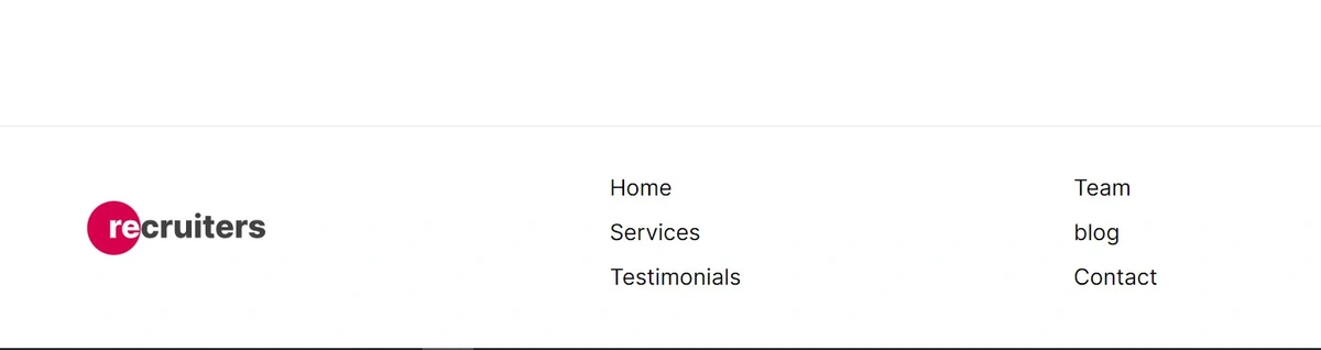
Inside the components folder, create a file named Navbar.js. In that file, let’s create the React component:
import Link from "next/link";
import { useState } from "react";
import { CgMenuCheese } from "react-icons/cg";
import { GrClose } from "react-icons/gr";
import Image from "next/image";
import MyBtn from "./MyButton";

const Navbar = () => {
  const [isOpen, setOpen] = useState(false);

  const toggleNavbar = () => {
    setOpen(!isOpen);
  };

  const navLinks = [
    {
      name: "Home",
      link: "/#home",
    },
    {
      name: "Services",
      link: "/#services",
    },
    {
      name: "Testimonials",
      link: "/#testimonials",
    },
    {
      name: "Team",
      link: "/#team",
    },
  ];

  return (
    // <nav className="bg-white flex flex-col lg:flex-row lg:justify-center items-center rounded-md justify-around my-auto p-2 md:py-3 md:m-3">
    <nav className="bg-white shadow-2xl sticky top-0 z-10 shadow-cyan-200/50 flex flex-col lg:flex-row lg:justify-center items-center rounded-md justify-around my-auto p-2 md:py-3 md:m-3">
      <div className="flex flex-row justify-between w-full">
        <div className="w-36 md:w-52 my-auto">
          <Link href="/">
            <a>
              <Image src={"/logo.svg"} alt="logo" width="300px" height="80px" />
            </a>
          </Link>
        </div>
        <div
          className="visible my-auto lg:invisible p-2 text-xl text-gray-800 rounded-sm hover:bg-gray-100 active:bg-turbo-gray-100 cursor-pointer"
          onClick={toggleNavbar}
        >
          {!isOpen ? <CgMenuCheese /> : <GrClose />}
        </div>
      </div>
      <div
        className={`${
          !isOpen ? "hidden" : "z-20"
        } flex flex-col lg:hidden ml-1 md:justify-between my-8 md:my-10 mx-auto space-y-4 font-semibold`}
      >
        {navLinks.map((item) => (
          <div key={item.name} className="hover:underline">
            <Link href={item.link}>
              <a>{item.name}</a>
            </Link>
          </div>
        ))}
        <div className="block lg:hidden ">
          <Link href="/#contact" className="">
            <a>
              <MyBtn textContent={"Contact"} />
            </a>
          </Link>
        </div>
      </div>
      <div className="hidden lg:flex flex-row justify-around space-y-0 space-x-6 lg:space-x-10 font-semibold">
        {navLinks.map((item) => (
          <div key={item.name} className="hover:underline my-auto">
            <Link href={item.link}>
              <a>{item.name}</a>
            </Link>
          </div>
        ))}
      </div>
      <div className="hidden lg:flex ml-6">
        <Link href="/#contact" className="">
          <a>
            <MyBtn textContent={"Contact"} />
          </a>
        </Link>
      </div>
    </nav>
  );
};

export default Navbar;
Explaining the code, here are the main parts of the navbar component:
import Link from "next/link";
import { useState } from "react";
import { CgMenuCheese } from "react-icons/cg";
import { GrClose } from "react-icons/gr";
import Image from "next/image";
import MyBtn from "./MyButton";
Above is the import statement we need for this component. Notice that we’re calling the button component we just created.
const navLinks = [
    {
      name: "Home",
      link: "/#home",
    },
    {
      name: "Services",
      link: "/#services",
    },
    {
      name: "Testimonials",
      link: "/#testimonials",
    },
    {
      name: "Team",
      link: "/#team",
    },
  ];
We created the section above as a way of avoiding repetitive parts of the code. It’s an array of link objects.
Here is how we map through this array to get the navLinks array:
{navLinks.map((item) => (
          <div key={item.name} className="hover:underline">
            <Link href={item.link}>
              <a>{item.name}</a>
            </Link>
          </div>
        ))}
<Link href="/">
<a>
<Image src={"/logo.svg"} alt="logo" width="300px" height="80px" />
</a>
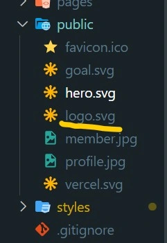
</Link>The “/logo.svg” comes from the public folder.
In the index.js file (pages folder), let’s import the navbar we just created:
…
import Navbar from "../components/Navbar";
…

const Home = () => {
  return (
    <div className="flex min-h-screen flex-col py-2">
      <Head>
        <title>Create Next App</title>
        <link rel="icon" href="/favicon.ico" />
      </Head>

	// called here:
      <Navbar />
      <main className="relative flex-1 lg:container text-center p-0 mx-auto overflow-x-hidden overflow-auto">
        …
 </main>

    </div>
  );
};

export default Home;
Let’s run the server with npm run dev and view it:
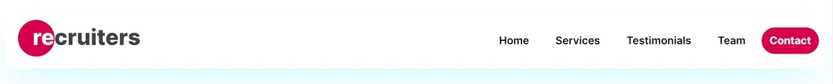
Mobile Responsiveness:
Creating the homepage’s main components
In this part, we’re going to build the main components of our project and learn how to insert those components into the page that we’re going to build.
We’ve taken this approach of building components to make them reusable across multiple pages if necessary. It helps us save time and avoid repeating ourselves.
For our landing page, we’re going to build the hero section and the business goal section, based on our business, as seen in the video.
The Hero component
Let’s go to our ButterCMS panel and follow the steps below.
Go to components:
We’ll find these elements below, but we’re going to delete all these default components (as listed below) one by one and start from scratch by clicking on them and then selecting the red bin in the top right corner of the page.
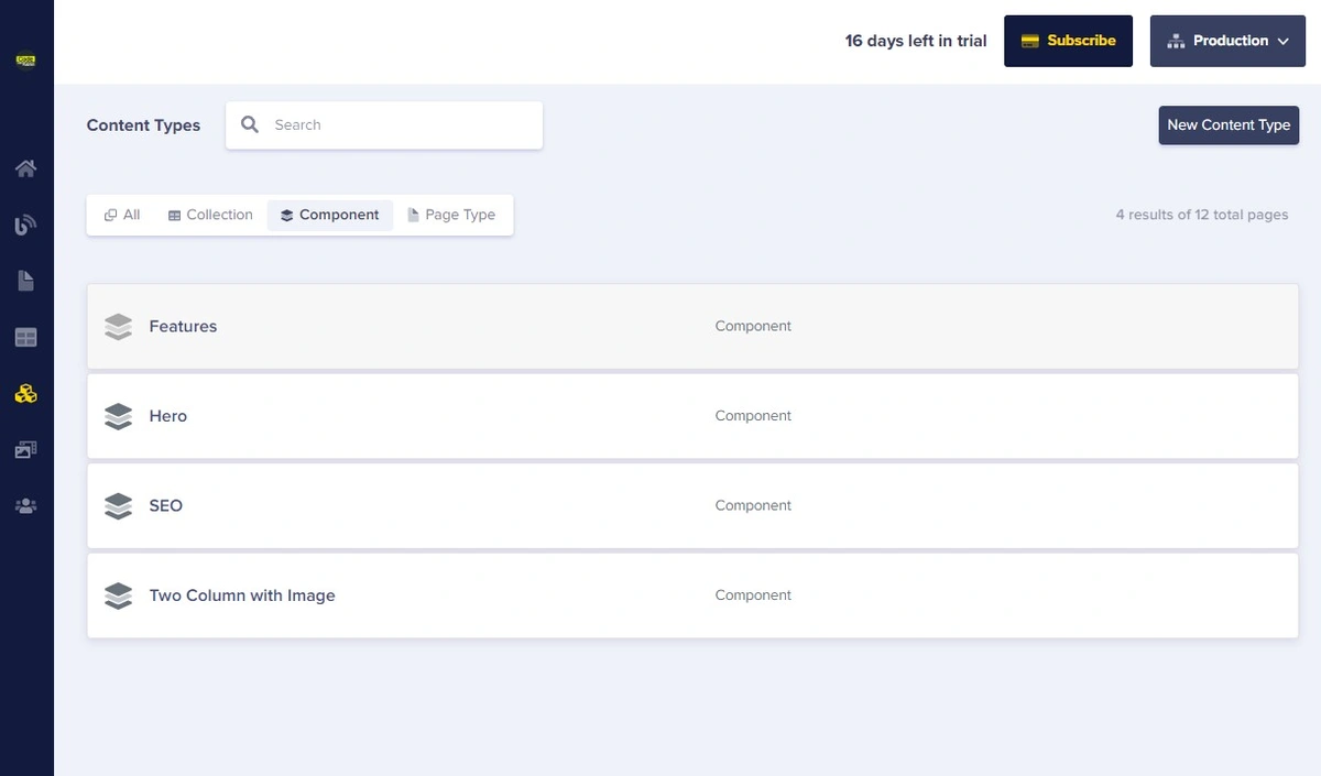
After deleting the components, we get this empty interface:
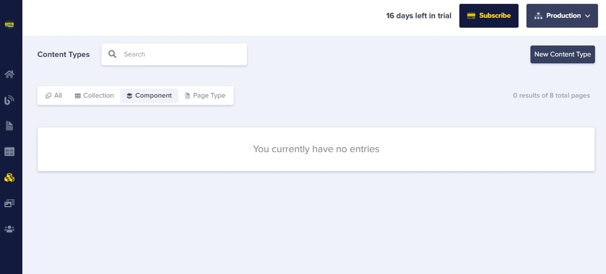
Let’s go ahead and create our hero component by following the steps below
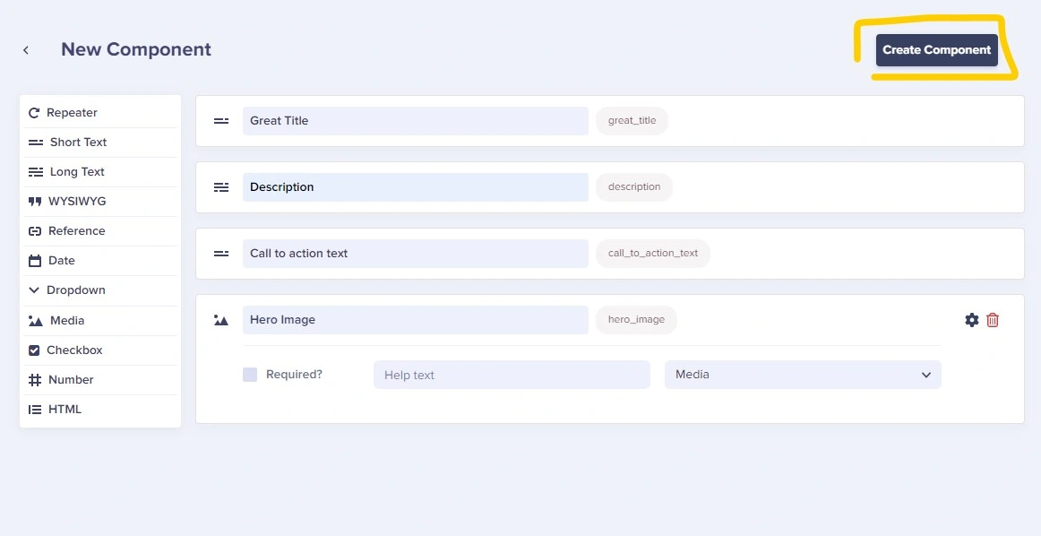
Create the component

Add the following fields:
Short textasGreat titleLong textasDescriptionShort textasCall to action textMediaasHero Image
Then click on Create Component.
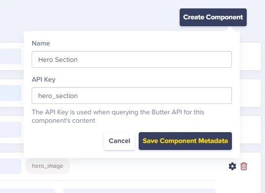
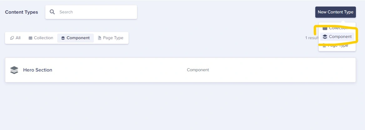
Now add the component’s name, hero_section, and save it:
The Goal component
After creating the Hero Section component in ButterCMS, let’s now create the Goal component:
Let’s add the following fields:
Short textastextLong textasgreat descriptionMediaasgoal image
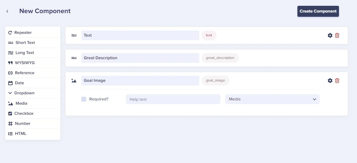
Next name the component Goal and save it.
Building the landing page
After creating the first components (Hero Section and Goal), let’s now create a page in order to insert those components:
Let’s go to the Landing page
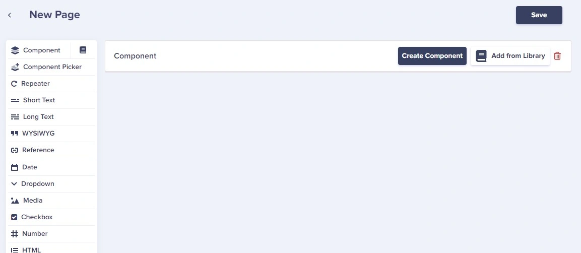
Click on New Page, then click on Create New Page.
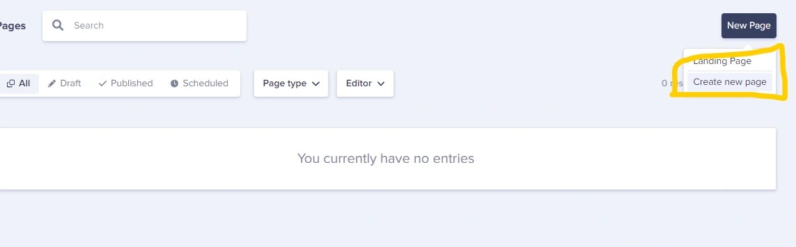
Here is what you'll get:
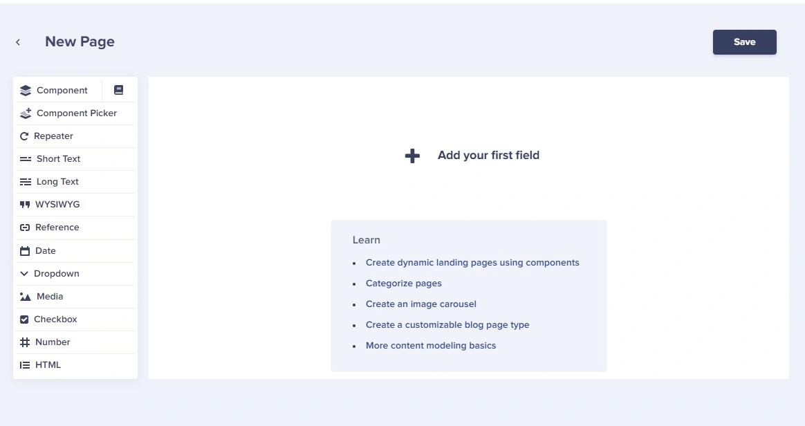
First, let’s add Component as a field.
Then click on Add from Library in order to insert our components:
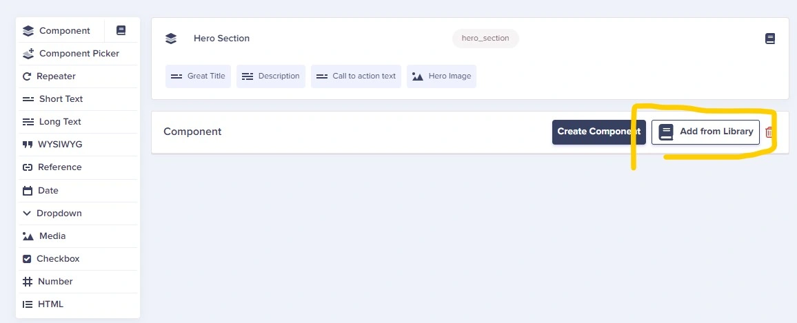
Now select the Hero Section component.
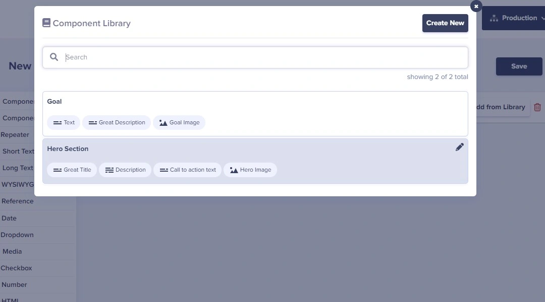
Then repeat the previous step and select the Goal component.
Let’s now name and save the page as Home Page:

After saving the new page, we can start adding content:
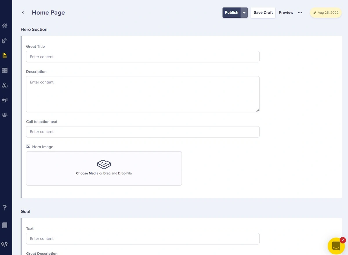
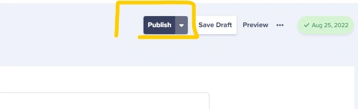
Add the content to the Hero and Goal fields. Then clicl publish.
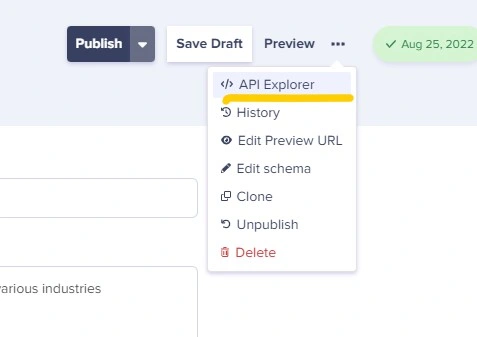
Testing the API
After publishing the content, let’s now test the API through ButterCMS’s API Explorer:
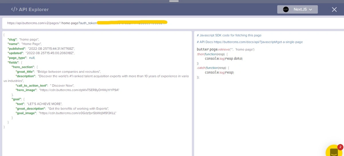
It works!!!
Making these components in our code
After preparing the content in ButterCMS, let’s go back to the code.
Creating the Hero component
So, inside the components folder, create a file named Hero.js. In the file, let’s create the React component:
import React, { useEffect, useState } from "react";
import MyBtn from "./MyButton";
import Butter from "buttercms";
const butter = Butter(`${process.env.NEXT_PUBLIC_BUTTER_CMS_API_KEY}`);
const Hero = () => {
const [hero, setHero] = useState({});
useEffect(() => {
butter.page
.retrieve("*", "home-page")
.then(function (resp) {
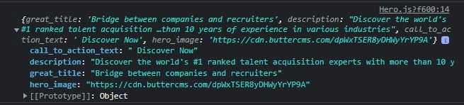
console.log(resp.data.data.fields.hero_section);
})
.catch(function (resp) {
console.log(resp);
});
}, []);
return (
<div
id="home"
className="flex flex-col md:flex-row justify-center my-5 md:my-8"
>
// …
</div>
);
};
export default Hero;What we have done:
import React, { useEffect, useState } from "react";
import Butter from "buttercms";

const butter = Butter(`${process.env.NEXT_PUBLIC_BUTTER_CMS_API_KEY}`);

const Hero = () => {
  const [hero, setHero] = useState({});

  useEffect(() => {
    butter.page
      .retrieve("*", "home-page")
      .then(function (resp) {
        console.log(resp.data.data.fields.hero_section);

      })
      .catch(function (resp) {
        console.log(resp);
      });
  }, []);

  return (
   // …
  );
};

export default Hero;
We’ve used a ButterCMS library called buttercms with our API token to access data from the CMS.
Let’s call the Hero component into the page component index.js in the pages folder:
import Head from "next/head";
import Navbar from "../components/Navbar";
import Hero from "../components/Hero";

const Home = () => {
  return (
    <div className="flex min-h-screen flex-col py-2">
      <Head>
        <title>Create Next App</title>
        <link rel="icon" href="/favicon.ico" />
      </Head>

      <Navbar />
      <main className="relative flex-1 lg:container text-center p-0 mx-auto overflow-x-hidden overflow-auto">
        <Hero />
      </main>

    </div>
  );
};

export default Home;
After running the server npm run dev, we have this in our console:
Cool! It works!
Now, let’s go back to the Hero component and render these data into the page:
import React, { useEffect, useState } from "react";
import MyBtn from "./MyButton";
import Butter from "buttercms";

const butter = Butter(`${process.env.NEXT_PUBLIC_BUTTER_CMS_API_KEY}`);

const Hero = () => {
  const [hero, setHero] = useState({});

  useEffect(() => {
    butter.page
      .retrieve("*", "home-page")
      .then(function (resp) {
        console.log(resp.data.data.fields.hero_section);
        setHero(resp.data.data.fields.hero_section);
      })
      .catch(function (resp) {
        console.log(resp);
      });
  }, []);

  return (
    <div
      id="home"
      className="flex flex-col md:flex-row justify-center my-5 md:my-8"
    >
      <div className="flex flex-col my-auto md:w-2/3">
        <div className="flex flex-col">
          <h1 className="font-extrabold text-4xl md:text-6xl">
            {hero?.great_title}
          </h1>
          <p className="text-sm mx-auto w-2/3 font-light md:text-md my-2 md:my-6">
            {hero?.description}
          </p>
        </div>
        <div className="mx-auto hover:cursor-pointer">
          <MyBtn textContent={hero?.call_to_action_text} />
        </div>
      </div>
      <img
        src={hero?.hero_image}
        alt="hero image"
        loading="lazy"
        className="invisible md:visible my-auto md:w-2/3"
      />
    </div>
  );
};

export default Hero;
Creating the Goal component
So, inside the components folder, create a file named Goal.js and in the file, let’s create the React component:
import React, { useEffect, useState } from "react";
import Butter from "buttercms";

const butter = Butter(`${process.env.NEXT_PUBLIC_BUTTER_CMS_API_KEY}`);

const Goal = () => {
  const [goal, setGoal] = useState({});

  useEffect(() => {
    butter.page
      .retrieve("*", "home-page")
      .then(function (resp) {
        console.log(resp.data.data.fields.goal);
      })
      .catch(function (resp) {
        console.log(resp);
      });
  }, []);

  return (
    <div className="bg-gray-100/50 rounded-sm my-10 py-0 md:px-6 flex flex-col md:flex-row justify-between">
   // …
    </div>
  );
};

export default Goal;
Let’s import the component into the main page:
import Head from "next/head";
import Navbar from "../components/Navbar";
import Hero from "../components/Hero";
import Goal from "../components/Goal";


const Home = () => {
  return (
    <div className="flex min-h-screen flex-col py-2">
      <Head>
        <title>Create Next App</title>
        <link rel="icon" href="/favicon.ico" />
      </Head>

      <Navbar />
      <main className="relative flex-1 lg:container text-center p-0 mx-auto overflow-x-hidden overflow-auto">
        <Hero />
        <Goal />

      </main>
    </div>
  );
};

export default Home;
Let’s run the server with npm run dev and see the console in the browser:
It works! Let’s now render these data on the component:
import React, { useEffect, useState } from "react";
import Butter from "buttercms";
const butter = Butter(`${process.env.NEXT_PUBLIC_BUTTER_CMS_API_KEY}`);
const Goal = () => {
const [goal, setGoal] = useState({});
useEffect(() => {
butter.page
.retrieve("*", "home-page")
.then(function (resp) {
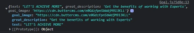
console.log(resp.data.data.fields.goal);
setGoal(resp.data.data.fields.goal);
})
.catch(function (resp) {
console.log(resp);
});
}, []);
return (
<div className="bg-gray-100/50 rounded-sm my-10 py-0 md:px-6 flex flex-col md:flex-row justify-between">
<img src={goal?.goal_image} alt="goal img" className="md:w-2/4 my-auto" />
<div className="flex flex-col justify-center my-auto p-6 md:w-3/5">
<h5 className="text-gray-600 text-md md:my-4 font-semibold">
{goal?.text}
</h5>
<h3 className="font-bold text-2xl md:text-4xl my-4">
{goal?.great_description}
</h3>
</div>
</div>
);
};
export default Goal;Build with Ease: Sign Up for a Free 14-Day Trial of ButterCMS!
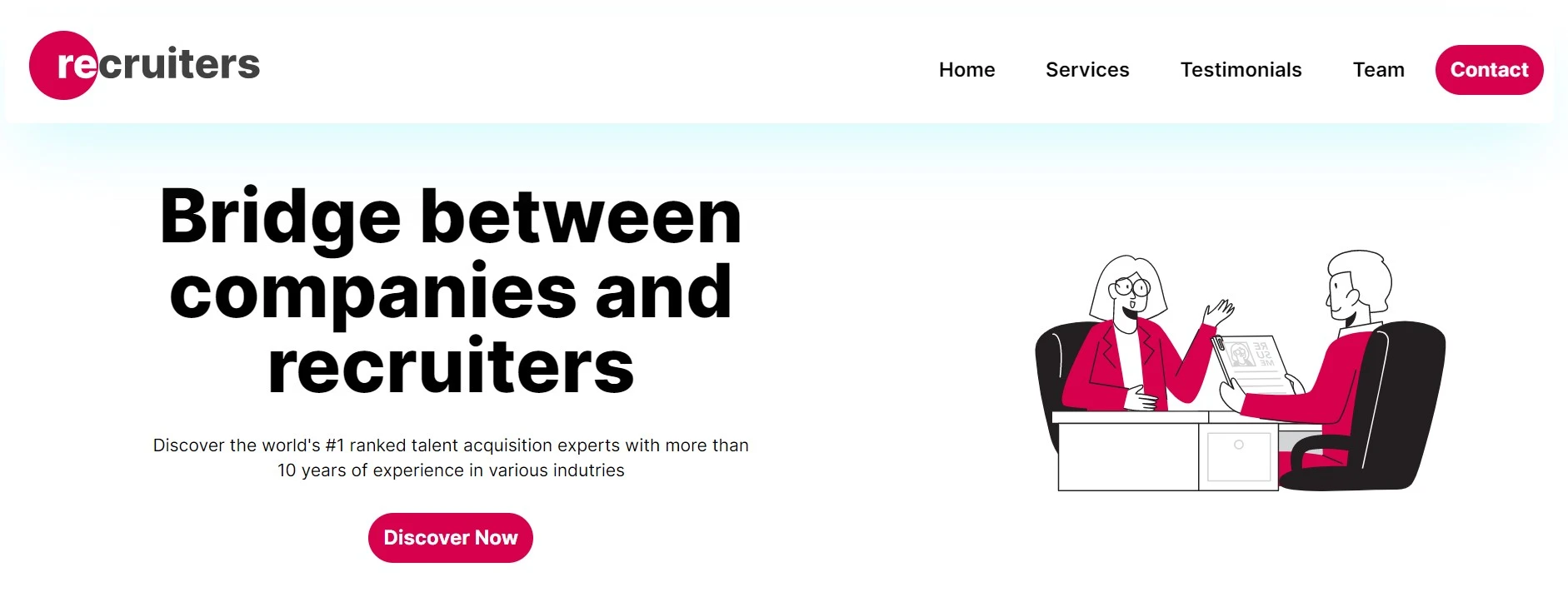
Start free trialOur results
After running the server with npm run dev, we have the following:
Our Hero section:
For mobile design (responsiveness):

The Goal section:

Step 5: Building more components for our landing page
Building the services section component
Inside the components folder, create a file named Service.js. This section will display and describe the services offered. In the file, let’s create the React component:
import React from "react";
import { TbListDetails } from "react-icons/tb";
import MyBtn from "./MyButton";

const Services = () => {
  return (
    <div id="services" className="flex flex-col my-6 md:my-10 mx-2 md:mx-auto">
	// Leave this empty
    </div>
  );
};

export default Services;
Let’s call the component in the pages/index.js file:
mport Head from "next/head";
import Image from "next/image";
import Navbar from "../components/Navbar";
import Hero from "../components/Hero";
import Goal from "../components/Goal";
import Services from "../components/Services";

const Home = () => {
  return (
    <div className="flex min-h-screen flex-col py-2">
      <Head>
        <title>Create Next App</title>
        <link rel="icon" href="/favicon.ico" />
      </Head>

      <Navbar />
      <main className="relative flex-1 lg:container text-center p-0 mx-auto overflow-x-hidden overflow-auto">
        <Hero />
        <Goal />
        <Services />
      </main>

    </div>
  );
};

export default Home;
Go back to ButterCMS to create the Services collection with three fields:
MediaasIconShort textasTitleLong textasDescription
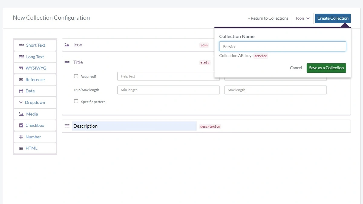
Now we'll insert the following data to three Service collection items:
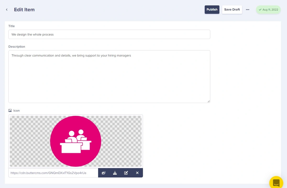
Service 1:
Title: We take care of the detailsDescription: Through clear communication and details, we bring support to your hiring managersIcon: random png icon
Service 2:
Title: We work out your growthDescription: Through clear communication and details, we bring support to your hiring managersIcon: random png icon
Service 3:
Title: We design the whole processDescription: Through clear communication and details, we bring support to your hiring managersIcon: random png icon
Here's what the input of said data should look like (keep in mind this is only one of three collection items):
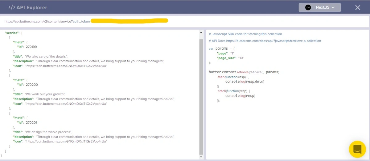
The API Explorer:
In our text editor, let’s update the component:
import React, { useEffect, useState } from "react";
import { TbListDetails } from "react-icons/tb";
import { MdWork } from "react-icons/md";
import { HiRefresh } from "react-icons/hi";
import MyBtn from "./MyButton";
import Butter from "buttercms";

const butter = Butter(`${process.env.NEXT_PUBLIC_BUTTER_CMS_API_KEY}`);

const Services = () => {
  const [services, setServices] = useState([]);

  const params = {
    page: "1",
    page_size: "10",
  };

  useEffect(() => {
    butter.content
      .retrieve(["service"], params)
      .then(function (resp) {
        console.log(resp.data.data.service);
        setServices(resp.data.data.service);
      })
      .catch(function (resp) {
        console.log(resp);
      });
  }, []);

  return (
    <div id="services" className="flex flex-col my-6 md:my-10 mx-2 md:mx-auto">
     // Let’s keep this empty
    </div>
  );
};

export default Services;
After running the server with npm run dev, we have this console output:
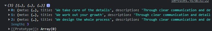
Great! We have an array of three services, just as we created in ButterCMS.
Let’s now render it to the page:
import React, { useEffect, useState } from "react";
import { TbListDetails } from "react-icons/tb";
import { MdWork } from "react-icons/md";
import { HiRefresh } from "react-icons/hi";
import MyBtn from "./MyButton";
import Butter from "buttercms";
const butter = Butter(`${process.env.NEXT_PUBLIC_BUTTER_CMS_API_KEY}`);
const Services = () => {
const [services, setServices] = useState([]);
const params = {
page: "1",
page_size: "10",
};
useEffect(() => {
butter.content
.retrieve(["service"], params)
.then(function (resp) {
console.log(resp.data.data.service);
setServices(resp.data.data.service);
})
.catch(function (resp) {
console.log(resp);
});
}, []);
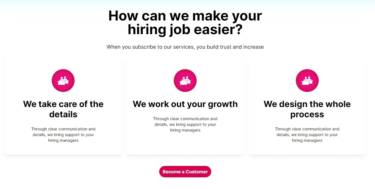
return (
<div id="services" className="flex flex-col my-6 md:my-10 mx-2 md:mx-auto">
<div className="flex flex-col mx-auto">
<h1 className="font-bold text-3xl md:text-5xl md:w-2/3 mx-auto">
How can we make your hiring job easier?{" "}
</h1>
<p className="text-md mx-auto w-2/3 font-light md:text-lg my-2 md:my-6">
{" "}
When you subscribe to our services, you build trust and increase{" "}
</p>
</div>
<div className="flex flex-col md:mx-auto md:px-2 sm:grid sm:grid-cols-2 gap-4 mx-2 lg:grid-cols-3 justify-between">
{services?.map((service, index) => (
<div
key={index}
className="flex flex-col mx-auto p-4 rounded-xl shadow-lg hover:shadow-xl shadow-gray-200/75"
>
<img
src={service.icon}
alt="icon"
className="p-2 h-16 w-16 md:h-20 md:w-20 text-6xl my-2 md:my-6 opacity-95 bg-turbo-pink-500 text-white rounded-full mx-auto"
/>
<h1 className="font-bold text-xl md:text-3xl">{service.title}</h1>
<p className="text-sm mx-auto w-2/3 font-light md:text-md my-2 md:my-6">
{service.description}
</p>
</div>
))}
</div>
<div className="mx-auto my-6 md:my-10">
<MyBtn textContent="Become a Customer" />
</div>
</div>
);
};
export default Services;Here is the outcome after running the server, the services list:
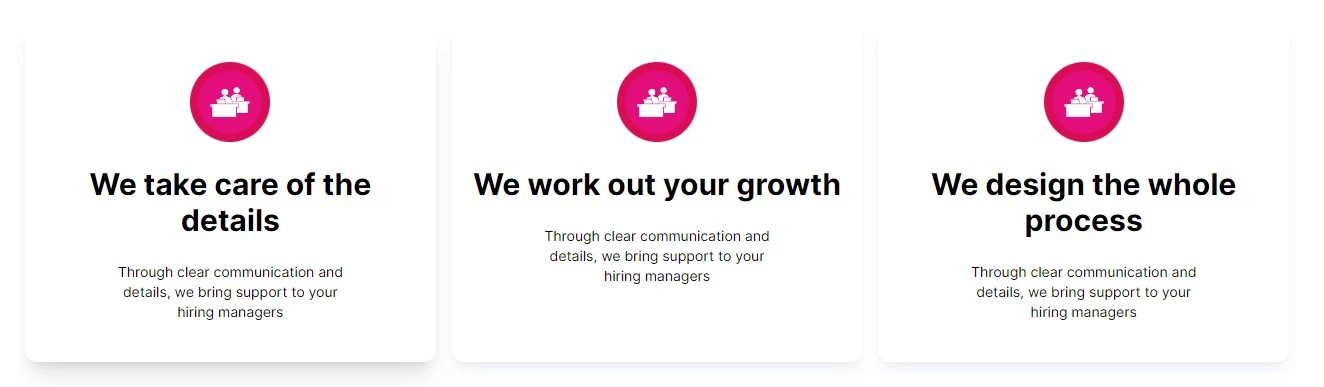
The services sections:
The testimonials component
Let’s now build the Testimonials.js component (inside the components folder) just as we did with the services section:
import React from "react";

const Testimonials = () => {
  return (
    <div id="testimonials" className="flex flex-col my-4 md:my-8">
    	// Let’s leave this empty too
</div>
  );
};

export default Testimonials;
Let’s import the component in pages/index.js:
import Head from "next/head";
import Image from "next/image";
import Navbar from "../components/Navbar";
import Hero from "../components/Hero";
import Goal from "../components/Goal";
import Services from "../components/Services";
import Testimonials from "../components/Testimonials";

const Home = () => {
  return (
    <div className="flex min-h-screen flex-col py-2">
      <Head>
        <title>Create Next App</title>
        <link rel="icon" href="/favicon.ico" />
      </Head>

      <Navbar />
      <main className="relative flex-1 lg:container text-center p-0 mx-auto overflow-x-hidden overflow-auto">
        …
        <Testimonials />
      </main>

    </div>
  );
};

export default Home;
The goal is to get this card:

In our ButterCMS project:
Our collection is made of three fields: the Profile Image field which is of Image type, the Name field which is of Short Text type, and the Testimonial field which is of Long Text type.
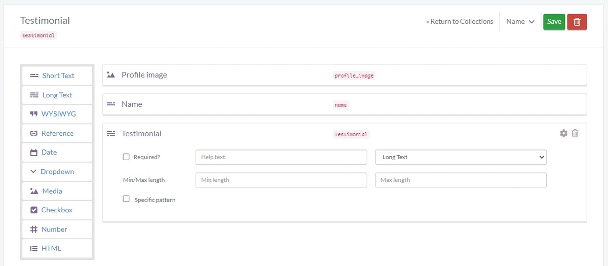
Adding our data
In this case, we’re adding the testimonials. The goal is to showcase our work. We can have multiple items from a collection that we create (in our case, the testimonial collection).
So, we have the profile image, name (“John Larson”, picked randomly), and the testimonial description.
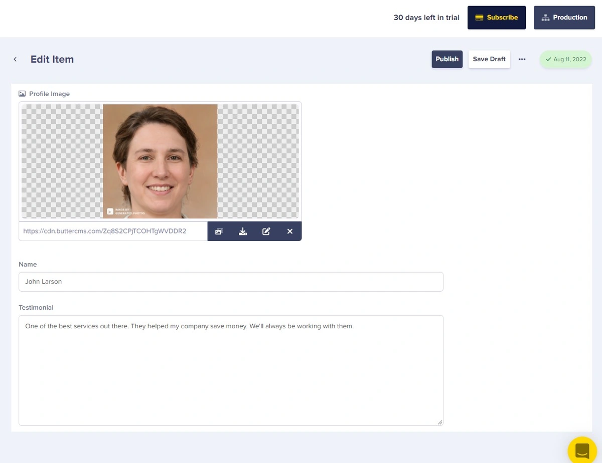
Here is how it looks like after completion:
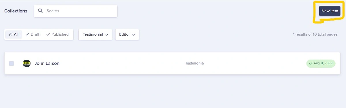
Naturally, a landing page would contain more than one tutorial, you can click on the New Item button in the top right corner and select Testimonial from the drop down menu that appears.
In the Testimonials.js component (inside the components folder), let’s integrate with ButterCMS:
import React, { useEffect, useState } from "react";
import Butter from "buttercms";

const butter = Butter(`${process.env.NEXT_PUBLIC_BUTTER_CMS_API_KEY}`);

const Testimonials = () => {
  const [testimonials, setTestimonials] = useState([]);

  const params = {
    page: "1",
    page_size: "10",
  };

  useEffect(() => {
    butter.content
      .retrieve(["testimonial"], params)
      .then(function (resp) {
        console.log(resp.data.data.testimonial);
        setTestimonials(resp.data.data.testimonial);
      })
      .catch(function (resp) {
        console.log(resp);
      });
  }, []);

  return (
    <div id="testimonials" className="flex flex-col my-4 md:my-8">
      // Let’s keep it empty
    </div>
  );
};

export default Testimonials;
Here is the outcome after running the server:
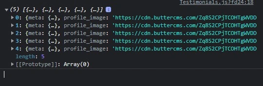
Let’s now render the fetched data in our page:
import React, { useEffect, useState } from "react";
import Butter from "buttercms";
const butter = Butter(`${process.env.NEXT_PUBLIC_BUTTER_CMS_API_KEY}`);
const Testimonials = () => {
const [testimonials, setTestimonials] = useState([]);
const params = {
page: "1",
page_size: "10",
};
useEffect(() => {
butter.content
.retrieve(["testimonial"], params)
.then(function (resp) {
console.log(resp.data.data.testimonial);
setTestimonials(resp.data.data.testimonial);
})
.catch(function (resp) {
console.log(resp);
});
}, []);
return (
<div id="testimonials" className="flex flex-col my-4 md:my-8">
<div className="flex flex-col mx-auto">
<h1 className="font-bold text-3xl md:text-5xl md:w-2/3 mx-auto">
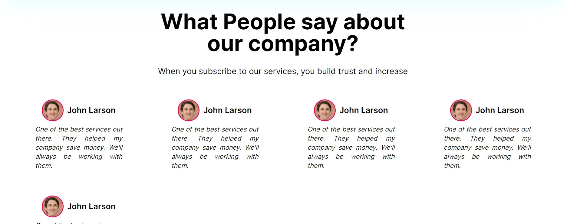
What People say about our company?{" "}
</h1>
<p className="text-md mx-auto w-2/3 font-light md:text-lg my-2 md:my-6">
{" "}
When you subscribe to our services, you build trust and increase{" "}
</p>
</div>
<div className="grid grid-cols-2 sm:grid-cols-3 lg:grid-cols-4 lg:px-8">
{testimonials?.map((testimonial, index) => (
<div
key={index}
className="flex flex-col w-36 md:w-52 mx-auto my-3 md:my-6"
>
<div className="flex flex-row justify-center gap-2">
<img
src={testimonial.profile_image}
alt="profile picture"
loading="lazy"
className="rounded-full border-2 border-turbo-pink-400 object-cover h-8 w-8 md:h-18 md:w-18 my-auto"
/>
<h2 className="text-sm md:text-md font-semibold my-auto">
{testimonial.name}
</h2>
</div>
<p className="p-2 text-justify text-xs italic md:text-md font-medium">
{testimonial.testimonial}
</p>
</div>
))}
</div>
</div>
);
};
export default Testimonials;The outcome after running the server:
The teams component
Let’s now build the Team.js component (inside the components folder):
import React from "react";

const Team = () => {
  return (
    <div id="team" className="flex flex-col bg-gray-100/50 py-2 md:py-6">

       // Let’s leave this empty
    </div>
  );
};

export default Team;
Let’s import the component in the pages/index.js file:
import Head from "next/head";
import Image from "next/image";
import Navbar from "../components/Navbar";
import Hero from "../components/Hero";
import Goal from "../components/Goal";
import Services from "../components/Services";
import Testimonials from "../components/Testimonials";
import Team from "../components/Team";
const Home = () => {
return (
<div className="flex min-h-screen flex-col py-2">
<Head>
<title>Create Next App</title>
<link rel="icon" href="/favicon.ico" />
</Head>
<Navbar />
<main className="relative flex-1 lg:container text-center p-0 mx-auto overflow-x-hidden overflow-auto">
<Hero />
<Goal />
<Services />
<Testimonials />
<Team />
</main>
</div>
);
};
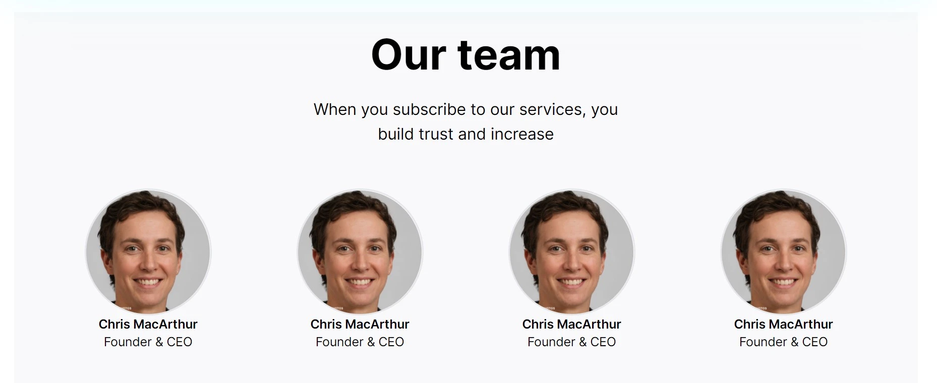
export default Home;The goal is to get this:
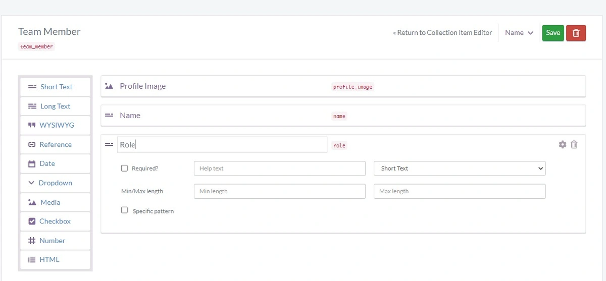
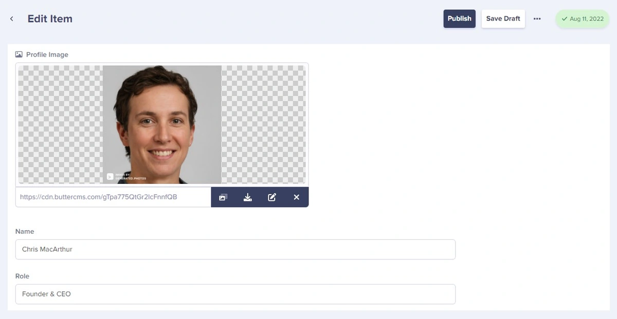
Back in ButterCMS, we’re adding three fields: the Profile Image field which is of Image type, the Name field which is of Short Text type, and the Role field which is also of Short Text type.
Creating the Team collection:
Adding our data:
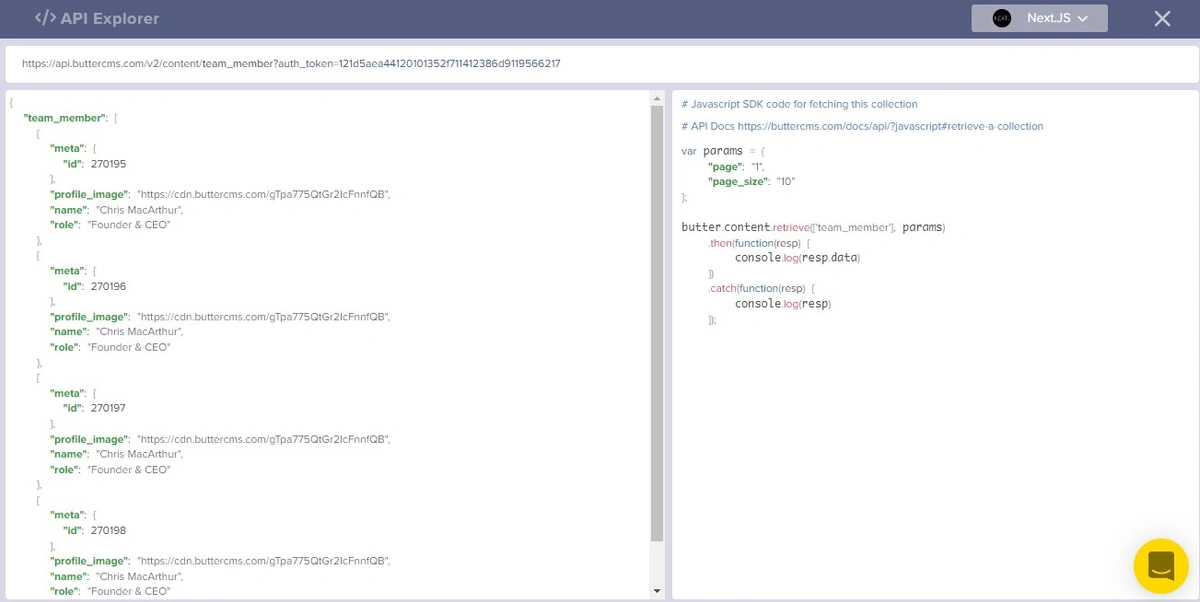
The API Explorer:
Back to our code:
import React, { useEffect, useState } from "react";
import Butter from "buttercms";
const butter = Butter(`${process.env.NEXT_PUBLIC_BUTTER_CMS_API_KEY}`);
const Team = () => {
const [members, setMembers] = useState([]);
const params = {
page: "1",
page_size: "10",
};
useEffect(() => {
butter.content
.retrieve(["team_member"], params)
.then(function (resp) {
console.log(resp.data.data.team_member);
setMembers(resp.data.data.team_member);
})
.catch(function (resp) {
console.log(resp);
});
}, []);
return (
<div id="team" className="flex flex-col bg-gray-100/50 py-2 md:py-6">
// keep it empty
</div>
);
};
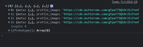
export default Team;After running the server, npm run dev, here is our console:
Let’s now render these data on the page:
import React, { useEffect, useState } from "react";
import Butter from "buttercms";

const butter = Butter(`${process.env.NEXT_PUBLIC_BUTTER_CMS_API_KEY}`);

const Team = () => {
  const [members, setMembers] = useState([]);

  const params = {
    page: "1",
    page_size: "10",
  };

  useEffect(() => {
    butter.content
      .retrieve(["team_member"], params)
      .then(function (resp) {
        console.log(resp.data.data.team_member);
        setMembers(resp.data.data.team_member);
      })
      .catch(function (resp) {
        console.log(resp);
      });
  }, []);

  return (
    <div id="team" className="flex flex-col bg-gray-100/50 py-2 md:py-6">
      <div className="flex flex-col mx-auto">
        <h1 className="font-bold text-3xl md:text-5xl md:w-2/3 mx-auto">
          Our team{" "}
        </h1>
        <p className="text-md mx-auto w-2/3 font-light md:text-lg my-2 md:my-6">
          {" "}
          When you subscribe to our services, you build trust and increase{" "}
        </p>
      </div>
      <div className="grid grid-cols-2 sm:grid-cols-2 lg:grid-cols-4 lg:px-8">
        {members?.map((member, index) => (
          <div key={index} className="flex mx-auto my-4 md:my-6 flex-col">
            <img
              src={member.profile_image}
              alt="profile picture"
              className="rounded-full border-2 object-cover h-28 w-28 md:w-36 md:h-36 mx-auto"
            />
            <div>
              <h2 className="text-sm text-center md:text-md font-semibold my-auto">
                {member.name}
              </h2>
              <p className="text-xs md:text-sm font-medium text-center">
                {member.role}
              </p>
            </div>
          </div>
        ))}
      </div>
    </div>
  );
};

export default Team;
Here is the outcome after running the server again: npm run dev:
All the team members’ data fetched and rendered on the page.
The contact form component
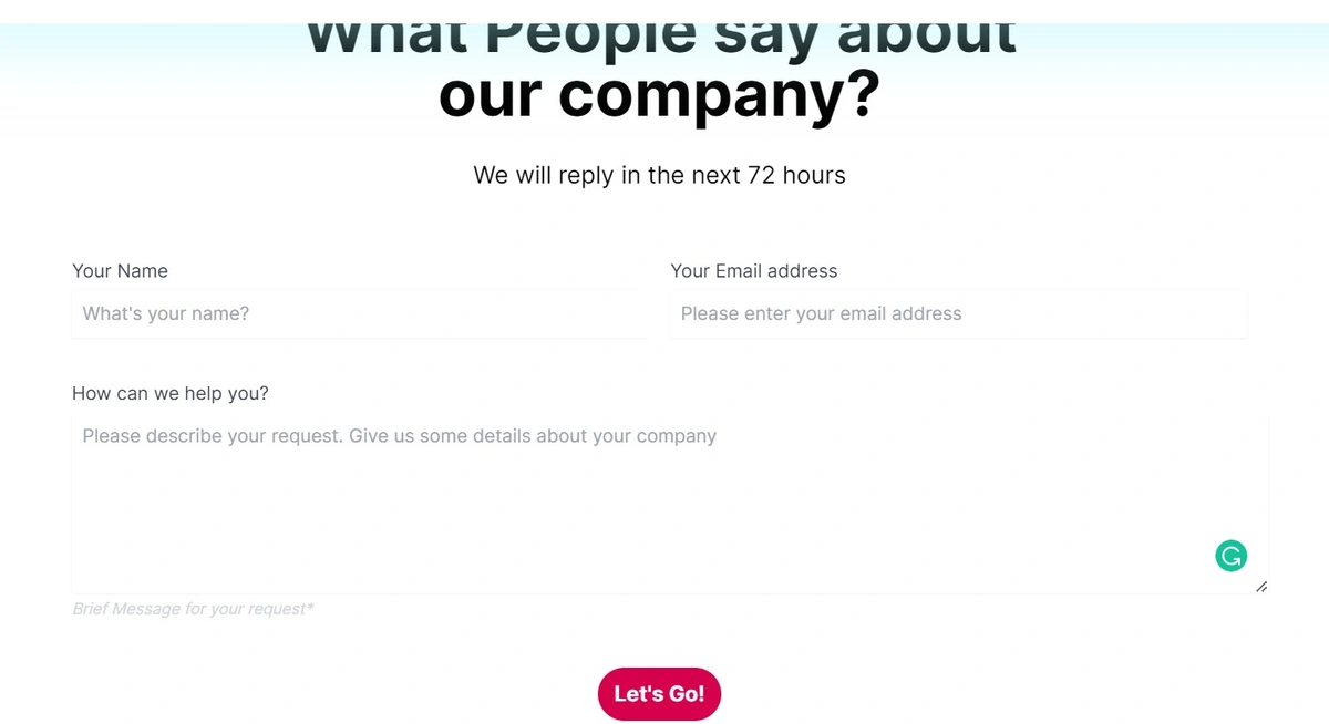
Let’s now create and build the Contact.js component (inside the components folder). This contact form will gather the visitor’s name, email address, and text message about their reason for contacting the site owner:
import React from "react";
import MyBtn from "./MyButton";

const Contact = () => {
  return (
    <div id="contact" className="flex flex-col my-5 md:my-10 py-5 md:py-10">
      <div className="flex flex-col mx-auto">
        <h1 className="font-bold text-3xl md:text-5xl md:w-2/3 mx-auto">
          What People say about our company?{" "}
        </h1>
        <p className="text-md mx-auto w-2/3 font-light md:text-lg my-2 md:my-6">
          {" "}
          We will reply in the next 72 hours{" "}
        </p>
      </div>
      <form action="" method="POST" className="mx-auto md:w-3/4">
        <div className="flex flex-col justify-between text-left overflow-hidden">
          <div className="px-4 py-5 sm:p-6">
            <div className="flex flex-col">
              <div className="flex flex-col md:flex-row justify-between">
                <div className="my-2 md:my-auto mx-2 md:w-1/2">
                  <label
                    htmlFor="Name"
                    className="block text-sm font-medium text-gray-700"
                  >
                    Your Name
                  </label>
                  <input
                    type="text"
                    name="Name"
                    id="Name"
                    autoComplete="given-name"
                    placeholder="What's your name?"
                    required
                    className="mt-1 p-2 focus:ring-cyan-500 focus:border-cyan-500 block w-full shadow-sm sm:text-sm border-cyan-300 rounded-sm"
                  />
                </div>

                <div className="my-2 md:my-auto mx-2 md:w-1/2">
                  <label
                    htmlFor="Email address"
                    className="block text-sm font-medium text-gray-700"
                  >
                    Your Email address
                  </label>
                  <input
                    type="email"
                    name="Email address"
                    id="Email address"
                    autoComplete="email"
                    placeholder="Please enter your email address"
                    required
                    className="mt-1 p-2 focus:ring-turbo-yellow-500 focus:border-turbo-yellow-500 block w-full shadow-sm sm:text-sm border-turbo-yellow-300 rounded-sm"
                  />
                </div>
              </div>

              <div className="mt-8 mx-2 w-full">
                <label
                  htmlFor="Message"
                  className="block text-sm font-medium text-gray-700"
                >
                  How can we help you?
                </label>
                <div className="mt-1 mx-auto">
                  <textarea
                    id="Message"
                    name="Message"
                    rows={6}
                    className="shadow-sm w-full mt-1 p-2 block sm:text-sm rounded-sm"
                    placeholder="Please describe your request. Give us some details about your company "
                    defaultValue={""}
                    required
                  />
                </div>
                <p className="mt-1 text-xs italic text-gray-300">
                  Brief Message for your request*
                </p>
              </div>
            </div>
          </div>
          <div className="my-3 mx-auto ">
            <button type="submit" className="inline-flex justify-center">
              <MyBtn textContent="Let's Go!" />
            </button>
          </div>
        </div>
      </form>
    </div>
  );
};

export default Contact;
After creating the component, let’s import the component in the pages/index.js page:
import Head from "next/head";
import Image from "next/image";
import Navbar from "../components/Navbar";
import Hero from "../components/Hero";
import Goal from "../components/Goal";
import Services from "../components/Services";
import Testimonials from "../components/Testimonials";
import Contact from "../components/Contact";
import Team from "../components/Team";

const Home = () => {
  return (
    <div className="flex min-h-screen flex-col py-2">
      <Head>
        <title>Create Next App</title>
        <link rel="icon" href="/favicon.ico" />
      </Head>

      <Navbar />
      <main className="relative flex-1 lg:container text-center p-0 mx-auto overflow-x-hidden overflow-auto">
        <Hero />
        <Goal />
        <Services />
        <Testimonials />
        <Team />
	// The component:
        <Contact />
      </main>

    </div>
  );
};

export default Home;
Here is the outcome after running the server:
Creating our footer
Let’s now create and build the Footer.js component (inside the components folder) which, just as any other traditional footer, will contain links to other sections of the website:
import React from "react";
import Image from "next/image";
import Link from "next/link";

const Footer = () => {
  return (
    // <footer className="flex h-24 w-full items-center justify-center border-t">
    <footer className="h-auto w-full py-2 md:py-8 text-md md:text-md justify-around sm:flex sm:flex-row grid grid-cols-1 px-4 md:px-2 border-t">
      <div className="w-36 md:w-52 md:md:w-36 my-2 md:my-auto space-y-2">
        <Link href="/">
          <a>
            <Image
              src={"/logo.svg"}
              alt="Picture of the author"
              width="300px"
              height="80px"
            />
          </a>
        </Link>
      </div>
      <div className="flex flex-col my-2 md:my-auto space-y-2">
        <div className="hover:underline">
          <Link href="/#home">
            <a>Home</a>
          </Link>
        </div>
        <div className="hover:underline">
          <Link href="/#services">
            <a>Services</a>
          </Link>
        </div>
        <div className="hover:underline">
          <Link href="/#testimonials">
            <a>Testimonials</a>
          </Link>
        </div>
      </div>
      <div className="flex flex-col my-2 md:my-auto space-y-2">
        <div className="hover:underline">
          <Link href="/#team">
            <a>Team</a>
          </Link>
        </div>
        <div className="hover:underline">
          <Link href="/#contact">
            <a>blog</a>
          </Link>
        </div>
        <div className="hover:underline">
          <Link href="/#contact">
            <a>Contact</a>
          </Link>
        </div>
      </div>
    </footer>
  );
};

export default Footer;
After creating the component, let’s import the component in the pages/index.js page:
import Head from "next/head";
import Image from "next/image";
import Navbar from "../components/Navbar";
import Footer from "../components/Footer";
import Hero from "../components/Hero";
import Goal from "../components/Goal";
import Services from "../components/Services";
import Testimonials from "../components/Testimonials";
import Contact from "../components/Contact";
import Team from "../components/Team";

const Home = () => {
  return (
    <div className="flex min-h-screen flex-col py-2">
      <Head>
        <title>Create Next App</title>
        <link rel="icon" href="/favicon.ico" />
      </Head>

      <Navbar />
      {/* <main className="flex w-full flex-1 flex-col items-center justify-center px-20 text-center"> */}
      <main className="relative flex-1 lg:container text-center p-0 mx-auto overflow-x-hidden overflow-auto">
        <Hero />
        <Goal />
        <Services />
        <Testimonials />
        <Team />
        <Contact />
      </main>

	// Here is the footer:
      <Footer />
    </div>
  );
};

export default Home;
Here is the outcome after running the server, npm run dev:
Our resulting landing page
Alright! Congratulations 💪. Check out the demo to see the final results: Demo.
Next.js landing page inspiration for your next project
As a developer, to go further in building one-page websites, you’ll need some inspiration, as shown below:
For more inspiration, check this article: The Best Free NextJS Landing Page Templates
React vs Next.js questions
Is Next.js better than React?
In a nutshell, using Next.js comes with many easy-to-use features which are better than using only React, such as routing, image optimization, and internationalization. The question is not what’s better, but how both work together combined, as we’re about to discuss in the next two questions.
Why use Next.js with Reactjs?
React, created by Facebook, is one of the most popular front-end frameworks, although it is considered more like a library (a tool we can use in any project) than a framework (an entire architectural design). Some believe this makes the work often harder since using a library there are a lot of features to be configured by yourself such as routing, image optimization, and so on. This is the reason why we have Next.js (one of many great React frameworks) which comes with more tools and “complete” architecture features.
Next.js brings static export features, pre-rendering, and many other features like image optimization, increasing the development process speed, middleware, routing, etc.
While React comes as a library, Next.js comes with some superpowers as described above. Hence, checking which one is better is necessary, as answered in the next question.
Which one is better, Next.js or React? Our final thoughts
If your goals include saving time in development, increasing optimization (images, videos), easy routing, efficient backend architecture, less configuration, Server-side rendering (SSR), static export (SSG), pre-rendering, automatic build size optimization, and faster development compilation, using Next.js is where you should slide. That’s because it’s built upon the React ecosystem foundation and comes with all these interesting features.
Closing thoughts
In this article, we’ve learned about the fundamentals of building a good landing page that potentially converts and leads visitors to become customers. We have given a proof of concept for building a landing page using modern technologies such as Next.js, TailwindCSS, and a headless CMS such as ButterCMS which makes building the landing page’s components and sections easier.

