
Dark mode is a digital design trend used to improve the aesthetics and usability of mobile app interfaces, making it an important tool in today's ever-changing technological scene. It quickly gained popularity in mobile development after Google introduced dark mode on the Android OS (Android 10 in 2019, and Apple followed suit with iOS (iOS 13 and iPadOS 13) later that year.
When building mobile apps with React Native, it is pertinent that Dark Mode be supported to provide an exceptional user experience. In this article, we will discuss five easy techniques for implementing React Native Dark Mode.
Table of contents
Looking to simplify content management while implementing features like dark mode? Start a 14-day free trial of ButterCMS and see how it can enhance your React Native projects. Now lets get into the tutorial!
Implement dark mode with Appearance

React Native has an in-built module Appearance that provides users with theme preferences, such as their preferred color scheme (light or dark). This module can toggle styles based on the selected color scheme.
The module provides the getColorScheme() method, which returns the value “dark” when it detects a dark color scheme. It also provides the addChangeListener() method, an event handler called when the appearance preferences change.
Here's a quick example of how to implement dark mode in React Native using the module:
import {Appearance, ColorSchemeName} from 'react-native';

const [theme, setTheme] = useState<ColorSchemeName>(Appearance.getColorScheme(),
);

 useEffect(() => {
   const appearanceSubscription = Appearance.addChangeListener(
     ({colorScheme}) => {
       setTheme(colorScheme);
     },
   );
   return () => appearanceSubscription.remove();
 }, []);

 useEffect(() => {
   console.log({theme});
 }, [theme]);
In the code above, we call the appearance.addChangeListener method on the useEffect hook. This listener listens to changes in the user’s device color preference. If there is a change to the device color preference, the listener is triggered and assigns the new color preference to a state value.
React Native also provides a simple hook named useColorScheme() for the appearance modules. The hook returns a 'bright' or 'dark' value, which signifies the preferred color scheme (light or dark mode). It also implements the event listener, which listens to changes in the user’s device color preference and causes a re-render when the user changes their phone’s color scheme.
Here's how a simple component will look when using useColorScheme:
import {StyleSheet, Text, useColorScheme} from 'react-native';

const Label: React.FC<LabelProps> = ({
    ...props
  }) => {
    const theme = useColorScheme();
    return (
      <Text style={[
          theme === 'dark' ? styles.dark : styles.light,
       ]}
        numberOfLines={2}
      >
        {props.label}
      </Text>
    );
 };

const styles = StyleSheet.create({
 dark: {
   backgroundColor: '#1A1A1A',
   color: '#FAFAFA',
 },
 light: {
   backgroundColor: '#FAFAFA',
   color: '#1A1A1A',
 },
});

 export default Label;
In the above code, we used the useColorScheme hook to acquire the dark and light user preferences that will be applied to the above component. The result is a React Native dark mode or light mode that can be applied to any React Native component.
Implement dark mode with React Navigation

Deciding on a navigation library is one of the most discussed topics in the React Native community. One of the top advantages of React Navigation is theme support. This offloads the implementation of making themes from developers.
React Navigation allows users to apply a React Native dark theme by consistently using a color palette, fonts, and layout patterns in building components. It accomplishes this by providing the theme prop to its NavigationContainer component, which encloses the component in which we want the theme to appear. If you make changes to the theme prop dynamically, every component inside the NavigationContainer component will instantly update to reflect the new theme.
An example of its usage is shown below:
import * as React from 'react';
import {useColorScheme} from 'react-native';
import { NavigationContainer, DefaultTheme, DarkTheme, } from '@react-navigation/native';

export default function App() {
    const scheme = useColorScheme();
    const MyTheme = scheme === 'dark' ? DarkTheme : DefaultTheme;

    return (
       <NavigationContainer theme={MyTheme}>
          {/* the component we want to add */}
          <MyButton />
       </NavigationContainer>
    );
}
In the code above, we obtain the device’s user preferences (light or dark mode) using the useColorScheme hook and pass it to React Navigation’s NavigationContainer.
After passing the user preferences to the NavigationContainer as shown above, we call the 'useTheme' hook to reveal the theme within the component. In this case, we map the dark user preference to a React native dark theme provided by the React Navigation Package (which comprises specific, consistent color and layout properties) and the light user preference to a light theme provided by the React Navigation Package. We can then include the theme in the styling of our components.
import * as React from 'react';
import { TouchableOpacity, Text } from 'react-native';
import { useTheme } from '@react-navigation/native';

// Black background and white text in light theme, inverted on dark theme

function MyButton() {
  const { colors } = useTheme();
  return (
    <TouchableOpacity style={{ backgroundColor: colors.card }}>
      <Text style={{ color: colors.text }}>
 	  Button!
      </Text>
    </TouchableOpacity>
  );
}
As shown in the code above, we utilize the useTheme hook from React Navigation to apply the theme to the component. The end result is a React Native dark mode or light mode that can be used with any React Native component as shown in the image below:
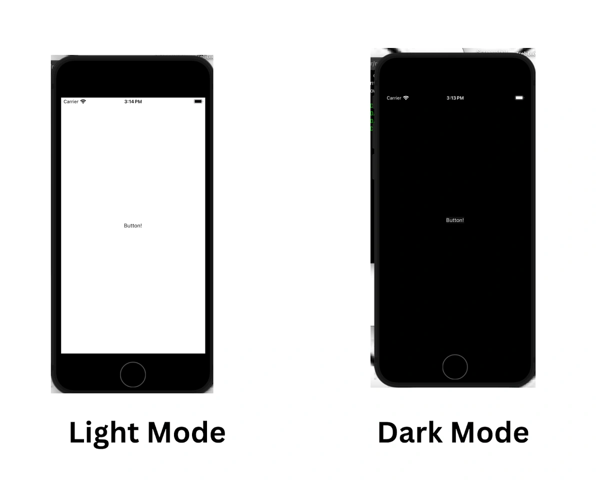
A picture of the dark mode from the React Navigation method
Implement dark mode with styled-components
Styled-components is one of the most trusted and widely used libraries for styling React applications. It also supports React Native with all of its excellent features.
In React Native, styled-components allow you to define styled elements as React Native components, eliminating the need for separate stylesheet objects. Implementing a React native light and dark theme is easy with styled-components because styled components expose a context provider called ThemeProvider, enabling users to assign a theme to all React components enclosed in it.
The code below uses the useColorScheme hook to get the device's user preference (light or dark mode). We then map the dark mode user preference to a dark theme consisting of consistent colors for backgrounds and foregrounds and also map the light mode user preference to a light theme consisting of a different consistent color type. After doing this, we pass these themes to the styled-component's ThemeProvider.
import { useColorScheme } from 'react-native';
import { ThemeProvider } from 'styled-components';
const darkTheme = {
background: "#1A1A1A",
foreground: "#FAFAFA"
};
const lightTheme = {
background: "#FAFAFA",
foreground: "#1A1A1A",
};
const App: React.JSX.Element = (props) => {
const scheme = useColorScheme();
return (
<ThemeProvider theme={scheme === 'dark' ? darkTheme : lightTheme}>
<Button>
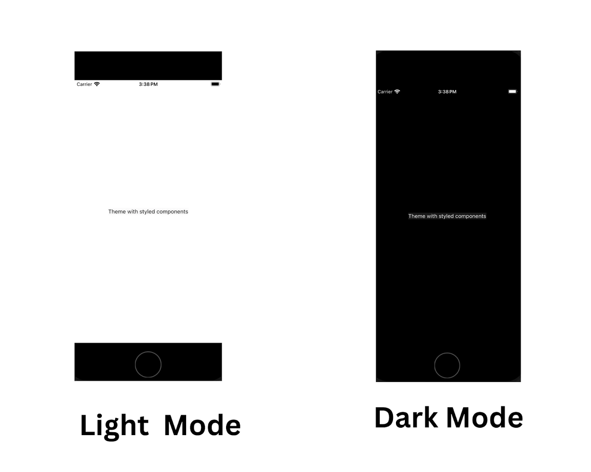
<Text>Theme with styled components</Text>
</Button>
</ThemeProvider>
);
}
export default App;When adding a preference, the components under the ThemeProvider will have access to the user preference as a props value, as demonstrated above.
import styled from 'styled-components/native'

const Button = styled.TouchableOpacity`
  color: ${props => props.theme.foreground};
  background-color: ${props => props.theme.background};
`;

const Text = styled.Text`
 color: ${props => props.theme.foreground};
`;
In the code above, we apply the theme to the styled component as a props value.
This method avoids the inline styling approach used in all previous methods. It can make our JSX look cleaner and more maintainable, as all style-related items will go in the style declaration.
Implement dark mode with Emotion Native

Emotion is one of the giants in the CSS-in-JS arena and supports React Native, making it a great choice for developers working on a solution that supports both mobile and web platforms.
Like styled components, emotion also avoids the inline styling approach for theme support. It has a similar ThemeProvider that can help you supply a theme to all child components. The syntax here looks quite the same as for styled components:
import { useColorScheme } from 'react-native';
import { ThemeProvider } from '@emotion/react-native';

const darkTheme = {
  background: "#1A1A1A",
  foreground: "#FAFAFA"
};

const lightTheme = {
  background: "#FAFAFA",
  foreground: "#1A1A1A",
};

const App: React.JSX.Element = (props) => {
  const scheme = useColorScheme();
    return (
      <ThemeProvider theme={scheme === 'dark' ? darkTheme : lightTheme}>
          <Button>
            <Text>Theme with styled components</Text>
          </Button>
       </ThemeProvider>
  );
}

export default App;
In the code above, we use the useColorScheme hook to get the device's user preference (light or dark mode). We then translate the dark mode user option to a dark theme consisting of consistent colors for backgrounds and foregrounds and to a light theme consisting of a different constant color type. Following this, we pass these themes to Emotion’s ThemeProvider
Implement dark mode with React Native Paper

Several UI libraries are available for React Native developers today. One of the most prominent is React Native Paper, a cross-platform material design for React Native. It is a collection of customizable and production-ready components for React Native, following Google’s Material Design guidelines. With 30+ customizable components, it is a great choice to use with Material UI.
React Native Paper comes with theming support. Themes provided at the top of the component tree are used across all components.
To implement a React Native Paper dark theme, React Native Paper exposes a Provider component that accepts a theme prop. The theme prop accepts properties that comprise color schemes, fonts, and layout patterns. The Provider component can accept these themes (properties) and pass them to its children’s components, as shown in the code below.
import * as React from 'react';
import { DefaultTheme, Provider as PaperProvider } from 'react-native-paper';
import App from './src/App';

const darkTheme = {
  ...DefaultTheme,
  roundness: 2,
  colors: {
    ...DefaultTheme.colors,
    primary: "#1A1A1A",
    accent: "#FAFAFA"
  },
};

const lightTheme = {
  ...DefaultTheme,
  roundness: 2,
  colors: {
    ...DefaultTheme.colors,
    primary: "#FAFAFA",
    accent: "#1A1A1A",
  },
};

export default function Main() {
const scheme = useColorScheme();
  return (
    <PaperProvider theme={scheme === 'dark' ? darkTheme : lightTheme}>>
      <App />
    </PaperProvider>
  );
}
After adding the Provider component, we can call the 'useTheme' hook (which React Native Paper provides) on the children component of the Provider. This hook exposes the theme earlier added to the Provider component within these components. We can then apply the theme to our components directly, as shown in the code below:
import * as React from 'react';
import { useTheme } from 'react-native-paper';

export default function App() {
 const theme = useTheme();

 return <View style={{ backgroundColor: theme.colors.primary }} />;
}
The result is a React Native dark theme applied to the React Native Paper components.

When should you use each method?
These methods each serve a purpose: to achieve dark mode theming in React Native applications. However, each approach excels in a specific context. In this section, we will go through each approach and discuss when it can be used.
Native Appearance Module
Depending on the user's device preference, the Appearance module should be utilized in theming when light and dark themes are needed. For example, the Appearance module can be used to build applications that compulsorily show a certain type of color palette, fonts, and layout when the user’s device preference is set to dark mode and vice versa.
React Navigation
React Navigation includes both theming and navigation utilities. It is the ideal option if you want to match the application's theming to its navigation technology. As the navigation and theming are combined into one package, you are exempt from installing another theming library, which could increase the application's bundle size.
You can also modify the default bright and dark themes React Navigation offers to fit your design specifications.
Styled-components
Styled components offer an advantage over React Native's usual method of creating styles in that they allow us to utilize simple CSS instead of JavaScript objects.
Styled components provide styling freedom, allowing for the creation of reusable user interfaces.
Due to this, it is an excellent choice if you want to create complicated design systems and fully themed applications from the bottom up. You can easily create a standard native component with styled components and then style it with its styles API. Also, themes being passed directly as props into the component enforces the application of themes at the component level, resulting in fully themed design systems or applications.
Emotion Native
Emotion Native offers flexibility in styling, making it easy to build reusable user interfaces. It is an ideal choice if you desire to build complex design systems from the ground up. You can easily create a regular native component with emotion and then easily style the component with emotion styles.
React Native Paper
React Native Paper offers reusable components for creating user interfaces and enhancing user experience. It follows Material Design UI principles, ensuring consistency. Its reusable components are so flexible that they can accept themes, which makes it an ideal choice if you want to theme prebuilt component systems.
React Native Paper is designed for performance, making it responsive and smooth.
Are there other methods to implement dark mode?
Using the context API with the appearance module in theming applications is a viable technique for implementing dark mode. It is a native approach and does not require any additional package installations. Themes are sent to a React Context via Providers and then to the Context’s child component. Furthermore, if you desire to theme the application based on the device's preferences, use the Appearance module to retrieve the preferred theme and send it to other components via the Context.
Wrapping it up
Dark mode is one of the essential features of apps today. As developers, we are always in pursuit of the finest solutions that are scalable and easy to maintain. The libraries discussed above provide great support for dark mode and are quite easy to implement in conjunction with ButterCMS as your React Native CMS. Feel free to let us know which library you are using for dark mode in your next unicorn app using the comments below.
Updated April 2024 by Peter Osah.
