In today's digital world, product landing pages play a vital role for organizations, particularly e-commerce brands, that aim to showcase their products and features to potential customers, while also offering a means of engagement—such as enabling users to swiftly make purchases of products or services directly from the page. Therefore, it becomes a crucial task for businesses to ensure that their product landing pages effectively convey all necessary information and provide a fast, responsive web application.
In this tutorial, we will delve into the process of building a product landing page using Gridsome and ButterCMS. Together, these two technologies offer a potent, dynamic, and high-performing product landing page.
Throughout this article, we will explore the key steps involved in building a product landing page. This will encompass tasks such as establishing the content structure, designing the layout of the web page, incorporating content onto the product landing page using the predefined structure on ButterCMS, and showcasing the final results.
Table of contents
What is Gridsome?
Gridsome is a contemporary JavaScript framework built upon Vue.js. It serves as a platform for constructing statically generated web applications. Gridsome capitalizes on well-regarded web technologies, including GraphQL, APIs, CMSs, and databases, as data sources. Moreover, it embraces the Jamstack software architecture, facilitating the creation of scalable, exceptionally rapid, and finely optimized web applications.
Since Gridsome is rooted in Vue.js, developers enjoy the flexibility to adopt a component-based developmental approach. This approach involves crafting and utilizing reusable UI components, with access to the comprehensive Vue.js ecosystem encompassing libraries, tools, and plugins. This strategy simplifies the process of generating interactive and dynamic websites.

Outlined below are the advantages that arise from developing web applications using Gridsome, benefitting both developers and users:
-
Static Site Generation (SSG): Gridsome employs SSG, a tool that generates an entirely static HTML website throughout the Gridsome application's build process. By employing SSG, Gridsome preloads content and constructs static pages, facilitating swift loading times for landing pages and diminishing server strain.
-
Enhanced SEO Support: By harnessing statically generated pages, search engine bots can readily crawl static HTML files. This accessibility heightens visibility within search engines and augments SEO performance. As a result, the content on product landing pages becomes effortlessly accessible in search engine results, fostering heightened conversion rates.
-
Reduced Server Load: In the realm of Gridsome, the server's role is confined to overseeing the build process for generating static files. These static files can be directly served, thereby diminishing the server's demands and fostering the web application's scalability.
Powering your landing page with ButterCMS
ButterCMS stands as a versatile headless CMS that distinguishes the content management layer from the presentation layer. This approach empowers developers to shape front-ends according to their favored frameworks. It boasts compatibility with a wide array of frameworks, including Swift, Nuxt.js, Ionic, and Next. The platform features an intuitive UI tailored for content creation and management.
This tutorial centers on the construction of a well-structured landing page through ButterCMS. By harnessing the ButterCMS component picker, we attain the flexibility to rearrange the structure of the web application and fabricate new landing pages utilizing predefined components. Once the framework for the page's content structure is in place, we proceed to populate content within the designated page type. We leverage ButterCMS's API integration to retrieve content for display within the landing page web application.
Building a product landing page with Gridsome and ButterCMS
In this section, we will build two product landing pages; one for a smoothie site and the other for a coffee site. We will start by first creating a page type for the landing page; creating and adding components to it using the component picker until we have the desired content structure for the landing page. Next, we will create a product landing page for smoothies using the page type we created, fetch data from ButterCMS using its API features and display it on the product landing page web application we will build later on in this tutorial. We will also demonstrate using the created page content structure to create a new product landing page for a coffee site, leveraging the flexibility offered by the component picker component to rearrange the order of components to create a new unique page. The code for this tutorial can be found in this GitHub repo.
Tutorial prerequisites
To follow along with this tutorial, you need the following:
-
Knowledge of the Vue.js framework
-
Node.js >= v16.12.0 installed on your local machine
-
An active ButterCMS account
Configuring our page type
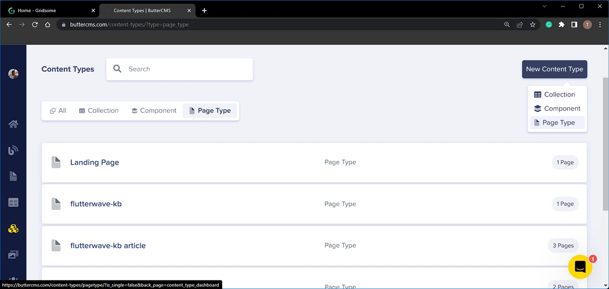
Sign in to your established ButterCMS account, or complete the registration process if you lack one. Following a successful login, navigate to the Content Types section within the left-side navigation panel. To craft a product landing page, our initial step involves generating a fresh page type to house content destined for the web application.
Within the dashboard interface, initiate the creation of a novel page type by clicking the New Content Type button. Proceed by selecting Page Type, a selection exemplified in the image below:
Within the new page that unfolds, we have the New Page-type Configuration Page. This page allows us to select the desired fields and build components that will define the content structure of our page type. First, we will add an SEO component from the component library. This is a pre-built component provided by ButterCMS and contains:
-
An SEO title using a short text field
-
An SEO description using a short text field
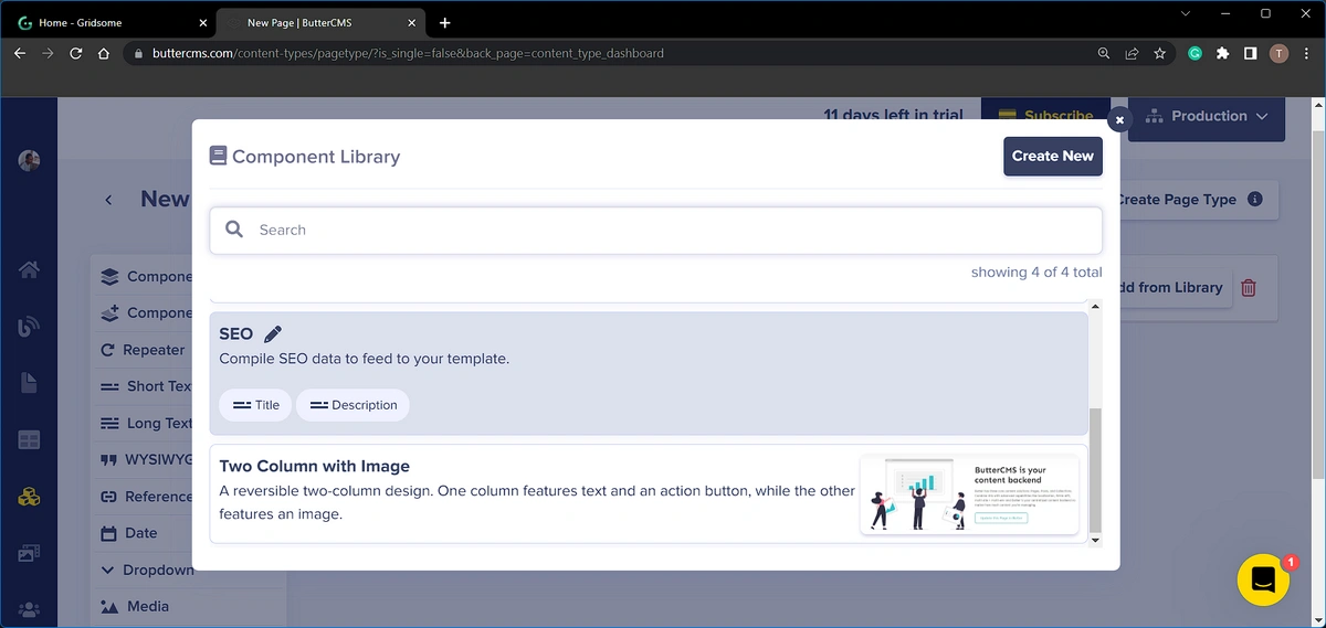
Next, we will add the component picker to the page configuration. The component picker field makes it possible to create dynamic pages, by selecting from an array of components. These components can also be conveniently rearranged. For instance, the content layout can undergo restructuring, such as interchanging the placement of an "about" and "contact" component. This versatility empowers the creation of diverse pages while adhering to the same page type. In the image below, we added the component picker and named it (Body):
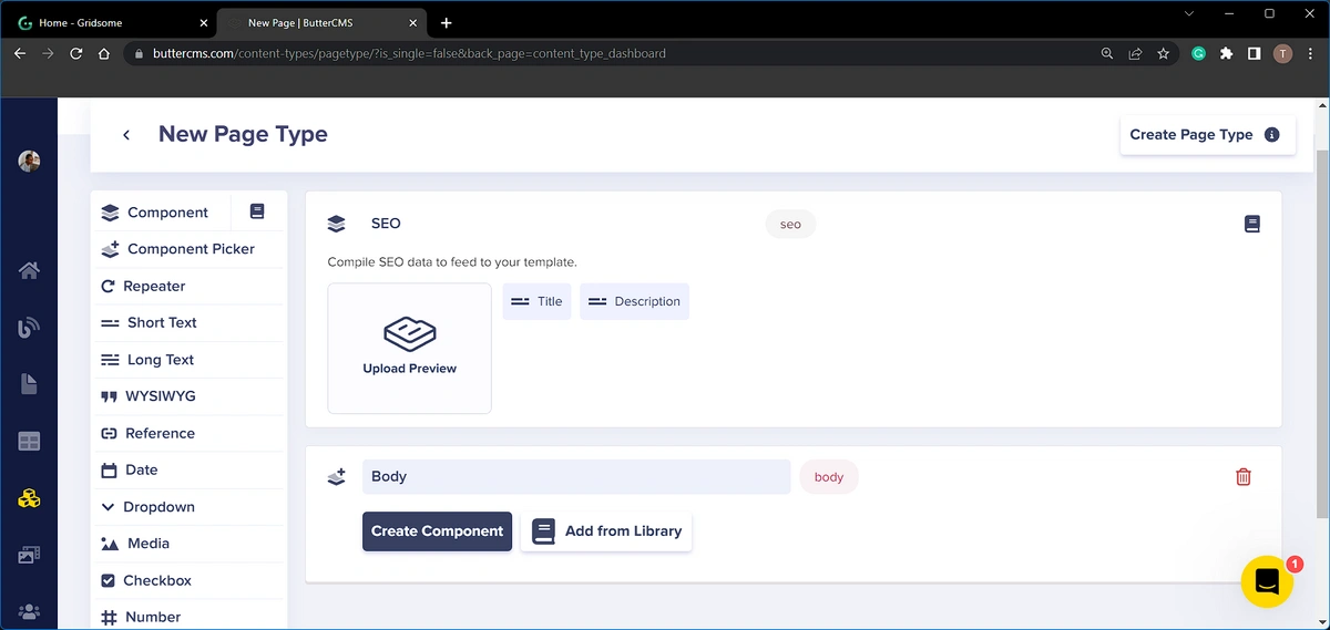
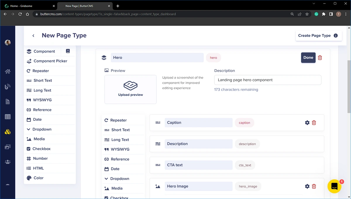
The product landing page's first section will be a Hero section. For this section, we will create a new component called “Hero” within the component picker. This component will contain the following fields:
-
A short text field: caption
-
A long text field: description
-
A short text field: CTA text
-
A media field: Hero image
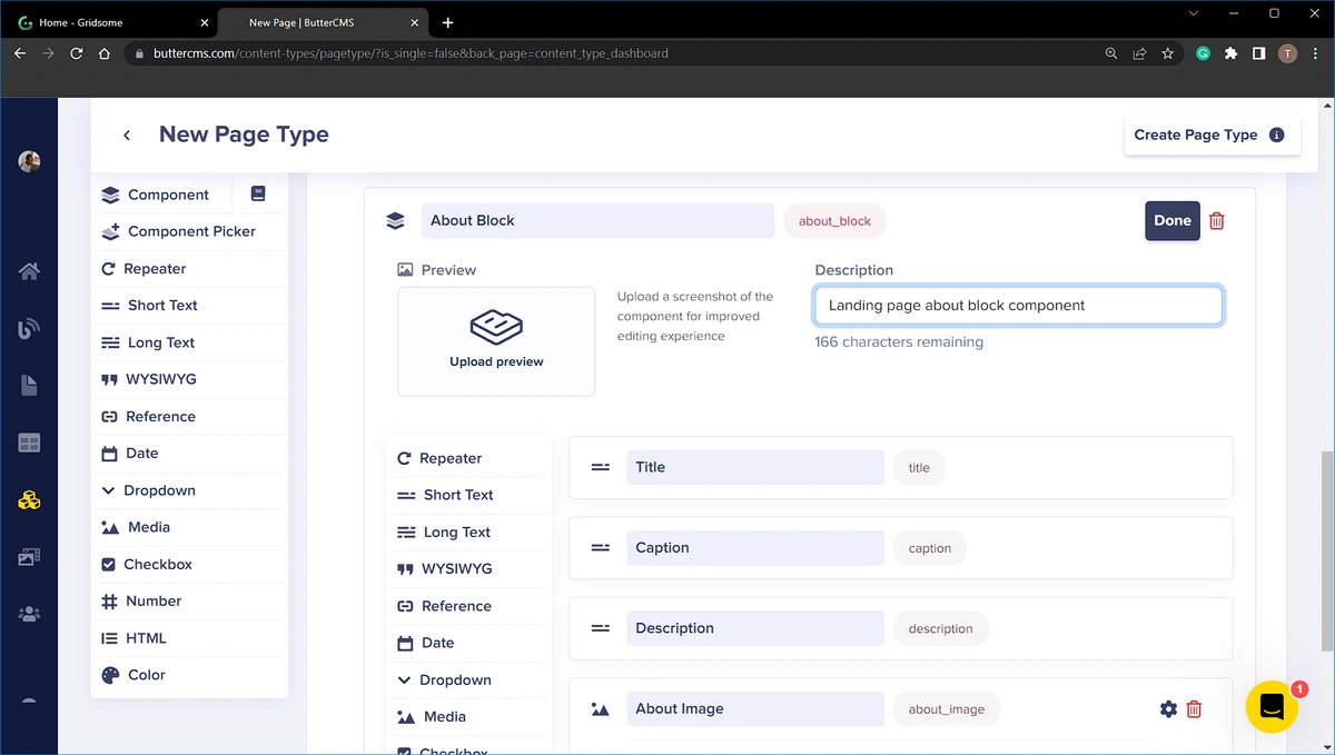
Next, for the About section of the product landing page, we will create a new component named “About Block”. This block will contain the following fields:
-
A short text field: title
-
A short text field: caption
-
A long text field: description
-
A media field: About Image
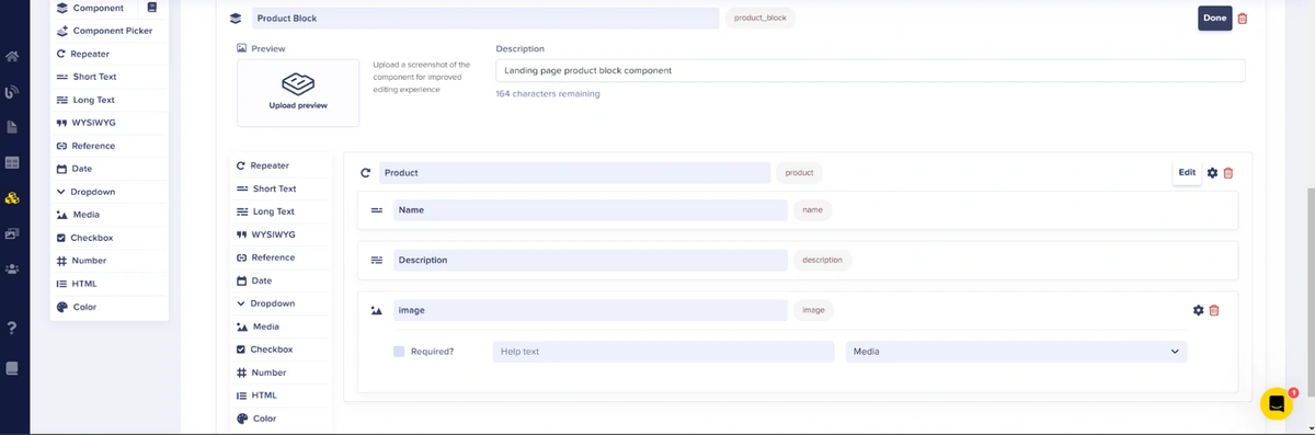
After that, we will have another component for the product section of the landing page that we’ll name “Product Block”. This component will consist of a Repeater field called Product. This Repeater will contain the following fields:
-
A short text field: Name
-
A Long text field: Description
-
A media field: image
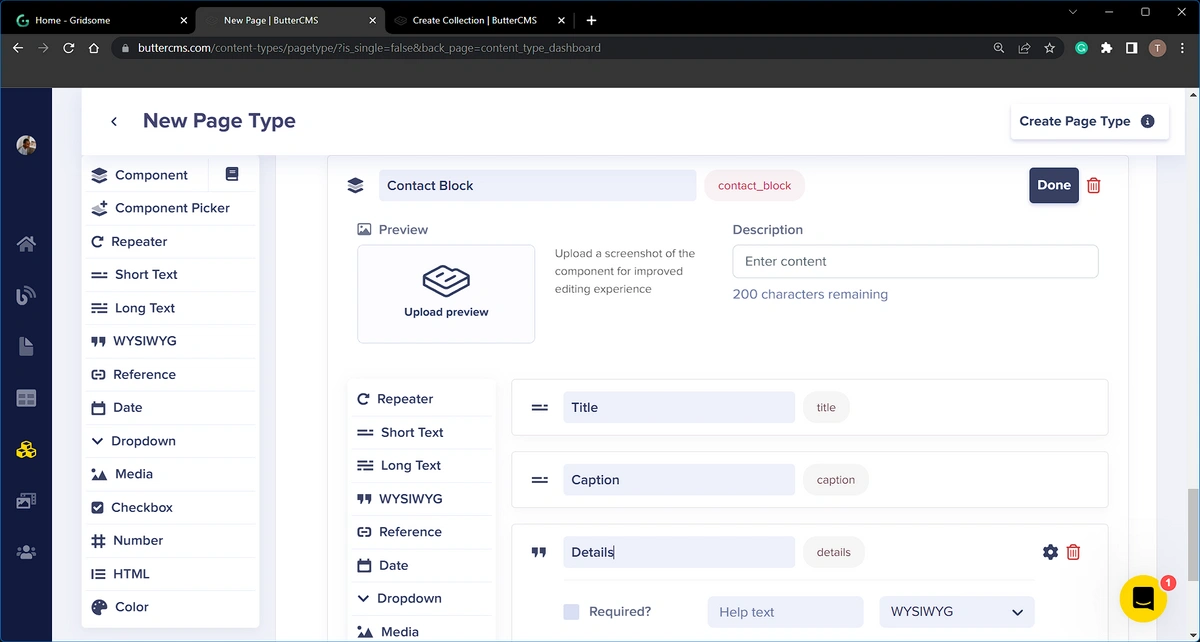
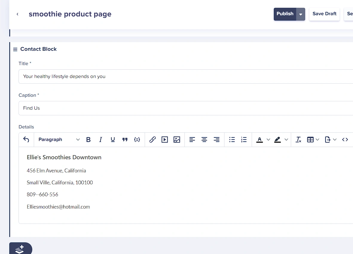
Finally, the landing page will end with a contact section. For the details in this section, we will create a component named “Contact Block” with the following fields:
-
A short text field: Title
-
A short text: caption
-
A WYSIWYG field: details
To save the newly created page type, click the Create Page Type button and save the page as “Smoothies Landing Page”:
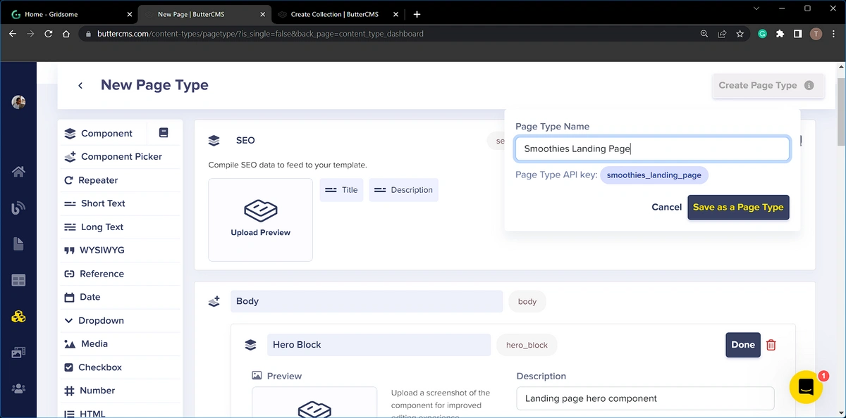
Lastly, click on the Save as a Page Type button.
Adding content to the landing page
In the section above, we defined the structure of the page type for the product landing page. In this section, we will create a new page using the components we created earlier. Later on, we will create a second page using the Smoothies Landing Page page type and demonstrate how you can use the component picker to create a slightly different page.
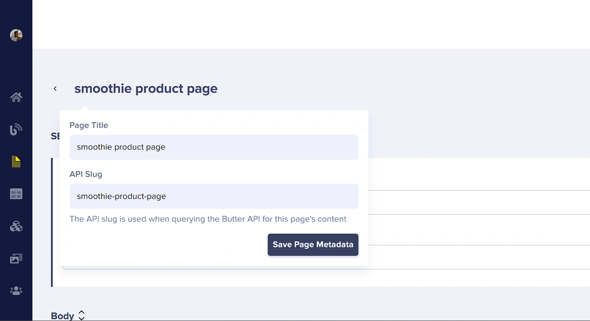
To create a new page, hover over Pages from the left-side menu and select the + next to Smoothies Landing Page to create a page using that specific page type. Once on the new page, we’ll start by entering the page metadata. Below we’ve entered “smoothie product page”.
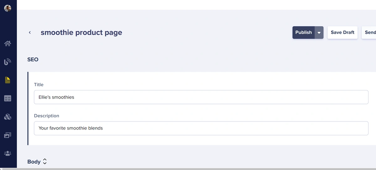
We will also enter the content for SEO in the block provided by our content structure:
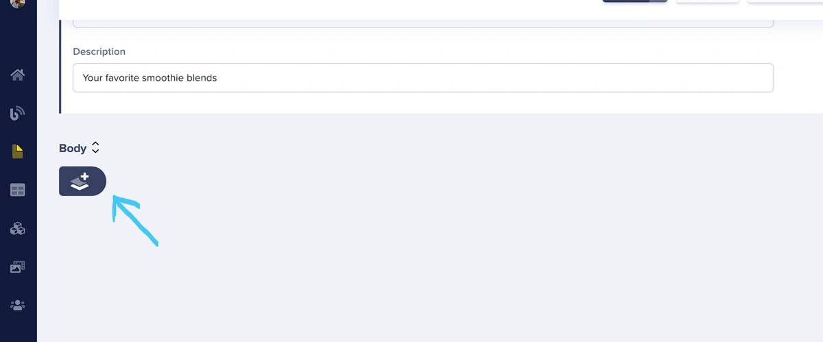
Next, we will add our components to the smoothie product page using the Body component picker. We’ll begin by adding the following components: Hero Block, About Block, Product Block, and Contact Block. To add these click the component picker button seen below:
This opens up the Component Library modal shown in the image below:
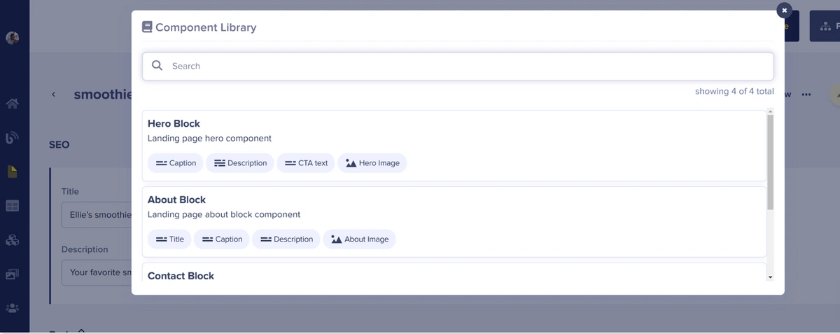
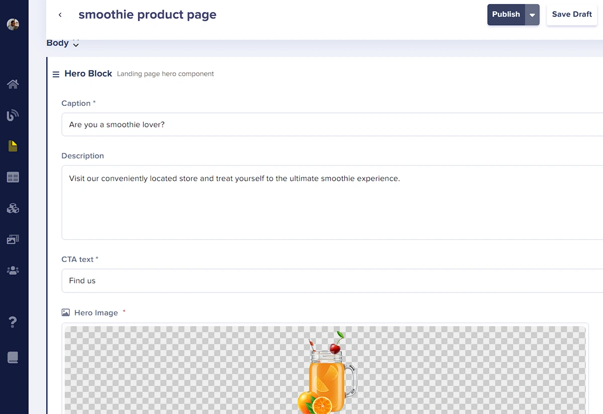
Within this modal, our first action will be to choose the Hero Block component. Clicking on it will incorporate it into the page. Then we can input the desired content into the designated fields, as depicted in the image below:
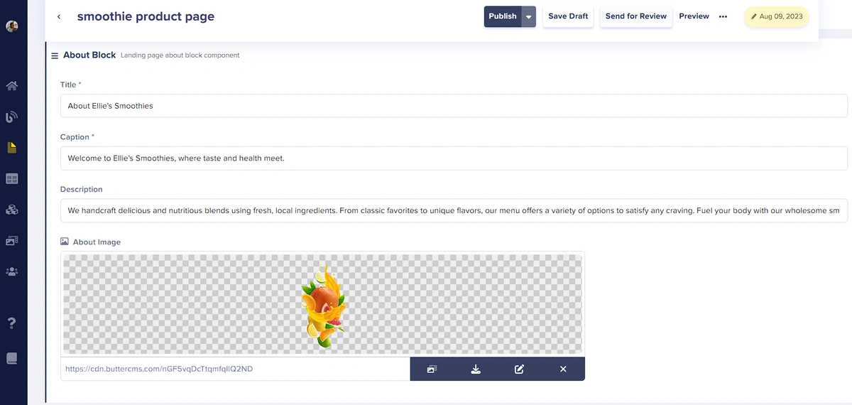
After adding content to the Hero Block fields, we’ll follow the steps above to add the About Block component.
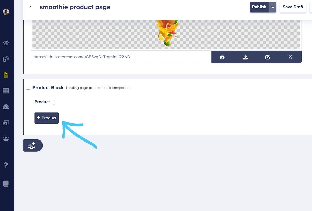
Next, we will use the component picker to add the Product Block component to the page.
This block contains a Repeater field, which is a group of one or more content fields that can be created as many times as desired, allowing us to add as many products as we need. After adding the Product Block, click on the Product repeater field to add a product to this block:
This creates a new item in the Product Block component. Now you can add your product details into the available fields. Below you can see the information for our first product.
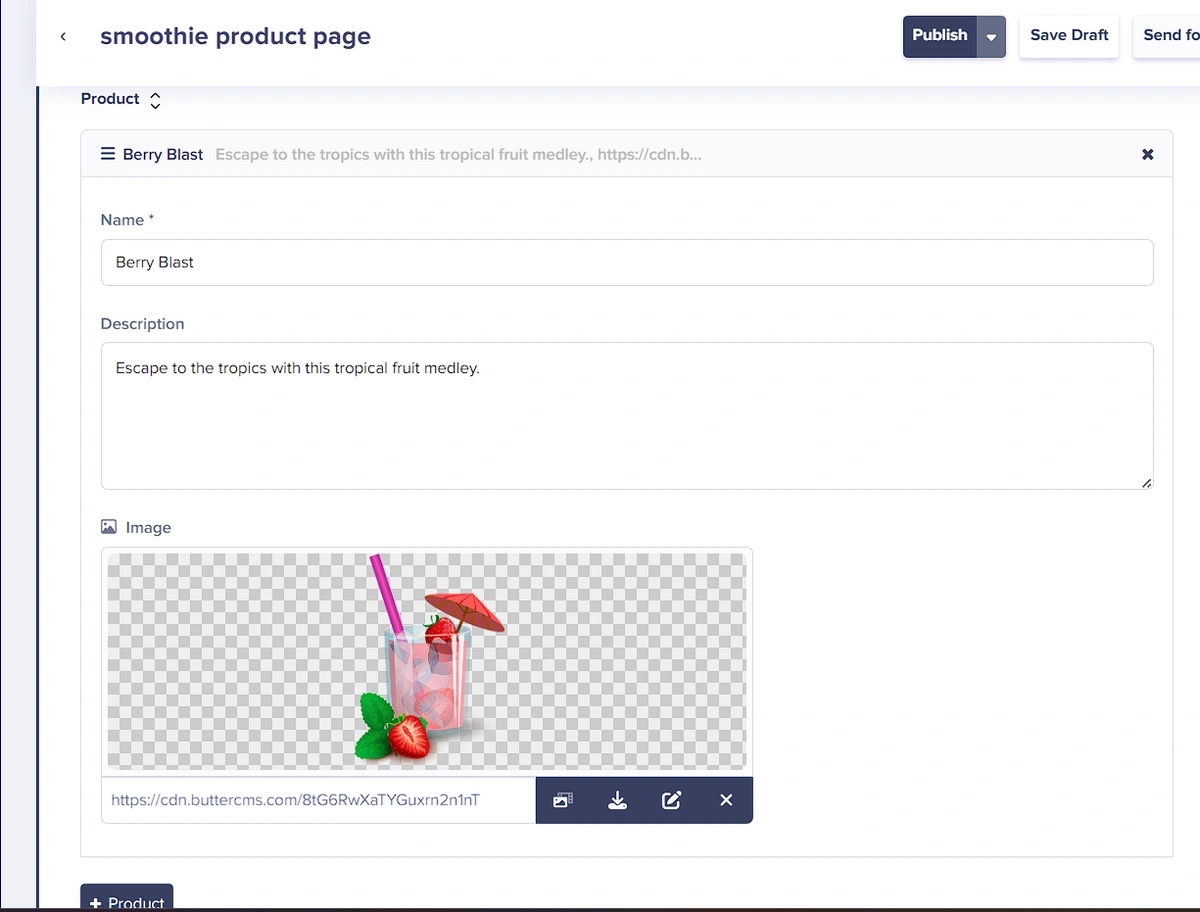
Repeat the previous step (click on the product Repeater field to create a new item and fill in the necessary information) to create a second Product repeater item.
Finally, we will add the Contact Block component from the component picker and enter the contact information:
Building the landing page application
For this tutorial, we will be making use of the Gridsome framework to build the landing page web application. To install and set up Gridsome, make use of the steps outlined below:
Open a CLI and enter the following command to install Gridsome globally on your local machine:
// yarn users
yarn global add @gridsome/cli

// npm users
npm install --global @gridsome/cli
Next, we will create a new Gridsome project with the following syntax:
gridsome create <project name>
In the command above, “project name” refers to the name of the application to be created. When this command is entered followed by the enter/return key, a project directory is set up on your local machine, and Gridsome starter code and dependencies are pulled into this directory. Upon completion of this process, we can navigate to the newly created directory with the following CLI commands:
cd <project name>
# Run the application with the next command
npm run develop
If any error occurs due to a missing package/dependency, this can be fixed by first running “npm install”, then start the application with “npm run develop”
Setting up TailwindCSS
To make building the front-end interface of the landing page application easier and less time-consuming, we will make use of TailwindCSS, an open-source CSS library. This dependency can be installed and set up as follows:
Open up a CLI in the project directory and enter the following command:
npm i -D @tailwindcss/postcss7-compat postcss@^7 @tailwindcss/typographyNext, run “npx tailwind init” to create a Tailwind configuration file at ./tailwind.config.js.
To allow support for Vue.js and other file types, we will modify this configuration file:
// ./tailwind.config.js

module.exports = {
  content: [
    "./src/**/*.vue",
    "./src/**/*.js",
    "./src/**/*.jsx",
    "./src/**/*.html",
    "./src/**/*.pug",
    "./src/**/*.md",
  ],
  darkMode: "media", // or 'media' or 'class'
  theme: {
    extend: {},
  },
  variants: {
    extend: {},
  },
  plugins: [require("@tailwindcss/typography")],
};
Next, create a new file ./src/main.css and add the CSS style directives:
/* ./src/main.css */
@tailwind base;
@tailwind components;
@tailwind utilities;
We will also add an import for the CSS file in the ./src/main.js file:
// This is the main.js file. Import global CSS and scripts here.
// The Client API can be used here. Learn more: gridsome.org/docs/client-api
// Import global styles from ./main.css
require('~/main.css')
import DefaultLayout from '~/layouts/Default.vue'
export default function (Vue, { router, head, isClient }) {
  // Set default layout as a global component
  Vue.component('Layout', DefaultLayout)
}
Finally, we will create a Gridsome Tailwind config to make use of the TailwindCSS dependency. To do this, create a new file: ./gridsome.config.js and add the following code to it:
// ./gridsome.config.js

const tailwind = require("tailwindcss");
const postcssPlugins = [tailwind()];

module.exports = {
  siteName: 'Gridsome',
  plugins: [],
  css: {
    loaderOptions: {
      postcss: {
        plugins: postcssPlugins,
      },
    },
  },
}
Adding ButterCMS Integration
In this section, we will build the landing page of the application with Gatsby, and integrate ButterCMS into it. To get started, we will first install the ButterCMS dependency and make use of the Read Token from ButterCMS to fetch content for the application.
npm install buttercmsThe READ API TOKEN that is required to fetch content from ButterCMS can be found in the settings pane of the ButterCMS dashboard. In the landing page project directory, create a new file .env and add the following key as follows:
READ_TOKEN= <your API token here>Next, we will create a new file butter.js that initializes the read token, in the ./src/libs. In this file, we will add the following:
// ./src/libs/butter.js
const butter = require("buttercms");
const Butter = butter(process.env.READ_TOKEN);
module.exports = Butter;
The DataStore API provided by Gridsome is a useful tool for easily fetching content in a Gridsome application. In the ./gridsome.server.js file, we will set up the Data Store “api.loadSource()” hook to handle data fetching from ButterCMS.
const Butter =  require('./src/libs/butter.js');
// Server API makes it possible to hook into various parts of Gridsome
// on server-side and add custom data to the GraphQL data layer.
// Learn more: https://gridsome.org/docs/server-api/

// Changes here require a server restart.
// To restart press CTRL + C in terminal and run `gridsome develop`

module.exports = function(api) {
  api.loadSource(async ({ addCollection }) => {
    // Use the Data Store API here: https://gridsome.org/docs/data-store-api/

    // create a product page collection from the smoothies page collection type
    const product = addCollection({
      typeName: "product"
    });

    // retrieve the product page from Butter CMS
    const productResponse = await Butter.page.retrieve('smoothies_landing_page', 'smoothie-product-page');


    // add the data to the product collection
    product.addNode({id: "smoothie-product-page", ...productResponse.data.data.fields});

  });
  api.createPages(({ createPage }) => {
    // Use the Pages API here: https://gridsome.org/docs/pages-api/
  });
};
In the code block above, we create a homePage collection for our Data Store API which will contain our landing page data. We fetch that data using “Butter.page.retrieve” and add it to the collection using “homePage.addNode()”.
In the index.vue file, we will return the components of the web application based on the content returned from ButterCMS:
<page-query>
query {
  product(id: "smoothie-product-page") {
    id
    seo {
      title
      description
    }
    body {
      type
      fields {
        caption
        description
        cta_text
        hero_image
        title
        about_image
        product {
          name
          description
          image
        }
        details
      }
    }
  }
}
</page-query>
<script>
import Hero from "@/components/Hero.vue";
import About from "@/components/About.vue";
import Product from "@/components/Products.vue";
import Contact from "@/components/Contact.vue";
export default {
  metaInfo: {
    title: "Home",
  },
  components: {
    Hero,
    About,
    Product,
    Contact,
  },
  created() {
    console.log(this.$page.product);
  },
};
</script>
<template>
  <layout>
    <div v-for="(block, i) in $page.product.body" :key="i">
      <Hero v-if="block.type == 'hero_block'"
        :caption="block.fields.caption"
        :description="block.fields.description"
        :cta="block.fields.cta_text"
        :image="block.fields.hero_image"
      />
      <About v-else-if="block.type == 'about_block'"
        :title="block.fields.title"
        :description="block.fields.description"
        :image="block.fields.about_image"
        :caption="block.fields.caption"
      />
      <Product v-else-if="block.type == 'product_block'"
        :smoothies="block.fields.product"
      />
      <Contact v-else-if="block.type == 'contact_block'"
        :details="block.fields.details"
        :title="block.fields.title"
        :caption="block.fields.caption"
      />
    </div>
  </layout>
</template>

<style>
/* styles */
.text {
  @apply mt-16 text-4xl z-20;
}
</style>
n the code block above, we fetched the “Hero”, “About”, “Product” and “Contact” components from ButterCMS and we are returning them in our application by passing content as props to the appropriate components in our project directory. In the following sections of this tutorial, we will define these components.
Creating Landing Page Components
In this section, we will create components for the “Hero”, “About”, “Product” and “Contact” sections of the Gridsome product landing page application. In the src directory, create a new folder called ./src/components. In this folder, create the following files: Hero.vue, Header.vue, About.vue, Products.vue and Contact.vue. Add the following blocks of code in the respective files.
In ./src/components/Header.vue:
<!-- ./src/components/Header.vue -->
<page-query>
{
  product(id: "smoothie-product-page") {
    seo {
      title
      description
    }
  }
}
</page-query>
<script>
export default {
  name: "Header",
};
</script>
<template>
  <header class="site-header">
    <div class="wrapper">
      <g-link to="/">
          <p class="site-header__title">
            {{
              $page.product.seo.title
            }}
          </p>
      </g-link>
      <nav class="site-nav">
        <div class="site-nav__cont">
          <p class="site-nav__slug">
           {{
              $page.product.seo.description
            }}
          </p>
          <li class="site-nav__cta">
            <g-link class="cta">
              Find us
            </g-link>
          </li>
        </div>
      </nav>
    </div>
  </header>
</template>
<style scoped>
@import url('https://fonts.googleapis.com/css2?family=Chakra+Petch:ital,wght@0,300;0,400;0,500;1,300&family=Righteous&display=swap');
.site-header {
  @apply sticky top-0 w-full p-4 z-10 rounded-md;
}
.site-header > .wrapper {
  @apply flex justify-between items-center py-4 px-2 gap-4 w-4/5 max-w-7xl mx-auto backdrop-blur-2xl rounded-md;
}
.site-header__title{
  @apply text-2xl font-bold text-gray-800;
  /* font-family: 'Chakra Petch', sans-serif; */
  font-family: 'Righteous', cursive;
}
.site-nav__cont {
  @apply flex items-center gap-12;
}
.site-nav__slug {
  @apply hidden md:inline-block text-sm font-medium;
  font-family: 'Chakra Petch', sans-serif;
}

.site-nav__cta {
  @apply ml-auto list-none;
  font-family: 'Chakra Petch', sans-serif;
}

.cta{
  @apply inline-block text-sm rounded-xl bg-slate-100 py-2 px-6;
}
</style>
The code block above uses the Header.vue component to display the SEO title and description from the ButterCMS page content, in the header of the web application.
In ./src/components/Hero.vue:
<!-- ./src/components/Hero.vue -->

<script>
export default {
  name: "Hero",
  // props for caption, description, image and cta text
  props: {
    caption: {
      type: String,
      required: true,
      // default: ""
    },
    description: {
      type: String,
      required: true,
      // default: ""
    },
    image: {
      type: String,
      required: true,
      // default: ""
    },
    cta: {
      type: String,
      required: true,
      // default: ""
    },
  },
};
</script>
<template>
  <div class="landing-cont">
    <div class="landing-cont__hero">
      <div class="landing-cont__hero__text">
        <h1 class="title">
          {{ caption }}
        </h1>
        <p class="subtitle">
          {{ description }}
        </p>
        <g-link class="cta">
          {{ cta }}
        </g-link>
      </div>
      <div class="landing-cont__hero__image">
        <!-- hero image -->
        <img :src="image" />
      </div>
    </div>
  </div>
</template>
<style scoped>
@import url("https://fonts.googleapis.com/css2?family=Chakra+Petch:ital,wght@0,300;0,400;0,500;1,300&family=Righteous&display=swap");

.landing-cont {
  @apply h-[80vh] px-5 flex justify-center items-center;
}

.landing-cont__hero {
  @apply flex justify-center items-center flex-col md:flex-row gap-24 w-full;
}

.landing-cont__hero__text {
  font-family: "Righteous", cursive;
}

.landing-cont__hero__text {
  @apply w-full md:w-2/5;
}
.landing-cont__hero__text .title {
  @apply text-[35px] md:text-[65px] text-white;
}

.landing-cont__hero__text .subtitle {
  @apply text-[15px] md:text-[17px];
}

.landing-cont__hero__text .cta {
  @apply mt-5 inline-block rounded-tl-2xl rounded-br-2xl bg-white py-2 px-6 shadow-lg;
}

.landing-cont__hero__image img {
  @apply w-[200px] md:w-[400px];
}
</style>
In the code block above, we are returning the Hero component block fetched from ButterCMS, with its “caption”, “description”, and “cta” items.
In ./src/components/About.vue:
<!-- ./src/components/About.vue -->

<script>
export default {
  name: "About",
  // props for title, caption, description and image
  props: {
    title: {
      type: String,
      required: true,
    },
    caption: {
      type: String,
      required: true,
    },
    description: {
      type: String,
      required: true,
    },
    image: {
      type: String,
      required: true,
    },
  },
};
</script>
<template>
  <div class="about-cont">
    <!-- header title -->
    <h2>
      {{ title }}
    </h2>
    <div class="about-cont__details">
      <div class="about-cont__details__imgcont">
        <!-- image container -->
        <img :src="image" />
      </div>
      <div class="about-cont__details__description">
        <!-- description -->
        <h3>{{ caption }}</h3>
        <p>
          {{ description }}
        </p>
      </div>
    </div>
  </div>
</template>
<style scoped>
@import url("https://fonts.googleapis.com/css2?family=Chakra+Petch:ital,wght@0,300;0,400;0,500;1,300&family=Righteous&display=swap");

.about-cont {
  @apply h-screen relative overflow-hidden flex-col bg-white flex gap-4 justify-center items-center;
  font-family: "Chakra Petch", sans-serif;
}

.about-cont h2 {
  @apply text-4xl mt-24 mb-5;
}

.about-cont__details {
  @apply flex w-4/5 flex-col md:flex-row justify-center items-center gap-10 md:gap-24;
}

.about-cont__details__imgcont {
  @apply w-1/2 h-full flex justify-center items-center;
}

.about-cont__details__imgcont img {
  @apply w-[500px]  shadow-2xl;
}

.about-cont__details__description {
  @apply w-4/5 md:w-1/2 h-full flex gap-8 flex-col;
}

.about-cont__details__description h3 {
  @apply text-lg font-bold;
}
</style>
In the code block above, we are returning the about title, image, and description from the ButterCMS API response.
Next, we will render a list of products from the “Product Component Block” on ButterCMS. We will do this in ./src/components/Products.vue:
<!-- ./src/components/Product.vue -->

<script>
export default {
  name: "product",
  // prop for products
  props: {
    smoothies: {
      type: Array,
      required: true,
    },
  },
  created() {
    console.log(this.smoothies);
  },
};
</script>
<template>
  <div class="product-cont">
    <!-- header title -->
    <h1>Our Products</h1>
    <div class="product-cont__details">
      <!-- product cards -->
      <div class="product__cards">
        <div
          v-for="smoothie in smoothies"
          :key="smoothie.id"
          class="card"
        >
          <img :src="smoothie.image"  :alt="smoothie.title" />
          <h3>{{ smoothie.name }}</h3>
          <p>{{ smoothie.description }}</p>
        </div>
      </div>
    </div>
  </div>
</template>
<style scoped>
@import url("https://fonts.googleapis.com/css2?family=Chakra+Petch:ital,wght@0,300;0,400;0,500;1,300&family=Righteous&display=swap");

.product-cont {
  @apply min-h-screen pb-24 relative overflow-hidden flex-col bg-white flex gap-4  items-center;
  font-family: "Chakra Petch", sans-serif;
}

.product-cont h1 {
  @apply text-4xl mt-24 mb-5;
}

.product-cont__details {
  @apply flex w-4/5 flex-col md:flex-row justify-center items-center gap-10 md:gap-24;
}

.product__cards {
  @apply grid gap-10 grid-cols-1 md:grid-cols-2 lg:grid-cols-3 grow;
  /* grid-template-columns: 1fr 1fr 1fr; */
}

.product__cards .card{
  @apply bg-white rounded-lg shadow-md p-6 w-max max-w-[300px] md:max-w-[400px];
}

.product__cards img {
  @apply mb-4 rounded !w-[140px];
}

.product__cards h3 {
  @apply text-[#faca42] font-medium  text-lg;
}

.product__cards p {
  @apply text-gray-700 mt-2;
}
</style>
In the code block above, we iterated through the repeater field in the Product component block, to return each with its image, name, description, and price attributes.
To display the Header component, we will add an import for it in the ./src/layouts/Default.vue file:
<script>
import Header from "@/components/Header.vue";
export default {
  components: {
    Header,
  },
};
</script>

<template>
  <div class="layout">
    <Header/>

    <slot></slot>
  </div>
</template>

<static-query>
query {
  metadata {
    siteName
  }
}
</static-query>

<style>
body {
  @apply bg-[#faca42];
  font-family: -apple-system, system-ui, BlinkMacSystemFont, "Segoe UI", Roboto,
    "Helvetica Neue", Arial, sans-serif;
  margin: 0;
  padding: 0;
  line-height: 1.5;
}

.layout {
  max-width: 100%;
  margin: 0 auto;
}
</style>
Finally, we will return the location details in the ./src/components/Contact.vue file:
<!-- ./src/components/Contact.vue -->
<script>
export default {
name: "Contact",
props: {
details: String,
caption: String,
title: String,
}
};
</script>
<template>
<div class="contact-cont">
<!-- header title -->
<h1>{{ title }}</h1>
<div class="contact-cont__contact">
<div>
<h2>{{caption}}</h2>
<div class="">
<div class="bg-white rounded-lg shadow-md p-6">
<div v-html="details"></div>
</div>
</div>
</div>
</div>
</div>
</template>
<style scoped>
@import url("https://fonts.googleapis.com/css2?family=Chakra+Petch:ital,wght@0,300;0,400;0,500;1,300&family=Righteous&display=swap");
.contact-cont {
@apply py-24 relative overflow-hidden flex-col flex gap-4 justify-center items-center text-center;
font-family: "Chakra Petch", sans-serif;
}
.contact-cont h1{
@apply text-4xl text-white mb-10;
font-family: 'Righteous', cursive;
}
.contact-cont__contact{
@apply py-10;
}
.contact-cont__contact h2{
@apply text-3xl font-semibold mb-4;
}
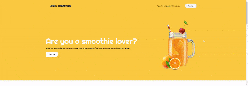
</style>To view the results, open up a CLI in the project directory and enter the following command: “npm run develop”. This will start up the application on a server that can be accessed via the provided URL. Below is the output upon running the application:
Using our page type to quickly create a new product page
In this section, we will examine how the previously established page type, along with its component picker, can be employed to generate a new landing page. By utilizing the component picker, we can also modify the layout of sections on the landing page without needing to edit the front-end code.
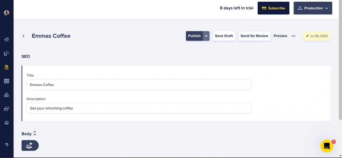
Within the ButterCMS dashboard, navigate to the Pages section within the left-side navigation menu, and click to access the Pages dashboard. In the newly opened window, select the New Page button. A drop-down menu will emerge; select "Smoothies landing page" to leverage the page type created earlier.
For the page and SEO component title on this page, we will input “Emmas Coffee".
Next, we will use the Body component picker to add our different components. We will add the “Hero block”, “Product block”, “About block” and “Contact block”. Note that, as a benefit of using the Body component picker we can easily drag around the component blocks to reorder them and change the structure of how the page appears. On this second page, we have the Product block appearing before the About block:
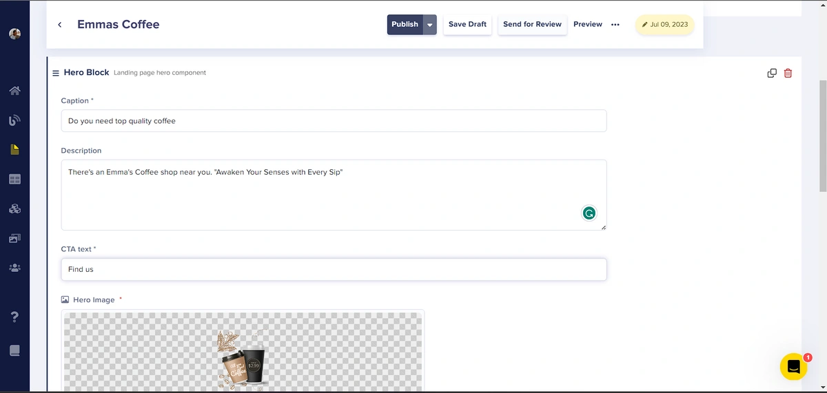
The Hero component:
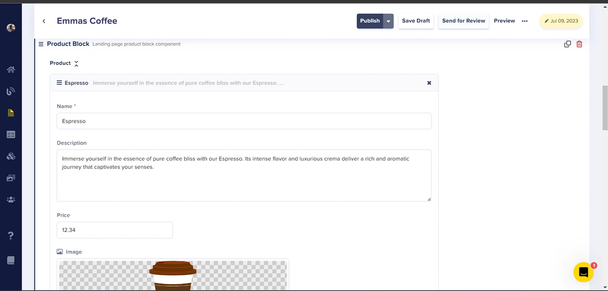
The Product component:
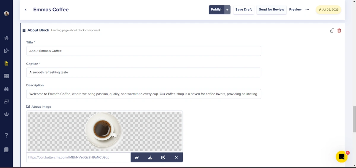
The About component:
The Contact component:

Final results
With the new product landing page setup complete, we can make use of this content to display the coffee landing page, we just need to update the id of the page to be fetched from ButterCMS. In the ./gridsome.server.js file, we will update the id smoothie-product-page with emmas-coffee:
const Butter =  require('./src/libs/butter.js');
// Server API makes it possible to hook into various parts of Gridsome
// on server-side and add custom data to the GraphQL data layer.
// Learn more: https://gridsome.org/docs/server-api/

// Changes here require a server restart.
// To restart press CTRL + C in terminal and run `gridsome develop`

module.exports = function(api) {
  api.loadSource(async ({ addCollection }) => {
    // Use the Data Store API here: https://gridsome.org/docs/data-store-api/

    // create a product page collection from the smoothies page collection type
    const product = addCollection({
      typeName: "product"
    });

    // retrieve the product page from Butter CMS
    const productResponse = await Butter.page.retrieve('smoothies_landing_page', 'emmas-coffee');


    // add the data to the product collection
    product.addNode({id: "emmas-coffee", ...productResponse.data.data.fields});

  });
  api.createPages(({ createPage }) => {
    // Use the Pages API here: https://gridsome.org/docs/pages-api/
  });
};
We also need to update the id in our query within the ./src/pages/index.vue file:
query {
  product(id: "emmas-coffee") {
    id
    seo {
      title
      description
    }
    body {
      type
      fields {
        caption
        description
        cta_text
        hero_image
        title
        about_image
        product {
          name
          description
          image
        }
        details
      }
    }
  }
}
Finally, we will also update the query in ./src/components/Header.vue:
<!-- ./src/components/Header.vue -->
<page-query>
{
  product(id: "emmas-coffee") {
    seo {
      title
      description
    }
  }
}
</page-query>
Now, if we run the application, we will get the following result:
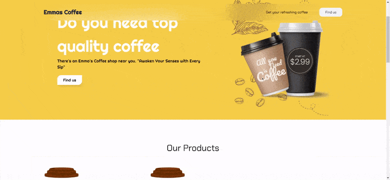
Note that the About section is now displayed after the Product section. This is due to the arrangement of the content structure on ButterCMS.
Closing thoughts
In conclusion, crafting dynamic landing pages with Gridsome and ButterCMS opens up a world of limitless creative possibilities. The seamless integration of Gridsome's performance-oriented framework and ButterCMS's headless content management system empowers developers to create engaging, dynamic landing pages which offer immense value to e-commerce brands by tailoring content to individual users, enhancing user engagement, and boosting conversion rates. To learn more about how you can use ButterCMS with Gridsome, check out the tutorials below.
