

- Why use Gatsby?
- Why use ButterCMS?
- Tutorial: Creating landing pages with Gatsby and ButterCMS
- Bootstrap your Gatsby app
- Installing TailwindCSS
- Setting up ButterCMS
- Building our components
- Create the Welcome component in ButterCMS
- Fetching the components from ButterCMS
- Creating and fetching the Features, Items, and Extra collections
- Closing thoughts
Landing pages are standalone web pages made especially for marketing or advertising efforts. They are the pages that visitors "land" on after clicking on an email link, an advertisement from Google, a Twitter link, or any other comparable website. Landing pages can also be Search Engine Results Pages (SERPs), depending on your search. This article will cover how to build and add landing pages to a Gatsby application. We will be fetching most of the data for our landing page from a headless CMS—ButterCMS to be precise.
Table of contents
Why use Gatsby?
There are lots of reasons for using Gatsby to create your applications. Some of them include performance, quality web experiences, speed, and different pre-rendering techniques.
Gatsby is an open-source static site generator (SSG) that uses GraphQL and Webpack as well as the front-end development framework React. It is used to create static web pages that adhere to the most recent web standards, are progressive web applications (PWA), and are speed- and security-optimized.
The Jamstack architecture, which combines JavaScript, APIs, and HTML without requiring a database or server-side programming language, powers Gatsby websites. With faster load times and simpler hosting and development, it is possible for Gatsby sites to be hosted by various means, such as through a content delivery network (CDN) or object storage service.
Performance is another priority when creating Gatsby websites. The end-user experience is significantly enhanced by pre-rendering pages as it decreases the requirement for servers to produce pages.
Why use ButterCMS?
ButterCMS is an amazing content management system built for a headless architecture. It is easy to use, comes with a nice component approach, and has great performance. The ButterCMS API is quick, straightforward, and simple to integrate into any application of your choice. Additionally, they offer SDKs for numerous programming languages. Butter stores multimedia materials on a low-latency CDN.
A headless CMS also offloads a lot of our work, freeing us up to concentrate on business needs. For instance, we may rely on the dashboard to give content editors a strong tool. The ability for editors to schedule content publication is a cool tool and makes ButterCMS a pleasure to work with. You can compose your content in advance and trust ButterCMS for publishing whenever you want. Additionally, we can configure roles and users by using the ButterCMS admin interface.

Tutorial: Creating landing pages with Gatsby and ButterCMS
We will be creating a landing page together from scratch in this section with Gatsby and TailwindCSS. We will put all the data in the application from the start and later we will transfer the data to ButterCMS and then fetch it from there. We will be working with TailwindCSS as it is a CSS framework built with utility in mind. It is low-level, extremely adaptable, and provides all the building blocks required to create custom designs without requiring you to struggle to override obnoxiously opinionated styles. Below is a preview of what we will be building:
Prerequisites
The following requirements are needed to follow along in this tutorial:
- Good grasp of JavaScript, Gatsby, React components, and hooks
- An understanding of APIs and how to fetch data from them
- How content management systems (CMSs) work
- CSS and how TailwindCSS works
- A ButterCMS account
- The Gatsby CLI installed
- Node.js installed
- Axios installed
Let's get started!!
Bootstrap your Gatsby app
Before creating a new Gatsby application, you need to make sure that you have the Gatsby CLI installed on your system. You can see how to get it from here. Once you have that installed, go ahead and run the command below on your terminal to create a new Gatsby app:
npm init gatsby
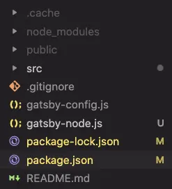
Answer the questions from the prompts and in no time you will have your created project.
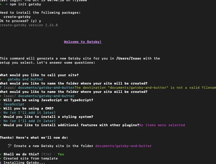
The image above shows what you should see on your terminal after creating a Gatsby project. Next, navigate to the project folder and open it in the code editor of your choice.
Installing TailwindCSS
Let’s learn how to install and use TailwindCSS in our Gatsby application. First, we run the command below to install Tailwind and its peer dependencies:
npm install -D tailwindcss postcss autoprefixer gatsby-plugin-postcssnpx
tailwindcss init -p
The next thing we need to do is to enable the Gatsby PostCSS plugin. In the gatsby-config.js file, enable the gatsby-plugin-postcss:
// gatsby.config.js
module.exports = {
  plugins: [
    'gatsby-plugin-postcss',
    // ...
  ],
}
Next, add the paths to the Tailwind template files in the tailwind.config.js file:
// tailwind.config.js

/** @type {import('tailwindcss').Config} */
module.exports = {
  content: [
    "./src/pages/**/*.{js,jsx,ts,tsx}",
    "./src/components/**/*.{js,jsx,ts,tsx}",
  ],
  theme: {
    extend: {},
  },
  plugins: [],
}
Create a styles/global.css file in the src folder and add the @tailwind directives.
@tailwind base;
@tailwind components;
@tailwind utilities;
Next, create a gatsby-browser.js file at the root of your project and import the created styles/global.css file into it:
import './src/styles/global.css'
And with that, we are done installing TailwindCSS in our project.
Setting up ButterCMS
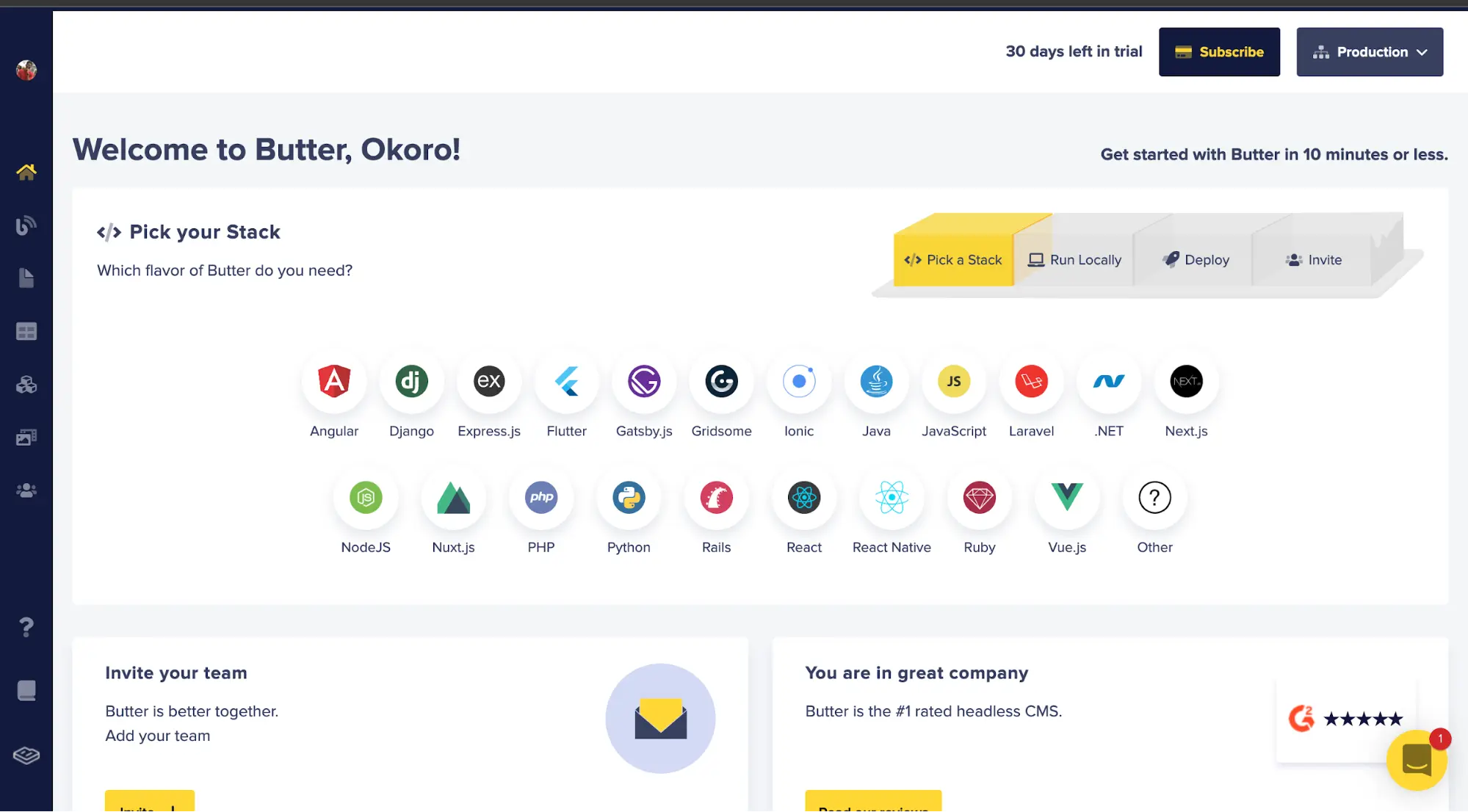
With Tailwind installed, let's set up our ButterCMS project and create the data that we will be using in our application. To start, we need to create a ButterCMS account, which we can do by clicking on the link here. Your dashboard should look like the image below after creating a ButterCMS account.
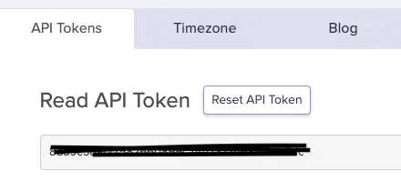
Next, we will create an API key that will enable us to make requests to and fetch data from ButterCMS. Go to your account and click on settings.
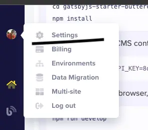
The image above shows where to get your API key. The next step is to copy your API key and keep it safe as we will be using it for fetching data.
With that done, let's install ButterCMS into our Gatsby project by running the command below:
npm install buttercms --saveNext, navigate to the gatsby-config.js file, copy the code below, and paste it in there.
require('dotenv').config({
path: `.env.${process.env.NODE_ENV}`,
});
module.exports = {
siteMetadata: {
title: `butter and gatsby`,
siteUrl: `https://www.yourdomain.tld`,
},
plugins: [
'gatsby-plugin-postcss',
{
resolve: `gatsby-source-buttercms`,
options: {
authToken: process.env.BUTTER_CMS_API_KEY,
},
},
],
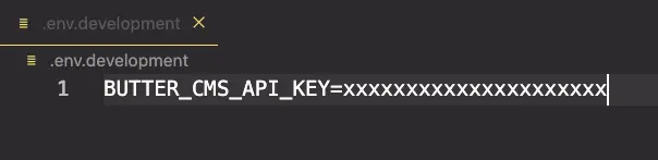
};We are resolving our ButterCMS plugin in the code block above. We are also pointing to the .env file that we will create to hold the API key that we got from ButterCMS. Create a .env.development file at the root of the folder and paste your API key into it. It should look like the image below:
Building our components
We will be building out the components of our application. As we build out the components, we will immediately import them into the src/pages/index.js file so that we can see them in the browser. Let's get started.
The Navigation component
Create another folder inside the src folder and name it the components folder. Inside the components folder, create a Navigation.js file and paste the code below into it:
import * as React from "react";
import { Link } from "gatsby";

const Navigation = () => {
  return (
    <div className="navigationPanel flex bg-zinc-800 justify-between px-4 pr-1 py-2 items-center text-white sm:pr-5">
      <h1 className="text-3xl italic text-green-400">KenIs Technologies</h1>
      <nav className="lg:w-1/4 hidden md:block md:w-1/3">
        <ul className="flex justify-between px-5">
          <li className="hover:underline hover:scale-105 transition-all duration-200">
            <Link to="/">Home</Link>
          </li>
          <li className="hover:underline hover:scale-105 transition-all duration-200">
            <Link to="/about">About</Link>
          </li>
          <li className="hover:underline hover:scale-105 transition-all duration-200">
            <Link to="/contact">Contact</Link>
          </li>
        </ul>
      </nav>

      <button className="shopNowButton text-white bg-emerald-500 py-3 px-2 rounded-2xl text-lg md:bg-green-400 md:text-black hover:scale-105 transition-all duration-300">
        Shop Now
      </button>
    </div>
  );
};


export default Navigation;
The code above is for the navbar section of our application. The code above will look like the image below:

The Welcome component
Create a Welcome.js file in the components folder and paste the code below into it:
import * as React from "react";

const Welcome = () => {
  return (
    <div className="welcomePanel flex flex-col justify-center items-center bg-slate-800 h-2/3 text-white">
      <h2 className="text-4xl mb-5 text-green-400">
        Welcome to KenIs technologies
      </h2>
      <p className="text-xl w-3/4 md:w-1/2 text-center mb-5">
        We are a software development company, that deal in all kind of tech
        gadgets, from LED monitors to customizable photochromic lens to protect
        your eyes during screentime.Lorem ipsum dolor sit, amet consectetur adipisicing elit. Aliquam
        assumenda aliquid magni laudantium consectetur ut eius tenetur sequi
        velit voluptate!
      </p>

      <div className="flex pt-8">
        <button className="bg-green-400 py-3 px-2 rounded-xl text-black mr-5 text-lg hover:text-red">
          Shop Now
        </button>

        <button className="bg-green-400 py-3 px-2 rounded-xl text-black text-lg">
          Dream it
        </button>
      </div>
    </div>
  );
};

export default Welcome;
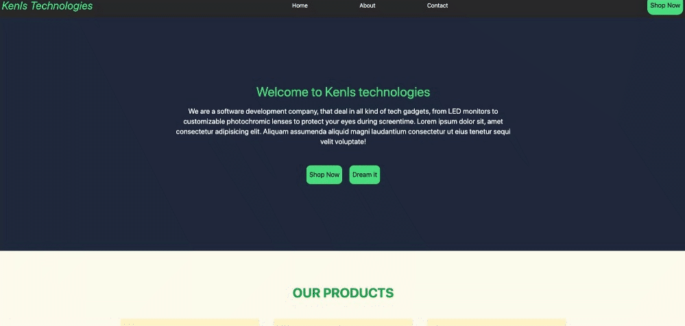
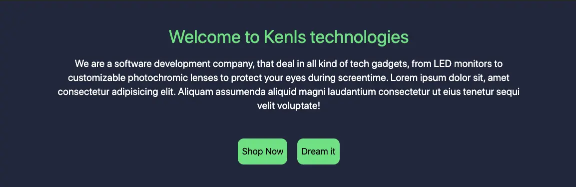
The code above is responsible for the welcome part of our application which looks something like the image below:
The Items components
This component will be in charge of displaying the services and products of our company. Create an Items.js file in the components folder and paste the code below into it:
import * as React from "react";
import pic1 from "../images/gadget1.jpeg";
import pic2 from "../images/gadget2.jpeg";
import pic3 from "../images/gadget3.jpeg";
import pic4 from "../images/gadget4.jpeg";
import pic5 from "../images/gadget5.jpeg";
import pic6 from "../images/gadget6.jpeg";

const Items = () => {
  const blogs = [
    {
      title: "Smartphones",
      body: "Lorem ipsum...",
      author: "Kene",
      id: 1,
      imgSrc: pic1,
    },
    {
      title: "Rock your World!",
      body: "Lorem ipsum...",
      author: "Isaac",
      id: 2,
      imgSrc: pic2,
    },
    {
      title: "Laptops",
      body: "Lorem ipsum...",
      author: "Kene",
      id: 3,
      imgSrc: pic3,
    },
    {
      title: "Hard drives and hard disks",
      body: "Lorem ipsum...",
      author: "Kene",
      id: 4,
      imgSrc: pic4,
    },
    {
      title: "Game dev tools",
      body: "Lorem ipsum...",
      author: "Kene",
      id: 5,
      imgSrc: pic5,
    },
    {
      title: "Macbooks",
      body: "Lorem ipsum...",
      author: "Kene",
      id: 6,
      imgSrc: pic6,
    },
  ];

  return (
    <div className="flex px-8 bg-amber-50 py-24 flex-col">
      <h1 className="flex justify-center uppercase text-4xl text-green-600 pb-8 font-bold">
        Our products
      </h1>

      <div className="items-container w-full flex flex-wrap justify-center lg:w-full xl:w-3/4 xl:m-auto">
        {blogs.map((blog) => (
          <div
            className="px-1 bg-amber-100 m-5 pt-5 pb-10 w-96 flex flex-col items-center rounded-md hover:bg-yellow-100 hover:shadow-sm hover:-translate-y-1 transition-all duration-300"
            key={blog.id}
          >
            <img className="self-stretch" src={blog.imgSrc} />
            <h2 className="text-xl text-green-600 uppercase m-2 font-bold">
              {blog.title}
            </h2>
            <p className="text-lg italic">Written by {blog.author} </p>
          </div>
        ))}
      </div>
    </div>
  );
};

export default Items;
The code above is responsible for creating the image below:

The Features component
This will be the component that will hold some unique features of the company. Create a Features.js file in the folder component and paste the code below into it:
import * as React from "react";
import icon from "../images/banknote.svg";
const Features = () => {
const feats = [
{
id: 1,
imgSrc: icon,
description: "Multiple Payment Options",
},
{
id: 2,
imgSrc: icon,
description: "24/7 Customer Service",
},
{
id: 3,
imgSrc: icon,
description: "Extensive product Information",
},
{
id: 4,
imgSrc: icon,
description: "User reviews on all our products",
},
{ id: 5, imgSrc: icon, description: "Secure Details" },
{
id: 6,
imgSrc: icon,
description: "Product filtering and sorting",
},
];
return (
<div className="py-24">
<h1 className="flex justify-center uppercase text-4xl text-green-600 pb-8 font-bold">
Our main features
</h1>
<div className="w-full flex flex-wrap justify-center">
{feats.map((feat) => (
<div className="px-1 bg-amber-50 m-5 mb-8 pt-5 pb-10 w-96 flex flex-col items-center rounded-md hover:bg-amber-100 hover:-translate-y-1 transition-all duration-300">
<img className="mb-5" src={feat.imgSrc} />
<h2 className="text-lg italic">{feat.description}</h2>
</div>
))}
</div>
</div>
);
};
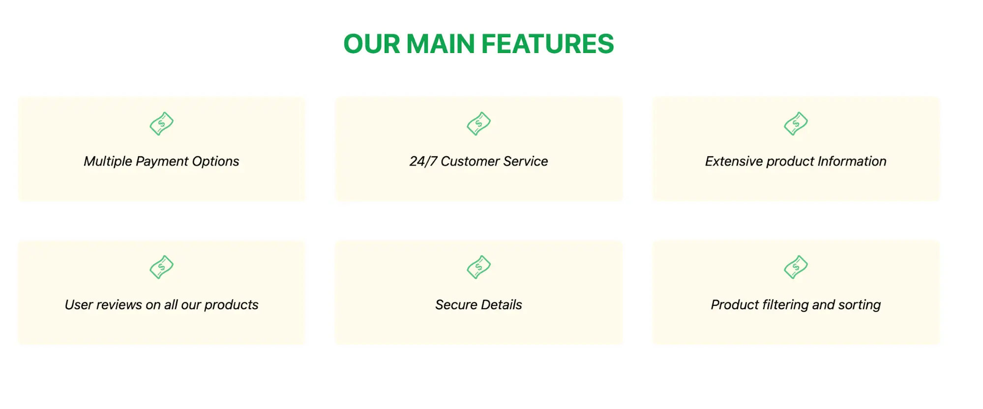
export default Features;The code above will render the image below on the browser
The Extra component
This section will showcase some other services our company offers and which we want to include in our landing page.
import * as React from "react";
import pic1 from "../images/gadget1.jpeg";
import pic2 from "../images/gadget5.jpeg";
import pic3 from "../images/gadget6.jpeg";

const Extra = () => {
  const offers = [
    {
      title: "Software engineering internships",
      body: "We offer Internships to students who are registered with us and complete our training programme and pass with flying colours",
      id: 1,
      imgSrc: pic1,
    },
    {
      title: "Mentorship programmes",
      body: "As a techie, you may often be confused, need some professional guidance or perhaps someone to teach you about the real-world dev life. Enroll in our mentorship programme today!",
      id: 2,
      imgSrc: pic2,
    },
    {
      title: "Councelling",
      body: "We offer career and mental to anyone who needs it for no cost at all. E no easy to live for Naija, and we understand. Book a councelling session now!",
      author: "Kene",
      id: 3,
      imgSrc: pic3,
    },
  ];

  return (
    <div className="flex px-8 bg-amber-50 py-24 flex-col">
      <h1 className="flex justify-center uppercase text-4xl text-green-600 pb-8 font-bold">
        More from us
      </h1>

      <div className="items-container w-full flex flex-wrap justify-center">
        {offers.map((offer) => (
          <div
            className="px-0 bg-amber-100 m-5 pt-0 pb-10 w-96 flex flex-col items-center rounded-lg overflow-hidden hover:bg-amber-200 hover:-translate-y-1 transition-all duration-300"
            key={offer.id}
          >
            <img className="self-stretch" src={offer.imgSrc} />
            <h2 className="text-xl text-green-600 uppercase m-2 font-bold text-center">
              {offer.title}
            </h2>
            <p className="text-lg italic px-3 text-center mt-3">
              {offer.body}{" "}
            </p>
          </div>
        ))}
      </div>
    </div>
  );
};

export default Extra;
The code above will render the image below on the browser:

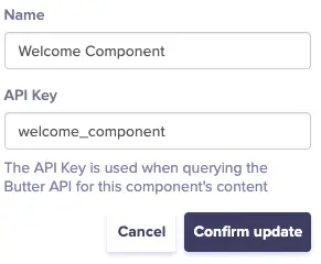
Create the Welcome component in ButterCMS
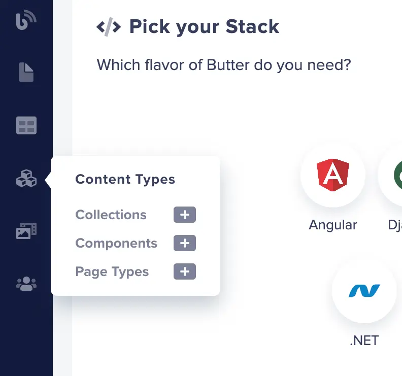
Navigate to the ButterCMS dashboard and then go to components:
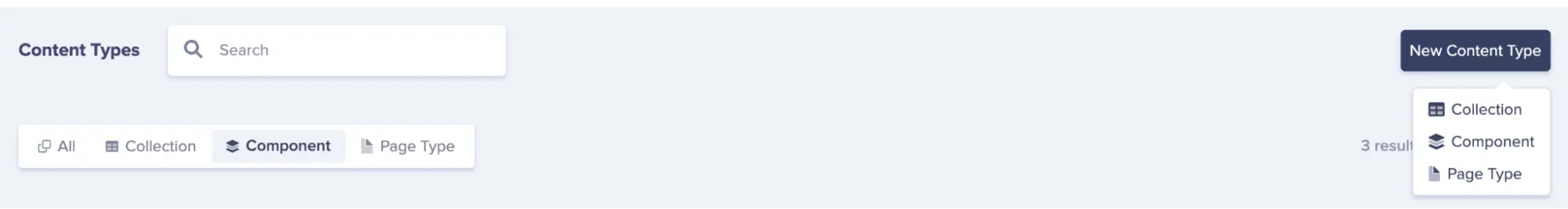
Delete the default components created by ButterCMS and let's create our first component which will be the Welcome component. Click on the New Content Type button and select Component from the drop-down menu as shown in the image below:
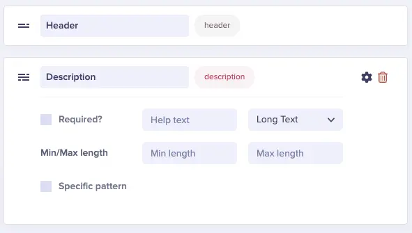
Add the following fields:
Short textasHeaderLong textasDescription
Click on Create Component at the top of the page and add the name you want for the component.
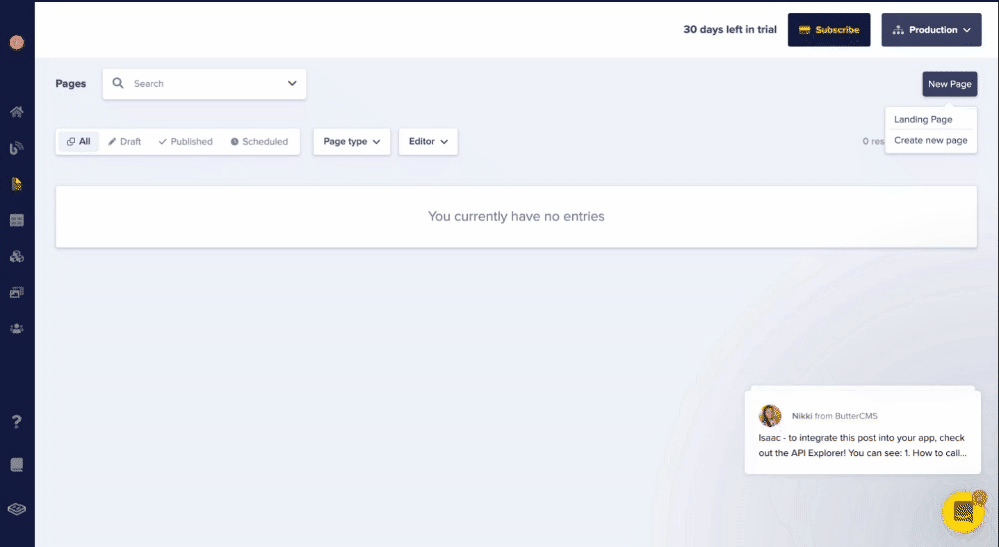
Next, navigate to the Pages tab.
Click on New Page, then click on Create New Page. Click on Component, and then click Add from Library.
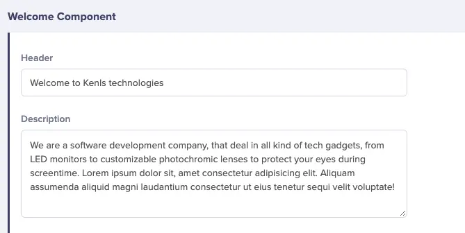
Select the newly created Welcome component and then proceed to save the Page Metadata.
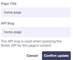
Next, fill in the fields with the same data from the Welcome component that we created in our Gatsby application.
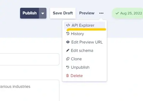
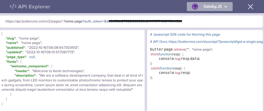
Click on the Publish button to save the changes. Now, let's test the API which we will be making our requests to.
When we click on API Explorer, we can see the results posted and how we can make a fetch request to it.
Now, all we need to do is navigate to our code editor and make a request for the data. Let's do so in the Welcome.js file which will be covered in the next section.
Fetching the components from ButterCMS
This section will cover how to fetch the created component from ButterCMS into our Gatsby application. Copy the code below and update the Welcome.js file.
import * as React from 'react';
import axios from 'axios';
const URL = `https://api.buttercms.com/v2/pages/*/home-page?auth_token=${process.env.BUTTER_CMS_API_KEY}`;
const Welcome = () => {

  const [data, setData] = React.useState(null);
  React.useEffect(() => {
    axios.get(URL)
      .then(res => console.log(res?.data?.data?.fields?.welcome_component))
      .catch(err => console.log(err));
  }, []);

  return (
    <div className="welcomePanel flex flex-col justify-center items-center bg-slate-800 h-2/3 text-white">
      // This stays the same
    </div>
  );
};
export default Welcome;
We installed and imported axios to make our request. Next, we defined the URL to which we will be making our requests and then created a way to handle our state. We made a request to the defined URL and then logged the results to the console.

Now, all we need to do is just pass the data to be rendered on the page.
import * as React from 'react';
import axios from 'axios';
const URL = `https://api.buttercms.com/v2/pages/*/home-page?auth_token=${process.env.BUTTER_CMS_API_KEY}`;
const Welcome = () => {

  const [data, setData] = React.useState(null);
  React.useEffect(() => {
    axios.get(URL)
      .then(res => setData(res?.data?.data?.fields?.welcome_component))
      .catch(err => console.log(err));
  }, []);

  return (
    <div className="welcomePanel flex flex-col justify-center items-center bg-slate-800 h-2/3 text-white">
      <h2 className="text-4xl mb-5 text-green-400">
        {data?.header}
      </h2>
      <p className="text-xl w-3/4 md:w-1/2 text-center mb-5">
        {data?.description}
      </p>
      <div className="flex pt-8">
        <button className="bg-green-400 py-3 px-2 rounded-xl text-black mr-5 text-lg hover:text-red">
          Shop Now
        </button>
        <button className="bg-green-400 py-3 px-2 rounded-xl text-black text-lg">
          Dream it
        </button>
      </div>
    </div>
  );
};
export default Welcome;
With that done, we have successfully fetched and rendered our data from ButterCMS.
Creating and fetching the Features, Items, and Extra collections
Since we are mapping through and displaying data in the Features.js, Items.js, and Extra.js files, we will be making use of the collections part of ButterCMS. You can find out more about why you will want to use ButterCMS collections here.
Navigate to the Collections tab in the side menu and click on New Item. We will begin with the Extra collection that will hold our different services.
Configure your collection to have the following fields:
MediaasImageNumberasIdShort textasTitleLong textasbody
Next, save the collection's name.
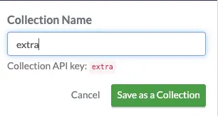
Create and configure the following collections by following the steps discussed earlier.
Configure your Item collection to have the following fields:
MediaasImageNumberasIdShort textasTitleLong textasbodyShort textasauthor
Finally, configure your Features collection to have the following fields:
MediaasIconNumberasIdLong textasdescription
Now go to the Collections section, select New Item, pick Extra from the drop-down menu, and fill in the data for the Extra collection.

Do the same for as many entries as you have in the Extra.js file. Click on the Publish button when done and then click on API Explorer to see the data and how to fetch it.
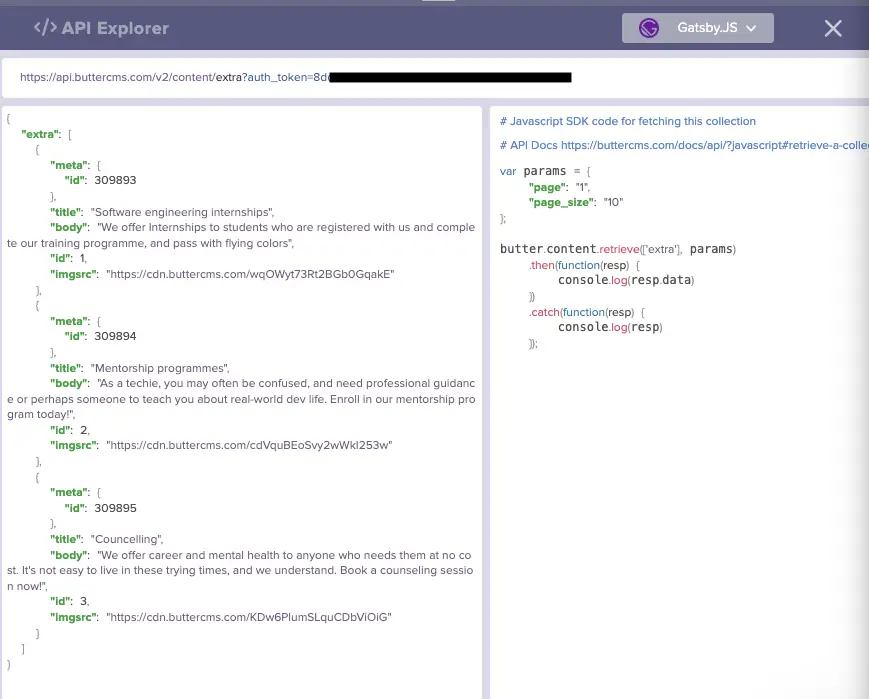
Now, go to the Extra.js file.
import * as React from "react";
import axios from "axios";
const URL = `https://api.buttercms.com/v2/content/extra?auth_token=${process.env.BUTTER_CMS_API_KEY}`;
const Extra = () => {
const [datas, setDatas] = React.useState([]);
React.useEffect(() => {
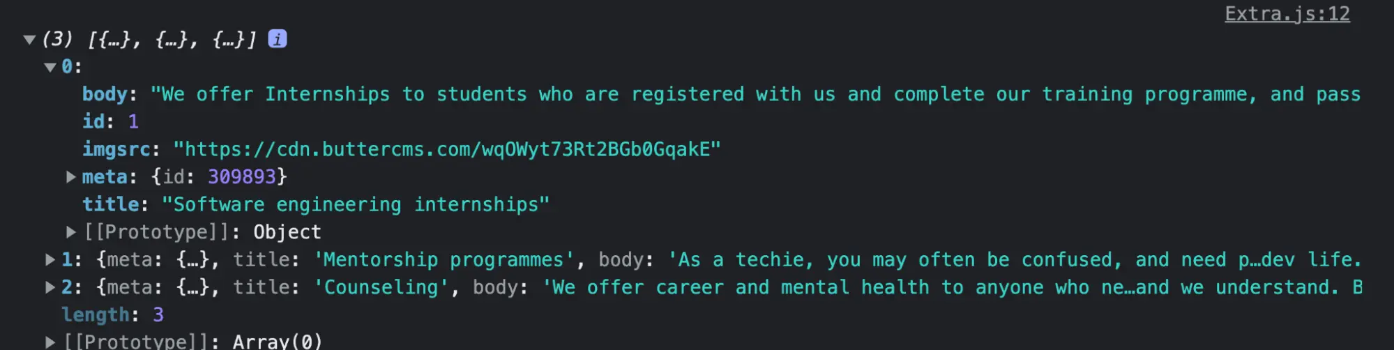
axios.get(URL).then((res) => {
console.log(res?.data?.data?.extra);
});
}, []);
return (
<div className="flex px-8 bg-amber-50 py-24 flex-col">
// This stays the same
</div>
);
};
export default Extra;We defined the URL for our request and created our state. Next, we made a request to the URL and then logged the result to the console.
Now, pass the data to be rendered.
import * as React from "react";
import axios from "axios";
const URL = `https://api.buttercms.com/v2/content/extra?auth_token=${process.env.BUTTER_CMS_API_KEY}`;
const Extra = () => {
  const [datas, setDatas] = React.useState([]);
  React.useEffect(() => {
    axios.get(URL).then((res) => {
      setDatas(res?.data?.data?.extra);
    });
  }, []);
  return (
    <div className="flex px-8 bg-amber-50 py-24 flex-col">
      <h1 className="flex justify-center uppercase text-4xl text-green-600 pb-8 font-bold">
        More from us
      </h1>
      <div className="items-container w-full flex flex-wrap justify-center">
        {datas.map((data) => (
          <div
            className="px-0 bg-amber-100 m-5 pt-0 pb-10 w-96 flex flex-col items-center rounded-lg overflow-hidden hover:bg-amber-200 hover:-translate-y-1 transition-all duration-300"
            key={data.id}
          >
            <img className="self-stretch" src={data.imgSrc} alt='' />
            <h2 className="text-xl text-green-600 uppercase m-2 font-bold text-center">
              {data.title}
            </h2>
            <p className="text-lg italic px-3 text-center mt-3">
              {data.body}
            </p>
          </div>
        ))}
      </div>
    </div>
  );
};
export default Extra;
With that done, we see that the component is still rendering as it should. Now, follow the steps above for creating and fetching the Features and Items collections from ButterCMS.
With our progress so far, we should be able to achieve the results below.
Welcome component:
Item component:
Feature component:
Extra component:
Closing thoughts
This tutorial covered how to create a landing page with Gatsby and TailwindCSS and how to connect it to ButterCMS, which is an amazing content management system with great performance. We learned how to use ButterCMS pages, components, and collections. We also learned how to manage our page content from ButterCMS.
Changing or updating content on your page is as easy as updating the collection item that is referenced in ButterCMS. We used Gatsby in this tutorial because it is a static site generator that comes with benefits such as speed, SEO, security, accessibility, and extensibility. It is also easy to pick up if you already have knowledge of React. You can also take this further by adding some other components like hero images or values which you offer to your landing page. Congratulations on making it to this point and here is a link to the source code for this tutorial on Github.

