
- React Native basics and the virtual DOM
- Tutorial: Build & Add Landing Pages to a React Native Application
- 3 examples of React Native landing pages to take inspiration from
- React Native landing page best practices and resources
- FAQ: How can I efficiently use React Native's component-based architecture to enhance user interfaces?
- Closing thoughts
Creating a landing page with an excellent user experience is crucial—it's the best way to engage visitors and turn them into raving customers. A poor user experience, on the other hand, can lead to high bounce rates and missed opportunities.
Thank goodness React Native provides a proven solution for developing landing pages that are both performant and responsive. You don’t have to look further.
This guide will walk you through creating a React Native landing page using ButterCMS. If you are a developer looking for an easy way to create an effective landing page, this will greatly help you
Table of contents
React Native basics and the virtual DOM
React Native is a popular framework for building mobile applications using JavaScript and React. It allows developers to use the same codebase for iOS and Android platforms, leading to efficient development cycles.
Features of React Native include:
- Live reload: React Native has an intriguing extra feature not present in other native frameworks—the live reload function, which allows you to immediately see the effect of the most recent adjustment you have made to the code.
- Third-party library support: Node Package Manager (NPM) is used to install React Native, and it is pretty simple to use. Most JavaScript programmers are familiar with NPM, and it's easy for beginners to understand NPM commands. The third-party library provides native app functionality that is not accessible in React Native. According to the React Native documentation, there are several functionalities that are not accessible (such as maps). As a result, we must incorporate third-party libraries into our project.
- Code reusability: React Native uses JavaScript, which is commonly known as one of the most well-known and high-level interpreted programming languages. It is simpler to read and debug in comparison with other languages like Java or Swift. In addition, JavaScript enables code reuse, which speeds up app development. React Native's modular nature makes the code easier to comprehend and maintain. Developers can now share similar code across platforms with little effort and expense, saving time and money on mobile app development.
- User interface improvements: React Native's JSX lets you create user interfaces with JavaScript. It allows you to develop a highly interactive UI for your app while avoiding platform requirements. It's important because user interfaces in React are built using declarative programming, which reduces coding errors and makes it very easy to discover where things go wrong when they do.
While the traditional React library uses a Virtual DOM to update the UI efficiently, React Native employs a bridge to communicate with native components, optimizing updates for mobile performance. This bridge ensures your app can achieve high-performance standards and smooth user interactions. For more advanced UI transitions, consider incorporating libraries like Reanimated to enhance the user experience.
Enhance Your React Native App’s UX with Dark Mode—Learn How Now!
Read the tutorialTutorial: Build & Add Landing Pages to a React Native Application
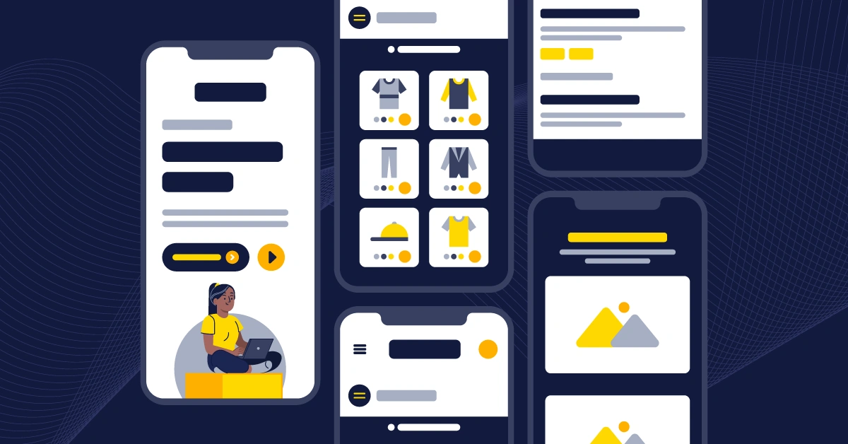
In this tutorial, we'll build a landing page that contains several different sections with React Native. Here's a GIF showing what we'll build in this tutorial:

Tutorial prerequisites
To follow this tutorial, ensure you have the following:
- Access to a headless cms like ButterCMS. Start a 14-day trial now.
- Basic knowledge of React Native.
- React Native set up on your device.
- An Android and iOS simulator to test the application (You can learn more about setting up a simulator for React Native here.)
- A code editor for writing and editing our code (I recommend VS Code.)
The code for this tutorial can be found in this GitHub repo.
Step 1: Set up your development environment
Ensure you have the latest version of React Native installed:
In your terminal, type these commands to create an application.
 npx create-expo-app buttercms-landing-page

 cd buttercms-landing-page
To start the application, type the following:
npx expo start
Then, choose the simulator you want to run the application.
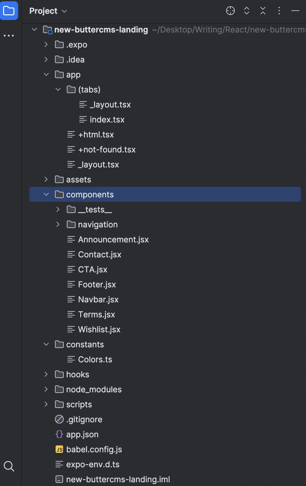
Step 2: Set up the React Native application
React Native follows a component-based design similar to React whereby the user interface is separated into multiple sections called components. For the landing page in React JS, you will create multiple components.
In the components folder, create the following files: Announcement.jsx, Contact.jsx, CTA.jsx, Footer.jsx, Navbar.jsx, Terms.jsx, and Wishlist.jsx:
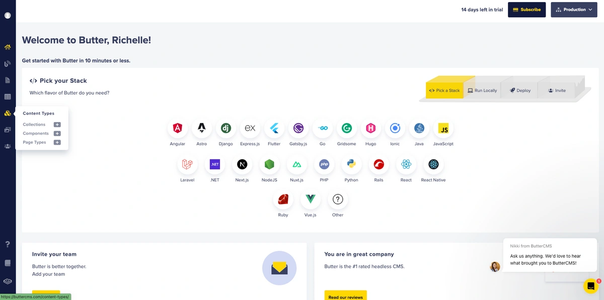
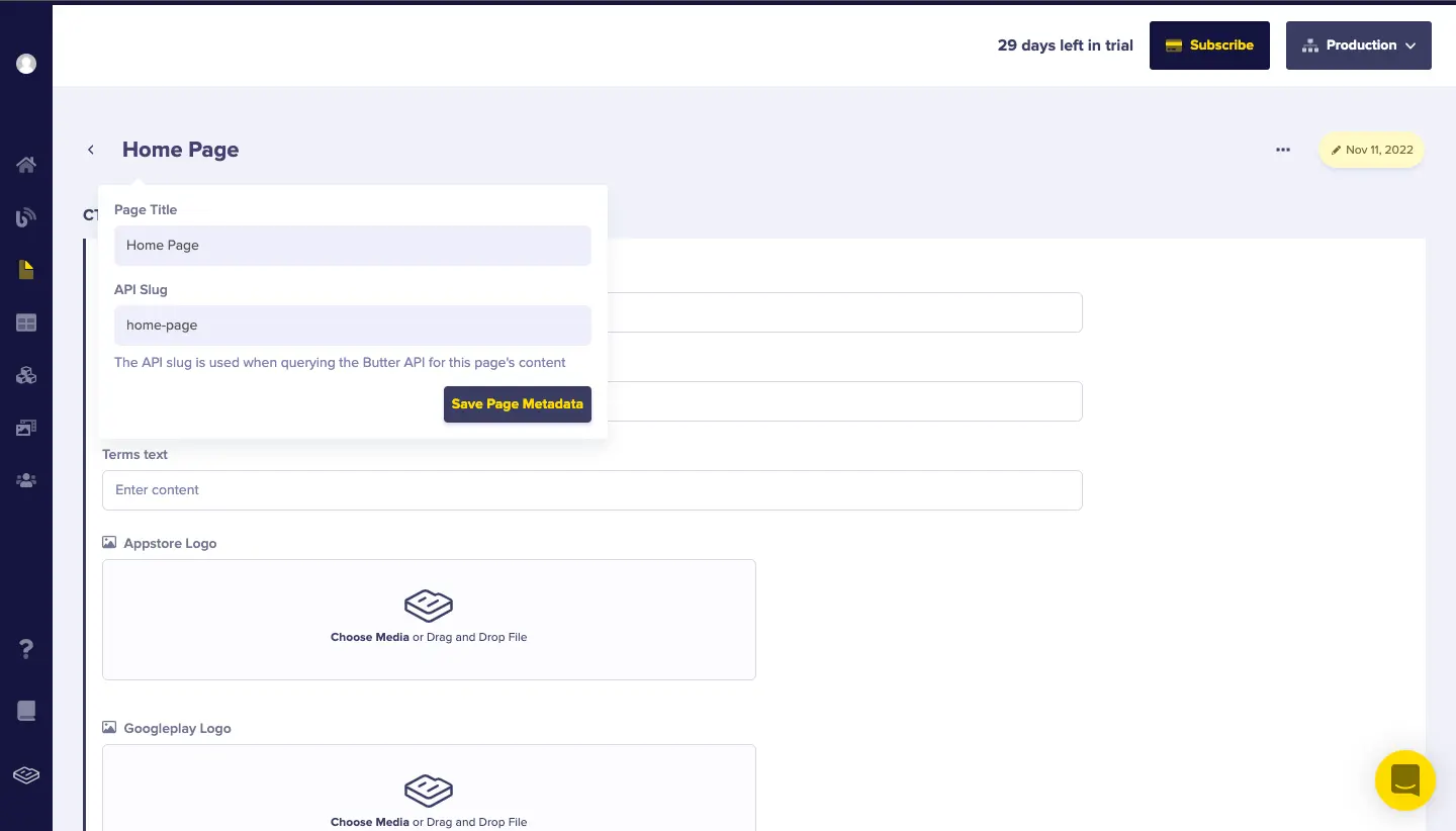
Step 3: Create the landing page in ButterCMS
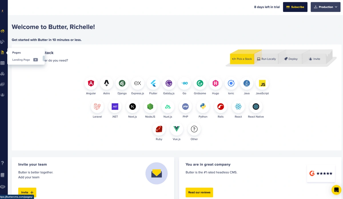
To start building our landing page with ButterCMS, head over to the ButterCMS website. Then, sign up and create an account. If you already have an existing account, log in with your credentials, and you will be directed to your dashboard.
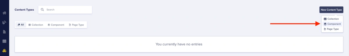
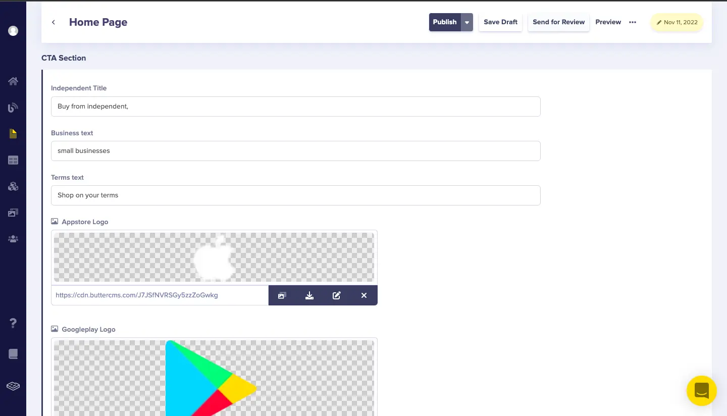
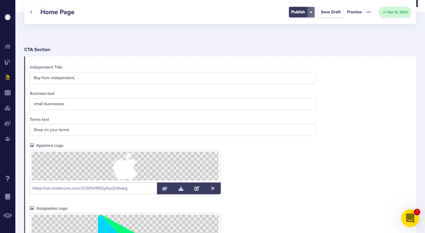
Build the CTA component
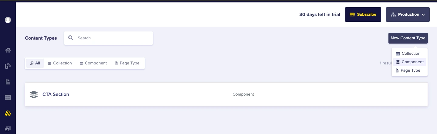
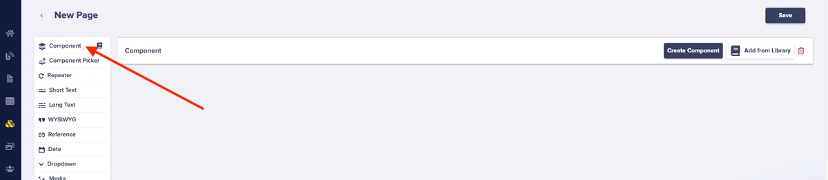
Head to the sidebar of the dashboard, hover over Content Types and click on Components.
You will find the default components on this page, which you will delete. Create your custom component by following the steps below.
Add our texts as short text fields and our App Store and Google Play logos as media fields.
- Short text ⇢ independent_title
-
Short text ⇢ business_text
-
Short text ⇢ terms_text
-
Media ⇢ appstore_logo
-
Media ⇢ googleplay_logo
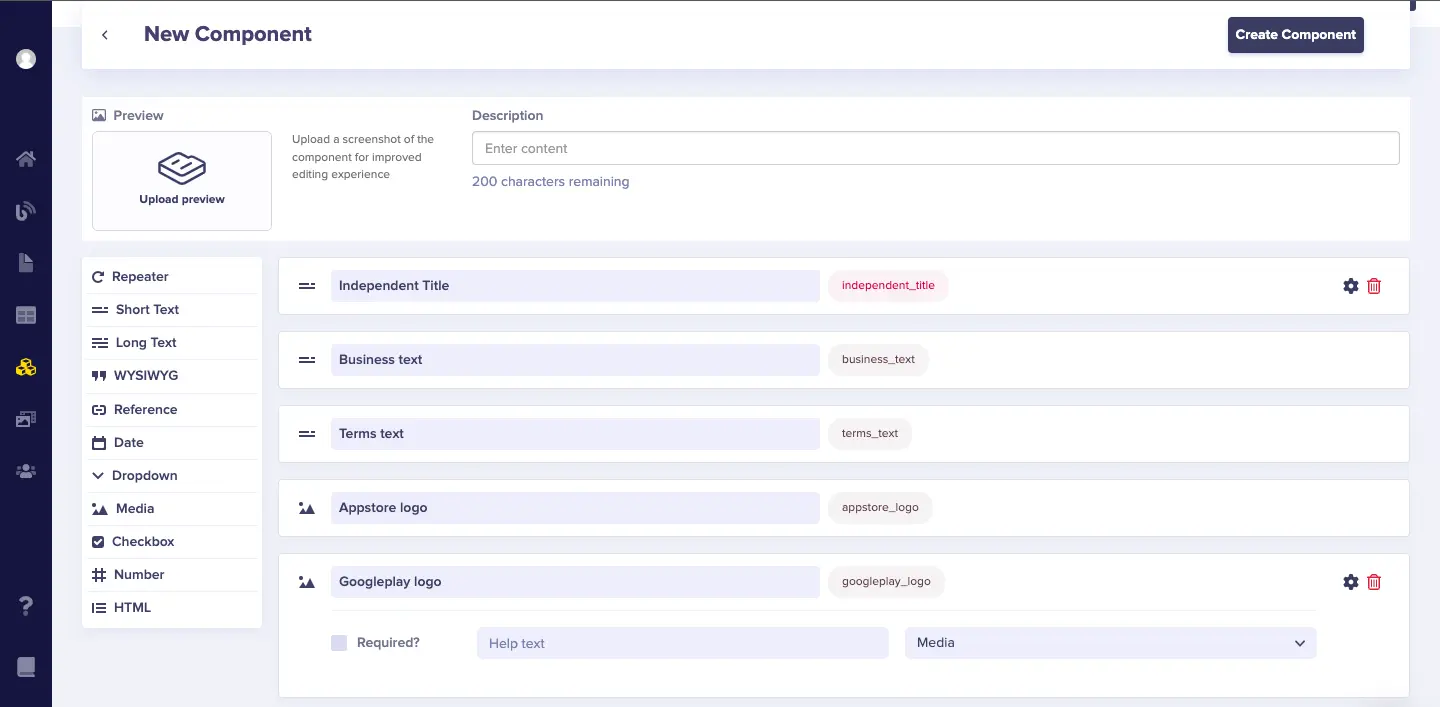
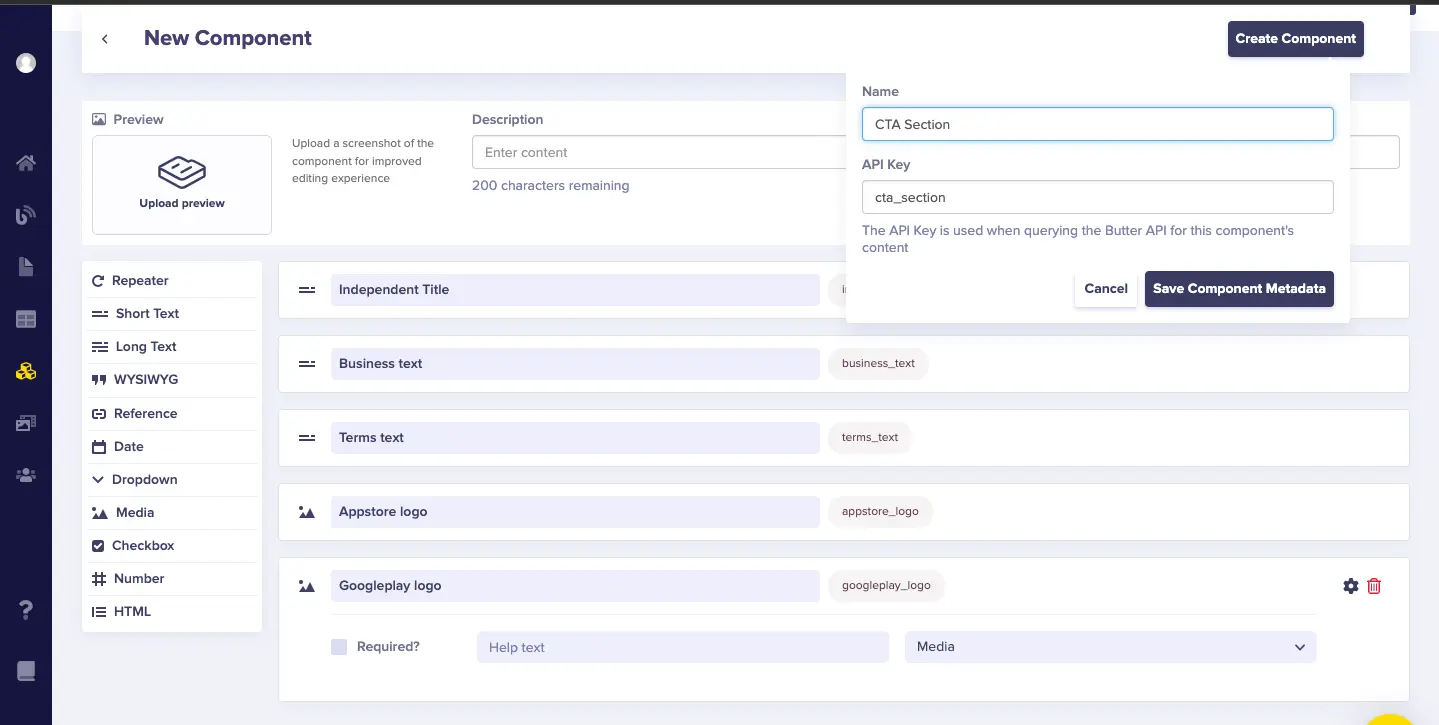
Then, click the Create Component button and name the component as “CTA Section.”
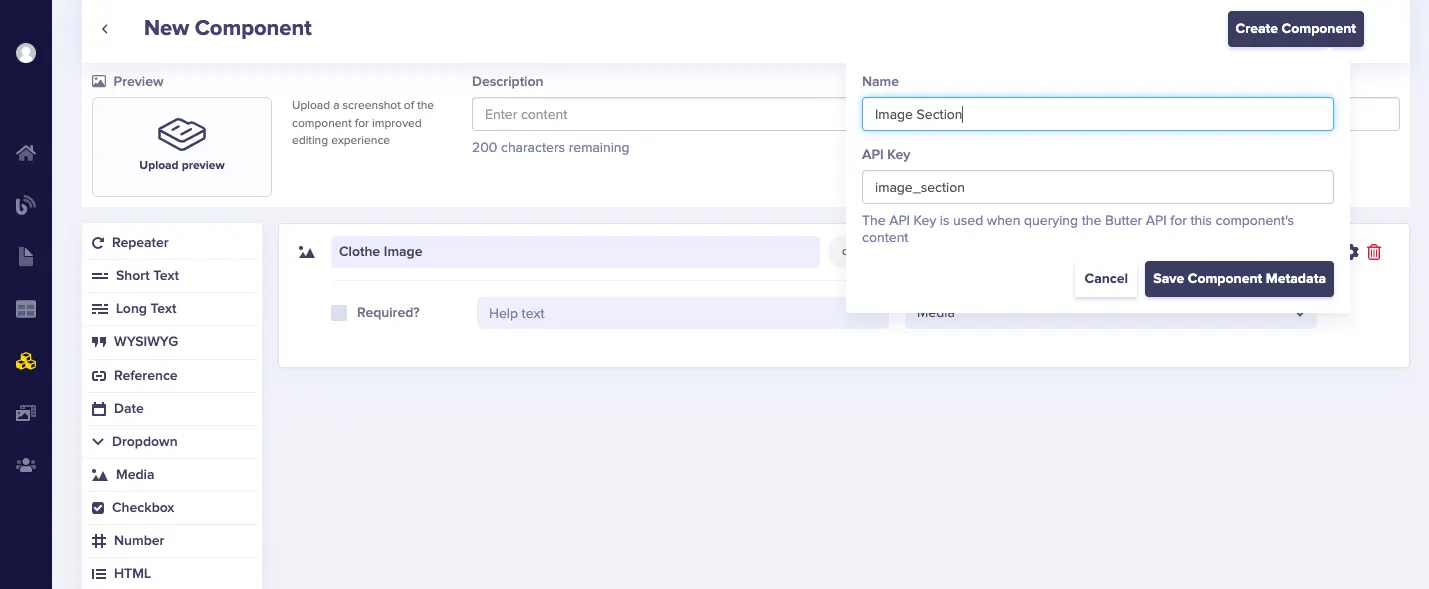
Create Image component
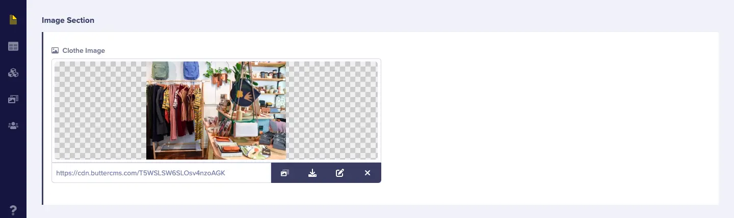
Now, the CTA Section component in ButterCMS is done. You will now create the Image component:
But first, add the fields. The Image component is just an image, so we’ll add the picture as a media field in ButterCMS and save the component.
-
Media ⇢ clothes_image
Then, save it as “Image Section.”
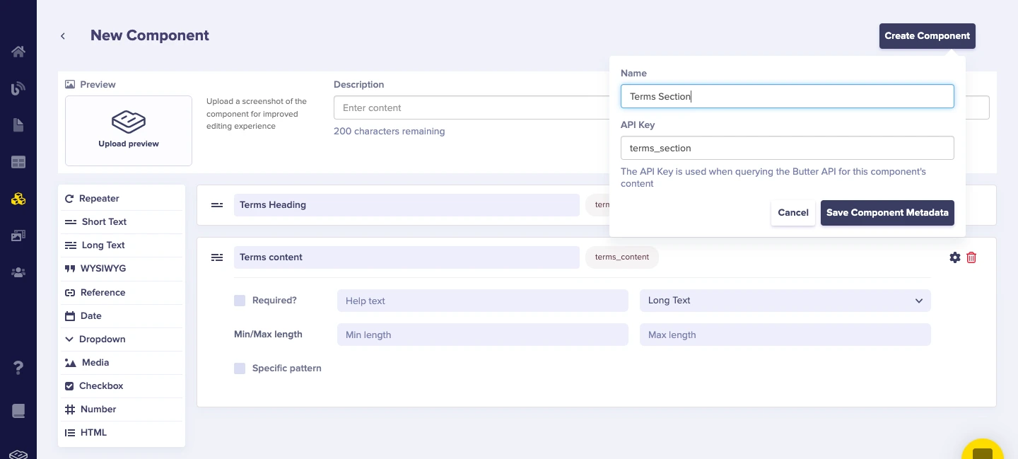
Create Terms Section component
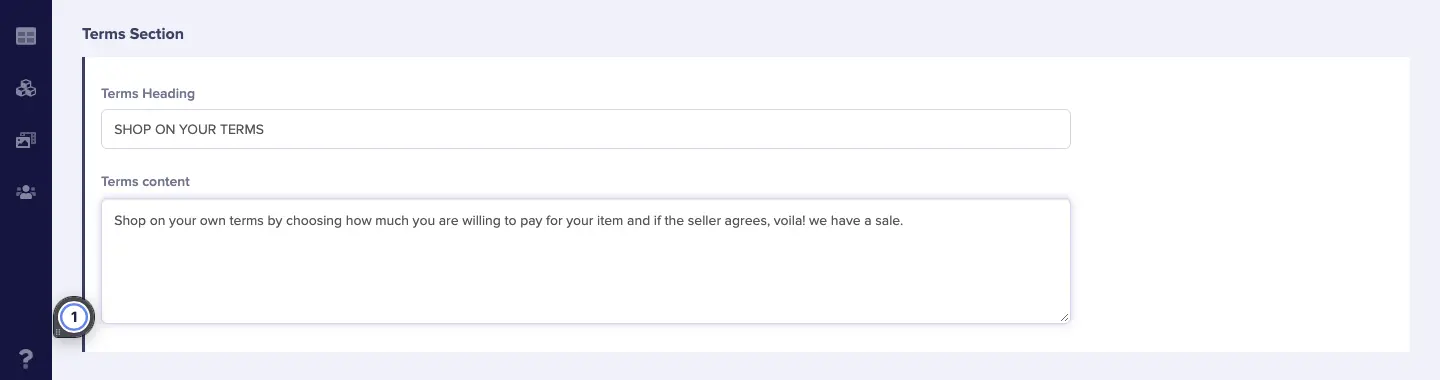
Create a new component just as we did with the other components, but this time, our Terms Section will need a short text and long text field for the terms heading and terms text, respectively.
-
Short text ⇢ terms_heading
-
Long text ⇢terms_content
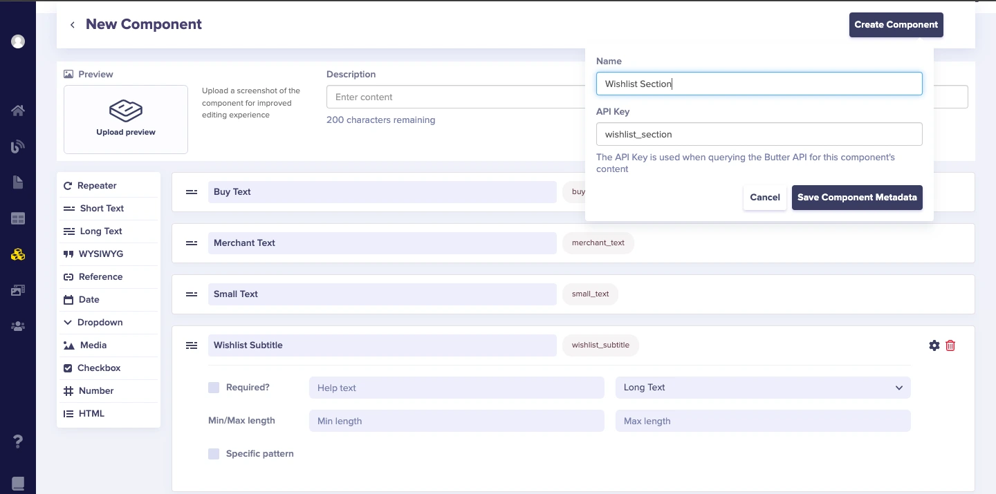
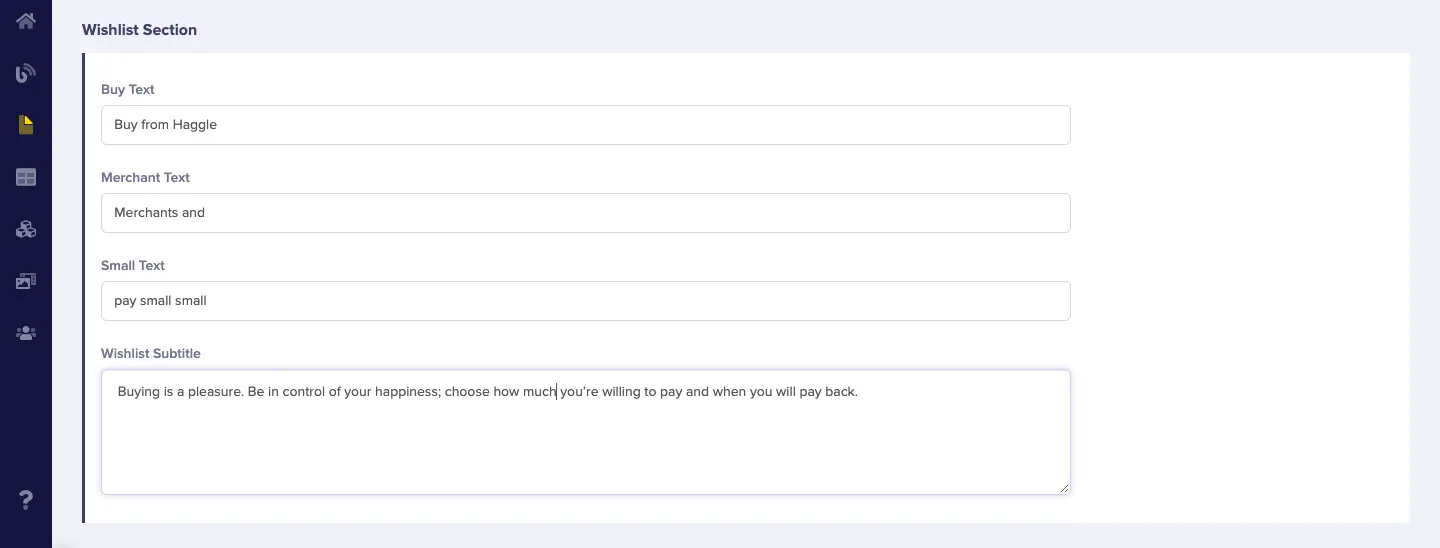
Create Wishlist Section component
The Wishlist section contains text fields, such as:
-
Short text ⇢ buy_text
-
Short text ⇢ merchant_text
-
Short text ⇢ small_text
-
Long text ⇢ wishlist_subtitle
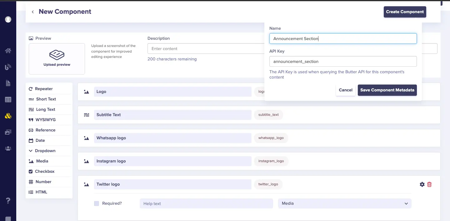
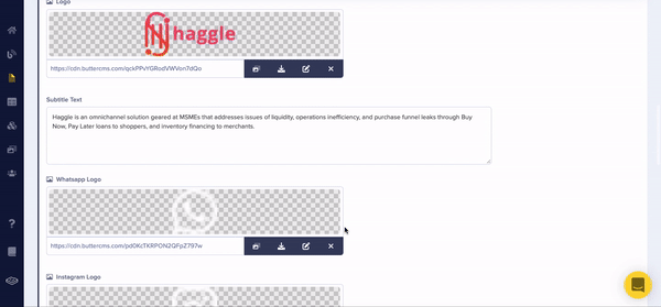
Create Announcement section component
The Announcement components contain the following fields:
-
Media ⇢ logo
-
Long text ⇢ subtitle_text
-
Media ⇢ whatsapp_logo
-
Media ⇢ instagram_logo
-
Media ⇢ twitter_logo
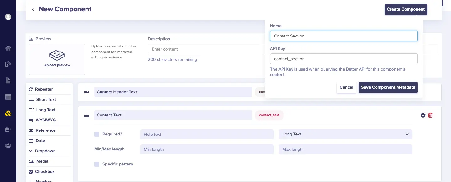
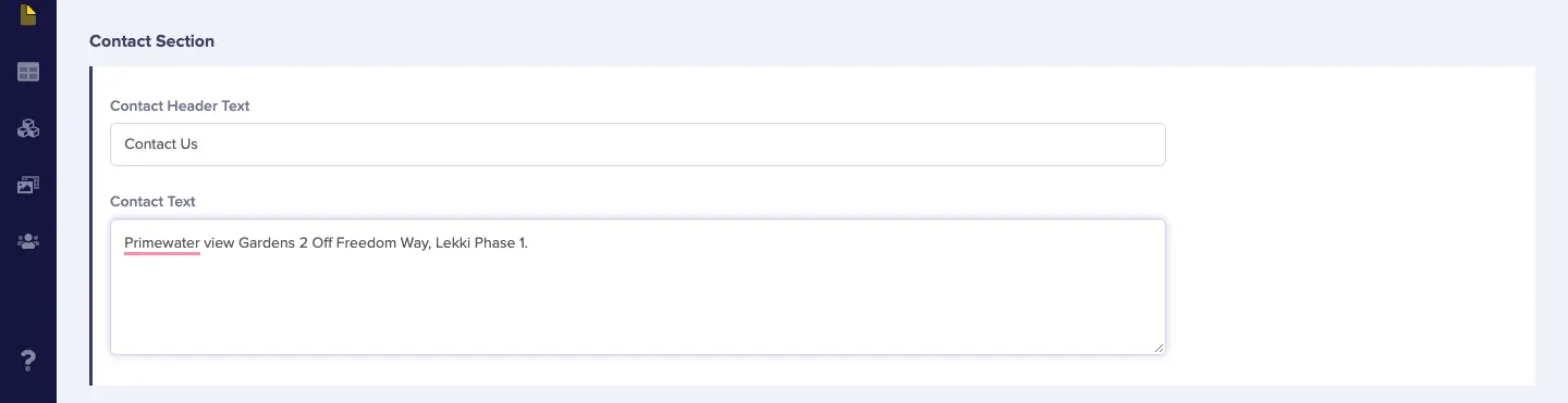
Create a Contact section component
The Contact component contains the following fields:
-
Short text ⇢ contact_header_text
-
Long text ⇢ contact_text
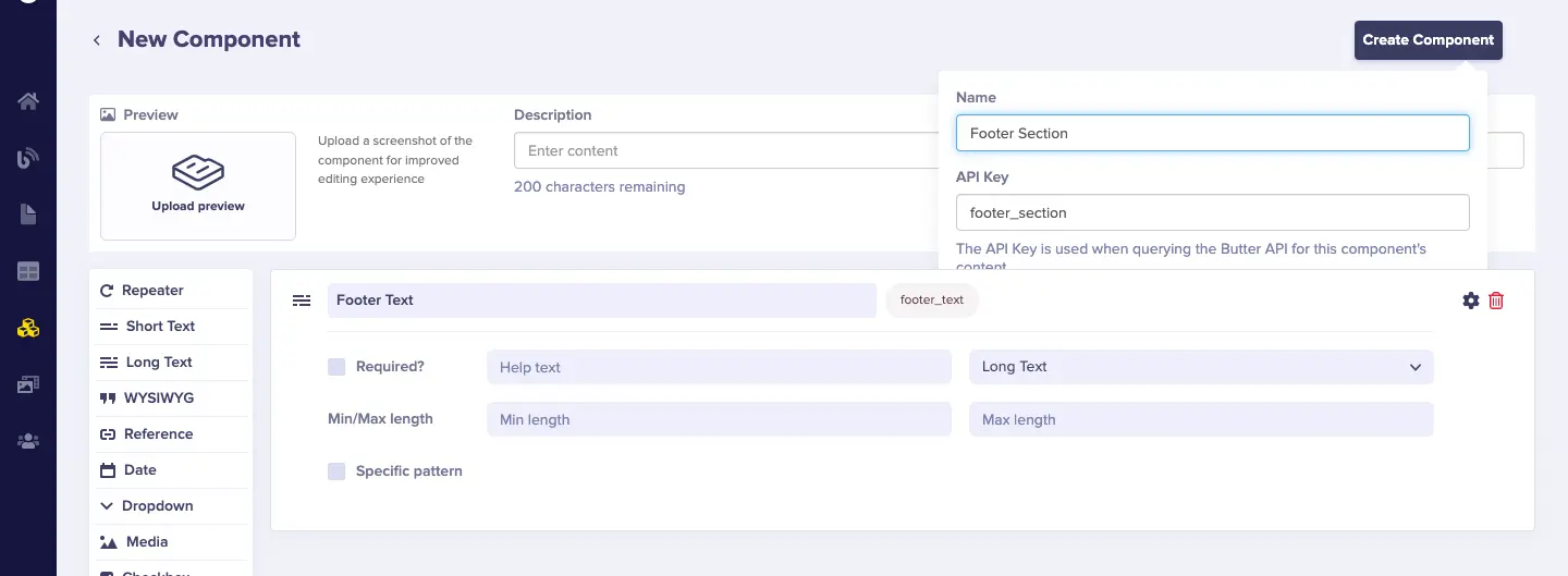
Create a Footer section component
The Footer component contains the following fields:
-
Long text ⇢ footer_text
Now, we’re done creating the components we need for our landing page in ButterCMS.
Building our landing page using components
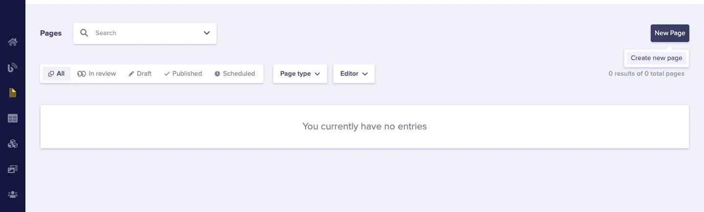
Next, head to Pages and create one in our ButterCMS dashboard.
Create a new page by clicking on the New Page button and then clicking on Create New Page.
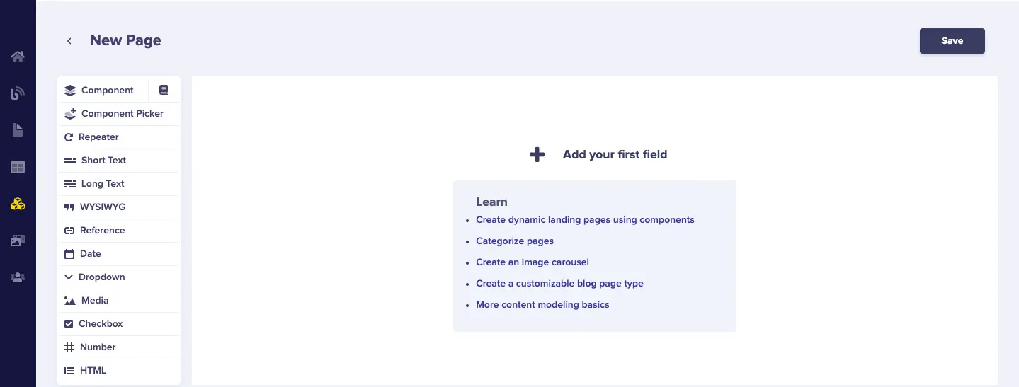
Here's a view of what you'll get when you create a new page:
Get started by adding our components:
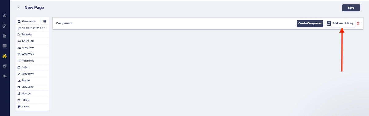
Next, click on Add from Library to import our components.
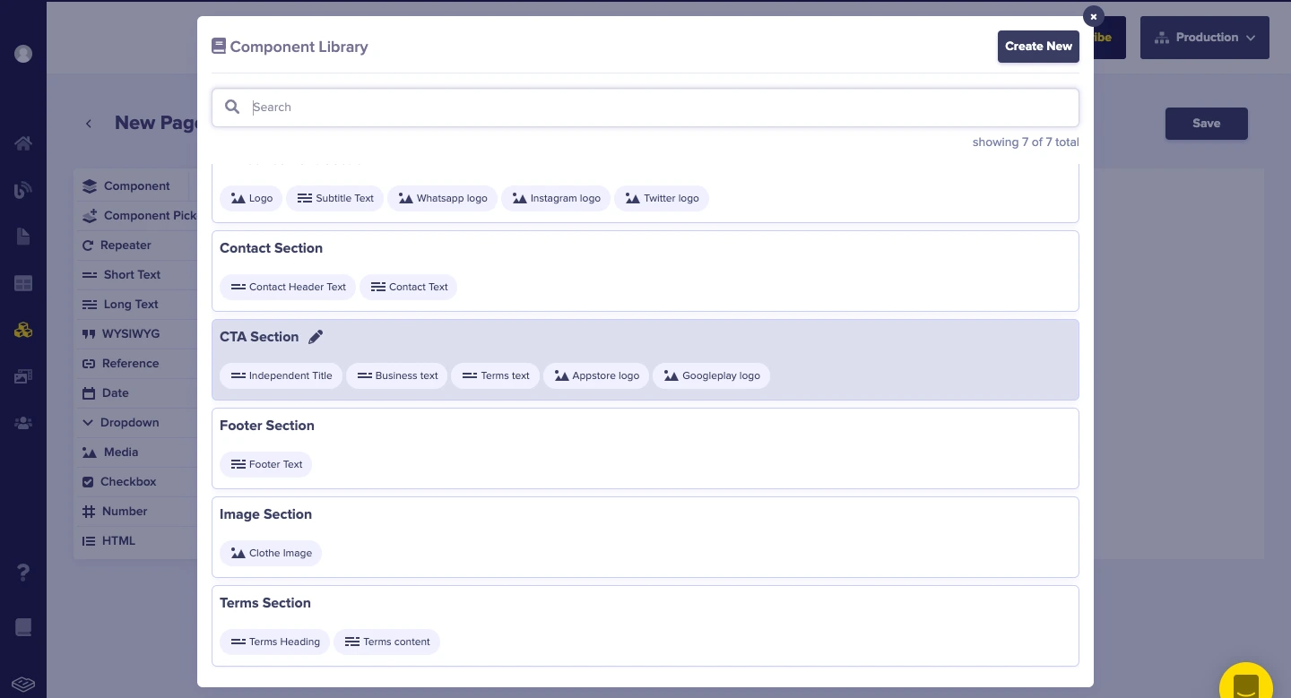
Next, select the CTA Section component.
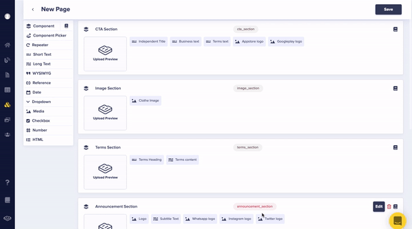
Repeat the previous steps and add each of the components you created. After you've included them all, the page should look like this:
Click the Save button and save the page as Home Page.
After saving the new page, we can begin adding its content.
Add CTA section content:
Add Image section content:
Adding Terms section content:
Adding Wishlist section content:
Adding Announcement section content:
Adding Contact section content:
Adding Footer section content:

After we're done adding the content, click on the Publish button.
Step 4: Connect the ReactNative app to ButterCMS
To connect the app to ButterCMS, you need an access token. It can be found on the Settings page of the ButterCMS website.

You will use Axios, a well-known library for sending asynchronous HTTP requests to REST APIs. This library comes in handy when conducting CRUD operations. You may communicate with the backend using this library. Utilize Axios in our application to link our CMS to our application via a fetch request, which will return the content saved in our CMS.
Use the following command to install Axios:
npm i axiosCreate a GET request in index.js to retrieve data from the CMS:
import { useState, useEffect } from "react";
import { StatusBar } from "expo-status-bar";
import {
 StyleSheet,
 View,
 SafeAreaView,
 Image,
 ScrollView,
} from "react-native";
import CTA from "../../components/CTA";
import Navbar from "../../components/Navbar";
import shop from "../../assets/images/shop.png";
import Terms from "../../components/Terms";
import Wishlist from "../../components/Wishlist";
import Announcement from "../../components/Announcement";
import Contact from "../../components/Contact";
import Footer from "../../components/Footer";
import axios from "axios";
export default function App() {
 const [data, setData] = useState();

 const access_Token = "API_KEY";
 useEffect(() => {
   const fetchData = async () => {
     await axios
       .get(
         `https://api.buttercms.com/v2/pages/*/home-page/?auth_token=${access_Token}`
       )
       .then((response) => {
         setData(response.data.data.fields);
       })
       .catch((err) => console.error(err));
   };
   fetchData();
 }, []);


 return (
   <View style={styles.container}>
     <StatusBar style="auto" />
     <SafeAreaView>
       <ScrollView>
       <Navbar />
         <CTA data={data?.cta_section} />
         <Image
           source={{ uri: data?.image_section?.clothe_image }}
           style={{ width: "100%", height: 200 }}
         />
         <Terms data={data?.terms_section} />
         <Wishlist data={data?.wishlist_section} />
         <Announcement data={data?.announcement_section} />
         <Contact data={data?.contact_section} />
         <Footer data={data?.footer_section} />
       </ScrollView>
     </SafeAreaView>
   </View>
 );
}

const styles = StyleSheet.create({
 container: { flex: 1 },
});
Set up a retrieve request in the above code block that returns data from the CMS. When you perform the request, set the value of the state data to the received result. The necessary data pieces were also supplied as props for each component.
In the example below, we configure the CTA component to use CMS contents such as short text fields (independent_title, business_text, and terms_text), and media fields (appstore_logo and googleplay_logo) in the CTA component that we configured in ButterCMS.
import React from "react";
import { View, StyleSheet, Text, Image } from "react-native";
import Apple from "../assets/images/apple.png";
import google from "../assets/images/google.png";
const CTA = ({ data }) => {
return (
  <View style={styles.container}>
    <View style={{ alignItems: "center" }}>
      <Text style={styles.buyText}>{data?.independent_title}</Text>
      <Text style={styles.smallText}>{data?.business_text}</Text>
      <Text style={styles.terms}>{data?.terms_text}</Text>
    </View>
    <View
      style={{
        marginTop: 20,
        width: "80%",
        flexDirection: "row",
        justifyContent: "space-between",
      }}
    >
      <View style={styles.button_container}>
        <Image
          source={{ uri: data?.appstore_logo }}
          style={{ width: 25, height: 25 }}
        />
        <View style={{ marginLeft: 5 }}>
          <Text style={styles.download}>Download on the</Text>
          <Text style={styles.appStore}>AppStore</Text>
        </View>
      </View>


      <View style={styles.button_container}>
        <Image
          source={{ uri: data?.googleplay_logo }}
          style={{ width: 25, height: 25 }}
        />
        <View style={{ marginLeft: 5 }}>
          <Text style={styles.download}>Get it on</Text>
          <Text style={styles.appStore}>Google Play</Text>
        </View>
      </View>
    </View>
  </View>
);
};

export default CTA;

const styles = StyleSheet.create({
container: {
  backgroundColor: "black",
  width: "100%",
  height: 300,
  marginTop: 40,
  alignItems: "center",
  justifyContent: "center",
},
buyText: {
  color: "#fff",
  fontSize: 25,
},
smallText: {
  color: "#ED4A66",
  fontSize: 25,
  marginTop: 8,
},
terms: {
  color: "#fff",
  marginTop: 8,
  fontSize: 18,
},

button_container: {
  borderWidth: 1,
  borderColor: "#fff",
  flexDirection: "row",
  borderRadius: 5,
  padding: 5,
  alignItems: "center",
},
download: {
  color: "#fff",
},
appStore: {
  color: "#fff",
  fontSize: 20,
  fontWeight: "600",
},
googleImage: {
  width: 20,
  height: 20,
},
});
In Terms.jsx, we will configure it to use the terms_heading and terms_content of the Terms component that we configured in ButterCMS.
import React from "react";
import { Text, View, StyleSheet } from "react-native";

const Terms = ({ data }) => {
return (
  <View style={styles.container}>
    <Text style={styles.terms}>{data?.terms_heading}</Text>
    <View style={styles.text_container}>
      <Text style={styles.text_content}>{data?.terms_content}</Text>
    </View>
  </View>
);
};

export default Terms;

const styles = StyleSheet.create({
container: {
  width: "100%",
  alignItems: "center",
  marginTop: 20,
  marginBottom: 20,
},
terms: {
  color: "rgba(255, 0, 104, 1)",
  fontSize: 20,
  fontWeight: "600",
},
text_container: {
  width: "70%",
  marginTop: 10,
},
text_content: {
  textAlign: "center",
  fontSize: 15,
},
});
In Wishlist.jsx, we will use the Wishlist component fields (buy_text, merchant_text, small_text, and wishlist_subtitle) that we configured in ButterCMS:
import React from "react";
import { Text, View, StyleSheet, TextInput, Button } from "react-native";

const Wishlist = ({ data }) => {
return (
  <View style={styles.container}>
    <View style={styles.header_container}>
      <Text style={styles.header_text}>{data?.buy_text}</Text>
      <Text style={styles.header_text}>{data?.merchant_text}</Text>
      <Text style={styles.header_text_last}>{data?.small_text}</Text>
    </View>
    <View style={styles.content_container}>
      <Text style={styles.content}>{data?.wishlist_subtitle}</Text>
    </View>

    <View style={styles.input_container}>
      <TextInput
        placeholder="Input your email address"
        style={styles.input}
      />
      <View>
        <Button title="JOIN  WAITLIST" color="rgba(255, 0, 104, 1)" />
      </View>
    </View>
  </View>
);
};

export default Wishlist;

const styles = StyleSheet.create({
container: {
  width: "100%",
  height: 300,
  backgroundColor: "black",
  alignItems: "center",
  justifyContent: "center",
},
header_container: {
  width: "100%",
  alignItems: "center",
},

header_text: {
  color: "#fff",
  fontSize: 20,
  fontWeight: "600",
},
header_text_last: {
  color: "rgba(255, 0, 104, 1)",
  fontSize: 20,
  fontWeight: "600",
},
content_container: {
  width: " 70%",
  marginVertical: 20,
},
content: {
  color: "#fff",
  textAlign: "center",
},
input_container: {
  width: "80%",
  flexDirection: "row",
},
input: {
  backgroundColor: "#fff",
  width: "50%",
  padding: 8,
  borderRadius: 5,
},
});
In Announcement.jsx, we will use the media files (logo, whatsapp_logo, instagram_logo, and twitter_logo) and text field (subtitle_text) from the Announcement component:
import React from "react";
import { Text, View, StyleSheet, Image } from "react-native";
import logo from "../assets/images/logo.png";
import whatsapp from "../assets/images/whatsapp.png";
import insta from "../assets/images/Insta.png";
import twitter from "../assets/images/twitter.png";
const Announcement = ({ data }) => {
return (
  <View style={styles.container}>
    <View>
      <Image
        source={{ uri: data?.logo }}
        style={{ width: 200, height: 90 }}
      />
    </View>
    <View style={styles.content_container}>
      <Text style={styles.content}>{data?.subtitle_text}</Text>
    </View>
    <View>
      <View style={styles.icon_box}>
        <View style={styles.icon_container}>
          <Image
            source={{ uri: data?.whatsapp_logo }}
            style={styles.image_socials}
          />
        </View>

        <View style={styles.icon_container}>
          <Image
            source={{ uri: data?.instagram_logo }}
            style={styles.image_socials}
          />
        </View>

        <View style={styles.icon_container}>
          <Image
            source={{ uri: data?.twitter_logo }}
            style={styles.image_socials}
          />
        </View>
      </View>
    </View>
  </View>
);
};

export default Announcement;

const styles = StyleSheet.create({
container: {
  paddingVertical: 20,
  paddingHorizontal: 20,
},
content_container: {
  marginTop: 20,
},
icon_container: {
  backgroundColor: "#000",
  width: 35,
  height: 35,
  alignItems: "center",
  justifyContent: "center",
  borderRadius: 50,
  marginRight: 10,
},
icon_box: {
  flexDirection: "row",
  marginVertical: 15,
},
});
In Contact.jsx, we will use the Contact component fields (contact_header_text, contact_text).
import React, { Component } from "react";
import { Text, View, StyleSheet } from "react-native";

const Contact = ({ data }) => {
return (
  <View style={styles.container}>
    <View>
      <Text style={styles.header}>{data?.contact_header_text}</Text>
      <View>
        <Text>{data?.contact_text}</Text>
      </View>
    </View>
  </View>
);
};

export default Contact;

const styles = StyleSheet.create({
container: {
  paddingHorizontal: 20,
},
header: {
  color: "#000",
  fontWeight: "700",
  fontSize: 20,
},
});
And, finally, in Footer.jsx, we will use the Footer component field (footer_text):
import React from "react";
import { Text, View, StyleSheet } from "react-native";

const Footer = ({data}) => {
return (
  <View style={styles.container}>
    <Text style={styles.text_content}>
     {data?.footer_text}
    </Text>
  </View>
);
};

export default Footer;

const styles = StyleSheet.create({
container: {
  width: "100%",
  backgroundColor: "#000",
  padding: 15,
  marginTop: 20,
},
text_content: {
  color: "#fff",
  textAlign: "center",
  lineHeight: 20,
},
});
Now, when you run the program in the simulator, you get the following result:
3 examples of React Native landing pages to take inspiration from
Airbnb
Airbnb’s landing page is a prime example of how to create a seamless user experience across various devices using React Native. By leveraging the component-based architecture of React Native, Airbnb can ensure that its landing page maintains a consistent and responsive layout, whether accessed from a smartphone, tablet, or desktop.

Source: Apple App Store
Uber Eats
Uber Eats leverages React Native to deliver fast real-time updates and smooth transitions. It efficiently notifies users of order statuses and delivery estimations without compromising performance. The unified codebase ensures consistent features across iOS and Android. Smooth animations and intuitive navigation make the food ordering experience seamless and engaging.\
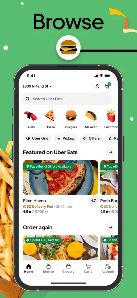
Source: Apple App Store
Instagram’s mobile landing page leverages React Native for swift navigation, responsive design, and excellent media performance. Instagram ensures a consistent user experience across multiple devices, from smartphones to tablets, with React Native. This approach allows for quick updates and feature enhancements without separate codebases. The result is a highly interactive and engaging landing page that effectively showcases rich media content while maintaining performance and responsiveness.

Source: Apple App Store
React Native landing page best practices and resources
Implementing best practices is essential for ensuring your React Native landing page is efficient and engaging. Here are some key strategies and valuable resources to help you achieve that:=
-
Keep it simple: Focus on minimalistic design and essential elements. To achieve this, use clean layouts and remove unnecessary features to enhance usability and visual appeal.
-
Optimize images: Use optimized images to improve load times. Compress images using tools like TinyPNG or ImageOptim before integrating them into your app.
-
Test on multiple devices: Ensure your landing page looks and performs well on various devices. Use emulators and real devices for both iOS and Android to test different screen sizes and resolutions.
-
Leverage component libraries: Use libraries like NativeBase or React Native Elements to speed up development. Incorporate pre-built components from these libraries to reduce development time and ensure consistency.
-
Monitor performance: Continuously monitor and optimize your app’s performance using tools like React Native Performance Monitor. Regularly check performance metrics and optimize code to reduce bottlenecks and improve load times.
Resources
FAQ: How can I efficiently use React Native's component-based architecture to enhance user interfaces?
React Native’s component-based architecture allows developers to build encapsulated components that manage their state and behavior and then compose them to make complex UIs.
Here’s how you make your landing page with React efficient:
Break down the UI into components
Identify and create small, reusable components. Let us define a reusable Header component that displays a title within a styled container.
Example:
// Header Component
const Header = () => (
  <View style={styles.header}>
    <Text style={styles.title}>My Landing Page</Text>
  </View>
);

const styles = StyleSheet.create({
  header: {
    height: 60,
    backgroundColor: '#f8f8f8',
    alignItems: 'center',
    justifyContent: 'center',
  },
  title: {
    fontSize: 20,
  },
});
Manage state efficiently
Use hooks to manage state within your components. We will use React's useState hook to handle the state of a counter, which increments each time the button is pressed.
Example:
const LandingPage = () => {
const [count, setCount] = useState(0);

  return (
    <View style={styles.container}>
      <Text>Button pressed {count} times</Text>
      <Button title="Press Me" onPress={() => setCount(count + 1)} />
    </View>
  );
};

const styles = StyleSheet.create({
  container: {
    flex: 1,
    justifyContent: 'center',
    alignItems: 'center',
  },
});
Pass props to components
Ensure components can receive data and actions as props. Let us create a reusable Button component that accepts title and onPress as props, making it flexible for use in various parts of an application.
Example:
const Button = ({ title, onPress }) => (
  <TouchableOpacity onPress={onPress} style={styles.button}>
    <Text style={styles.buttonText}>{title}</Text>
  </TouchableOpacity>
);

const LandingPage = () => (
  <View style={styles.container}>
    <Text>Welcome to my Landing Page</Text>
    <Button title="Sign Up" onPress={() => console.log('Button Pressed')} />
  </View>
);
Maintain consistent styling
Use StyleSheet to ensure consistent styling across your components. We will create a StyleSheet with styles for a container and button.
Example:
const styles = StyleSheet.create({
  container: {
    flex: 1,
    justifyContent: 'center',
    alignItems: 'center',
  },
  button: {
    backgroundColor: '#007BFF',
    padding: 10,
    borderRadius: 5,
    alignItems: 'center',
  },
  buttonText: {
    color: '#FFF',
    fontSize: 16,
  },
});
Optimize performance
Use React.memo to prevent unnecessary re-renders. Let us wrap the Button component with React.memo, a higher-order component that memoizes the rendered output. This means the Button component will only re-render if its title or onPress props change, thus optimizing performance by avoiding unnecessary re-renders.
Example:
const Button = React.memo(({ title, onPress }) => (
  <TouchableOpacity onPress={onPress} style={styles.button}>
    <Text style={styles.buttonText}>{title}</Text>
  </TouchableOpacity>
));
By following these steps, you can effectively use React Native’s architecture to build user interfaces that are seamless and high-performing.
Closing thoughts
Creating a top-notch React Native landing page is key to keeping users engaged and boosting conversion rates. With its component-based structure, you can build responsive and maintainable UIs by breaking your design into reusable parts and managing the state efficiently. Tools like memoization and ButterCMS can streamline your work, making updates and content management easy.
Start leveraging the advantages of a unified codebase today and create visually appealing and high-performing landing pages with React Native and ButterCMS. Start your 14-day trial.

